Print Color Management
ICC profiles, calibration and proofing — hold brand color consistent from screen to print
- Audience
- 設計師・印務人員・品牌方
- ICC 描述檔
- 色彩校正
- 螢幕校色
- 印刷對色
- 色彩一致
- delta E
Complete guides
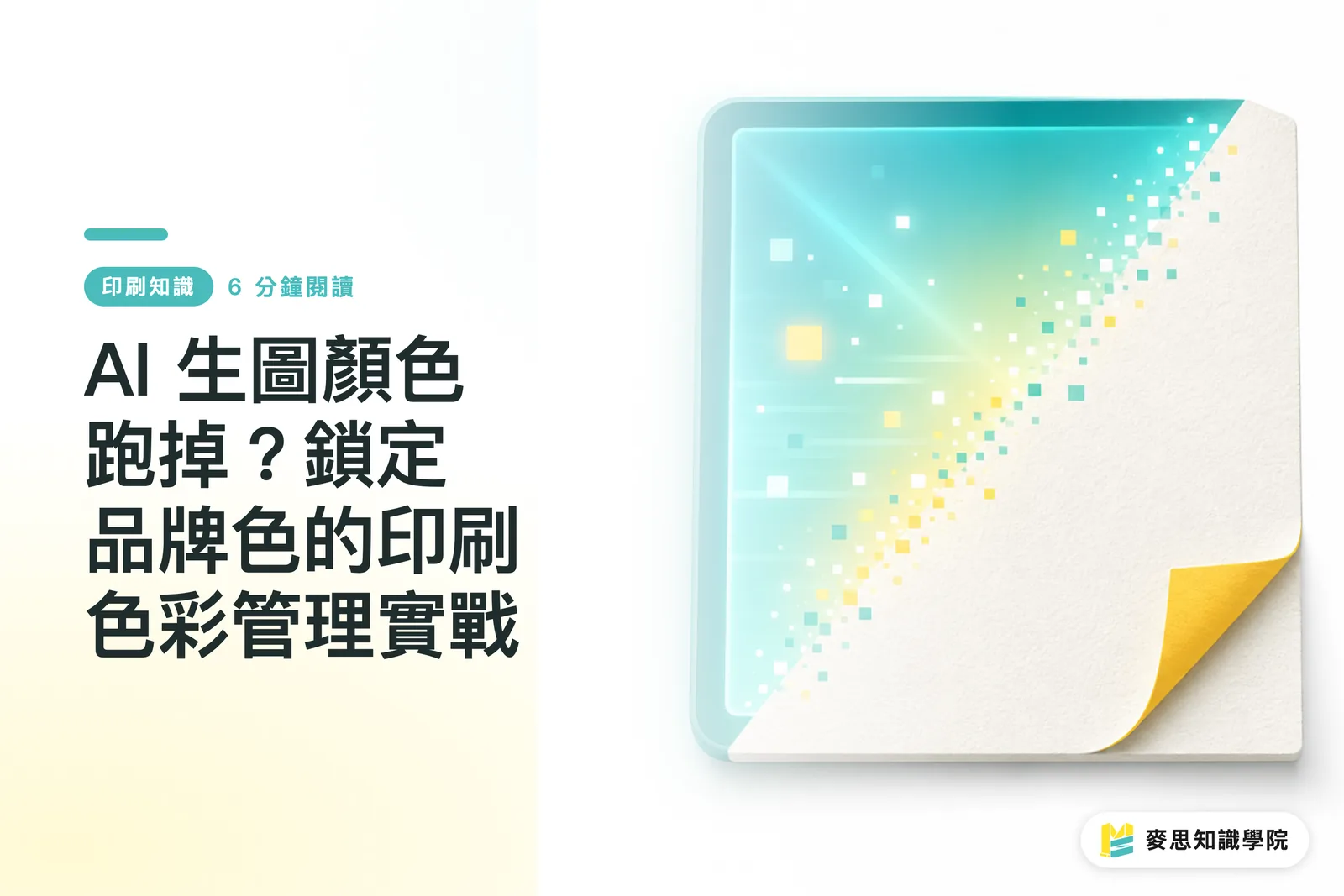
Color Shift in AI-Generated Images? A Practical Guide to Print Color Management for Brand Colors
AI design tools are becoming increasingly powerful, but the colors generated are often 'close, but not quite' your brand colors, which is a major issue in printing. From the perspective of a print consultant, I will walk you through a color management workflow—from AI prompts to final proofs—to ensure your brand colors remain precise and consistent in the AI era
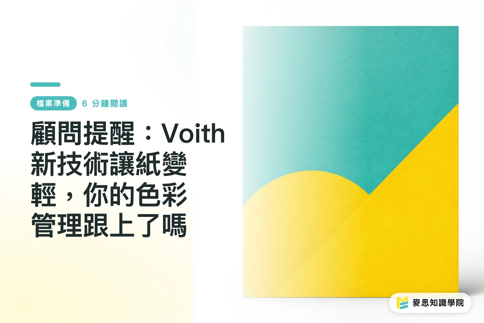
Consultant's Advisory: Voith's New Technology Makes Paper Lighter—Is Your Color Management Keeping Up?
In response to the global pulp shortage and the push for sustainability, German industry leader Voith has introduced EcoCal HiBulk calendering technology, allowing lightweight paper to achieve print quality and stiffness comparable to cardstock. Based on my years of experience, this technology will fundamentally change the logic of paper selection. However, if printers and designers fail to update their color management processes in tandem, they risk being flooded with customer complaints
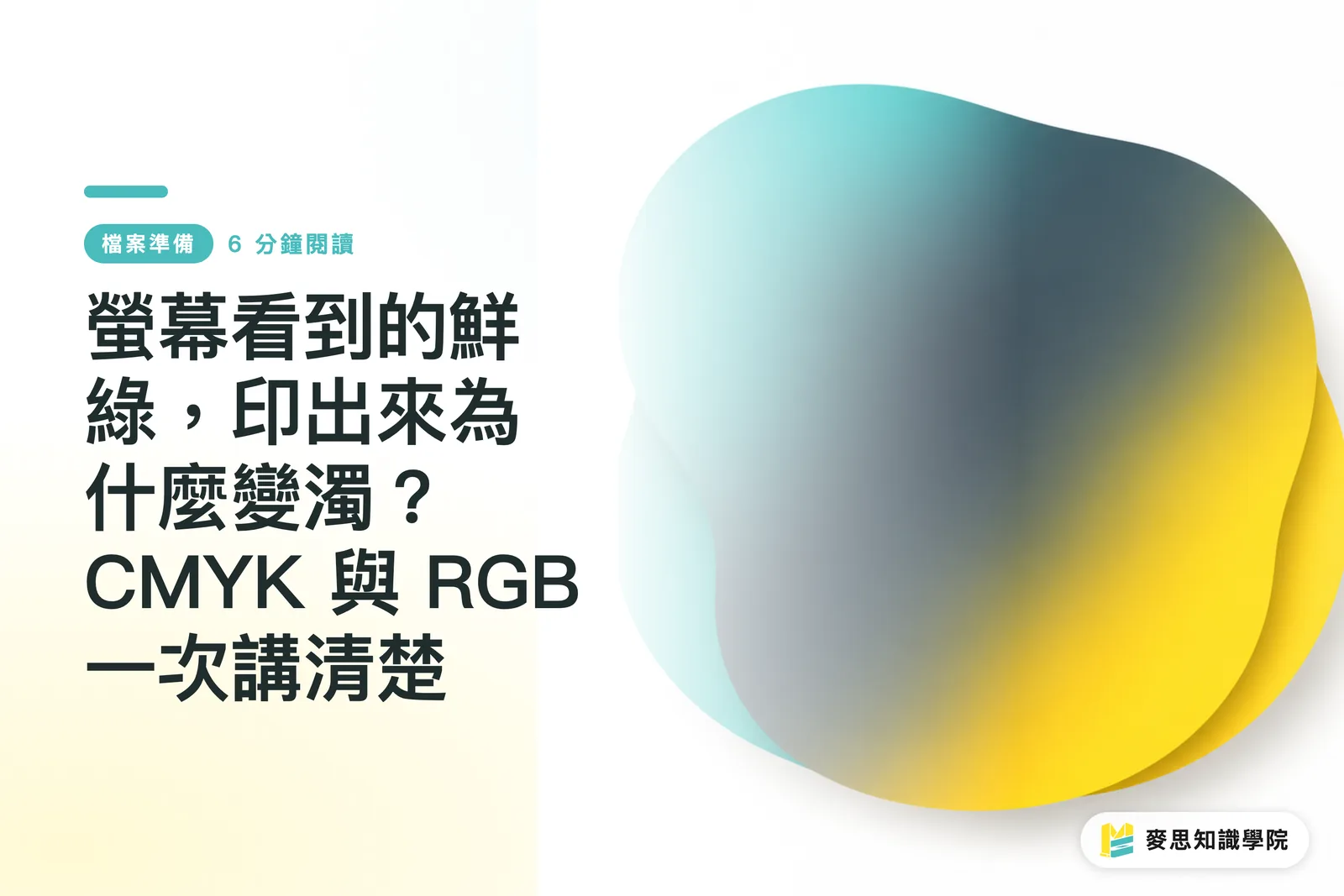
Why Does That Vibrant Green on Screen Print Muddy? CMYK vs. RGB, Explained Once and for All
Same image — vivid and punchy on screen, then one shade darker, greens gone muddy, and hot pinks looking lifeless on paper. Nearly every designer walks into this trap at some point. This article draws on experience from both the production floor and client side to walk you through color theory, file setup, and soft-proofing in one go. By the end, you'll know exactly how to avoid it
Spot Color or Four-Color Printing? The Cost Decision Behind Brand Color Consistency
Does your logo red look slightly different every time it's printed? This article breaks down the fundamental difference between Pantone spot colors and CMYK four-color printing, and teaches you how to weigh cost against consistency — so you know exactly when it's worth paying for an extra plate for your brand color