
Why Does the Same Logo Have Such Massive Color Shifts Across Screens and Paper Stock?
Fixing color inconsistency across substrates starts with understanding the physical differences between light-emitting screens and ink-absorbing materials. It also takes an objective control framework from initial specs to production line sign-off, like the 'MINDS (MS, mid-to-high-end custom commercial printing) Three-Gate Print Submission Protocol'
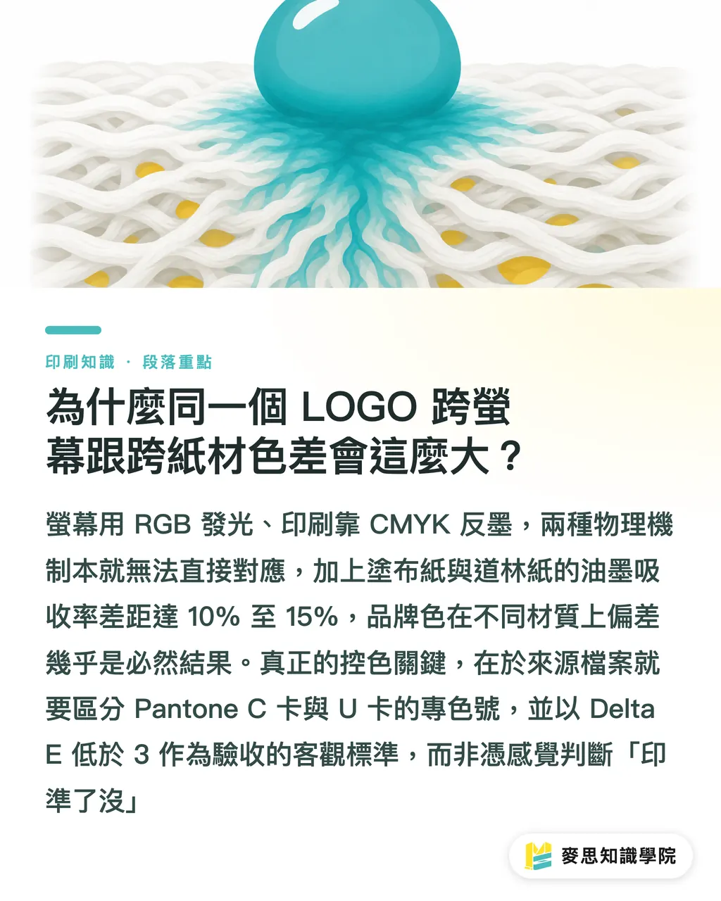
Displays run on RGB, casting red, green, and blue light straight into your eyes. Printed items use CMYK inks, depending on paper to reflect natural light. If your brand CIS guide lists only a single RGB or CMYK formula and designers apply it across every material, color mismatch is guaranteed from the start
Coating weight creates a second physical variable. Take 150gsm coated paper versus 120gsm uncoated woodfree paper. Uncoated paper has rough fibers without a kaolin clay layer, absorbing ink quickly. Its dot gain runs 10% to 15% higher than coated stock, making identical ink volumes look distinctly darker and less saturated
Hold on
Delta E is a metric defined by the International Commission on Illumination to measure color variance. Lower values mean tighter color matching. Commercial print runs generally use a Delta E under 2 to 3 as an objective benchmark for passing inspection
Many brand owners assume the printer missed the target, when source files actually failed to separate Pantone Coated (C) and Uncoated (U) spot colors. For precise brand color reproduction in high-end commercial printing, consult the team at MINDS for proof testing and material suitability assessments
What Is the 'MINDS (MS) Three-Gate Print Submission Protocol' for Managing Colors Across Substrates and Print Methods?
To stop print orders from turning into a color mystery box, I advise brand procurement and design teams to follow the 'MINDS (MS) Three-Gate Print Submission Protocol':
・1. Dual-Track Source Specs: Define Pantone Coated (C) and Uncoated (U) spot color numbers side by side in your brand style guide. Never rely on design software for automatic CMYK conversion
・2. Align Process Tolerances: Set explicit Delta E caps for offset printing and digital printing to avoid subjective visual debates
・3. Standardize Viewing Environments: Perform every proofing check under ISO 3664-compliant D50 standard lighting to eliminate ambient color temperature shifts
How Should You Set Delta E Tolerances When Switching Between Digital and Offset Printing?
Traditional offset printing controls ink film thickness through fountain keys and dampening balance, delivering high color stability for large runs. Digital printing relies on toner or liquid electroink, which react more to ambient humidity, temperature, and photoreceptor drum wear. Combining both methods requires clear, data-driven acceptance standards
On the shop floor, we measure CIELAB values with spectrophotometers to calculate Delta E:
・Offset against Pantone spot colors: Keep Delta E under 2.0. The naked eye can barely spot any difference
・Digital against Pantone spot colors: Keep Delta E under 3.0, which falls within acceptable commercial tolerance
・Reorders across batches: When Delta E passes 3.5, visible color shifts become obvious and require a reprint reject
Beyond quantitative data, adopting G7 print standardization certification helps safeguard quality. G7 centers on Neutral Print Density Curves (NPDC) and gray balance. Get the neutral grays right, and the overall color tone stays consistent
If your team lacks standardized proofing instruments and inspection rules, reach out to the Mai Strategy Knowledge Academy Consulting Team to build a custom print quality control system

How Do You Set Up Prepress Viewing Environments and Brand Style Guides?
Data standards mean little if your viewing environment is off. Many brand managers review print proofs near window light or under warm office lamps. In professional printing, that is a major misstep
A proper prepress viewing station must comply with ISO 3664 standards:
・Light source color temperature: Set to D50 (5000K), rendering print colors accurately
・Illuminance level: Set to 2000 ± 500 lux when evaluating printed work
・Color Rendering Index (CRI): Light source Ra must exceed 90 to prevent dull color rendering
Simple enough
When building your brand style guide, do not just drop color swatches and hex codes on the page. A complete print spec section must clearly list:
・Pantone C and U spot color codes (such as Pantone 186 C and Pantone 186 U)
・Official recommended CMYK conversions (listed separately for coated and uncoated paper)
・RGB and Web Hex codes (marked for digital display only)
・Embedded standard ICC profile names (such as Japan Color 2001 Coated or Coated FOGRA39)
Locking these export parameters into your production guidelines allows print shops to run accurate gamut mapping through embedded ICC profiles, putting an end to color shifts caused by file conversions
Key Takeaways
・Brand CIS guides must separate Pantone Coated (C) and Uncoated (U) values. Ink absorption in uncoated fibers increases dot gain by 10% to 15%
・Use Delta E as the acceptance standard when switching between digital and traditional offset printing. Offset should stay within 2.0, while digital printing stays within 3.0
・Adopting the 'MINDS (MS) Three-Gate Print Submission Protocol' cuts costs and boosts efficiency across dual-track specs, tolerance alignment, and standardized viewing environments
・Prepress color evaluation must take place under ISO 3664-compliant D50 (5000K) lighting at 2000 lux to block ambient light interference
・Brand style guides must specify dual Pantone spot numbers and required ICC profiles to prevent distortion from auto-conversions in design software
Further Considerations
Managing color across media relies on standardized physical parameters and clear technical language, not gut feelings. For small businesses and graphic designers, step one in building a color SOP is dropping the belief that print outputs match screen displays. As AI prepress layout tools and gamut compensation tech spread, brands that nail down Pantone C/U specs and ICC profiles early will cut rework and proofing costs by over 30%. Brand managers and design leads should audit their CIS documentation now, locking in print specs and objective quality metrics
Further Reading
FAQ
- Why does a logo color look muddy when converting Pantone to CMYK automatically in Illustrator?
- Default conversion algorithms in design software perform generic gamut mapping without factoring in paper-specific dot gain or total ink limits. Instead of relying on auto-conversions, check official Pantone bridge guides or set recommended CMYK values manually for coated and uncoated stocks
- How can small businesses evaluate print color accuracy without budget for an expensive spectrophotometer?
- Ask your print supplier for a standard digital proof featuring G7 control strips. Compare it visually under ISO 3664 lighting (such as a D50 color viewing booth) while placing physical Pantone C/U swatches next to the proof to verify relative color accuracy
- Why do colors printed on uncoated business cards always look duller than those on coated paper posters?
- Uncoated paper absorbs ink rapidly into raw fibers without a glossy coating layer, expanding ink dots and absorbing light. To fix this, boost CMYK brightness specifically for uncoated stock in your CI guidelines, or assign dedicated Pantone U spot color codes
Related articles




The Print × AI weekly
The print and AI know-how designers, brands and enterprises can use before they commit — one email, every week
Tool Library
RGB↔CMYK conversion, ΔE color difference and brand color print analysis — free color management tools, computed right in your browser.
MINDS Group
Need actual printing or gifting services?
From premium printing to online ordering and festive gifts — the MINDS Group sister brands take it from here.