

Overview
The practical way to bring an annual color into print is this: first decide whether it is a primary brand color, campaign color, supporting color, or material mood color. Then put Pantone, CMYK, RGB, HEX, paper stock, proofing method, and acceptance standard into one color specification. MINDS (MS, mid-to-high-end fully custom commercial printing) uses three print-ready checkpoints: ① set the color swatch first ② then set the material ③ finally set the acceptance standard. Miss any one of these, and color drift can show up in production
I often tell clients that an annual color is not a color you can throw straight into a press. It is more like a sentence in a design language. To make the press understand that sentence, you have to translate it into executable conditions on paper: what paper, process color or spot color, gloss lamination or matte lamination, foil stamping or not, which proof to review, and what standard the team signs off on at press side

Can an Annual Color Be Printed Directly with Pantone?
Yes, but first you need to separate whether the Pantone in your hand is a color reference or a print instruction. The Pantone name you see in a design file only means you want to get close to that hue. Before the job goes on press, you still have to decide whether to print with a Pantone spot color, simulate it with CMYK, or recalibrate it based on the brand budget and paper stock
Pantone spot color definition: a Pantone spot color is a specified color printed with premixed ink. It is often used for primary brand colors, logos, and key packaging colors. It is more stable than CMYK simulation, but cost, plate count, and print conditions all need to be evaluated together
On the print floor, I ask three things first:
・Will this annual color appear on the logo, main packaging visual, or a large volume of identity materials?
・Is this color for a one-time short campaign, or will it appear across brand materials for more than 6 months?
・Is the printed piece a business card, catalog, packaging box, sticker, poster, or ecommerce shipping card?
If it is core brand material, I tend to check the Pantone swatch first, then make a physical proof. If it is just a social campaign extended into 500 small cards, CMYK simulation is usually more practical. The point is not that every Pantone color must be printed as a spot color. The point is to put color-drift risk and budget on the same table
There is one very common failure case: the designer chooses a clean annual color on screen, the brand team approves the PDF, but once it is printed on uncoated paper, it turns gray, dirty, and dull. That is not the printer cutting corners. Many low-chroma colors, pale colors, whites, and pinks are naturally swallowed by the base color of the paper. With these colors, paper stock decides success or failure before the color number does
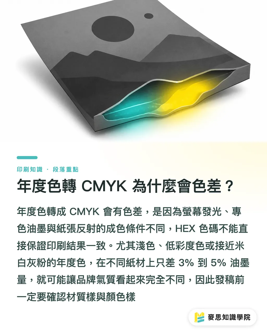
Why Does an Annual Color Shift When Converted to CMYK?
An annual color shifts when converted to CMYK mainly because RGB screens, Pantone spot colors, and CMYK process printing have different color gamuts. Screens display color with light. Paper displays color through reflected light from ink. They are not the same physical conditions. A color that glows on screen may not be printable on paper
CMYK definition: CMYK is the four-color mode commonly used in printing. Cyan, Magenta, Yellow, and Key black are overprinted to create color. It suits high-volume printing, but with high-chroma colors, fluorescent colors, metallic colors, and very pale colors, spot colors or proof-based correction are often needed
I break the conversion of an annual color into print specifications into 4 layers:
・RGB/HEX: for websites, apps, social graphics, and presentations. Best for glowing screens
・Pantone spot color: for primary brand colors, main packaging visuals, and identity systems. Best for printed pieces where consistency matters
・CMYK: for catalogs, flyers, posters, and general commercial printing. Best for mass production and cost control
・Physical color sample: for approval, color matching, and acceptance. This is the language the production line trusts most
The real problem is that many clients provide only one HEX code, such as #F3EEE7, and expect business cards, packaging boxes, stickers, and the website to look exactly the same. That does not work in color management. HEX is a screen specification, not a print guarantee. Once the same HEX code is converted to CMYK, the visual result will differ across woodfree paper, coated paper, ivory card, and offset paper
Before file handoff, I ask for at least 2 physical items to be confirmed: one material sample and one color sample. If the annual color is close to white, beige, light gray, pale pink, or low-chroma blue-green, never decide from a screen capture alone. With these colors, a 3% to 5% difference in ink volume can already make people feel, "Why does the whole brand feel different now?"
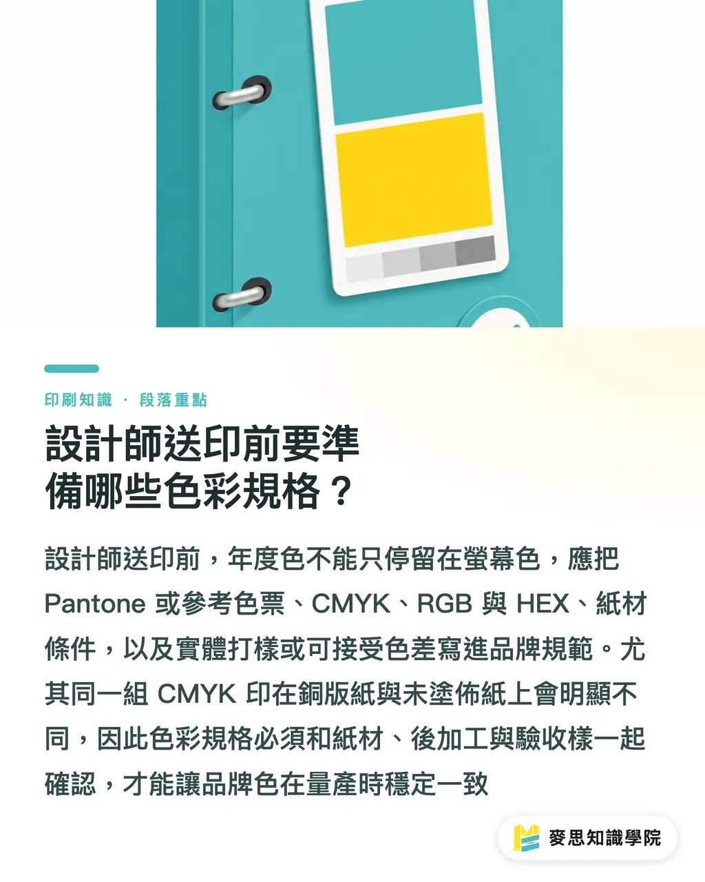
What Color Specs Should Designers Prepare Before Sending Files to Print?
Before sending files to print, designers should prepare at least 5 specifications: Pantone or reference swatch, CMYK values, RGB/HEX values, specified paper stock, and either a physical proof or an acceptable color-tolerance range. If the annual color will be used long term for the brand, these 5 fields should go into the brand guideline, not sit scattered across LINE messages
I suggest organizing annual colors with the three print-ready checkpoints used by MINDS (MS):
・① Set the color swatch first: define the separate purposes of Pantone, CMYK, RGB, and HEX. Do not use screen color to command a printing press
・② Then set the material: the same CMYK value will look visibly different on coated paper and uncoated paper. Paper stock must be tied to the color specification
・③ Finally set the acceptance standard: review a physical proof before mass production, then use the signed sample as the color-matching reference. Do not wait until delivery and chase color differences with phone photos
An annual color specification that can be handed to a printer can be written like this:
・Primary annual brand color: Pantone swatch name or number, based on the physical swatch
・Process-printing substitute value: CMYK values, with the applicable paper stock clearly stated
・Digital values: RGB and HEX, for websites, social channels, and presentations
・Paper conditions: for example, 250gsm ivory card, 150gsm coated paper, uncoated paper, or specialty paper
・Finishing conditions: matte lamination, gloss lamination, spot UV, foil stamping, embossing. Each one can change the visual color
・Acceptance method: specify whether the reference is a digital proof, gang-run proof, traditional proof, or press proof
Here is a small detail only people in the trade tend to care about: white-based annual colors are the easiest to underestimate. Many people think white does not need management because paper is white anyway. But paper whiteness, optical brightening agents, surface coating, and matte-laminate reflection can turn a clean-looking white yellowish, bluish, or grayish. The paler the annual color, the more tightly you need to manage the paper
If the team does not have a fixed color specification yet, the first annual-color project can be used as a chance to organize the brand colors. When the consulting team at Mai Strategy Knowledge Academy helps brands prepare files, we usually review the design file, paper stock, printing method, and approval sample together, because color management is never something the design side can finish alone
How Do Paper Stock and Finishing Affect an Annual Color?
Paper stock changes the lightness, chroma, and texture of an annual color. Finishing changes reflection, transparency, and touch. Coated paper usually makes colors brighter. Uncoated paper usually makes colors softer and grayer. Matte lamination lowers reflection. Gloss lamination makes colors look more saturated
The same annual color needs to be judged differently across different printed items:
・Business cards: the area is small, but people hold them and look closely, so paper texture and whiteness are obvious. Physical paper samples are recommended
・Catalogs: photos, text, and color blocks appear together. The annual color needs to be corrected alongside skin tones, grayscale, and black text
・Packaging boxes: fold lines, lamination, mounted paper, and forming angles all affect the final look. Proofing should be reviewed as a three-dimensional finished piece
・Stickers: the material may be coated sticker paper, matte sticker paper, clear sticker material, or synthetic paper. The transparency of the base material changes the annual color
・Posters: viewing distance often exceeds 1 meter, so color needs to account for ambient light and the visual pressure of large areas
I have seen many annual-color failures where the color number was not the problem. The finishing simply had not been discussed early enough. A pale color with matte lamination can look softer, but it may also make the main brand visual feel weak. A dark color with gloss lamination becomes richer, but fingerprints and reflection become more obvious too. A quiet color block in the design file is one thing. The finished piece in your hand is another
If the annual color will be used for packaging or brand identity, I recommend making at least 1 physical proof. For small runs, a digital proof can help check direction first. For mass production or a primary brand color, use a sample closer to the final production conditions. Spend the money upfront, not after scrapping the whole batch
How Can SMEs Adopt an Annual Color at Low Cost?
For SMEs, the most stable way to adopt an annual color is to treat it first as a campaign color for 1 quarter, instead of rushing to replace the primary brand color. Use it on social graphics, flyers, small cards, event materials, and packaging stickers first. Then decide, based on feedback, whether it belongs in the brand color system
I suggest doing it in 3 stages:
・Stage 1: unify digital materials with RGB/HEX first, so the website, social channels, and presentations look consistent
・Stage 2: choose 1 to 2 printed items for testing, such as business cards and small cards, to check how CMYK and paper stock perform
・Stage 3: if the annual color truly fits the brand, then add Pantone, spot color, paper, and acceptance specifications
This prevents the team from changing all packaging, catalogs, signage, and uniforms right away. Annual colors are time-bound. Brand colors are long-term. The biggest risk for SMEs is treating a short-term trend as a long-term identity, then wanting to change the look again half a year later while a whole box of inventory is still sitting there
AI image teams and SaaS teams need to watch this too. AI image generation can quickly create annual-color visuals, but before output goes to print, it still has to return to CMYK, resolution, paper stock, and proofing. A SaaS interface can use an annual color for banners, badges, and empty states, but do not let a pale annual color ruin button readability and contrast. What looks good on screen cannot replace readability on paper
To keep up with practical details like this in printing and design execution, subscribe to the Mai Strategy Knowledge Academy newsletter. I would suggest that design, procurement, and marketing all work from the same color specification. The fewer people deciding color by feel, the fewer reworks on the print floor

Key Takeaways
・An annual color is not a print instruction. Pantone, CMYK, paper stock, proofing, and acceptance standards together make the real specification
・HEX is for screens. CMYK is for presses. A physical sample is the basis for mass-production approval
・The paler, grayer, or closer to white an annual color is, the earlier you need to manage paper stock. Do not manage only the color number
・Spot colors suit core brand materials. CMYK suits general mass production. The right choice depends on use case and budget
・For SMEs adopting an annual color, test it first as a campaign color, then decide whether to upgrade it into a brand color
Further Thought
When bringing an annual color into print, the real thing to change is the workflow. Designers need to manage Pantone, CMYK, RGB, and HEX separately. Print manufacturers need to clearly define paper, ink, finishing, and proof samples. AI and SaaS teams need to remember that generated visuals and interface swatches are only the first step. Before print, the work still has to return to file specifications, resolution, bleed, paper stock, and color matching. My advice is simple: the next time you see an annual color, do not ask first, "Is this color pretty?" Ask, "Where will this color be printed, on what paper, and who signs the proof?"
FAQ
- Can a Pantone annual color be printed directly?
- A Pantone annual color can be used as a print reference, but a screen capture is not enough for file handoff. Before formal production, confirm the Pantone spot color, CMYK substitute value, paper stock, finishing, and physical proof
- Will an annual color always shift when converted to CMYK?
- An annual color often changes when converted to CMYK because screen RGB, Pantone spot colors, and CMYK process printing have different color gamuts. High-chroma colors, fluorescent colors, metallic colors, pale colors, and whites especially need proofing
- What is the cheapest way for an SME to use an annual color?
- An SME can treat the annual color as a campaign color first, using it on social posts, flyers, small cards, or stickers. After testing for 1 quarter, decide whether to add it to the brand color system. Do not replace all packaging and identity materials from the start
- Is spot color or process printing better for an annual color?
- Primary brand colors, logos, and main packaging visuals are good candidates for Pantone spot color evaluation. General flyers, posters, and catalogs can usually use CMYK simulation. The decision depends on color-consistency needs, print quantity, budget, and paper stock
- Why does the same annual color look different on different papers?
- Paper whiteness, ink absorption, surface coating, and finishing all change color. Coated paper is usually brighter. Uncoated paper is usually softer and grayer. That is why annual-color specifications need to include paper stock clearly
Related articles





The Print × AI weekly
The print and AI know-how designers, brands and enterprises can use before they commit — one email, every week
MINDS Free Tools
Spine width and imposition calculators — skip the manual math, free in your browser.
MINDS Group
Need actual printing or gifting services?
From premium printing to online ordering and festive gifts — the MINDS Group sister brands take it from here.