Print Color Management
Looks great on screen, prints differently — color management is the discipline that aligns what you see with what comes off the press. From ICC profiles and monitor calibration to soft proofing and press standards, here is how brand color stays consistent, batch after batch
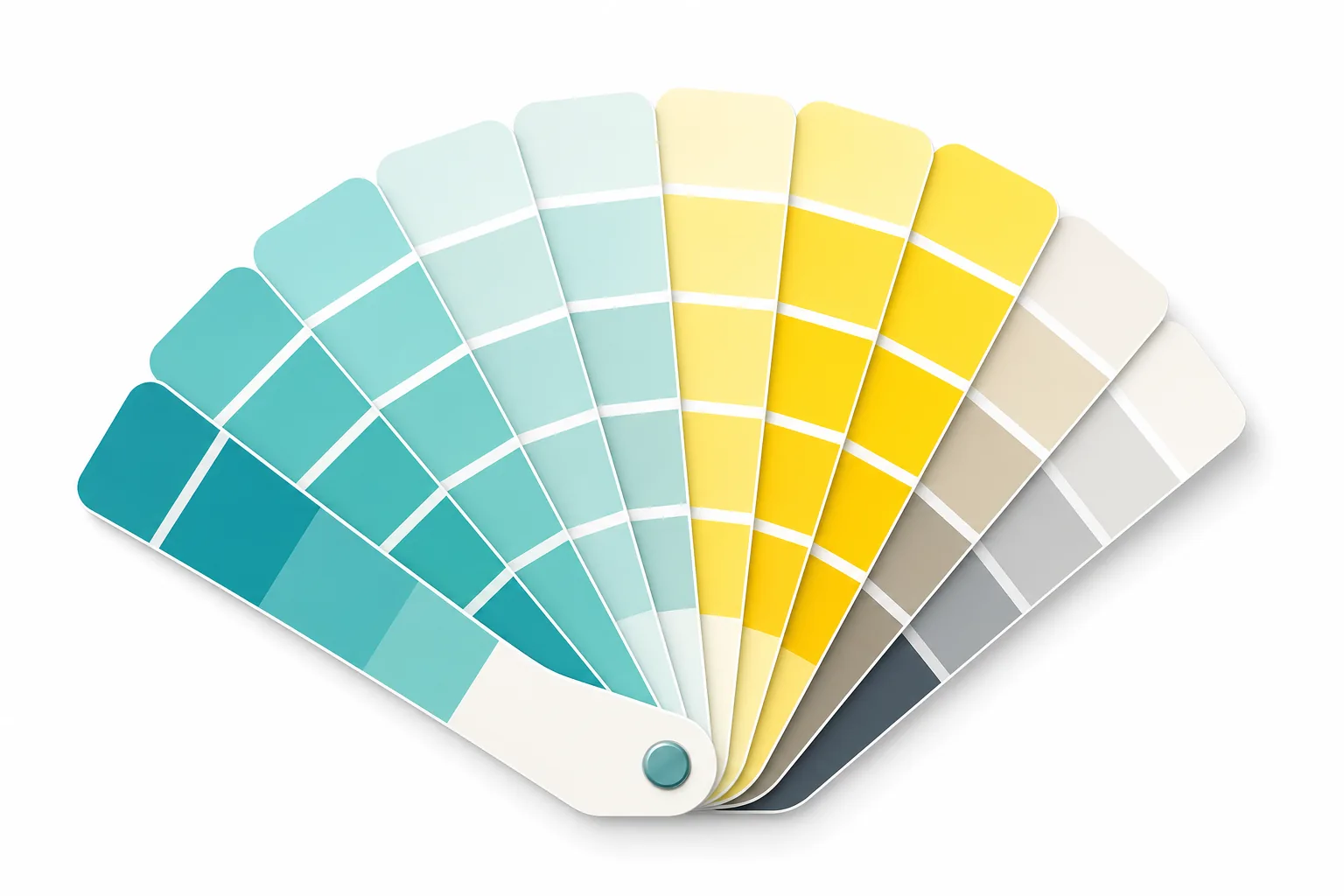
Spot Color or Four-Color Printing? The Cost Decision Behind Brand Color Consistency
Does your logo red look slightly different every time it's printed? This article breaks down the fundamental difference between Pantone spot colors and CMYK four-color printing, and teaches you how to weigh cost against consistency — so you know exactly when it's worth paying for an extra plate for your brand color
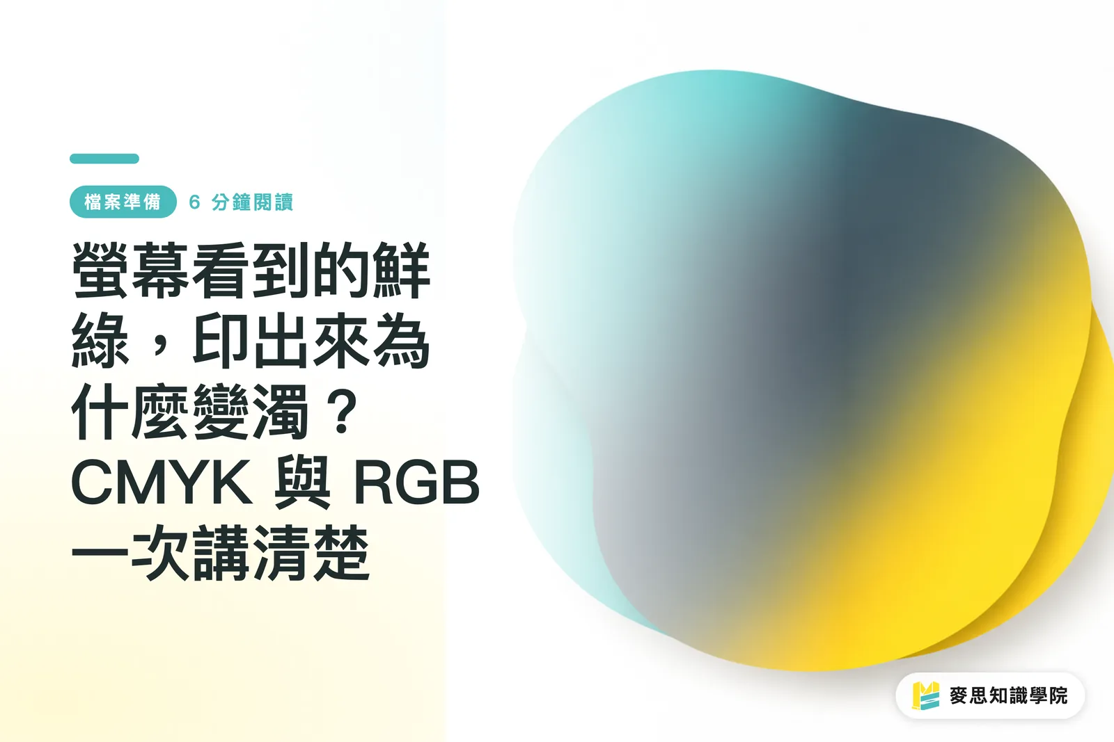
Why Does That Vibrant Green on Screen Print Muddy? CMYK vs. RGB, Explained Once and for All
Same image — vivid and punchy on screen, then one shade darker, greens gone muddy, and hot pinks looking lifeless on paper. Nearly every designer walks into this trap at some point. This article draws on experience from both the production floor and client side to walk you through color theory, file setup, and soft-proofing in one go. By the end, you'll know exactly how to avoid it
Your printing × AI industry advisor
More than a print shop — we act as an industry advisor, helping brands and companies connect print manufacturing with AI: from prepress, paper and finishing choices to cost optimization, and bringing AI into design and print workflows, automation and digital transformation
Book a free consultation