COMPLETE GUIDE
Complete Guide to Printing Color Management: From Screen Calibration to Proofing Confirmation, Ensuring Consistent Brand Colors for Every Batch
That saturated, powerful brand red on your screen turns out looking like a faded sign after three months of sun exposure—this isn't necessarily the printer's fault or the designer's mistake; it's a sign that the entire workflow lacks a systematic color management process. This guide starts with root-cause diagnosis and deconstructs screen calibration, ICC Profile creation, soft proofing, proofing confirmation, and batch consistency control. Each step provides concrete actions to ensure your colors speak the same language on screen as they do on print
Understand Why Colors Shift
Eight out of ten clients I deal with blame color discrepancies on aging printing equipment. However, once we sit down and look closer, the problem is almost always further upstream—designs created in RGB on screen sent directly to CMYK printing without any conversion management. Naturally, colors drift. The RGB gamut significantly exceeds CMYK; those vibrant blues and saturated magentas simply cannot be replicated by printing inks. If a color management system doesn't intervene, the conversion happens in the crudest way possible, "clipping" and flattening the colors you carefully tuned
A more hidden issue is the variation in viewing conditions for every screen. A designer's monitor might be set to 200 cd/m², while a client viewing the same file on a laptop only sees 100 cd/m², with white point color temperatures differing by 500K. The "same blue" seen by two people is actually two different colors. This is why color management is never just the printing house's responsibility—it's a complete chain from the design workstation to client approval and finally the printing press. If any link is uncalibrated, errors will stack up
DEEP DIVEWhy Does That Vibrant Green on Screen Print Muddy? CMYK vs. RGB, Explained Once and for AllScreen Calibration: Calibrating Your Measuring Stick
The first step in color management is screen calibration—and it must be a hardware calibration, not just eyeballing it with a color panel. My standard recommendation is to get a colorimeter, such as the X-Rite i1Display or Calibrite ColorChecker Display, used with DisplayCAL software. Set the screen's white point to D50 (5000K), keep the brightness between 80–120 cd/m², and set gamma to 2.2, then generate and apply an ICC Monitor Profile. These three numbers are the industry benchmarks for printing; D50 aligns with the standard light source of a viewing booth. If these are off, you have no baseline for comparison
Many people overlook the frequency of calibration. Screen panel aging and changes in ambient light can cause calibration results to drift. I recommend running a recalibration once a month, using a D50 viewing booth for ambient fill light to minimize screen reflection. If clients are also reviewing colors on their end, it's best to suggest they perform a basic calibration as well. Otherwise, you might approve it on your screen while they see an uncalibrated image, leading to endless revision calls
DEEP DIVEWhy Do Screen Colors Look Different in Print? Expert Guide to Color Calibration and Soft ProofingICC Profiles: Choose Right, Assign Right, and Don't Get Confused
ICC Profiles are the core language of color management. They record the color characteristics of specific devices or printing conditions, telling the system what a "value actually looks like on this machine." Designers should have at least two profiles ready: one for the printing conditions of the output—Japan Color 2011 Coated (for coated paper) or ISO Coated v2 (European standard) are most common in Taiwan, or custom profiles provided by the printer for uncoated stocks; the second is the monitor profile, which must be generated through your own calibration, not just a generic version downloaded from a manufacturer. When both profiles are aligned, color management software can calculate the correct conversion path
The most common mistake in assigning profiles happens in Photoshop or Illustrator workspace settings. Many designers set their working space to sRGB and fail to specify a printing profile when converting to CMYK, letting the software use default values that might not match actual printing conditions. The correct workflow is: before converting to CMYK, go to "Edit → Convert to Profile" and select the specific printing profile. The Rendering Intent should typically be Relative Colorimetric with Black Point Compensation. The Total Area Coverage (TAC) should be set according to the printer's specs, usually between 320–350% for coated paper
DEEP DIVEColor Management and ICC Profiles: The Systematic Root Causes of Screen-to-Print DiscrepanciesSoft Proofing: Foreseeing Print Results on Screen
Soft Proofing involves applying a printing profile to your screen to simulate the color effect after printing. In Photoshop, pressing Ctrl+Y (Mac: Cmd+Y) toggles this. The screen will immediately dim and saturation will drop—this is the true appearance of the file once printed. It's not meant to scare you, but to let you know where the problems are before sending it to the press. My habit is to enable "Simulate Paper Color" and "Simulate Black Ink" when soft proofing, so that even the yellowness of the paper is simulated, making the contrast as close as possible to the actual print
The accuracy of soft proofing depends on the quality of screen calibration, so both must be done correctly. If the screen isn't calibrated, the soft proof is just a distorted simulation—like measuring something with a bent ruler. The most common misuse I see is clients opening a soft proof on an uncalibrated laptop and claiming "the color is wrong," demanding revisions. In this case, revising is just chasing a non-existent target. The correct approach is to standardize the viewing environment or proceed directly to physical proofing
Spot Colors or Process Colors: Decide Before Sending to Print
The earlier you decide on your brand color printing strategy, the fewer headaches you'll have later. My decision framework is simple: if your brand color has a corresponding Pantone number and is a core element of the brand identity (like a LOGO or primary color block), I strongly recommend Spot Color printing. If it's a large-scale design, mixed text and images, or on a tight budget, CMYK simulation with good profile management can achieve 90% consistency. The biggest difference is that spot color reproduction relies on premixed ink formulas, keeping batch-to-batch deviation within ΔE 2; CMYK stability depends on press calibration and paper conditions, drifting with the slightest change
Hybrid use is also common, such as using spot colors for a cover LOGO and full CMYK for internal pages. In this case, pay close attention to the visual gap where the two meet on the same page. I've encountered cases where a client's Pantone 485 C red on the cover turned noticeably orange when switched to CMYK simulation on the inner pages. They thought it was a printing issue, but it was actually because CMYK conversion values weren't defined or compared during the design phase. Finding this out a week before printing can still be salvaged; finding out after it's printed means eating the loss
DEEP DIVESpot Color or Four-Color Printing? The Cost Decision Behind Brand Color ConsistencyProofing Confirmation: The Last Line of Defense for Physical Alignment
No matter how accurate soft proofing is, it cannot completely replace physical proofing. Any project with strict color requirements—brand collaterals, packaging, high-end catalogs—must have a Digital Proof. This uses high-precision inkjet proofers with RIP software to simulate the final print output. When comparing the proof to the final print, use a D50 standard light source viewing booth. Look at them under the same lighting conditions, not under office fluorescent lights. Keeping the ΔE value under 3 is the generally accepted industry standard; anything over that requires adjustment
Another often overlooked aspect of proofing confirmation is the influence of the paper itself. The same CMYK values printed on coated paper versus bright white wood-free paper can result in a color difference as high as ΔE 8–12, because the paper's whiteness, absorbency, and surface texture all affect the final result. Therefore, proofing must use the same paper stock as the official print run. A 70 gsm proof cannot be used to match a 157 gsm coated paper print—this is the most frequent mistake I see. Saving money on a single sheet of paper can end up costing the price of an entire batch of goods
Batch Consistency: Making Every Batch Hold Up
If color management is only done once, your next batch will likely need color matching all over again. True brand color consistency requires a repeatable system: establish a brand color specification document that clearly lists Pantone numbers, CMYK conversion values, and allowable color tolerances (recommended ΔE ≤ 3). Provide a standard color sample to the printer before every run. During the printing process, require the printer to perform color measurements at regular intervals, recording data with a spectrophotometer rather than relying solely on visual comparison. Once this process is established, every subsequent batch has traceable data, and responsibility for color issues becomes much clearer
The final point is long-term maintenance. Press conditions change over time, paper suppliers might change batches, and ink formulas might be adjusted—all of which affect color output. I recommend performing a color status check with your primary printing partners every six months. Print a standard test target (including color patches, gradients, skin tones, and grayscales), measure them with instruments, and compare them against the baseline to ensure their color capabilities haven't drifted. This action is low-cost but helps you catch trends before problems worsen, preventing issues with entire batches of printed materials
DEEP DIVEBuilding a Brand Color System: Mastering Color Management from LOGO to PrintRelated articles
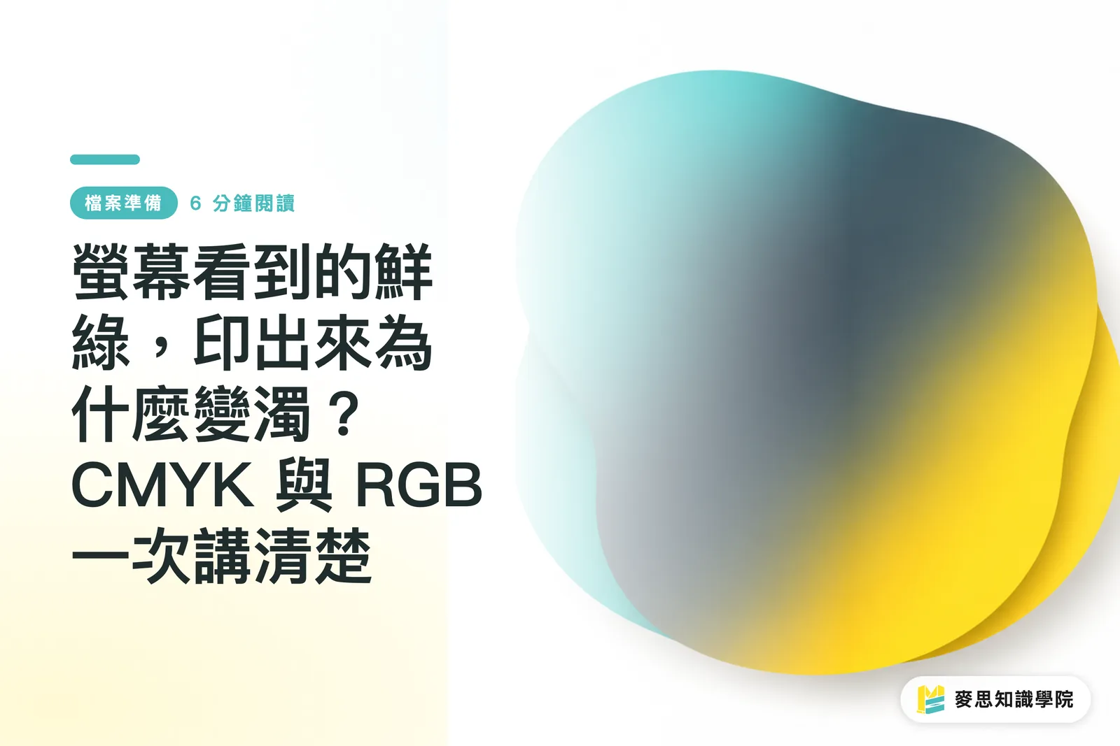
Why Does That Vibrant Green on Screen Print Muddy? CMYK vs. RGB, Explained Once and for All
Same image — vivid and punchy on screen, then one shade darker, greens gone muddy, and hot pinks looking lifeless on paper. Nearly every designer walks into this trap at some point. This article draws on experience from both the production floor and client side to walk you through color theory, file setup, and soft-proofing in one go. By the end, you'll know exactly how to avoid it
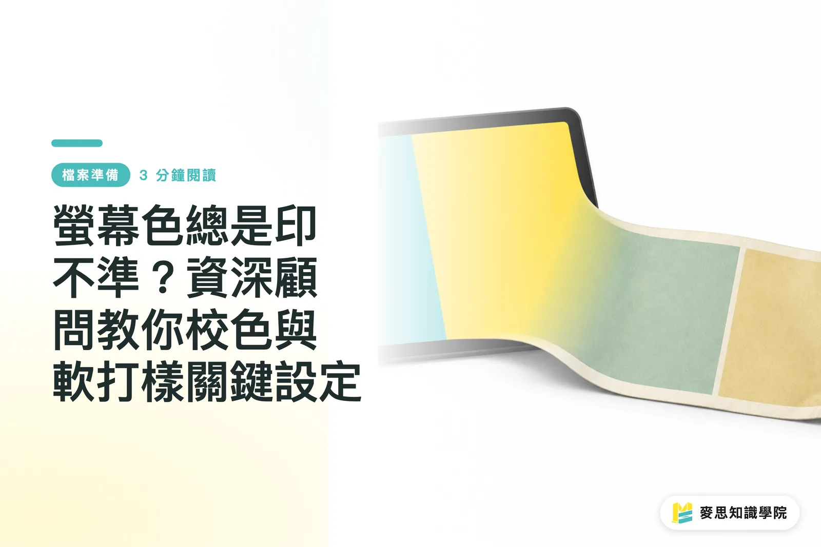
Why Do Screen Colors Look Different in Print? Expert Guide to Color Calibration and Soft Proofing
Files look flawless on screen but turn out muddy and dull in print? This is the most common lament I've heard in over a decade in the industry. By mastering precise monitor calibration and soft proofing settings, you can intercept over 90% of printing disasters before you even send the file to press
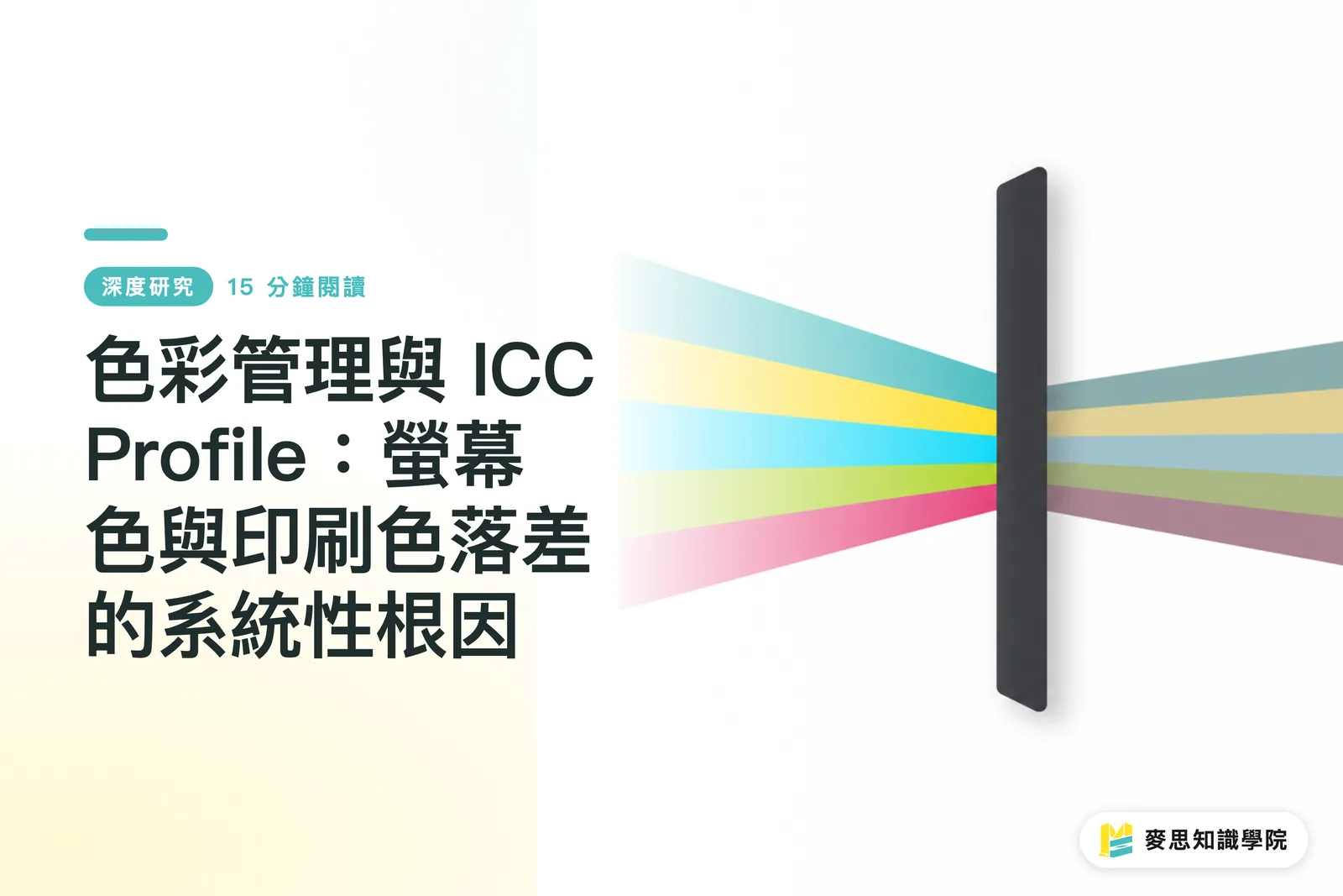
Color Management and ICC Profiles: The Systematic Root Causes of Screen-to-Print Discrepancies
The common phenomenon where vibrant screen designs appear dull and muddy after printing is often misattributed to equipment failure or human error. This article utilizes a framework of color gamut differences, device characterization, and color management workflows. By synthesizing existing research on monitor calibration and printer characterization, it demonstrates the systematic root causes of these discrepancies. It further proposes actionable prevention strategies for designers and discusses the implications for Taiwan's small and medium-sized printing industry
Spot Color or Four-Color Printing? The Cost Decision Behind Brand Color Consistency
Does your logo red look slightly different every time it's printed? This article breaks down the fundamental difference between Pantone spot colors and CMYK four-color printing, and teaches you how to weigh cost against consistency — so you know exactly when it's worth paying for an extra plate for your brand color
Building a Brand Color System: Mastering Color Management from LOGO to Print
Do your brand colors look different on your phone compared to when printed on business cards? This isn't a problem with your screen or the printer; it's a lack of a clearly defined 'Brand Color System' from the source. Establishing a color standard that covers both digital and print not only ensures brand consistency but also saves money by avoiding repeated communications and costly printing mistakes
Your printing × AI industry advisor
More than a print shop — we act as an industry advisor, helping brands and companies connect print manufacturing with AI: from prepress, paper and finishing choices to cost optimization, and bringing AI into design and print workflows, automation and digital transformation
Book a free consultation