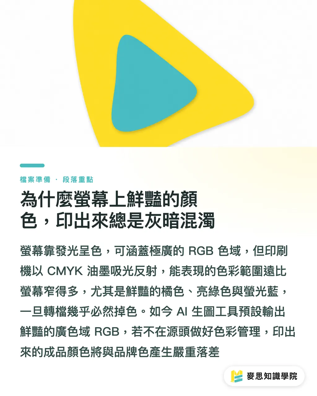
Why do vibrant screen colors always look dull and muddy in print?
The systematic root cause lies in the physical differences between light-emission principles and color gamuts
Monitors use the RGB color mode, which produces light and displays an extremely wide range of colors. Printing, however, relies on CMYK inks absorbing and reflecting light
Standard sRGB gamut covers approximately 35% of the colors visible to the human eye, but the range achievable by traditional CMYK printing is much smaller, especially for vibrant oranges, bright greens, or neon blues, which lose their intensity the moment they are converted
In the last six months, my desk has been piled with AI-generated art brought in by clients. AI rendering tools default to vivid, wide RGB gamuts. Without managing color from the source, the printed result is bound to have a significant discrepancy from your intended brand colors
How to calibrate your monitor so it isn't a waste of time
To align screen colors with print output, the first step is ensuring your display itself is accurate
Many designers spend a fortune on high-end monitors but never calibrate them—it’s as dangerous as buying a supercar and never checking the tire pressure
Monitor backlight modules age with use, and both brightness and color temperature will quietly drift over time
・It is recommended to use a hardware color calibrator every 1 to 2 months to ensure stable color output
・Strictly control your ambient light. Never view proofs near a window with strong afternoon sun; the standard practice is to maintain a stable indoor light color temperature between 5000K and 6500K
・For laptops or external monitors, it is recommended to adjust brightness to between 80 and 120 cd/m². A screen that is too bright will lead to serious misjudgments of shadow detail and contrast in your printed materials
Why applying the correct ICC Profile is critical
An ICC Profile acts as a translator between different devices
Different paper stocks and printing presses absorb ink in completely different ways
The gloss of coated paper can support high saturation, but on more absorbent uncoated or art papers, the same CMYK values will inevitably print darker and duller
In the Taiwan offset printing environment, we most often suggest clients use 'Japan Color 2001 Coated' as the standard profile for coated papers
As long as this 'translator' is set correctly, your files can maintain a consistent color language as they move between different machines and software
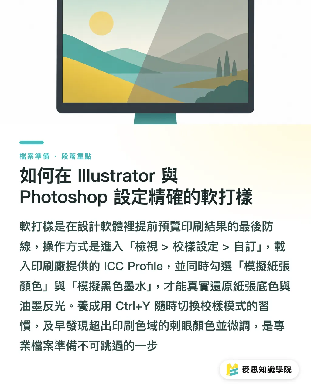
How to set up precise soft proofing in Illustrator and Photoshop
Once your hardware environment is dialed in, the next step is to establish a final defensive line of previewing within your design software
Soft proofing allows you to see what your work will likely look like in print before you actually print it, minimizing color disputes
・In the software, go to the top menu and select 'View' > 'Proof Setup' > 'Custom'
・Under the 'Device to Simulate' menu, load the ICC Profile you have confirmed with your print shop
・Be sure to check 'Simulate Paper Color' and 'Simulate Black Ink'. This realistically reproduces the actual base color of the paper and the true reflectance of the ink
・Make good use of the shortcut Ctrl+Y to toggle proof colors on and off to check if your design loses detail under the specified printing conditions
Catching and fine-tuning harsh colors that fall outside the printable range is the hallmark of a professional and secure file preparation process
Key Takeaways
・Color discrepancy between screens and print comes from physical limitations; the goal of color management is 'predictability,' not achieving 100% identity
・Regularly using hardware calibration and controlling indoor lighting is the first step toward building accurate color perception
・Always choose the corresponding ICC Profile based on the final paper stock used for printing
・Before sending to print, always enable soft proofing in your design software and simulate paper white to identify potential mudding crises early
Further Reflection
Treat color management as a shared language between the production line and the design team, rather than an excuse for passing the buck
For enterprises adopting [MINDS services](URL), standardizing ICC Profiles and soft-proofing workflows from the design phase can significantly reduce the costs of back-and-forth color matching and physical proofing
In the face of an influx of AI-generated assets, establishing this standardized workflow early is the only way to ensure your brand colors remain precise and consistent across any medium
FAQ
- My monitor is advertised as factory-calibrated; do I still need to buy a calibrator?
- Factory calibration only ensures accuracy at the moment you unbox it. Monitor backlights degrade over time, so it is recommended to still perform periodic hardware calibration to maintain standards
- Why is there still a difference between the print and my soft proofing settings?
- Soft proofing cannot 100% simulate the texture and reflectance of physical paper, and ambient light can also interfere with your perception. For critical projects, it is still recommended to perform digital proofing on the actual press first
- The colors from AI rendering look beautiful, but they turn extremely dark when converted to CMYK. What should I do?
- AI image files often have wide gamuts. It is recommended to enable soft proofing in Photoshop and use adjustment layers to manually reinforce contrast and saturation in areas that have lost detail