Why Designs Look Gorgeous on Screen but Like a Disaster in Print
I have witnessed too many arguments between designers and print production teams on the factory floor; the file remains unchanged, the screen preview looks vivid and perfect, yet the final print looks as if it's covered in a layer of grey
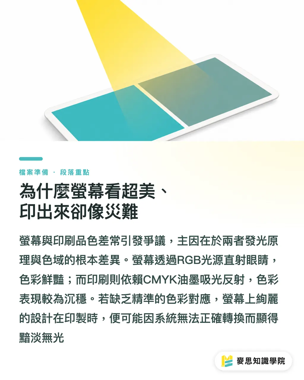
The systematic root cause lies in the physical differences between additive light and the printing gamut
Screens use RGB light directed straight into your eyes to produce high-brightness colors, whereas printing relies on light reflected off surfaces after being absorbed by CMYK inks
When you send a file into the printing workflow without a clear color mapping standard, the system is essentially guessing, leading to a massive discrepancy between the final product and your expectations
What Exactly Are You Configuring When Setting an ICC Profile?
The bridge that spans the gap between these two physical mediums is the ICC Color Profile
This is not a magical filter, but rather a 'mathematical translation dictionary' that describes how a device renders colors
・Design side: Your monitor must be calibrated and assigned the correct profile, such as the mainstream sRGB or the Display P3 standard common on Apple devices
・Print side: Facilities create custom color profiles based on specific paper and ink characteristics, allowing software to know 'exactly how much ink is needed to produce this specific red on this particular stock.'
With this dictionary, color management systems can maintain visual consistency as closely as possible when translating across devices
Which CMYK Profile Is Safe to Use Before Sending to Print?
Since you are going to print, your workspace color gamut in Illustrator or Photoshop must never remain in RGB
In the printing environments of Taiwan and Japan, the most widely accepted standard for coated paper (like standard glossy art paper) is Japan Color 2001 Coated
If your project is being outsourced to Europe, most local printers follow the Fogra39 or the newer Fogra51 standard
The specific setup steps in Illustrator are very straightforward:
・Click on the top menu 'Edit' and select 'Color Settings'
・In the Working Spaces CMYK dropdown menu, specify the corresponding standard profile mentioned above
・Save and apply to ensure your design is being color-corrected within the correct simulation environment
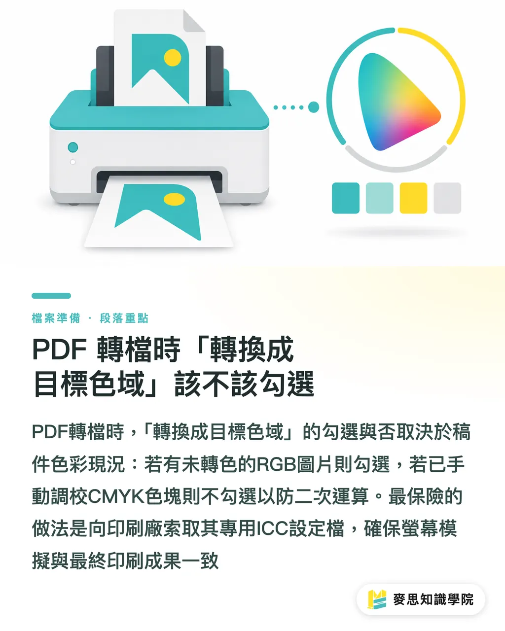
Should You Check 'Convert to Destination' During PDF Export?
This is the 'boss level' question that stumps most designers when exporting PDFs
Within the color section of the 'Output' settings, the logic for choosing between these options is quite clear:
・If the original file contains many RGB images that have not been converted: Choose 'Convert to Destination' to let the software force a conversion based on your previously set ICC profile
・If you have already manually fine-tuned all CMYK color swatches (e.g., corporate brand colors): You must select 'Don't Include Profile' (or 'No Conversion') to prevent the software from re-calculating and muddying your clean values
The safest, ultimate approach is to ask your print partner for their specific ICC profile before you even start the project
By importing this file into your system, your monitor can simulate the final output of their printing press with the highest possible accuracy
Key Takeaways
Physical color principles differ between screens and print; ICC profiles are the mathematical dictionaries that ensure clear communication between both ends
The most common default safety choice in the Taiwanese industry is Japan Color 2001 Coated, while Europe primarily uses Fogra39/51
If your CMYK values are already precisely set, remember to select 'No Conversion' when exporting to PDF to preserve the purity of your color swatches
Managing the process at the source is most effective; obtaining a custom ICC profile from the printer before starting can save countless hours of communication costs
Extended Thoughts
For printing facilities undergoing digital transformation or integrated service providers like MINDS, standardizing the ICC color management process and embedding it into the SaaS system's pre-flight mechanism is key to reducing communication friction
In the future, integrating automated workflows that instantly compare abnormal gamuts and provide correction suggestions the moment a client uploads a file will significantly improve print-ready success rates and client trust
FAQ
- Why were my files printed accurately before, but the colors were completely off after switching to a new printing house?
- Because every printer has different machine characteristics, ink brands, and even environmental humidity levels. If you did not obtain and apply the new factory's ICC profile for color mapping, batch color variance is a predictable physical phenomenon
- What happens if I forget to change the working color space in Illustrator?
- The system will simulate colors using the default US SWOP standard, which differs from the ink and paper characteristics commonly used in Asia, leading to a disconnection between your screen preview and the actual print result
- Will I avoid color shifts if I buy an expensive professional graphics monitor?
- High-end monitors cover a wider gamut (such as Display P3), but if they are not regularly calibrated with a colorimeter and used with correct soft-proofing settings, even the most exquisite image you see is merely a distorted illusion
- What should I do if the colors become very dark after I convert my photos to CMYK in software?
- This is a normal clipping phenomenon when colors exceed the gamut of the printing material. It is recommended to use the built-in 'Gamut Warning' feature in your software to identify out-of-gamut areas before conversion, and then manually adjust contrast or saturation to recover the details
Related articles
- Why Do Screen Colors Look Different in Print? Expert Guide to Color Calibration and Soft Proofing
- Preparing Print Files for Specialty Stocks: How Paper Characteristics Influence Prepress Settings
- What is the PDF/X required by print shops? A senior consultant reveals the secret to error-free file conversion