Prepress & Artwork
Bleed, resolution, fonts, PDF export — turn your design into a print-ready file
- Audience
- 設計師・印務人員・品牌方
- 出血
- 解析度
- Illustrator
- Canva
- 送印規範
- 字體
- 檔案輸出
Complete guides
- COMPLETE GUIDEBrand Color Consistency: A Complete Process Guide — From Color Swatch Definition to Press Proofing, Keeping Every Print Run on TargetThe most common complaint in brand work is "the business card and brochure primary colors don't match" — and the problem usually isn't the print shop's skill level, but rather the failure to establish clear brand color standards from the very beginning. This guide walks through every checkpoint where color can drift: setting color swatch benchmarks, the logic behind CMYK and RGB conversion, production file specifications, proofing and color-matching workflows, and cross-vendor color management SOPs — breaking each step down so you can follow along and keep your brand colors consistent7 STEPS
- COMPLETE GUIDEThe Complete Business Card Guide: From Design to Press in One PassA business card looks like the simplest print job, yet it is the one that goes wrong most often at the last minute — color shifts, edges trimmed off, blurry text, the wrong paper. This guide walks every gate from design and artwork to paper and press, in order, so you print it right and print it well6 STEPS
- COMPLETE GUIDEA Complete Guide to Print Procurement and Pre-Press Quality Control: From Spec Confirmation to Delivery Inspection — Every Pitfall CoveredIn my years working with clients, most print disputes don't come from poor craftsmanship at the print shop — they stem from a breakdown at some earlier stage before the job ever goes to press. Wrong color mode in the final artwork, skipped proofing, mixed-up paper weights — one mistake and you're looking at an entire reprint. This guide lays out every chokepoint in the procurement and print-submission process, walking you through from spec confirmation all the way to delivery inspection, so you have a practical checklist to follow the next time you send a job to print6 STEPS
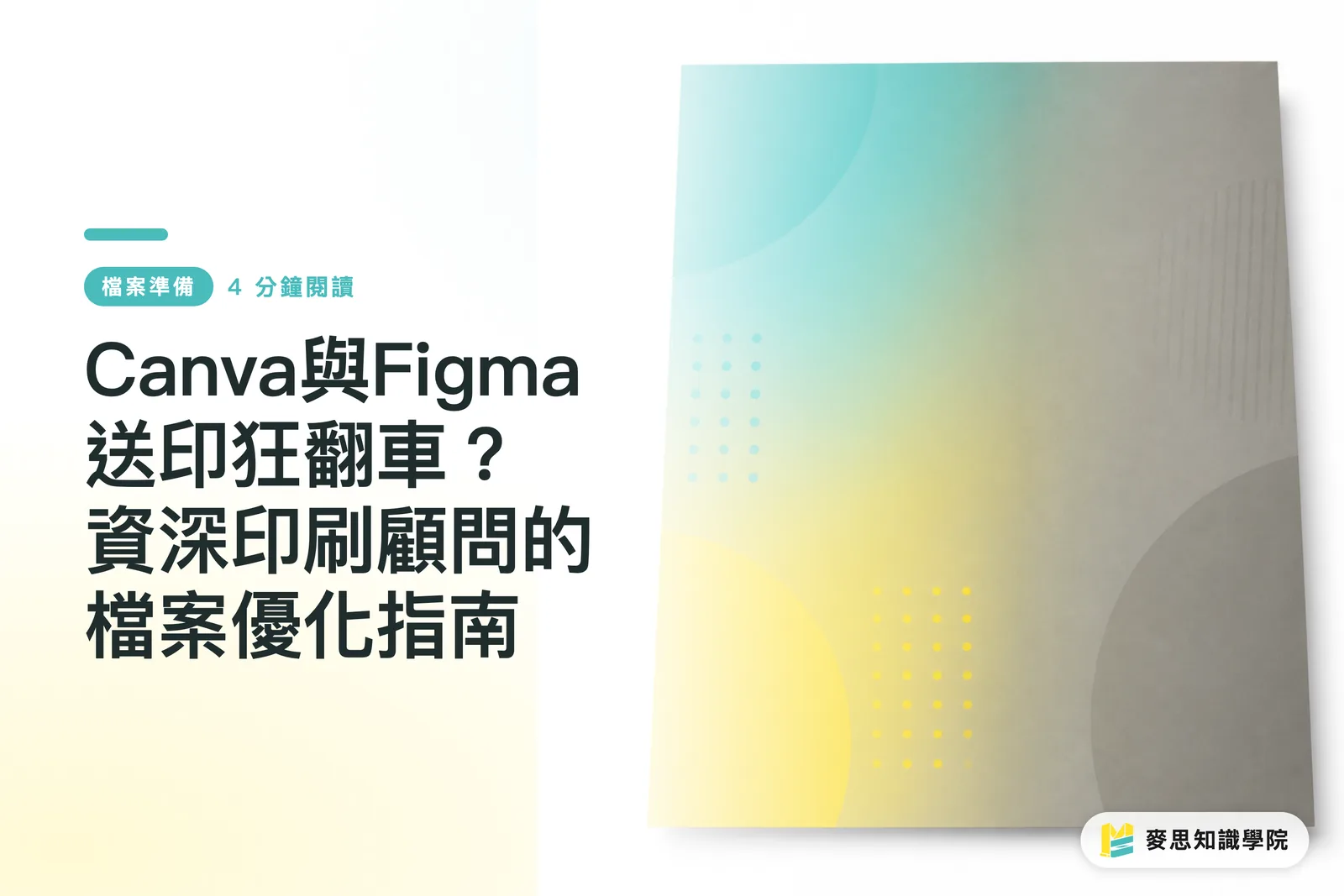
Printing Disasters with Canva and Figma? A Veteran Print Consultant's Guide to File Optimization
It looks perfect on screen, but comes out a mess in print—this is the most common complaint I hear on the production floor. This guide demystifies the inherent limitations of online design tools and teaches you how to convert your artwork into standard files that professional print shops can handle seamlessly

How to Design English Business Cards: A Consultant’s Guide to Layout and Prepress Pitfalls
When creating bilingual business cards for clients, the biggest fear is getting the English layout wrong or running into printing issues. I’ve distilled over a decade of prepress experience here, covering English job titles, formatting standards, and safe margins for final files. Ensure your designs look internationally professional while guaranteeing a smooth printing process
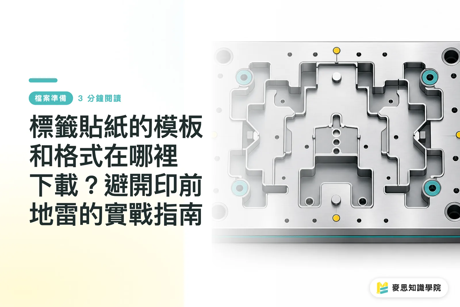
Where to Download Templates and Formats for Adhesive Labels? A Practical Guide to Avoiding Prepress Pitfalls
The safest and most effective way to find label templates is to request standard die-cut files directly from your partner printing house, rather than downloading random assets from the internet. This ensures that bleeds, resolution, and special finish layers fully comply with production standards, saving you significant costs in communication and revisions

URB Board Prices Hike Twice in Six Months: How Printers and Brands Can Defend Profit Margins
In the first half of 2026, Uncoated Recycled Board (URB) has seen its second round of price hikes. This cost tsunami is directly impacting corrugated box and food packaging production lines. The old practice of holding fixed long-term quotes is no longer effective; the signals coming from Europe and the U.S. will impact Taiwan within months. This article helps you understand the structural changes behind these costs and outlines actionable procurement and quoting strategies for frontline operations
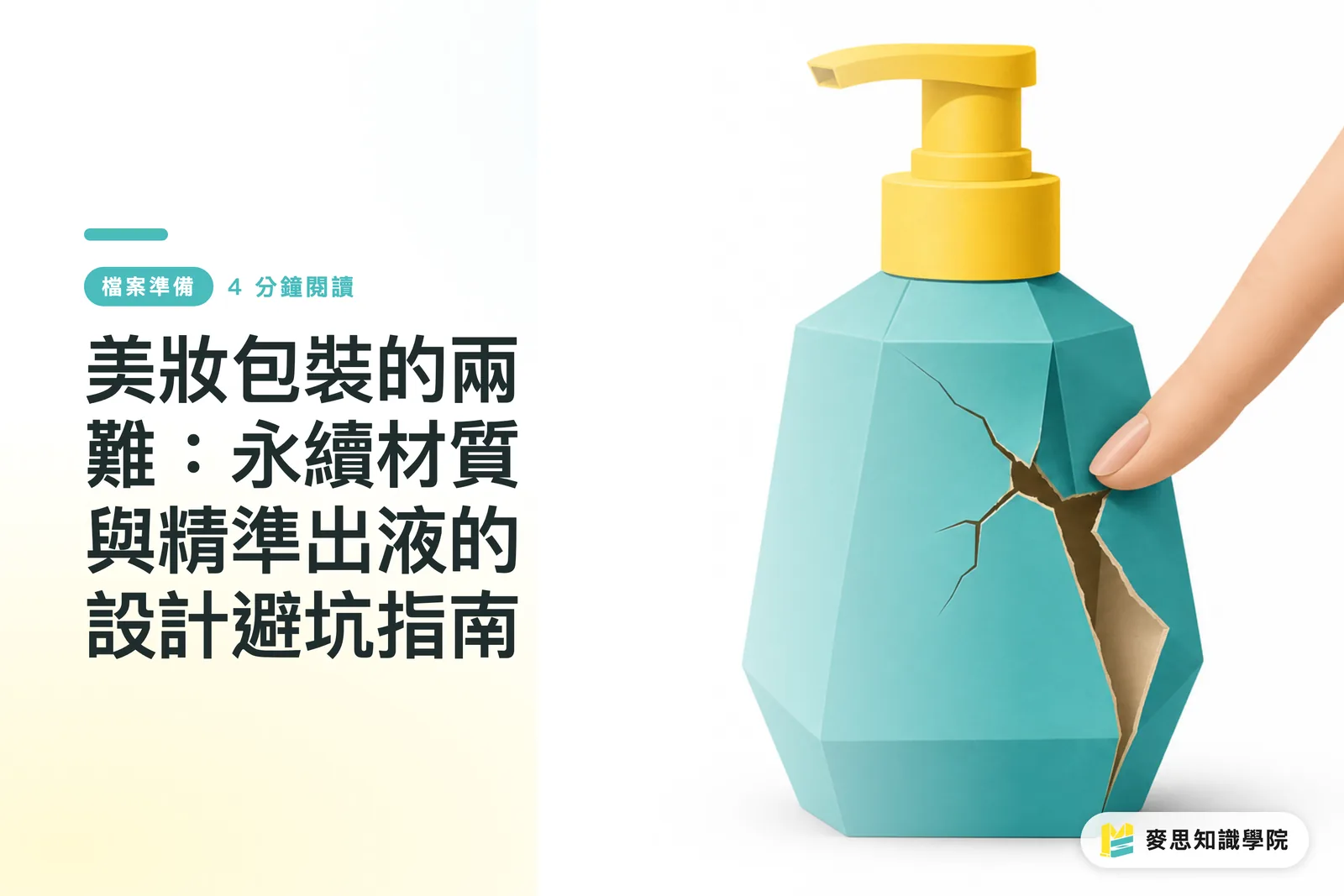
The Dilemma of Beauty Packaging: A Design Guide to Avoiding Pitfalls with Sustainable Materials and Precision Dispensing
When brands demand both "100% recyclable paper" and "precision-controlled dispensing pumps," it is often a recipe for disaster in prepress structural design. This article starts from recent real-world production pain points, breaks down the conflict between eco-friendliness and functionality in beauty packaging, and offers practical solutions for design teams and print manufacturers
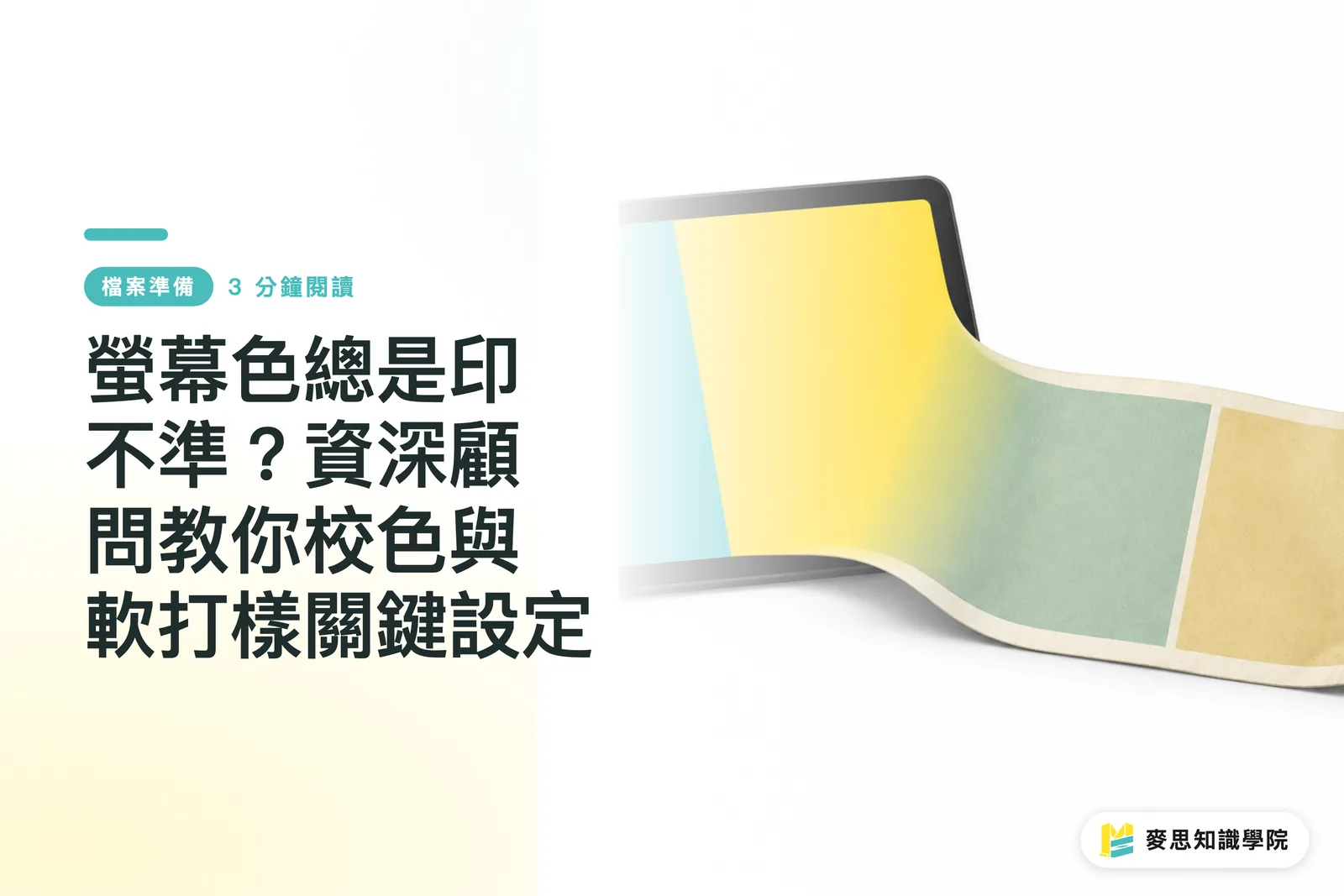
Why Do Screen Colors Look Different in Print? Expert Guide to Color Calibration and Soft Proofing
Files look flawless on screen but turn out muddy and dull in print? This is the most common lament I've heard in over a decade in the industry. By mastering precise monitor calibration and soft proofing settings, you can intercept over 90% of printing disasters before you even send the file to press
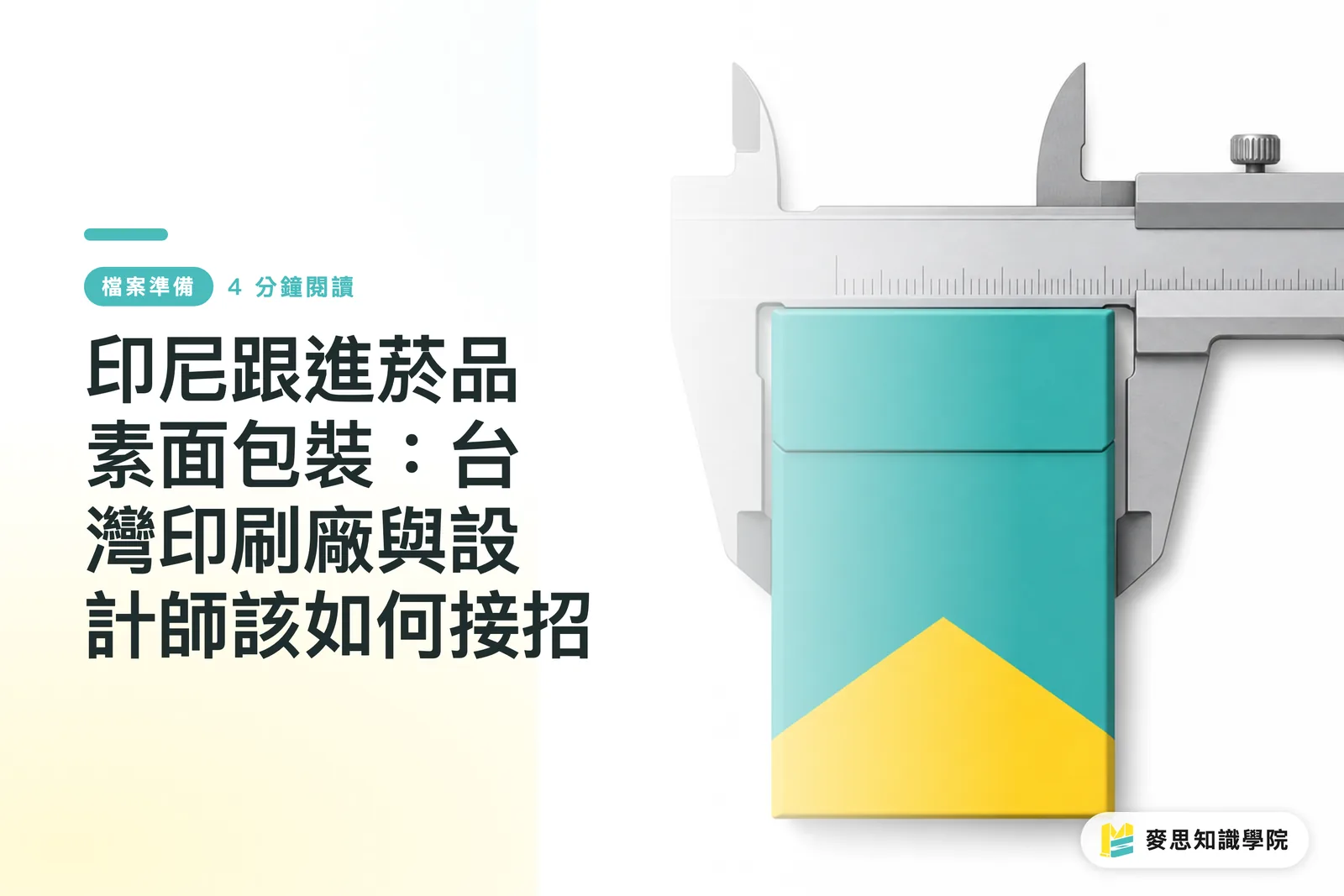
Indonesia Follows Suit on Tobacco Plain Packaging: How Taiwan's Printers and Designers Should Respond
Indonesia is set to implement standardized plain packaging for tobacco products, a regulatory wave sweeping from Australia and New Zealand into the Asia-Pacific region, reshaping the packaging supply chain. While brand design space is being severely compressed, these stringent compliance standards are raising the technical barrier for printing and manufacturing. This article breaks down the underlying logic of these regulatory shifts and strategies for securing and transforming orders
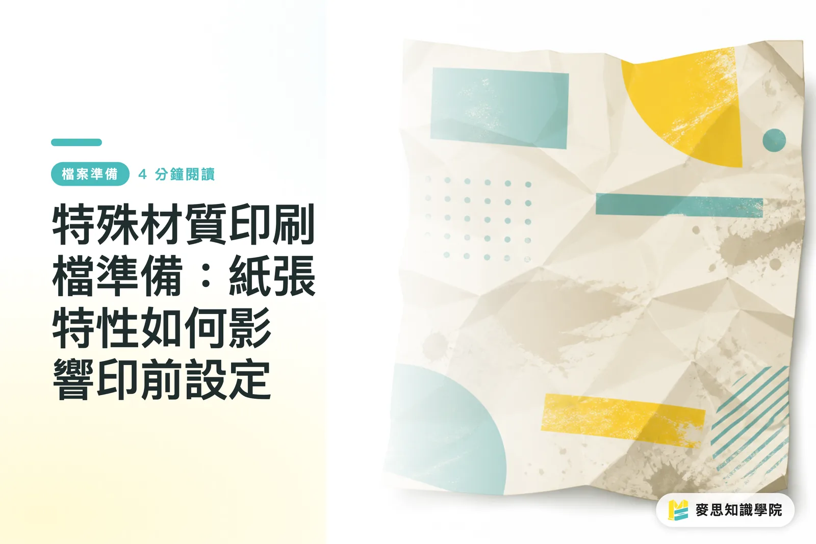
Preparing Print Files for Specialty Stocks: How Paper Characteristics Influence Prepress Settings
No matter how good a design looks on screen, choosing the wrong paper or skipping prepress adjustments will lead to disastrous print results. Drawing on over a decade of printing experience, this guide breaks down the temperaments of art paper, recycled paper, and pearlescent materials, helping you translate your creativity into physical form with pinpoint accuracy
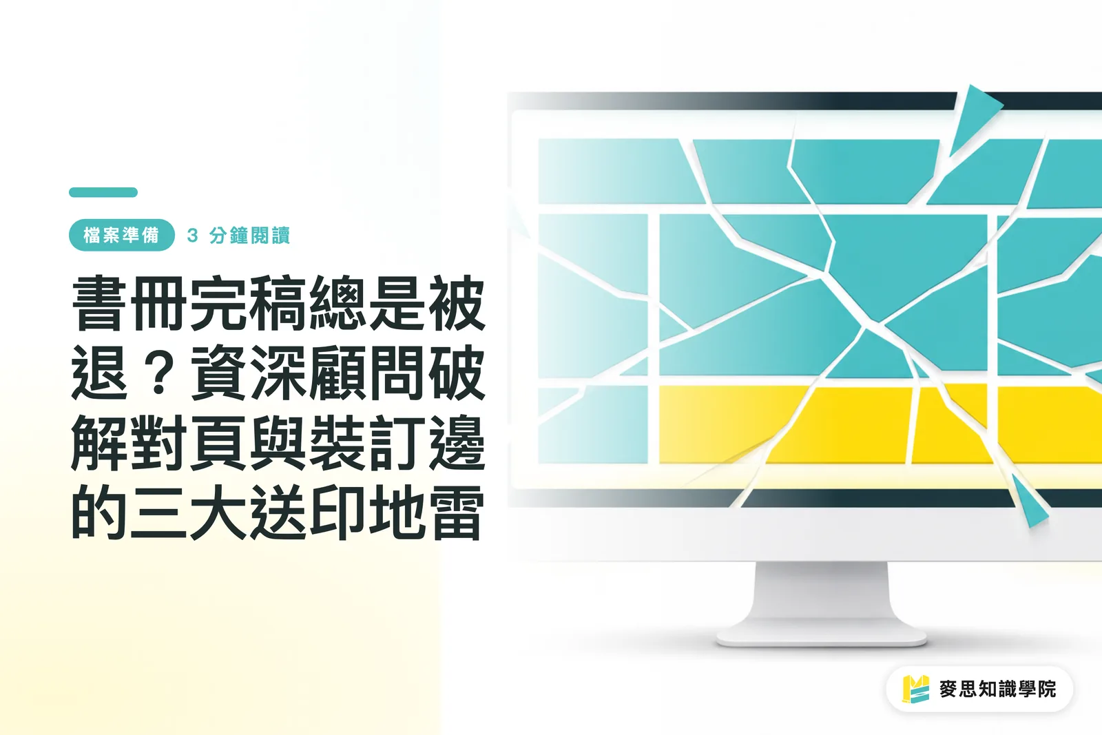
Book Files Rejected Again? A Senior Consultant Decodes the 3 Fatal Pitfalls of Spreads and Bindings
The perfect layout on your screen is often a disaster at the printing press. This guide helps you avoid the most fatal errors in book printing—spread exports, binding margin loss, and spine traps—to establish a painless workflow from InDesign to the press
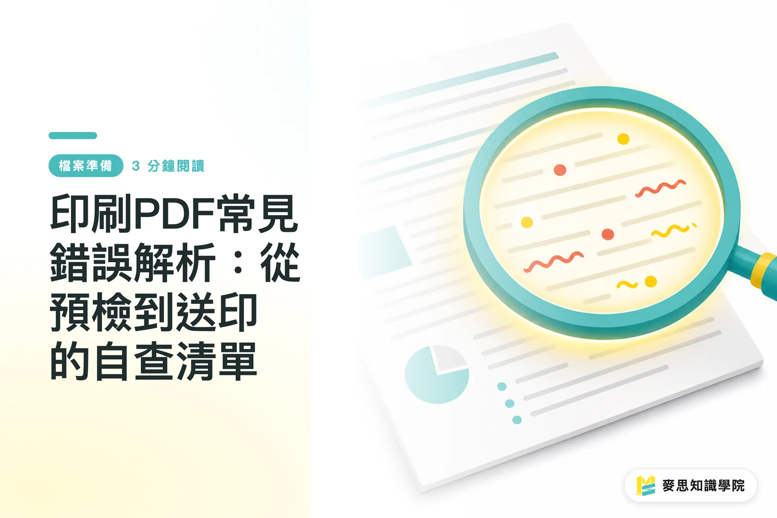
Resolving Common Print PDF Errors: A Pre-press Checklist from Preflight to Production
A file that looks flawless on screen but turns into a mess when printed is the most common grievance I've heard in my decade in the industry. This checklist condenses the top five pre-press pitfalls and teaches you how to use Preflight to block over 90% of printing disasters, ensuring your design quality makes it to the final product
Font Outlining vs. Embedding: Risk Management Every Designer Needs to Know Before Printing
Does your print file look perfect on screen, but turn out with missing characters or broken strokes in the final product? This is the most common sigh I hear on the production floor. This tutorial explains how to make the right decisions and avoid common file pitfalls
Preparing Illustrator Files for Print: A 10-Point Checklist Beginners and Pros Often Miss
Does your design look flawless on screen but turn into a disaster once printed? In my decade of experience at a printing house, I've seen these common file mistakes occur over and over again. This checklist will help you avoid 90% of reprinting risks, ensuring your design quality remains intact
No More Printing Disasters with Canva: A Print Consultant's Guide to Avoiding Color Shifts and Bleed Pitfalls
Does your file look perfect on screen but different in print? This is the most common sigh I hear on the factory floor. This tutorial helps you dodge the three invisible killers of Canva printing, solving issues at the source to ensure the final product matches what you see

What Exactly Is the PDF/X Format Print Shops Demand? Choosing Between X-1a and X-4
A file looks perfect on screen but turns out disastrous in print—this is the most common pre-press nightmare. Understand the technical logic of PDF/X, stop treating print specifications as a black box, and learn how to use the most precise formats to end back-and-forth communication and reprints
Building a Brand Color System: Mastering Color Management from LOGO to Print
Do your brand colors look different on your phone compared to when printed on business cards? This isn't a problem with your screen or the printer; it's a lack of a clearly defined 'Brand Color System' from the source. Establishing a color standard that covers both digital and print not only ensures brand consistency but also saves money by avoiding repeated communications and costly printing mistakes

Business Card Design & Printing Tips: A Comprehensive Guide to Sizes, Bleeds, and Finishes
A business card is a brand's first handshake. Yet, from dimensions and bleeds to finishing techniques, pitfalls abound. Wasting money on reprints is a minor inconvenience; missing that first impression is the real tragedy. I’ve distilled over a decade of experience into a practical checklist to help you get it right, from design to print, the very first time

Overprint, Knockout, and Trapping: Mastering 3 Printing Pitfalls to Avoid Disastrous Results
A file might look flawless on screen, but printing is a different story—text disappears, or annoying white edges appear next to patterns. These problems often stem from a few overlooked settings. This article breaks down the three file pitfalls that printing houses fear most, helping you avoid costly mistakes at the source
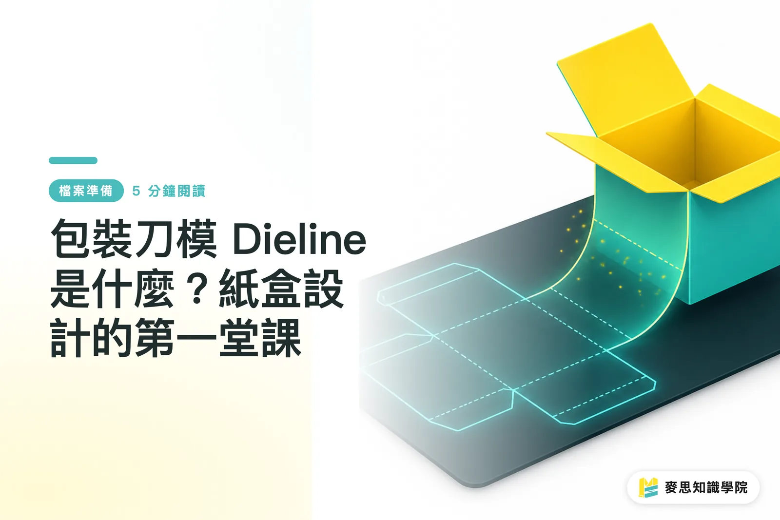
What is a Dieline? The First Lesson in Paper Box Design
In the world of packaging design, a dieline is an architect's blueprint; it determines the fate of a box. Drawing on over a decade of industry experience, this article walks you through the intricacies of dielines, ensuring your designs are not only beautiful but also production-ready

The 12-Point Print Survival Checklist: Expert Advice on Avoiding File Pitfalls
Files look flawless on screen but are a different story when printed—a common grievance I’ve heard throughout my decade in the industry. This checklist condenses the 12 most frequent communication bottlenecks between print shop technicians and designers. Use it as your final line of defense before sending files to print to prevent over 90% of costly reprints

Don't Let Your Printed QR Codes Become Unscannable: A Printing Consultant's Practical Checklist
A poorly printed QR Code doesn't just waste space; it wastes the effort of your entire marketing campaign. Based on my years of experience, the issue often stems from a few overlooked prepress details. This article provides a direct checklist—covering size, margins, and error correction—to ensure your printed QR Codes are always scannable
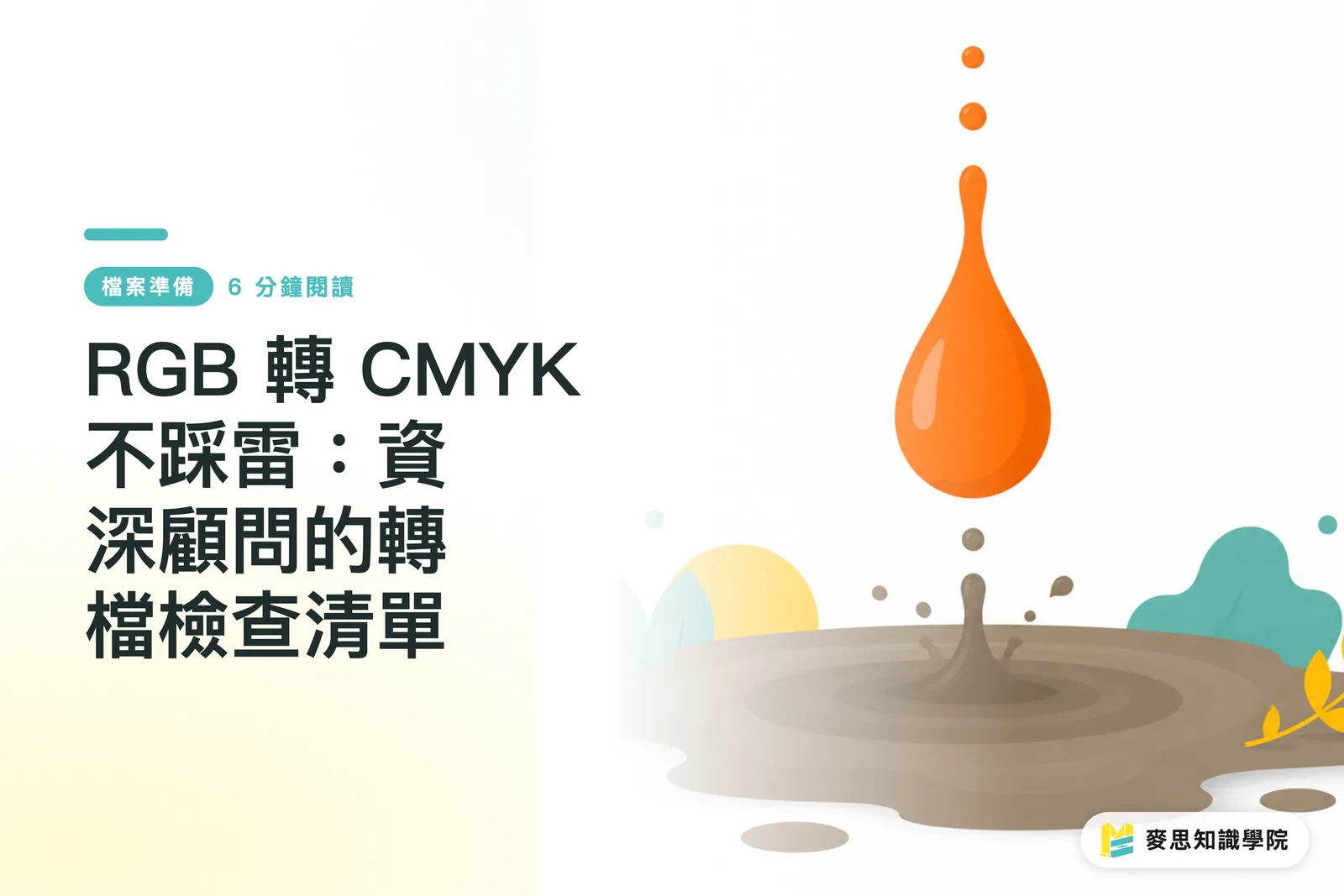
Avoiding Pitfalls in RGB to CMYK Conversion: A Senior Consultant's Checklist
Vibrant designs on screen turning out dull and muddy in print is a common point of contention between designers and printers. This isn't anyone's fault; it's a fundamental physical difference between the two color modes. Drawing on my years of practical experience, this article provides a checklist you can follow across the pre-, mid-, and post-conversion stages to ensure your hard work translates perfectly to print

Printing Typography: From Font Size and Leading to Knockout Text—Avoiding the Visual Trap Between Screen and Print
A design might look perfect on screen, but using the wrong font size or incorrect leading is a disaster once printed. Drawing on over a decade of hands-on printing experience, this article provides key safety guidelines for typography settings to ensure your design translates perfectly and saves you from costly reprints
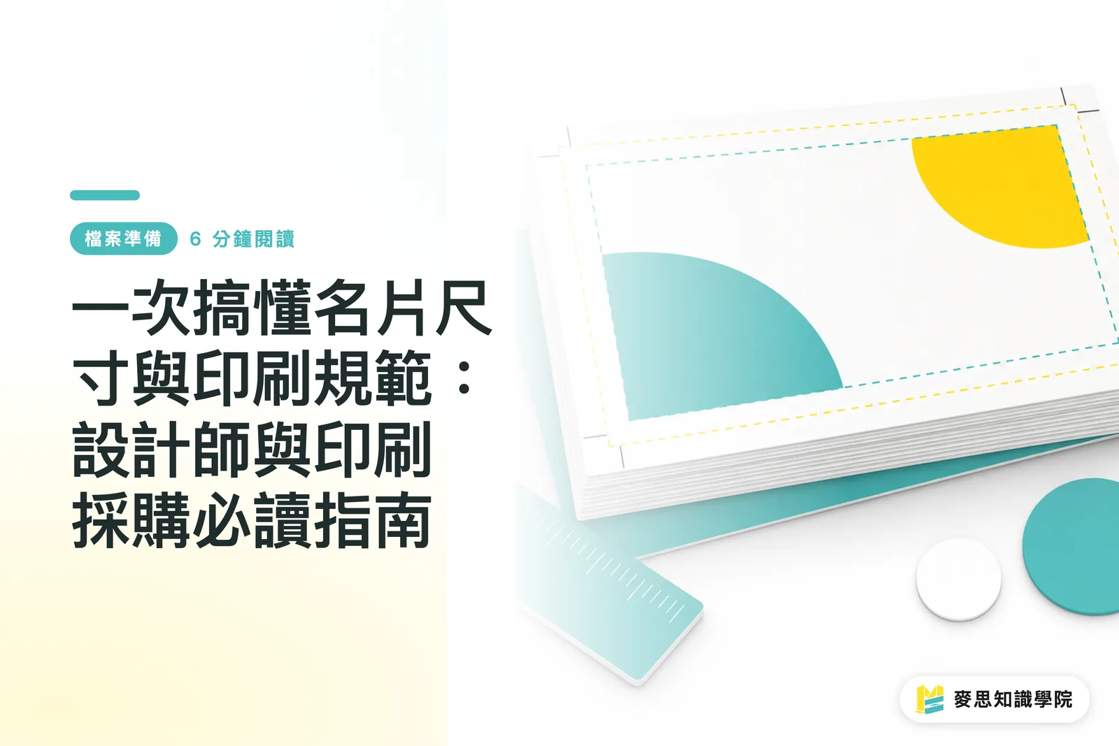
A Complete Guide to Business Card Sizes and Printing Specifications: A Must-Read for Designers and Purchasing Professionals
The standard size for business cards in Taiwan is 90x54mm, but the devil is in the details. Understanding bleed, safe zones, and color modes is the key to ensuring your design is printed perfectly without wasting money on reprints. Based on my decade-plus of experience in the industry, this article clarifies all the critical points you need to know before printing
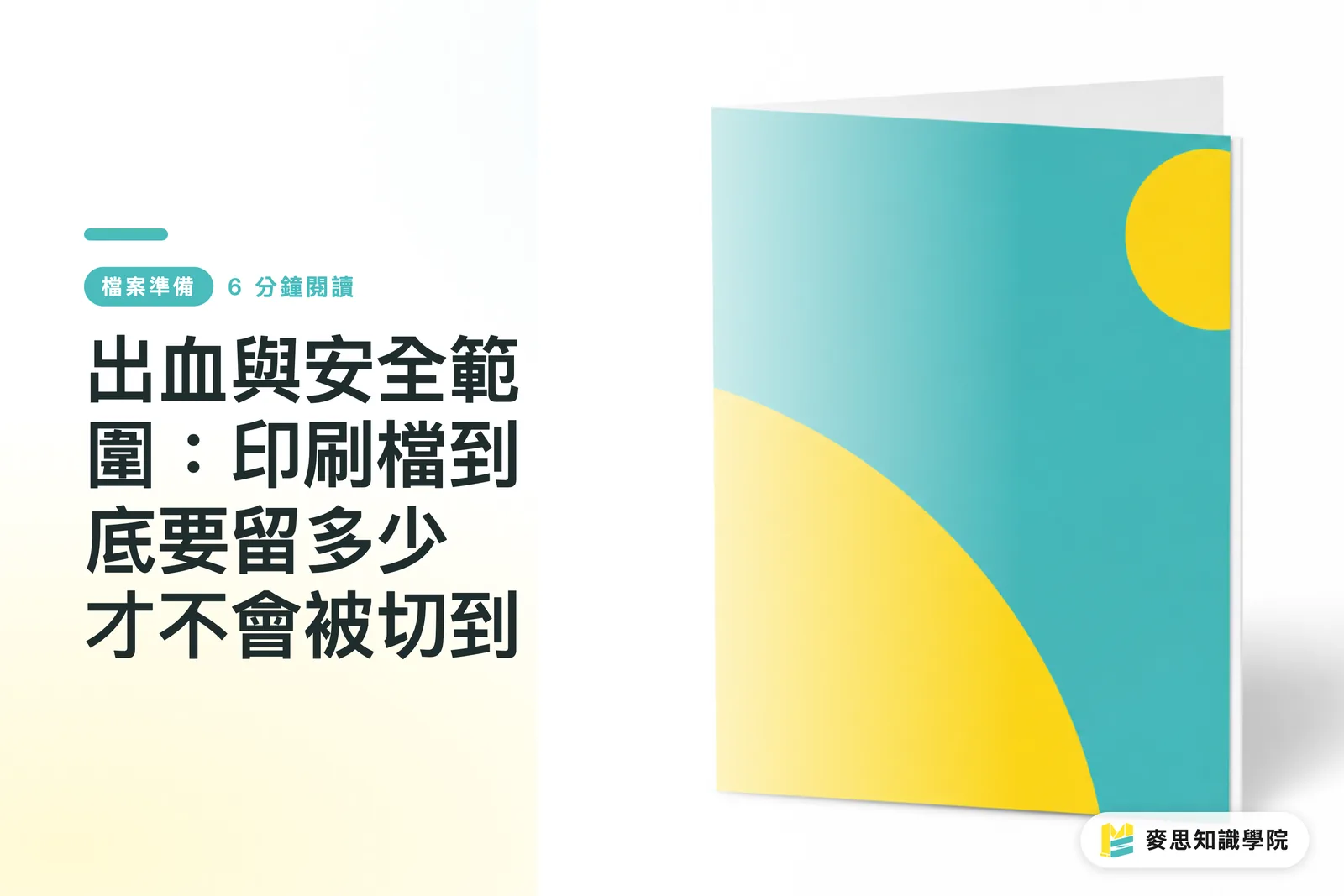
Bleed and Safe Zone: How Much Margin Does Your Print File Actually Need?
Every designer who's been in the game long enough has had a job come back with white edges — the only difference is how many times it took to learn the lesson. This article breaks down bleed and safe zone in full, with a pre-submission self-check routine to make sure your files go to press without any nasty surprises
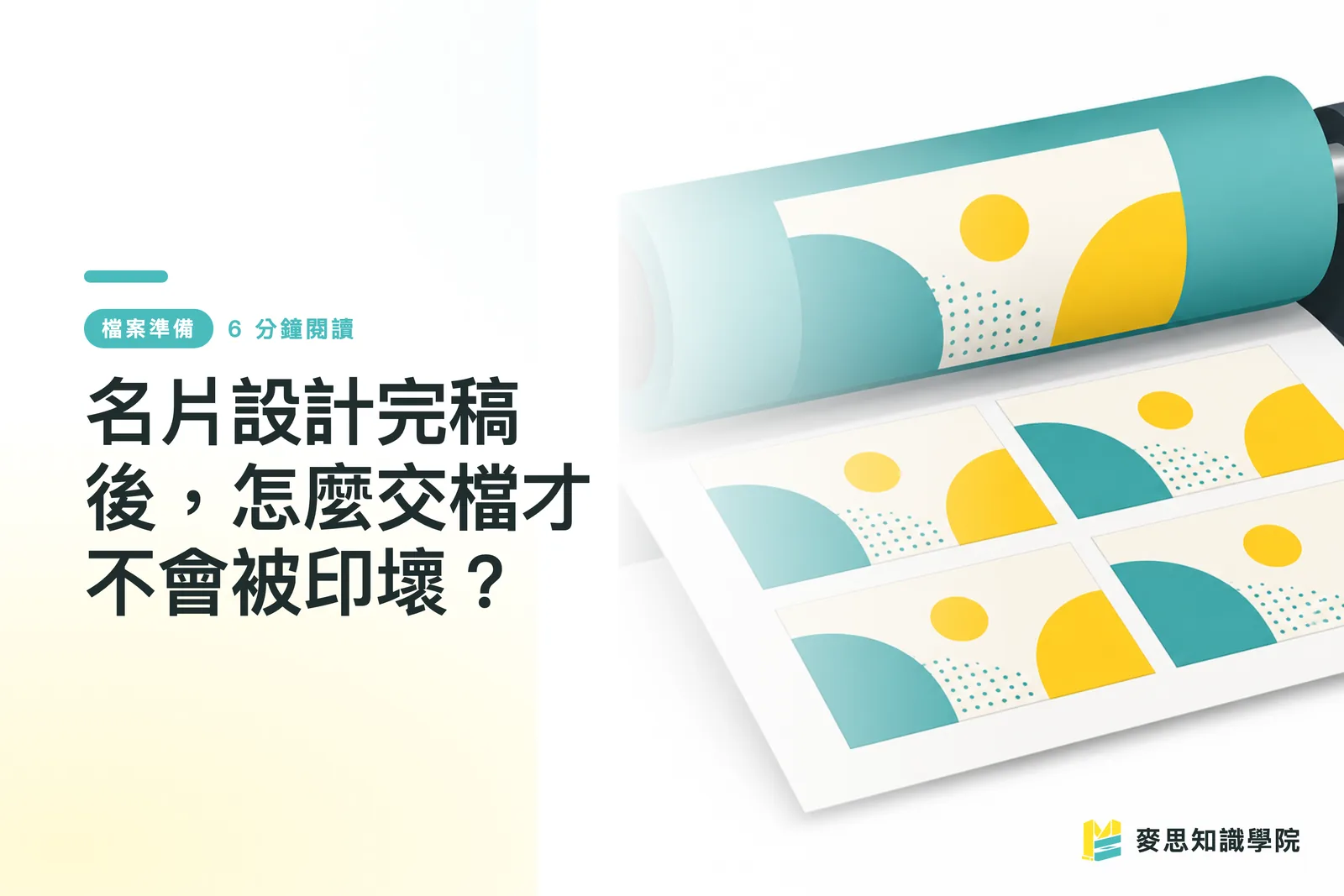
After Finishing Your Business Card Design, How Do You Submit Files Without Getting a Bad Print?
A finished design doesn't mean it's ready to print — missing bleed, using RGB, forgetting to outline your fonts: the problems only surface the moment you send it off. This guide covers everything you need to do between finalizing your design and submitting it to the printer. Follow these steps and what you get back will match what you saw on screen

How to Choose the Right Poster Size in Taiwan — A0/8K/4K Print Specs Explained
Getting the size wrong before printing means wasting both time and money on a reprint Drawing on years of experience on the production floor and working with clients, this article breaks down Taiwan's most common poster sizes, the differences between the ISO A-series and the kai-shu sheet system, plus bleed and resolution specs — so you can lock in the right specs before sending your file
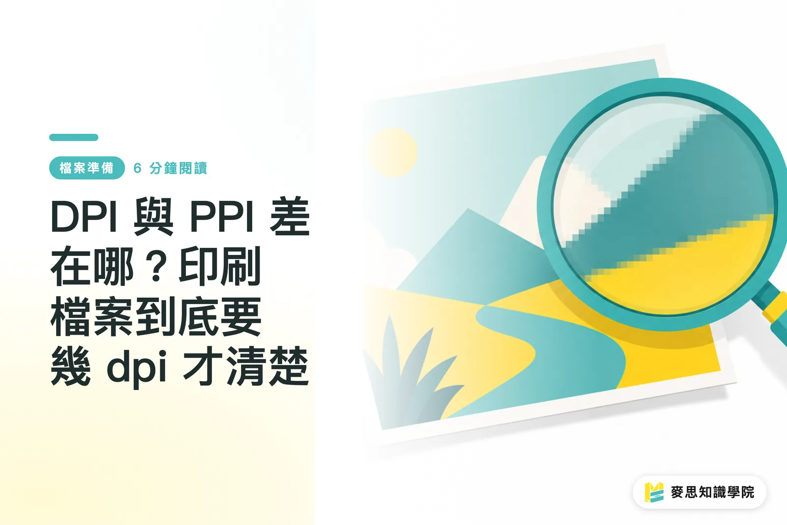
DPI vs. PPI: What's the Difference — and What Resolution Do Print Files Actually Need?
'It looked perfectly sharp on screen — so why did it come out blurry?' This is the most common trap designers and buyers fall into. This article breaks down the fundamental difference between DPI and PPI, explains why printing demands 300 dpi, and walks you through the simplest pre-submission self-check so you never send a file you'll regret after it's printed

Vector vs. Raster: Why Your Logo Must Always Be a Vector File
Print shops always ask for a "vector file" — but what is the actual difference? This article gives you a simple test to tell whether a file is raster or vector, and explains why logos, die lines, and foil-stamping plates cannot work without vector files, so you never end up with pixelated print again