
Why Do You Need a No-Software Judgment Method?
After years of back-and-forth between production lines and client teams, the most common scene is not a designer sending over a complete print-ready file. It is a salesperson spreading a dozen images across the table and asking, "The client says they want to use this one. Can we get a rough call first?" At that point, opening Photoshop, opening Illustrator, or running a PDF preflight tool is too slow. Slow enough that the client has already swiped to the next image
The first two checkpoints in MINDS (MS) print submission process, "visible small errors can be adjusted directly" and "visible structural errors need to be redrawn," can actually be handled in seconds with visual judgment. A preflight report is the third checkpoint. It turns gray areas into concrete numbers, but if the eyes run through the file first, 80% of the obvious landmines can be filtered out immediately
The value of this method is not to replace professional tools. It is to stop unprintable image files at the front end, saving the time spent opening files, converting formats, and running reports. It also saves the client from the look of disappointment when they hear, "This one cannot be used."
What Should You Look for at 100%? Dots and Detail
When you receive an image, the most natural first step is to zoom to 100%, meaning the file's original pixel size. An image that looks clear on screen often reveals three typical problems once enlarged:
・Pixel edges are obvious, with a blocky feel or stair-step jaggies. This usually means the resolution is too low or the image has been enlarged improperly
・Halftone dots, the colored dot pattern used in CMYK printing, are clearly visible and the edges are spreading. This suggests the image may have started as a low-DPI web version
・Detail areas, such as hair strands, fabric texture, or metallic reflections, turn into a blur with no real layers
For print use, an image viewed at 100% under 300 DPI, meaning 300 dots per inch and the standard resolution for commercial printing, should show smooth, continuous detail with visible gradation. If the enlarged image feels like "a phone photo of a computer screen, then enlarged again," odds are very high that it cannot be printed directly
There is a practical shortcut: point a phone camera at the screen, take a photo, then enlarge that photo. It is often easier to notice the pixel structure this way than by zooming on the computer, because the phone magnifies distortions that were originally hidden. This trick works very well when selecting images on-site
What Do Color Edges and Contrast Reveal?
The second three-second entry point is color boundaries. Enlarge the image enough to inspect the edges, then look at object contours, joins between color blocks, and the meeting points between text and background:
・Sharp edges and clean color transitions usually mean the original file quality is higher
・Spreading edges, halos, or unnatural intermediate colors, especially blue-green or magenta halos around black objects, usually point to excessive JPEG compression or repeated file conversion
・If the overall contrast feels flat, the shadows are not fully black, yet areas that should not be bright are glowing, that is often a sign of over-sharpening or HDR processing. It can print with obvious distortion
These visual traits are closely tied to technical issues such as color mode and compression, but catching them by eye is much faster than opening software to check gamut labels
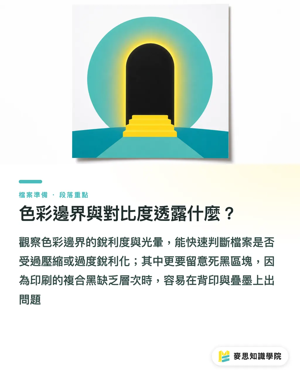
One indicator is often missed on-site: solid black areas. In print, so-called "pure black" is often a Rich Black built from CMYK inks. A common formula is C60 M40 Y40 K100. If the black areas in an image look completely dead, with no layers at all, large printed areas can develop issues such as setoff, where ink transfers to the back of the next sheet before drying, or uneven ink buildup. When the eye sees "one flat dead black block," it is time to be alert
What Can Font Edges Tell You?
Font edges are the most honest part of an image-quality check, because text is one of the shapes the human eye detects most sharply. When inspecting type edges, watch for three things:
・Whether the edges are smooth, without jaggies or a broken feel, especially in small text under 10pt
・Whether reversed text, light-colored text on a dark background, has clean inner edges and has not been swallowed by the background color
・Whether the text itself remains vector-based, a format where the computer describes shapes with mathematical paths, such as PDF, EPS, or SVG, rather than rasterized image text
If the text inside an image looks blurry, has colored edges, or turns into pixel blocks when enlarged, the file has either been compressed or the designer has embedded the type as an image. The former may still be solved by retrieving the original file. The latter almost always needs to be rebuilt
In practice, text in print files should preferably remain as vector text or embedded fonts. Do not outline the type and then hand it to the print shop by default. Outlining can prevent missing-font problems, but it turns text into non-editable shapes, making later edits expensive
Image Size Feel and File Size
The last three-second check is "size feel." When you get an image, look at two indicators first:
・Pixel dimensions, length × width, measured in px. An image meant to print as a full A4 page should have a long side of at least 2480 px, calculated at 300 DPI
・File size, in KB or MB. A high-resolution print image usually sits somewhere from several MB to dozens of MB
If an image file is only 200 KB but is expected to fill a full-page poster, it is almost certainly a web image with insufficient resolution. On the other hand, if the file is 30 MB but still looks blurry when enlarged, it may have been upsampled improperly, meaning software enlarged a low-resolution image to high resolution without adding real detail. It will still print badly
This judgment method is not precise, but it filters fast. When the on-site brief hits the impossible triangle of "small file, large print, sharp result," the default answer is that it cannot be printed. The next discussion is whether to retrieve the original image or reshoot it
What Comes After the Three-Second Check?
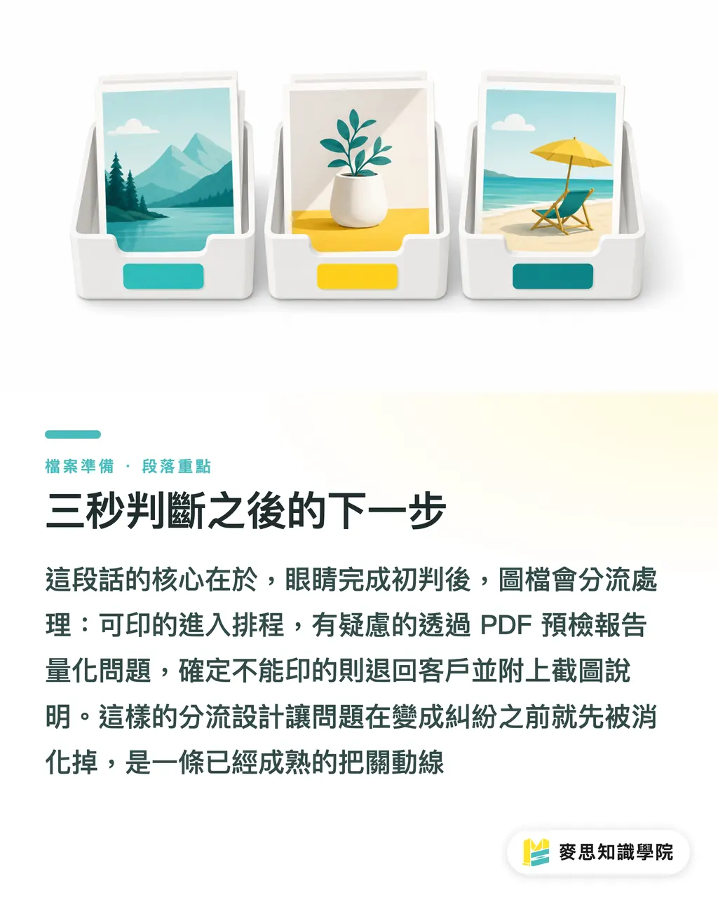
After the eyes run through the file, the images can be sorted into three groups:
・Clearly printable: move into layout and proceed with normal print submission
・Questionable but possibly recoverable: run a PDF preflight report and turn the "something feels off" seen by the eye into concrete numbers, such as resolution, color mode, and font embedding, then decide whether to fix it
・Clearly unprintable: return it to the client directly with screenshots from the visual check, explaining which feature shows that it cannot be printed
This workflow is already standard practice in the customer service process at MINDS. The goal is to handle problems before they turn into disputes. If the project is small and you want to test the process yourself first, you can also start from the ordering flow at Mai Printing and build the judgment standard from there
Deeper image-structure issues, such as color management, ICC profiles, and transparency flattening, should be handled by the Mai Strategy Knowledge Academy consulting team. That is a different level of work. What the eyes can do stops here
Key Takeaways
・The key to judging whether an image can print in three seconds is checking detail, edges, and color stability at 100% zoom
・Font edges are the most honest quality indicator. Blurry or pixelated text is almost always a problem file
・A dead-flat pure black area and a tiny file meant for large-format printing are two warning signs that usually mean the image cannot be printed directly
・Visual judgment is the first step. A preflight report is the second. Used together, they make high-risk files much faster to handle
・Filtered images should be sorted into printable, recoverable, and unprintable groups, so the process does not get stuck on "Should we try a test print?"
Further Thoughts
From long-term observation across production lines and client-side workflows, the three-second judgment method is most worth promoting at the first point of contact for sales and purchasing teams. File quality from designers varies widely. If sales can identify high-risk images during the first phone call using a few visual features, it saves later rounds of confirmation and lets the client understand the file condition earlier
This matters especially for AI image use. AI-generated images often show detail collapse at 100% zoom, with hair turning into lines or tissue texture blurring into a flat patch. This visual judgment method is a fast way to identify images that need to be redrawn
Recommended next step: turn this judgment method into a concise internal SOP, a standard operating procedure, so sales, purchasing, and design assistants can review files with the same standard. Then "Can this be printed?" will no longer be a question that has to be escalated to a senior person every time
Further Reading
FAQ
- What is 300 DPI? Why is it the print standard?
- 300 DPI means 300 dots per inch. It is a common resolution standard in commercial printing and helps details look smooth rather than rough on physical paper. Images below 300 DPI tend to print with obvious pixelation or visible dot patterns
- How can I enlarge an image and check details without opening Photoshop?
- On a computer, you can use the built-in image viewer or a browser to enlarge the image to roughly phone-wallpaper scale. A faster shortcut is to point a phone camera at the screen, take a photo, then enlarge it. Pixelation and compression artifacts are usually easier to spot that way
- Can a JPEG image be sent directly to print?
- It depends on the use case and compression level. Web JPEGs are often over-compressed and have lost detail, so they are not recommended for direct print use. A print-use JPEG still needs its resolution, color mode, RGB for screens versus CMYK for print, and file size checked against the job requirements
- Why do pure black areas often cause print problems?
- "Pure black" on screen is RGB black, corresponding to C0 M0 Y0 K100. In print, saturated black is created by layering four inks into Rich Black. If large pure-black areas use only single-color black or the overprint is uneven, issues such as setoff and uneven ink buildup can appear
- Can AI-generated images be sent directly to print?
- Usually, no. AI images often show local breakdown at 100% zoom, especially in fingers, textures, and text. Before printing, they need to be filtered with a visual judgment pass. Fix what can be fixed. Anything that cannot be fixed must be redrawn or reshot
Related articles



The Print × AI weekly
The print and AI know-how designers, brands and enterprises can use before they commit — one email, every week
MINDS Free Tools
Imposition calculator and preflight file check — free prepress tools, right in your browser.
MINDS Group
Need actual printing or gifting services?
From premium printing to online ordering and festive gifts — the MINDS Group sister brands take it from here.