COMPLETE GUIDE
The Complete Business Card Guide: From Design to Press in One Pass
A business card looks like the simplest print job, yet it is the one that goes wrong most often at the last minute — color shifts, edges trimmed off, blurry text, the wrong paper. This guide walks every gate from design and artwork to paper and press, in order, so you print it right and print it well
Design & Layout
Layout should serve reading order first: name, title, company and contact details need a clear hierarchy at a glance, and white space matters more than filling every corner
Do not shrink type too far — keep body text at 7pt or above and avoid hairlines below 0.25pt; keep key information at least 3mm from the trim line so it does not sit too tight to the edge
Color: CMYK & Spot Colors
Screens are RGB, print is CMYK — set your file to CMYK while designing so vivid blues and greens do not turn muddy after press
If your brand has a specified Pantone, tell the printer to run it as a spot color to hold accuracy; handing over RGB values and asking them to match is an argument no one wins
DEEP DIVEWhy Does That Vibrant Green on Screen Print Muddy? CMYK vs. RGB, Explained Once and for AllArtwork, Bleed & File Handoff
Leave proper bleed (usually 1-3mm) and extend background color or images all the way to the bleed line, or trimming tolerance will reveal white edges; outline all text so a missing font cannot reflow the layout
Hand off a PDF with bleed and crop marks, images at 300dpi, and confirm there are no leftover RGB images or low-res assets — get this gate wrong and the best design upstream is wasted
DEEP DIVEAfter Finishing Your Business Card Design, How Do You Submit Files Without Getting a Bad Print?Paper & Weight
Business cards most often use 250-350gsm — too thin feels flimsy and cheap; for rigidity and a premium feel go above 300gsm or choose specialty stock (cotton, linen, textured)
Paper feel is the hidden selling point of a card: same design, the right stock wins at the first handshake. Decide the use case and budget first, then come back to weight and stock
DEEP DIVEPaper Weight GSM Explained: How Many GSM for Business Cards, Flyers, and Posters?Printing & Special Finishing
Small runs that need speed or multiple versions favor digital; large runs needing color accuracy and spot colors favor offset. The choice loops back to affect artwork and cost
To stand out, add finishing — foil stamping, spot UV, embossing, rounded corners, die-cuts — but each technique needs registration and a die file reserved in the artwork; do not decide to add it after the run
Proofing, Press & Acceptance
If color matters, get a proof: a digital proof checks layout and catches typos, but only a contract proof can serve as the color reference. Before press, check the main color, die line and reversed-out text one more time
The moment you sign off, you own the whole run — talk about the card across design, prepress, paper, printing and finishing as one chain, with one color standard from end to end, so no one passes the buck at the handoff
DEEP DIVEHow Many Types of Print Proofing Are There? How to Choose Among the Three Without Getting BurnedRelated articles
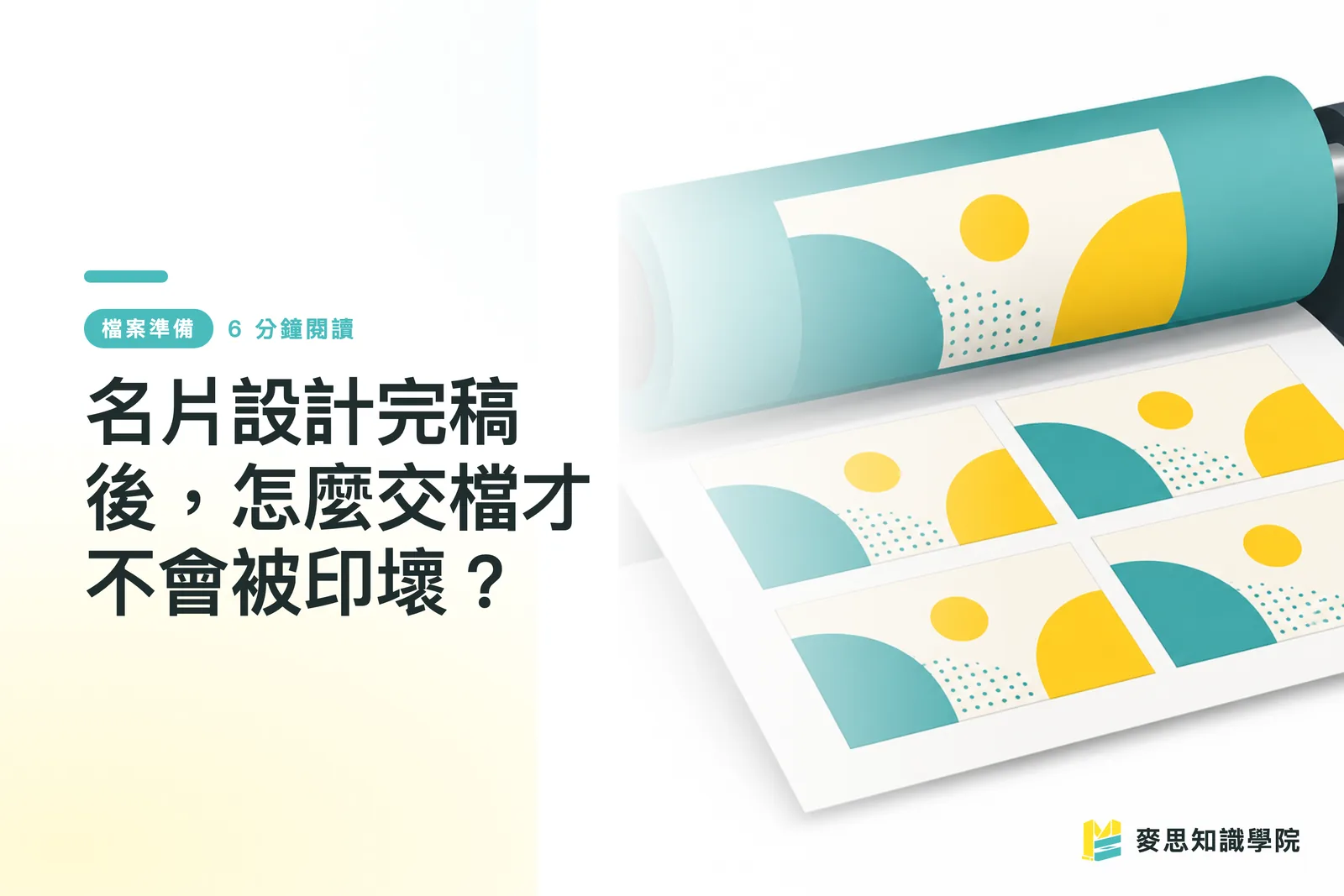
After Finishing Your Business Card Design, How Do You Submit Files Without Getting a Bad Print?
A finished design doesn't mean it's ready to print — missing bleed, using RGB, forgetting to outline your fonts: the problems only surface the moment you send it off. This guide covers everything you need to do between finalizing your design and submitting it to the printer. Follow these steps and what you get back will match what you saw on screen
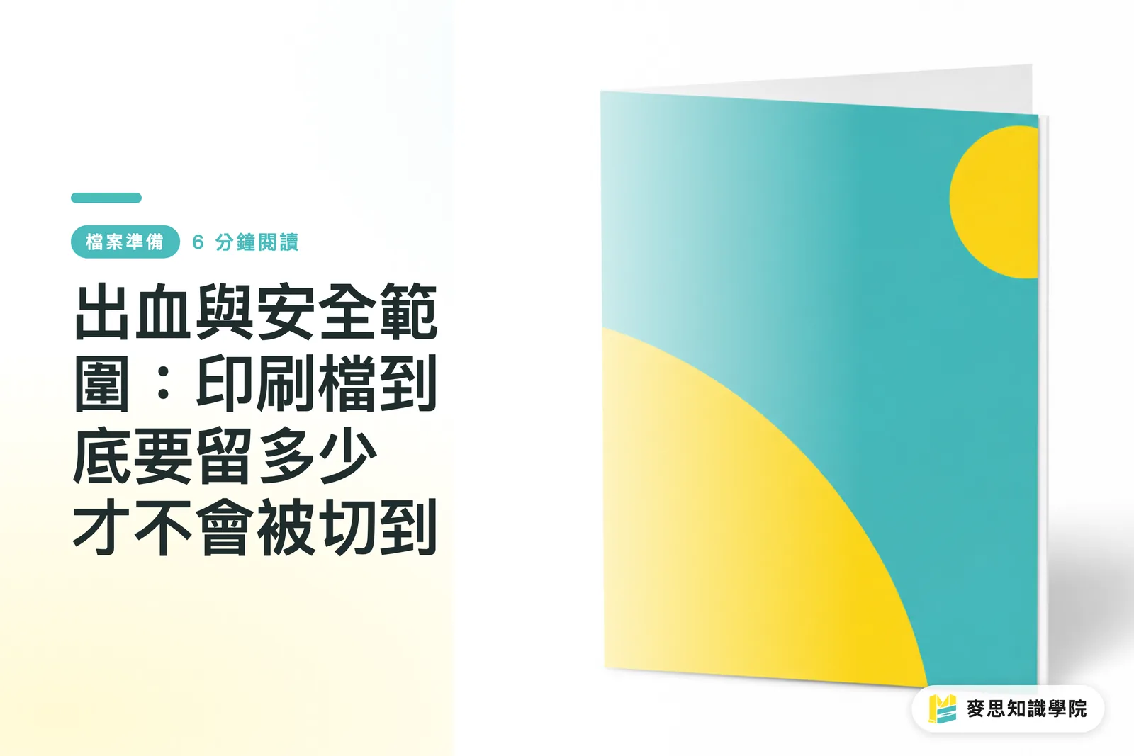
Bleed and Safe Zone: How Much Margin Does Your Print File Actually Need?
Every designer who's been in the game long enough has had a job come back with white edges — the only difference is how many times it took to learn the lesson. This article breaks down bleed and safe zone in full, with a pre-submission self-check routine to make sure your files go to press without any nasty surprises

Paper Weight GSM Explained: How Many GSM for Business Cards, Flyers, and Posters?
Higher isn't always better, and more expensive isn't always right — the key is working backward from the use case Drawing on years of hands-on experience in production and client work, this guide helps you understand gsm, stiffness, and how to choose the right weight for business cards, flyers, and posters
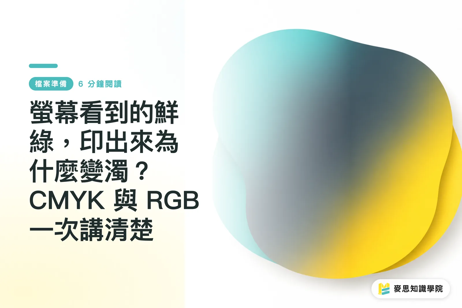
Why Does That Vibrant Green on Screen Print Muddy? CMYK vs. RGB, Explained Once and for All
Same image — vivid and punchy on screen, then one shade darker, greens gone muddy, and hot pinks looking lifeless on paper. Nearly every designer walks into this trap at some point. This article draws on experience from both the production floor and client side to walk you through color theory, file setup, and soft-proofing in one go. By the end, you'll know exactly how to avoid it
Your printing × AI industry advisor
More than a print shop — we act as an industry advisor, helping brands and companies connect print manufacturing with AI: from prepress, paper and finishing choices to cost optimization, and bringing AI into design and print workflows, automation and digital transformation
Book a free consultation