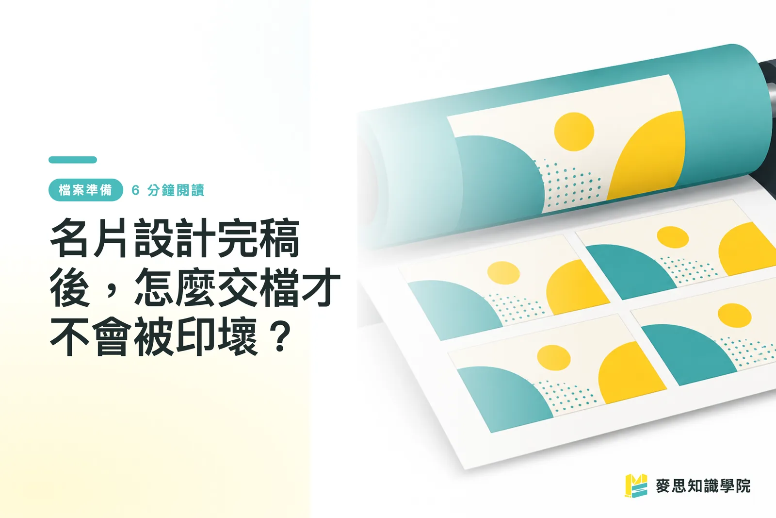
After Finishing Your Business Card Design, What Do You Actually Need to Prepare Before Sending It to Print?
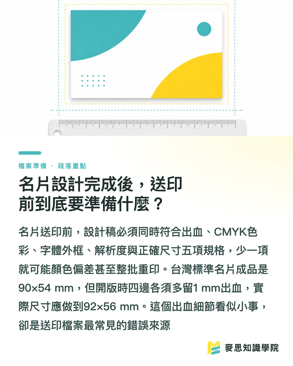
To put it plainly: your design file needs to be converted into something a print shop can work with. The five things that matter are bleed, CMYK color mode, outlined fonts, resolution, and correct dimensions
Miss any one of them and you're looking at anything from a color shift to reprinting the entire batch
The standard finished size for business cards in Taiwan is 90×54 mm — a specification the industry has used for a long time
But when you set up your document in software, never work to just 90×54. You need to add 1 mm of bleed on every side, bringing the actual document size to 92×56 mm
In the files I've reviewed over the years, roughly three out of ten designers get stuck at exactly this step. The artwork looks great — it's just missing the bleed
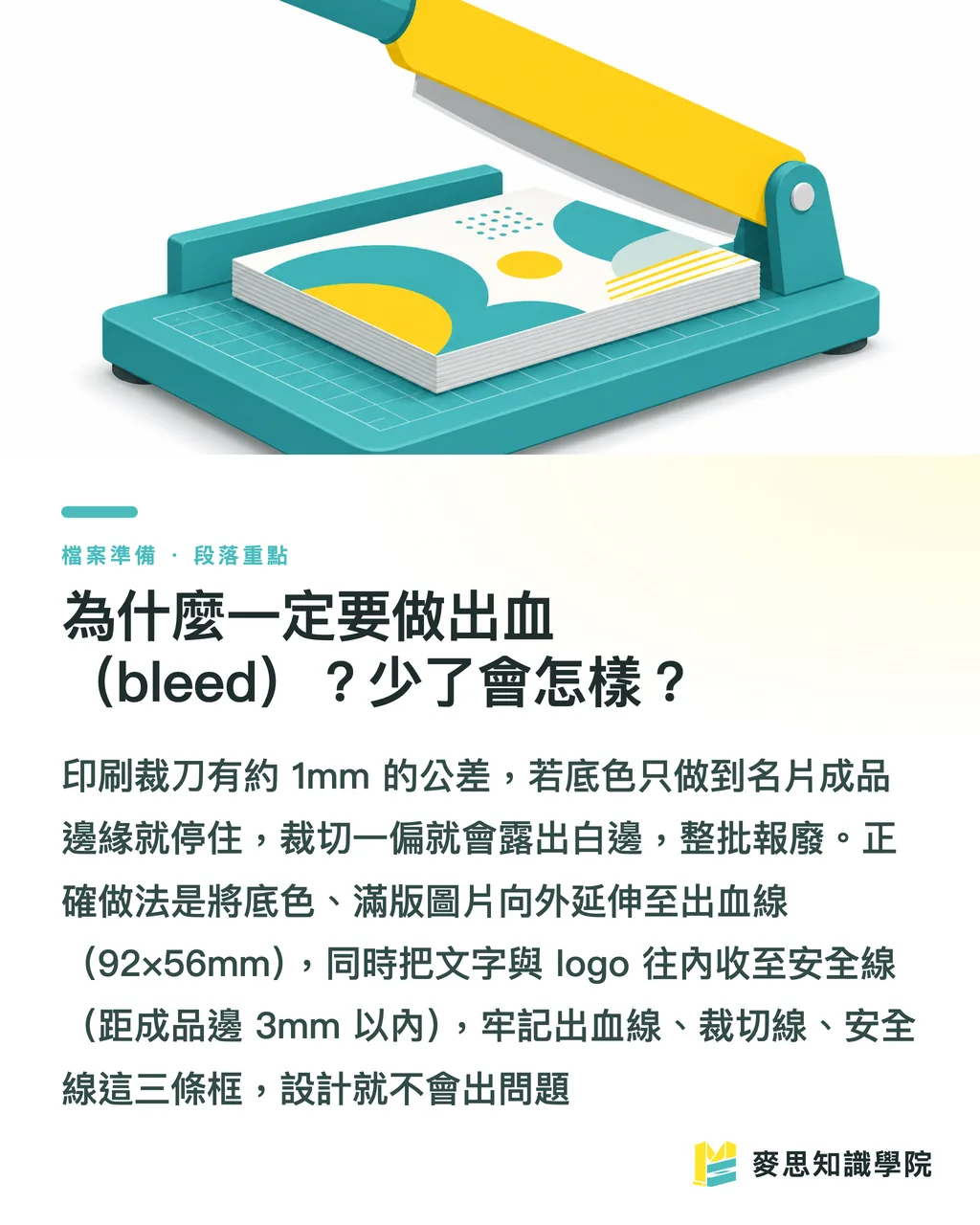
Why Is Bleed Non-Negotiable? What Happens If It's Missing?
Bleed is simply the strip around your design that gets trimmed off after printing
Presses print large sheets in bulk, which are then cut down into individual cards with a guillotine cutter
A cutter isn't a laser — it has tolerances, typically between 0.5 and 1 mm, and cutting a whole stack at once makes the variance worse
If your background color or image stops exactly at the 90×54 edge, even a tiny shift in the cut will leave a white sliver along the edge
That sliver is invisible on screen but glaring in print — and it ruins the whole box
The fix is straightforward: any background color, color block, or full-bleed photo that needs to reach the edge must extend all the way to the 92×56 boundary
Conversely, elements that can't be cut — like text and logos — need to sit inward, at least 3 mm from the finished edge
Just remember three lines: the outer boundary is the bleed line (92×
・56), the middle is the trim line (90×
・54), and the innermost is the safety line (3 mm inset)
Keep all critical information inside that innermost line and you'll be fine
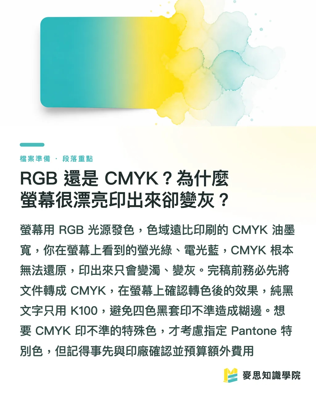
RGB or CMYK? Why Does Something That Looks Great on Screen Print Out Dull and Gray?
Getting the color mode wrong is the most common — and most maddening — reason business cards come out badly
Screens use RGB, mixing red, green, and blue light additively for a wide gamut and high saturation
Printing uses CMYK, combining cyan, magenta, yellow, and black inks subtractively — a noticeably narrower gamut than your screen
That neon green, electric blue, or vivid hot pink you dialed in on screen simply cannot be reproduced in CMYK
Force it to print and everything drops: bright green turns muddy, vivid blue goes grayish, and the client will ask if you printed the wrong file
That's why you must convert your document to CMYK before finalizing — preview the converted result on screen so there are no surprises
Two color scenarios worth calling out:
・For pure black text, use K100 (black plate only). Avoid 'rich black' (adding C, M, and Y on top of K) — on small type, even slight misregistration causes blurry, soft edges
・Reserve rich black (e.g., C40 M30 Y30 K100) for large black backgrounds, where it adds depth and density
・For gold, neon colors, or Tiffany Blue — anything CMYK can't nail — you'll need to specify a Pantone spot color. Check with your printer first; spot colors typically come at an extra cost
Resolution, Fonts, and File Formats: How to Set Them Up Without Problems?
These three items are your final checklist before submitting. Go through them one by one:
On resolution: the print standard is 300 DPI
Most images you grab from the web are 72 DPI — that's for screens. Print them on a business card and they'll come out as a blurry mess
The practical test: place the image at the exact size it'll appear on the card, then check its PPI. If it's under 300, don't use it
On fonts: before sending to print, you must convert all text to outlines (also called 'create outlines')
The reason: the printer's computer may not have the fonts you used. Without the font, text reverts to a system default and your layout falls apart
Once outlined, text becomes vector shapes — no longer tied to any font — so what the printer opens is exactly what you designed
The downside is that outlined text can't be edited, so always save a separate editable version before converting
On file format: PDF is the preferred format for print files. Use a print-spec PDF (PDF/X-1a or whatever setting the printer specifies) — it packages your bleed, color mode, and fonts all in one
If the printer needs native files, a packaged AI or InDesign file also works — just make sure to include all linked images
JPG is the least recommended option: compression degrades quality, and it can't preserve CMYK color data or bleed information

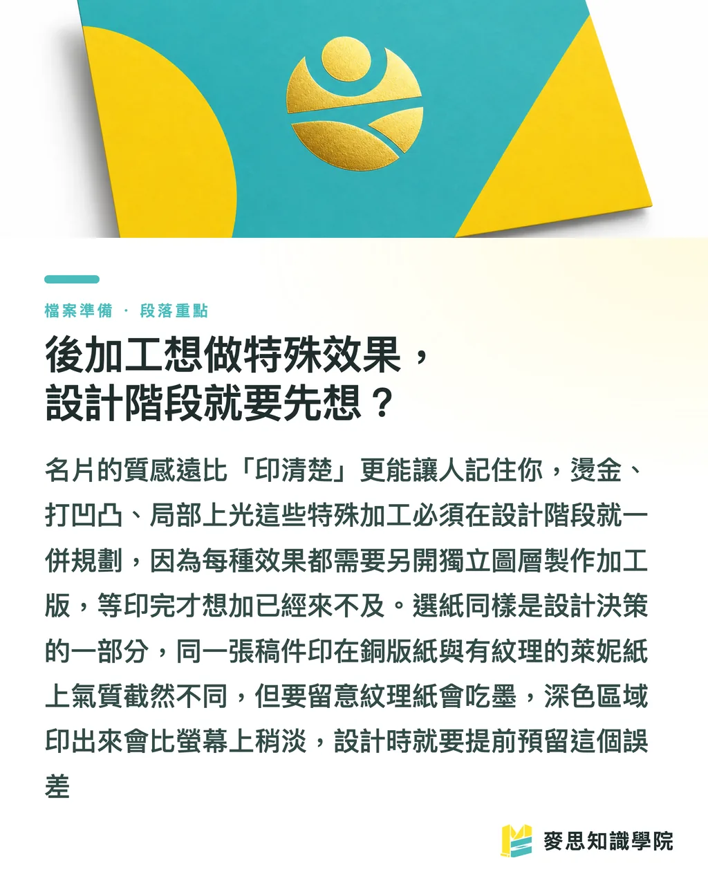
Thinking About Special Finishes? You Need to Plan for Them During the Design Stage
Business cards aren't just flat printed pieces — texture and tactile feel are what make them memorable
Over the past year or two I've noticed clients are no longer satisfied with 'just print it cleanly' — they're actively asking about ways to add tactile character
Foil stamping, embossing/debossing, spot UV coating, and textured paper — all of these need to be planned during the design stage, not tacked on afterward
The key point: specialty finishes usually require a separate finishing layer file
For example, if you want foil stamping on your logo, you need to add a separate layer in your file, marking the foil area with a single spot color — essentially telling the printer 'stamp here, nowhere else.'
Spot UV follows the same logic — wherever you want gloss versus matte, you mark it precisely on a dedicated layer
Alignment requirements for finishing layers are tight; even a slight offset causes misregistration, so your artwork needs to be clean and precisely positioned
Paper choice is part of the design
The same design printed on 250gsm coated stock versus cotton or linen paper creates an entirely different impression
Business card paper typically falls between 250 and 350gsm; anything lighter feels flimsy in hand and comes across as cheap
For a premium feel, textured stocks like laid or matte art paper are worth considering — but keep in mind that textured paper absorbs ink slightly differently, so dark colors may print a shade lighter than expected. Factor that in when designing
Key Takeaways
・Finished card size is 90×54 mm, but set your document to 92×56 with 1 mm bleed on each side; keep text at least 3 mm inside the trim line
・Convert to CMYK before finalizing. Neon colors and electric blues can't be reproduced in CMYK — use Pantone for vivid hues
・Use K100 for small black text; reserve rich black for large dark backgrounds to avoid blurry edges on small type
・Convert all text to outlines before sending to print, and save a separate editable copy as a backup
・Foil stamping, spot UV, and other specialty finishes require a dedicated finishing layer created during the design stage — they can't be added after the fact
Going Further
Business cards are the smallest print format, but they're the easiest place to make costly mistakes. Master the preflight process for cards and you've got the fundamentals of all print production: bleed, CMYK, resolution, outlines, and finishing layers — the same rules apply to posters, flyers, and packaging
For designers: build bleed, safety margins, and CMYK into your document template so every project starts right — that's ten times easier than fixing it later
For buyers and small business owners: spend ten minutes aligning specs with your printer before submitting — dimensions, bleed, color mode, finishing — it's far cheaper than a reprint
A growing number of people are using AI tools to generate business card designs. Be especially careful: AI-generated images default to RGB, 72 DPI, and no bleed — sending them straight to print almost guarantees a bad result. Run them through the full preflight process described above before submitting
If you'd rather not deal with these details yourself, find a partner who handles the full chain — design, preflight, and print production — and let someone with print expertise manage the specs while you focus on the creative
FAQ
- How much bleed should business card printing have?
- The standard for business card printing in Taiwan is 1 mm bleed on each side. The finished size is 90×54 mm, so your document should be set up at 92×56 mm. Extend any background colors or images that reach the edge to the bleed line, and keep text at least 3 mm inside the trim
- Should business card designs use RGB or CMYK?
- Always use CMYK for printing. RGB is for screens — highly saturated colors like neon and electric blue can't be reproduced in CMYK. Convert to CMYK before finalizing and preview the color shift on screen. For vivid special colors, specify Pantone instead
- Do you have to convert text to outlines before sending business card files to print?
- Yes. Outlining text removes its dependency on fonts, so the printer's system won't substitute a different typeface when they open the file. Just remember to save a separate editable copy before converting, since outlined text can't be edited
- What image resolution is needed for business cards to stay sharp?
- The print standard is 300 DPI. The 72 DPI images commonly found online will print blurry. Check that your image reaches 300 PPI at the actual size it appears on the card
- What should you watch out for when adding foil stamping or spot UV to a business card?
- Foil stamping and spot UV both require a separate finishing layer in your design file, with the treatment area marked using a single spot color. Alignment tolerances are tight, so confirm with your printer that they can handle these finishes and clarify the additional cost before submitting