

Why Do Boxes Warp After Folding? The Problem Is Rarely Printing, It Is Line Geometry
Score lines placed too close to the edge, ink covering creases, and cutting positions shifting off design are the three most common reasons for box warping. All three are set during final artwork prep. Print shops simply run the file as provided and cannot fix them after the fact
Whenever a client sends over a box that warps on one side, I never check press registration sheets first. Instead, I open the dieline and overlay it onto the flat layout. Eight times out of ten, the answer sits right in the gap between the dieline and the artwork
The hard part of packaging artwork prep is never matching four colors or preventing dot gain. It is managing how score lines, cut lines, and glue tabs line up relative to layout text and background colors. On an Illustrator screen, these look like thin vector lines. On a die-cutting machine, they become physical steel blades and creasing rules. A single millimeter decides whether the box sits flat or warps
At MINDS (MS, mid-to-high-end fully custom commercial printing), the first of our three prepress checkpoints focuses strictly on structure: score line margins in millimeters, ink crossing creases, and unprinted glue tabs. If a file fails this stage, perfect color accuracy down the line will not save a warped box

How to Set Score Line Safety Distances? 3 mm Is the Floor, Not the Ceiling
The standard industry practice for score lines is a minimum offset of 3 mm from the paper edge, though 4 to 6 mm offers much safer ground. This number comes from physical paper mechanics rather than visual aesthetics. Placed too close to the edge, the paper lacks enough body to take bending tension, cracking under pressure or warping when folded
Determine the offset based on two scenarios: ・ Score line on white or light backgrounds: start at 3 mm, though 4-5 mm is safest. ・ Score line on heavy ink coverage or dark solid areas: thick ink hardens paper locally and reduces elasticity. Push score lines out further to 5-6 mm
Another easily overlooked factor is grain direction relative to score lines. Paper fibers have a clear directional grain. Folding parallel to the grain yields smooth, flat edges. Folding perpendicular to it causes warping at best and paper cracking at worst. On any flat layout, align primary score lines parallel to the paper grain along the longer dimension. Confirm this detail when ordering paper stock, not on the die-cutting floor
Can Ink and Text Run Across Score Lines? The Answer Is Almost Always No
This rule gets broken all the time in design. Designers stretch background colors or large text across score lines to make layouts pop. The sheet looks clean while flat, but problems pop up as soon as it gets folded:
・ Ink cracks at the fold line, creating thin white cracks (known in the industry as color cracking). ・ Ink layers rub against each other after folding, causing color rub-off over time. ・ Dark ink across creases makes folded layers misalign visually, making the box look crooked
In practice, leave a 2-3 mm score line safety zone on both sides of every crease. Keep this area free of solid colors, critical text, and fine line barcodes. Barcodes are especially sensitive. Running one across a crease makes it unscannable, causing instant job rejections
Solid background fills can be handled in two ways. First, place score lines within white margins, trading a bit of layout space for structural stability. Second, use bleed to extend background colors past score lines, though that graphic will not be visible on the folded exterior (common on interior box flaps). Both approaches involve trade-offs based on product positioning. There is no single standard answer, but spell out your choice clearly in the artwork instead of letting the printer guess
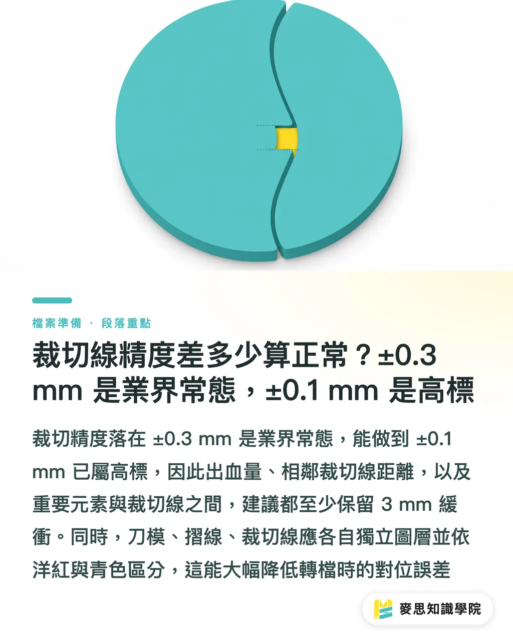
What Is Acceptable Cutting Line Tolerance? ±0.3 mm Is Industry Standard, ±0.1 mm Is High-End
Cutting precision in packaging production operates within realistic tolerances: ±0.3 mm is standard practice, while ±0.1 mm represents high-end accuracy, which typically requires platen die-cutter micro-adjustment and laser cutting support. In real terms, the cut line you draw in Illustrator may shift by ±0.3 mm on the actual press run
This mechanical variance impacts artwork prep across three key areas: ・ Bleed setup: Bleed is normally set to 3 mm to cushion cutting drift. Set it under 3 mm, and slight movement will expose white paper edges. ・ Clearance between cut lines: Maintain at least 3-4 mm between adjacent cut lines to prevent die vibration from multiplying cutting errors. ・ Safety margin for critical elements: Keep text and key graphics at least 3 mm away from cut lines, ideally 5 mm, for the same reason
Many files arrive with cut lines drawn as black vectors directly on design layers without a dedicated dieline layer. Prepress technicians must extract those lines manually to align the die, creating room for drift during file conversion. MINDS (MS) recommends isolating dielines, score lines, and cut lines on separate layers with clear color coding (industry standard: 100% Magenta for cut lines, 100% Cyan for score lines, and dashed lines for perforations). This practice cuts file conversion errors by at least half
How to Set Minimum Glue Tab Offsets? Start at 8 mm and Adjust for Box Style
The glue tab is the side flap that seals a paper box. This strip must stay entirely free of ink, which weakens glue bonding. It should not contain critical text that gets hidden inside the box, and it requires sufficient width to keep the box from springing open
Recommended glue tab widths across common box styles: ・ Folding cartons (roll-end tuck / mailer style): 8-10 mm glue tab width, kept completely clean of ink. ・ Rigid boxes (separate lid and base): Die-cut lid and base separately, leaving at least 5 mm unprinted on inner overlap edges to avoid jams. ・ Card sleeves and folders (two-panel folds): Glue flaps typically run 10-15 mm depending on paper weight. Thicker paper demands wider glue tabs
Another vital detail: glue tabs must never overlap score lines. Some designers draw glue tabs and score lines as separate lines. When die-cut, placing them too close causes creasing rules and glue area pressures to interfere with each other, distorting the paper locally. Keep glue tabs separated from the nearest score line by at least 3 mm, ideally 5 mm
Quick Reference Guide for Scoring and Cutting Specs Across Box Styles
Here is a direct comparison of key parameters across three popular box styles: ・ Folding cartons (single-sheet folding boxes, such as phone case or accessory boxes): 3 mm bleed; primary score lines 4-6 mm from paper edge; 8-10 mm glue tab; 2-3 mm score line safety zone. ・ Rigid boxes (separate lid and base, such as gift or tea boxes): 3 mm bleed; 5 mm unprinted margin on inner overlap areas; glue tabs adjusted for paper weight, recommended 10 mm or more. ・ Card sleeves (two-panel folds, such as header cards or card boxes): 3 mm bleed; score line centered symmetrically; 10-15 mm glue tab; 3 mm unprinted zone on both sides of center score line
Paper weight directly dictates these values. For light cardstock under 200 gsm, work off lower tolerance limits. For heavy cardstock over 300 gsm or grayboard, push every margin to the upper limit. Thicker stock requires deeper score lines and wider cutting buffers. That is a physical constraint, not a design preference
How to Spot Errors Yourself Before Sending to Print? A Three-Step Self-Check
Running a final check on flat layouts against dielines catches 80% of warping issues before production: ・ Step 1: Switch to Outline View. Hide color layers and review vectors alone. Check spatial relationships among score lines, cut lines, and glue tabs to make sure they do not collide or sit too close. ・ Step 2: Verify grain direction. Does the primary score line align parallel with paper length? If this check fails, everything else falls apart. ・ Step 3: Print and fold a physical mockup. Output a small scale test print on a desktop printer, then score and fold it manually by hand. Feel for warping, check glue adhesion, and see if graphics get hidden inside folds. This mockup tells you far more than looking at your monitor a hundred times
If questions remain after these three steps, send your layout to your printer's structural prepress team for review. At MINDS, this structural review is complimentary prior to printing, forming the first step of our three prepress checkpoints. For small-to-medium runs placed online, the ordering interface at MINDS Print automatically flags score lines positioned too close to edges, providing built-in error prevention
For deeper guidance on paper box structures and material pairing, explore the packaging design modules at Mai Strategy Knowledge Academy Consultant Team, where dielines, grayboard specs, and die-cutting creasing are covered in an integrated workflow

Key Takeaways
・ Box warping is rarely caused by the printing press itself. It stems from geometric layout mistakes among score lines, cut lines, and glue tabs in final artwork files
・ Keep score lines at least 3 mm away from paper edges, pushing out to 5-6 mm in heavy solid ink areas. Keep ink fills and critical text 2-3 mm clear of both sides of score lines
・ Industry standard cutting accuracy is ±0.3 mm. Bleed and safety margins exist specifically to cushion against this cutting drift
・ Glue tabs must stay free of ink and clear of score lines. Scale tab width up with paper weight. Adjust specs accordingly for rigid boxes, folding cartons, and card sleeves
・ Print out a desktop proof and fold it by hand before handoff. Manual testing exposes warping flaws faster than staring at Illustrator files for hours
Further Reflections
Packaging artwork preparation is where design and production split apart most frequently. Designers often focus on crafting beautiful layouts on screen without realizing that every thin vector line translates directly into physical steel blades and creasing rules on a die-cutter. The most practical step in adopting a sound prepress workflow is treating dielines, score lines, and cut lines as structural parts of layout design from day one rather than last-minute add-ons before printing. For print shops, building structural checks into standard prepress protocols (like the three-stage system at MINDS) differentiates service while slashing job rejection rates. Next time a box proofing job comes in, hold off on discussing paper stock or print runs. Print out the flat layout and fold it by hand. The flaws will reveal themselves immediately
Further Reading
FAQ
- What is the minimum margin required between a box score line and the paper edge?
- Industry standard practice requires at least 3 mm, pushing to 5-6 mm in solid dark ink zones. Thicker paper stocks require wider margins to prevent paper cracking or edge warping along score lines
- Can solid background colors run across a score line?
- Technically yes, but graphics on the folded side will be obscured or suffer from color cracking. In practice, leave a 2-3 mm unprinted safety zone on both sides of score lines, or design score lines to land within white space
- What is the typical cutting tolerance for cut lines?
- Standard packaging cutting accuracy falls within ±0.3 mm, with high-end setups reaching ±0.1 mm. This variance is why bleed is set to 3 mm and critical artwork stays at least 3 mm away from cut lines, creating a buffer for cutting drift
- How do you determine the width of a glue tab?
- Adjust glue tab width based on box style and paper stock weight, starting at 8-10 mm for folding cartons and 10-15 mm for card sleeves. Thicker paper demands wider glue tabs. Glue tabs must stay free of ink and text, and should never overlap score lines
- What self-checks can you perform before handing files off to print?
- Switch to Outline View to inspect dielines against artwork, ensure primary score lines run parallel to paper grain, and print out a desktop proof to fold manually by hand. These three steps catch the majority of box warping and adhesion issues
Related articles




The Print × AI weekly
The print and AI know-how designers, brands and enterprises can use before they commit — one email, every week
MINDS Free Tools
Imposition calculator and preflight file check — free prepress tools, right in your browser.
MINDS Group
Need actual printing or gifting services?
From premium printing to online ordering and festive gifts — the MINDS Group sister brands take it from here.