
Why beautiful screen designs fall flat on specialty paper
Many designers are accustomed to using the same CMYK values for everything, but this is a major printing taboo
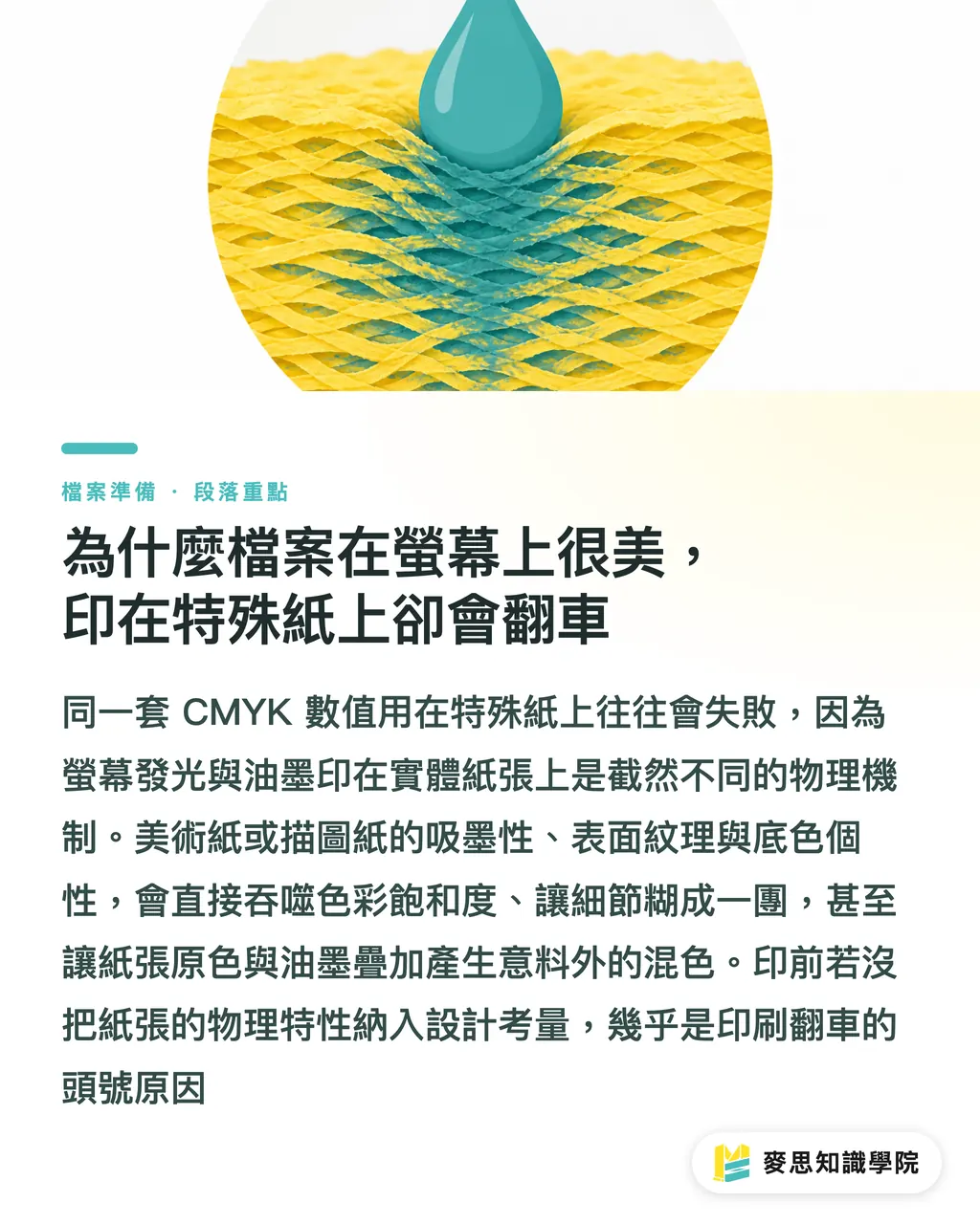
The physics of light-emitting screens versus ink on physical paper are fundamentally different
When you move away from standard coated paper to textured art paper or translucent tracing paper, the 'personality' of the paper itself strongly influences the final color expression
Based on the clients and projects I’ve worked with recently, eight out of ten printing disasters happen because the physical properties of the paper were not considered in the prepress design
You must understand that different paper absorbency, surface coatings, and textures will directly diminish color saturation or cause fine details to blur
・Understand paper absorbency: This determines whether ink sits on the surface or sinks into the fibers
・Evaluate surface texture: Coarse textures can cause 'feathering' on the edges of small text
・Consider base color interference: The base color of the paper (e.g., the grayish-yellow of recycled paper) will overlay with the ink, creating color shifts
Do art and recycled papers 'eat' color? How absorbency affects contrast
With the recent rise in ESG sustainable packaging, many brands want to switch to recycled paper
However, like uncoated art paper, recycled paper has large fiber pores and extremely high absorbency
Once ink is applied, it rapidly permeates the paper, causing a significant drop in color saturation—a vibrant red can easily turn into a dull brick red
If you don't adjust your prepress files, the final output will inevitably look washed out and lose its depth
My practical advice is to increase image contrast and saturation in your design software beforehand
・Overall saturation boost: For key visuals, manually increase saturation by at least 10% to 15% to compensate for ink absorption
・Strengthen highlight and shadow contrast: Make shadows deeper and highlights brighter to prevent midtones from muddying after absorption
・Avoid overly fine fonts: On rough paper surfaces, reversed text or thin fonts smaller than 6pt are highly prone to blurring due to ink spread
Why does printing on pearlescent paper look dark? Practical tips on white ink underprinting and drying time
Pearlescent stickers or synthetic papers offer a premium sheen loved by many brands, but they are also the biggest minefields for color discrepancies
Because pearlescent surfaces are non-absorbent, ink adheres only to the surface; coupled with the dark or metallic base of the material, printing CMYK directly will make colors look dirty and dull
In these cases, 'white ink underprinting' is the only way to ensure vibrant colors
Your prepress file must include a separate white ink layer to mask the base material color before the colored ink is applied
・Accurate white ink layer settings: Create an independent spot color layer for areas needing color fidelity and set it to overprint
・Allow for drying time: Ink on non-absorbent materials dries very slowly; allow at least 24 to 48 hours extra in your delivery schedule
・Avoid excessive total ink coverage: If the Total Ink Coverage (TIC) exceeds 250%, issues like set-off or smudging are highly likely
How to achieve a luminous look on translucent tracing paper? Prepress adjustments for overprinting and physical traits
Translucent materials like tracing paper create wonderful depth and rhythm, commonly used in high-end portfolios or invitations
However, their physical characteristics include a rigid texture, susceptibility to moisture-induced curling, and low ink absorbency
Printing on tracing paper presents the risk of insufficient saturation, as translucency causes ink to appear lighter
If you want to achieve solid color patterns on tracing paper, you must consider overprinting techniques or spot white ink
・Be mindful of color translucency: Patterns on the front and back will show through each other; utilize this characteristic during design rather than fighting it
・Mind the risks of full-bleed printing: Large areas of solid color blocks can easily cause the tracing paper to wrinkle or deform due to stretching
・Temperature and humidity control: These papers are extremely sensitive to environmental changes, necessitating strict humidity management during prepress and processing

Key Takeaways
Understanding paper absorbency is the first step in prepress; always boost contrast and saturation for uncoated paper
Pearlescent and metallic materials can diminish color lightness; leverage white ink underprinting to preserve the original design intent
Non-absorbent specialty materials (like synthetic or tracing paper) are difficult to dry; controlling delivery timelines and total ink volume is critical to success
Design should not rely solely on screen values; incorporating the physical properties and base colors of the paper into your process is essential for accurate results
Further Reflection
For designers and print buyers, selecting the right paper is only half the job; the mark of professionalism is knowing how to adjust prepress files according to the material
I recommend requesting paper samples or even doing spot proofs from print consultants with integrated experience like MINDS during the early design stages
Don't blindly trust the color swatches on your monitor; let the physical material converse with the ink to eliminate potential printing risks early
FAQ
- Why do my designs look dull when printed on art paper?
- Because art paper lacks a coating layer, it has extremely high absorbency. Once ink sinks into the fibers, it reduces reflectivity. You need to intentionally increase image contrast and saturation in prepress to compensate
- Is white ink underprinting mandatory for pearlescent stickers?
- Without white ink underprinting, the translucent colored ink will reveal the dark base of the pearlescent material, making the design look muddy. You must lay down a layer of white ink for vibrant, clear colors
- What should I watch out for when using recycled paper for packaging?
- Besides color shifts caused by high absorbency, you must consider the inherent grayish-yellow base of recycled paper. It will mix with the printed ink, so it's best to avoid large areas of light tones or tiny reversed text