
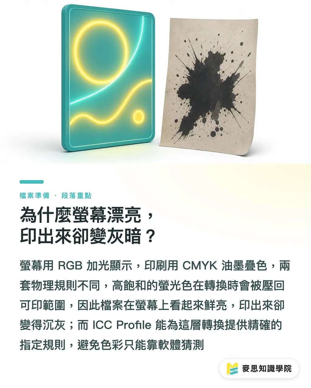
Why does it look great on screen but come out dull in print?
One sentence I hear more than any other on the press floor: "My file looks bright on the monitor—why does it look so different in print?"
The issue usually comes down to the fundamental difference between RGB and CMYK
・RGB: mixes three channels of light—Red, Green, Blue. The more you add, the brighter it gets. Ideal for phones, websites, presentations, and social graphics
・CMYK: stacks four ink colors—Cyan, Magenta, Yellow, Black—on paper that doesn't emit light. The more you stack, the darker it gets. Ideal for printed materials
・Gamut gap: highly saturated blues, fluorescent greens, and bright oranges that RGB can render often can't be faithfully reproduced in CMYK
・Conversion loss: when converting RGB to CMYK, anything that falls outside the printable gamut gets compressed back into range. That's why vivid colors turn muted and brights turn dirty
I often use this analogy with clients: RGB is neon; CMYK is ink on paper. They don't follow the same physical rules
That's where the value of an ICC Profile comes in. It tells the software: "Which CMYK should this RGB be mapped to? What should red look like under this specific press condition?"
Without an ICC, the software is just guessing
With an ICC, the translation follows a defined rule
What is an ICC Profile and how does it work in the print workflow?
ICC Profiles are often called color profiles. They aren't filters, and they don't make colors look prettier
An ICC Profile is a file that describes a color space. It tells Illustrator, Photoshop, Acrobat, or a RIP system which colors a device or print condition can reproduce, and how to convert between different color spaces
A complete color-managed print workflow typically passes through four checkpoints
・Design side: Color Settings in Illustrator or Photoshop define the working color space
・Image side: each photo may carry its own embedded profile—sRGB, Adobe RGB, Display P3, or something else
・Output side: when exporting PDF, you decide whether to convert to a specified CMYK, and whether to retain or embed an output profile
・Press side: the printer reinterprets the file using its own RIP, paper, ink, dot gain, and machine conditions
If even one of these four checkpoints isn't clearly communicated, color drift will show up
Take a red key visual as an example: if it's retouched in Adobe RGB, the embedded profile is ignored when placed in Illustrator, the PDF is converted to a different CMYK on export, and the printer's RIP applies yet another conversion—the final print can easily end up darker, browner, and noticeably desaturated
The biggest fear in color management isn't the conversion itself
It's not knowing how many conversions you've actually performed
How do you choose a common CMYK ICC?
There is no one-size-fits-all answer for ICC profiles, because each one describes a specific print condition
I start by asking three questions: where will it be printed, what paper will be used, and what output standard does the printer follow?
Here's how to understand the common options
・FOGRA39: common in European-standard print conditions, geared toward coated-paper commercial printing. Many international brands and European supply chains require settings like this
・Japan Color 2011 Coated: the typical coated-paper reference across the Taiwanese and Japanese print supply chains. It's often used as the communication baseline for catalogs, books, and packaging proofs
・GRACoL 2013: a North American commercial printing standard, useful when working with U.S. brands, international channels, or overseas print specs
In practice, I don't recommend designers ask, "Which ICC is the most accurate?"
A better question is: "Where will this job be printed? On what paper? Which output condition does the printer want me to use?"
If the printer hasn't specified a particular setting, a Taiwan- or Japan-standard coated-paper commercial job can start by confirming with the printer whether Japan Color 2011 Coated applies
For international brand work, European supply chains, or overseas output, follow the partner's spec—don't force a familiar setting onto it
Choosing the wrong ICC won't necessarily break the file
But it will make everyone think they're looking at the same color while actually holding different maps
Where do you configure ICC in Illustrator and Photoshop?
The most basic move on the design side is to make the working color space explicit
In Adobe apps, the main entry point is Edit > Color Settings
In Illustrator, check these spots
・Edit > Color Settings: confirm the RGB working space and CMYK working space
・CMYK Working Space: pick Japan Color 2011 Coated, FOGRA39, or GRACoL 2013 according to the printer's or output spec
・Color Management Policies: keep embedded profiles and prompt when there's a mismatch
・Profile Mismatches: enable Ask When Opening and Ask When Pasting
・Missing Profiles: enable Ask When Opening
In Photoshop, start from Edit > Color Settings as well, then judge based on each image's profile
・For finished photos: don't bluntly strip the original profile the moment you open the file
・For images headed to press: use Convert to Profile to move into the specified CMYK—not Assign Profile
・To preview print output: use View > Proof Setup > Custom, choose the printer's or a specified ICC for soft proofing
・For highly saturated RGB images: check the Gamut Warning first, then decide whether to adjust locally
A common misconception on the press floor: Assign Profile and Convert to Profile are not the same thing
・Assign Profile changes how the existing pixel values are interpreted—numbers stay the same, appearance can shift dramatically
・Convert to Profile maps the colors into a new color space—the numbers change, and the goal is to preserve appearance
What you actually use before sending to print is Convert to Profile
Assign Profile is more like slapping a new label on a box—get the label wrong and the whole batch tastes different
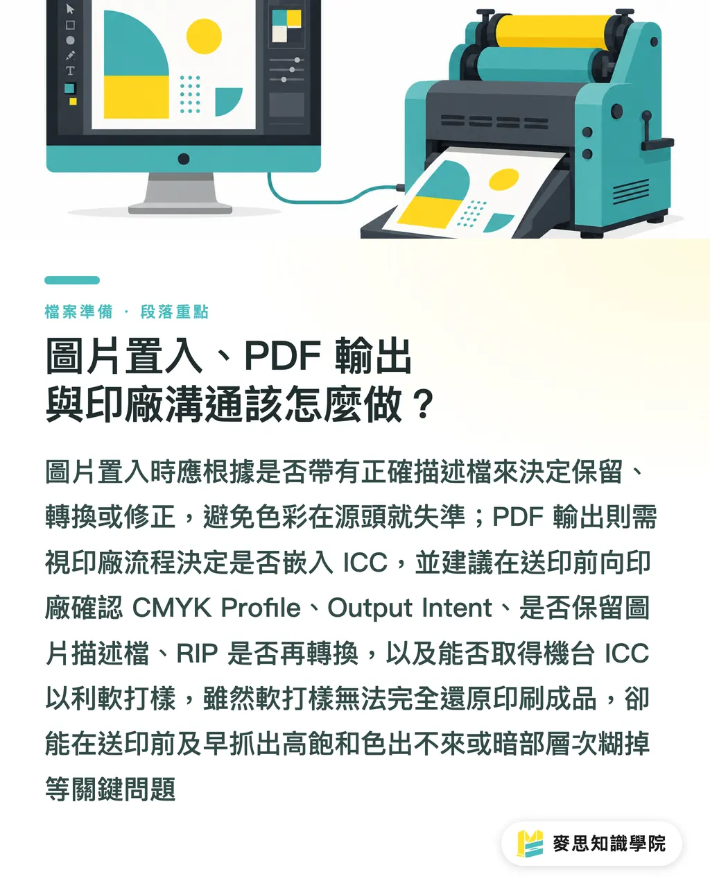
Image placement, PDF export, and printer communication—how do you handle them?
When placing images, I generally don't recommend ignoring embedded profiles by default
If one image is Adobe RGB and another is sRGB, and both are treated as the same RGB, color can drift right from the source
A more stable approach handles three scenarios
・Image has a correct embedded profile: keep it, so the software knows the original color source
・Image has no profile: judge by eye and source. Most web images can be checked as sRGB first, then converted as needed
・Image has a clearly wrong profile: don't ignore it. Test the difference between Assign Profile and Convert to Profile in Photoshop first, then decide how to fix it
When exporting PDF, whether to embed an output ICC depends on the printer's workflow
Some printers want the PDF already converted to a specified CMYK with an embedded Output Intent, so the RIP can confirm the file's intent
Others have their own standard flow and prefer a clean CMYK PDF without a lot of secondary conversion data attached
Before sending to print, I'd recommend asking the printer five direct questions—more effective than guessing
・Which CMYK ICC Profile should this job use?
・Does the PDF need an embedded Output Intent?
・Should images keep their embedded profiles, or all be converted to the specified CMYK?
・Will your RIP apply another color conversion?
・Can you share the ICC Profile for your machine or standard condition, so I can soft proof in Acrobat or Photoshop?
If the printer is willing to share their machine ICC, the design side can soft proof for a print-like preview
Soft proofing isn't a 100% guarantee—paper whiteness, surface coating, ink laydown, shop humidity, and monitor calibration all affect the result
But it can catch two big categories of problems before plates are made: colors that are too saturated to print, and shadow detail that collapses into a single tone
What this step saves isn't just time—it's catching the problem before you pay for a finished print run
This is exactly where MINDS can step in: file preparation, preflight checks, paper recommendations, and output communication
Not by dumping responsibility on the designer or the printer, but by getting the color rules straight before the press rolls
Key takeaways
・An ICC Profile doesn't make colors prettier—it makes sure different devices interpret colors by the same rules
・Converting RGB to CMYK always involves trade-offs; the professional approach is knowing in advance what you'll lose
・Specifying a CMYK profile before sending to print reduces guessing, not adds hassle
・Don't casually discard an image's embedded profile—many color shifts start from that one click
・The best color management isn't memorizing profile names; it's asking the printer how their machine, their paper, and their process actually run
Further thoughts
For print production, ICC is the tool that turns hands-on experience into a spec everyone can talk about. For designers, it's the insurance policy before sending to press. For SaaS and AI applications, the future ability to automatically review print files won't start with judging whether the design looks good—it starts with checking whether the file has a defined color space, whether images are profiled, and whether the PDF matches the printer's output conditions
I'd recommend that small teams and design groups build their own print color checklist: common papers, partner printers, designated ICC, PDF export settings, soft proofing steps. Lock down those five items first, and every subsequent output gets a lot more stable
FAQ
- What is an ICC Profile?
- An ICC Profile is a color description file that defines how a monitor, image, or print condition reproduces color. It lets Illustrator, Photoshop, PDF, and the printer's RIP interpret color using the same set of rules
- Do I always have to convert RGB to CMYK before sending to print?
- Most traditional offset and commercial printing jobs need a confirmed CMYK output. The point isn't blindly converting to CMYK, but converting according to the printer's specified ICC Profile, so vibrant RGB colors don't get squeezed at the press on the fly
- Should I choose FOGRA39, Japan Color 2011 Coated, or GRACoL 2013?
- FOGRA39 is common for European coated-paper printing, Japan Color 2011 Coated is typical across the Taiwan–Japan supply chain, and GRACoL 2013 is widely used in North American commercial printing. The safest move is to ask the printer which output standard they follow
- Should I keep the embedded profile when placing images into Illustrator?
- It's generally best to keep a correct embedded profile, because it tells the software the image's original color space. Only when the profile is clearly wrong should you go back to Photoshop to assess and correct it
- Should I embed the ICC when exporting PDF?
- It depends on the printer's workflow. Some printers want an embedded Output Intent to confirm intent; others prefer to control the RIP conversion themselves. Confirming the PDF spec with the printer is more reliable than applying a generic setting
Related articles
MINDS Group
Need actual printing or gifting services?
From premium printing to online ordering and festive gifts — the MINDS Group sister brands take it from here.