What Exactly Are Spot Colors, and How Do They Differ from CMYK?
Let's clarify the terminology first to make decision-making easier later
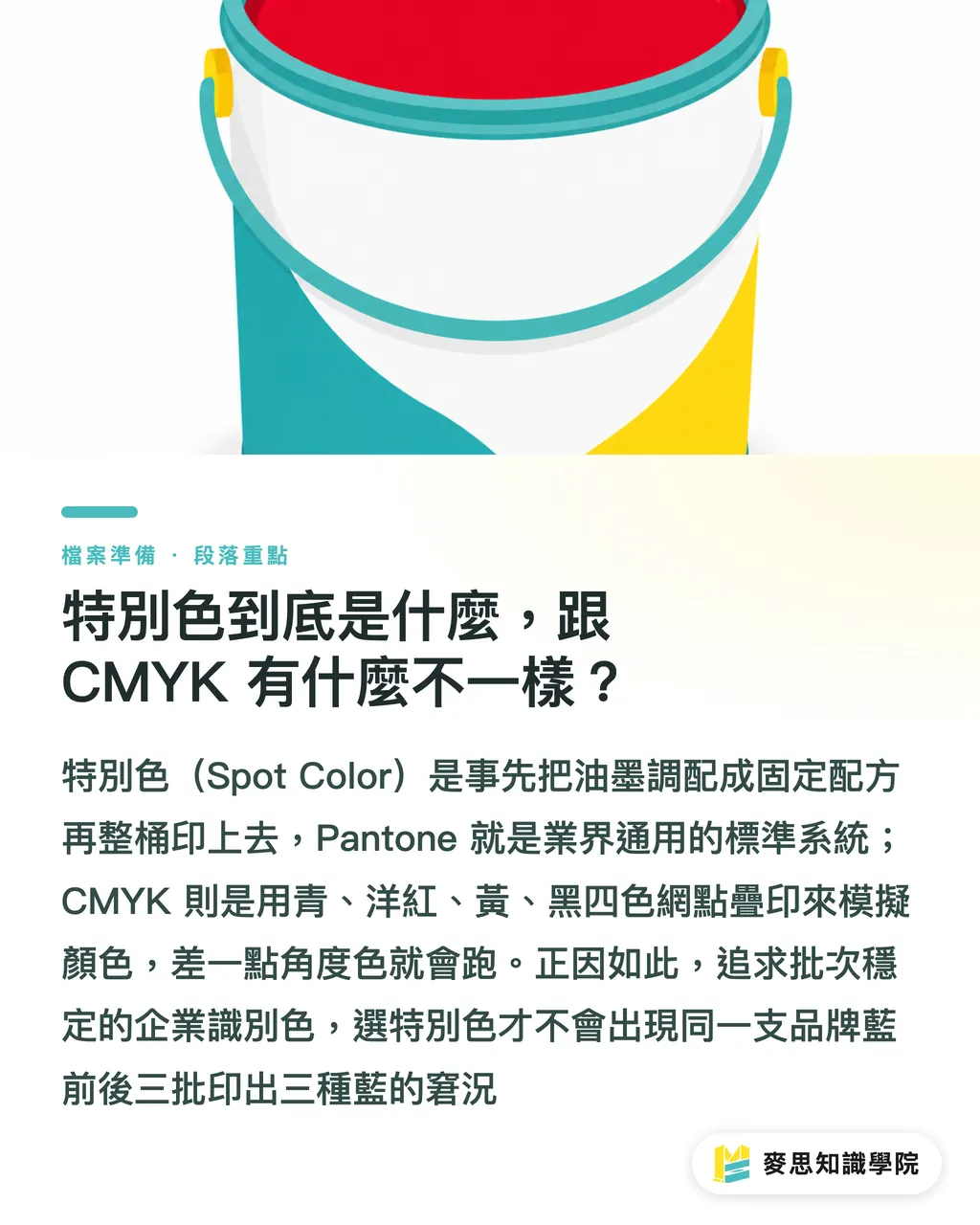
A spot color is a printing method where the ink is pre-mixed to the exact color you need before being applied to the press. Pantone is the most widely adopted spot color system in the industry, where each number in the swatch book corresponds to a batch of pre-mixed ink with a precise formula
In contrast, CMYK process printing uses halftone dots of cyan, magenta, yellow, and black layered together, relying on visual color mixing to 'simulate' the target color
What is the difference? Think of it this way: CMYK is like mixing four different paints on the spot to get the green you want, whereas a spot color is like ordering a pre-mixed bucket of paint that is formulated to be 'exactly that green.'
This difference determines everything. CMYK can simulate most colors, but because it is layered, a slight shift in the dot percentage on any plate will alter the resulting color
Since a spot color comes from a single pre-mixed batch, it yields a uniform color coverage and consistent results across different runs. I have seen too many clients get three different shades of blue across three batches for the same corporate color, and the issue almost always stems from trying to reproduce a spot color using CMYK
When Is It Actually Worth Paying Extra for Spot Colors?
Not every color warrants the extra cost, but in the following scenarios, trying to save money will usually cost you more in the end:
・High consistency for brand colors across batches: For corporate identity and main logo colors—where any deviation is immediately noticeable to the client—spot colors offer far superior batch-to-batch stability compared to CMYK process printing
・Colors outside the CMYK gamut: Fluorescent colors, metallics (gold, silver), and pastels simply cannot be reproduced using CMYK. No matter how you adjust the settings, you will only get a dull approximation, so you must rely on spot colors or metallic inks
・Monochrome or two-color print jobs: This is where most people miscalculate. For envelopes, single-color flyers, or two-color packaging, printing in CMYK requires outputs for four plates. Utilizing one or two spot colors instead requires only one or two plates, which actually lowers the platemaking costs
I want to highlight the third point in particular. Many people assume that spot colors are always more expensive, but the actual cost depends on the number of colors you print
For instance, a flyer with only black text and a single corporate red might only need two plates if you use a spot color. Forcing it into CMYK would require four plates instead, making it more expensive and less accurate
The decision logic boils down to this: if the number of colors is low, if color accuracy is critical, or if the color cannot be achieved via CMYK, seriously consider spot colors. If there are many colors or you are printing rich photographic images, stick to CMYK
Where Do the Extra Costs for Spot Colors Come From? How to Avoid Being Overcharged?
Let's break down the cost structure so you can judge whether the quote on your invoice is reasonable
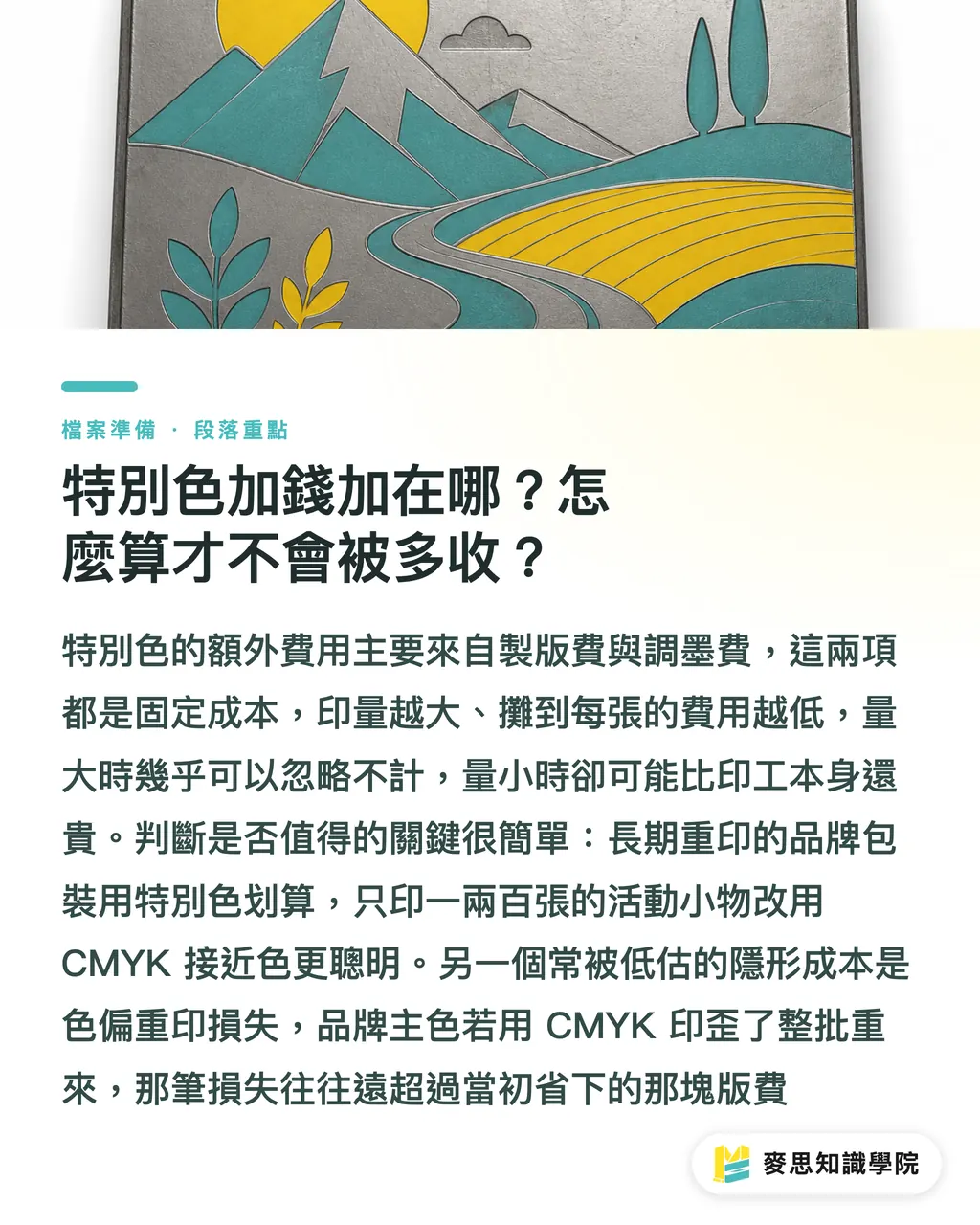
The extra costs of spot colors primarily come from two components:
・Platemaking fees: Each additional spot color requires its own printing plate. An extra plate means an additional platemaking fee
・Ink-mixing fees: The printer has to formulate and mix that specific ink according to the Pantone formula, which involves labor and material costs
The key lies in amortization. Platemaking and ink-mixing fees are fixed costs; they remain virtually the same whether you run 500 or 50,000 prints
Therefore, the larger the print run, the lower the amortized cost per print, making spot colors much more cost-effective. For small print runs, these fixed costs cannot be spread out, driving up the unit price
In practice, here is how I calculate it for my clients: for high-volume corporate stationery or packaging that is printed repeatedly over the long term, the amortized cost of the spot color plate is negligible, so you should definitely go for it
However, if you are only printing one or two hundred pieces of event swag and that exact shade isn't absolutely critical, the platemaking fee for a spot color might exceed the printing labor itself. In this case, choosing a close CMYK alternative is the smarter move
There is also a frequently overlooked cost: the price of reprinting due to errors. If a core brand color is printed incorrectly using CMYK and the entire batch has to be scrapped and reprinted, the loss is usually far greater than what you saved by skipping a single plate fee
Why Do the CMYK Values in Swatch Books Often Turn Out Wrong When Printed?
This is the biggest misconception during file preparation, and it is where many color deviations originate
In Pantone swatch books, a 'corresponding CMYK value' is often printed next to each spot color code. Many designers simply enter these values into their files, assuming it will yield the exact same color as the Pantone spot color
The truth is: those CMYK values are merely a 'reference conversion,' not an exact equivalent
Why? Because the final appearance of the color is dictated by the printing substrate. The same ink values will produce different results on different materials:
・Coated paper: With a coated surface, it absorbs less ink, making colors appear vibrant and saturated
・Uncoated paper: The fibers absorb the ink, which causes the exact same ink to look darker and duller
・PP film and synthetic paper: These have entirely different absorption and reflective properties
This is also why Pantone swatch books come in two versions: C (Coated) and U (Uncoated). The same color code can look noticeably different on coated versus uncoated stock
Therefore, my advice is straightforward: do not rely solely on your screen or the values. Always verify colors against a physical Pantone swatch book on the actual substrate
If you are working with a primary brand color, invest in a Pantone swatch book for the corresponding paper type, or request a press proof from the printer to verify on-site. The blue on your screen and the blue that gets printed are two completely different things. This discrepancy is not the printer's fault; color simply behaves differently across different media
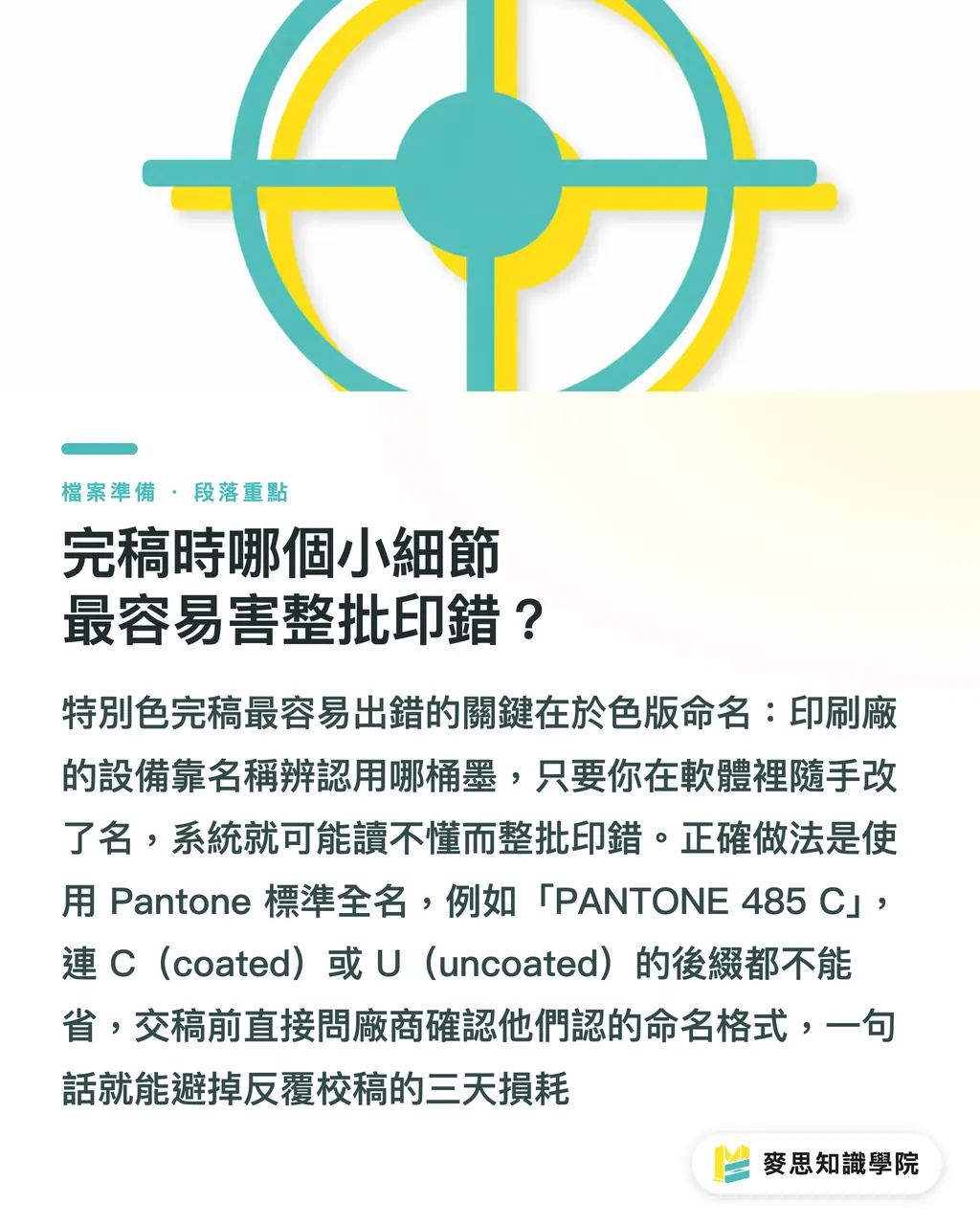
Which Minor Detail in File Preparation is Most Likely to Ruin the Entire Batch?
Even when all the technical decisions are correct, things often fall apart at the very end due to a simple naming issue
In a print-ready file, a spot color is identified by its 'plate name.' The printer's output devices rely on this exact name to recognize which ink bucket to use for that plate
If you invent a name in Adobe Illustrator—for instance, naming your brand blue 'Blue' or 'Blue_1' on a whim—the printer's automated system won't recognize it. At best, this causes delays as they call you to verify; at worst, it gets treated as an unknown color, ruining the entire print run
The correct approach: Align your plate names with the printing house using standard nomenclature
For example, the standard plate name for Pantone 485 on coated paper is 'PANTONE 485 C'—even the 'C' (coated) suffix must match exactly
When your file contains 'PANTONE 485 C,' the printer's system immediately identifies the correct ink and paper characteristics
Here are a few critical checkpoints before submitting your files:
・Use the standard, full Pantone name for plate names, including the C or U suffix. Do not rename them
・Verify that the spot color is set as a true 'spot color' attribute and has not been covertly converted to CMYK process color by the software
・Delete any unused spot color plates. Printers may charge an extra plate fee for every color present in the file
・Ask the printer directly: 'What naming format do you require for spot color plates?' A simple question can save you three days of back-and-forth
This might sound like a minor detail, but many of the rush-order disasters I have handled were caused by mismatched plate names. No matter how beautiful your design is, if a name is off by a single character, the machine cannot read it
Key Takeaways
・Spot colors are not inherently more expensive; they are simply 'more accurate and more consistent.' When the color count is low or the color is critical, they often turn out to be cheaper
・Fluorescent, gold, silver, and pastel shades lie outside the CMYK color gamut. They cannot be achieved with four-color printing and must be run as spot colors
・For monochrome or two-color print jobs, using spot colors often keeps plate costs lower than outputting four CMYK plates
・The CMYK values printed next to Pantone swatches are reference conversions only. Always verify colors using physical swatches on the actual substrate or press proofs
・Use standard full Pantone names (including the C/U suffix) for your plate names. Making up your own names is the leading cause of printing errors across an entire run
Further Thoughts
Buyers who truly save money do not just cut spot colors blindly. Instead, they distinguish between 'which color must be absolutely consistent' and 'which color is fine even with a minor deviation.'
Here is a recommendation: define your frequently printed brand colors with clear Pantone codes and corresponding substrates once and for all. Compile them into an internal color guide and attach it directly to every print order you place
For designers, establishing a fixed pre-flight checklist for plate names, spot color attributes, and paper types saves far more time and money than trying to fix color discrepancies after the printing is done
Rather than relying on luck and firefighting color issues batch by batch, it is much better to lock down the specifications at the source. This is exactly why MINDS Print clarifies and audits all color specifications for our clients before sending a job to the press
FAQ
- Are Pantone spot colors always more expensive than CMYK?
- Not necessarily. While each spot color adds plate and ink-mixing fees, if you only print one or two colors, using spot colors might require only one or two plates, which is cheaper than outputting four CMYK plates. CMYK is only more cost-effective when there are many colors or photographic images
- Which colors must be printed as spot colors because CMYK cannot reproduce them?
- Fluorescent colors, gold, silver, and pastels fall outside the CMYK color gamut. Layering four process colors will only yield a dull, approximate version. To achieve accurate results, you must use spot colors or specialized metallic inks
- Can the CMYK values printed on the swatches be used directly for file preparation?
- Those values are only reference conversions, not equivalents. The same ink printed on coated paper, uncoated paper, or PP film will look noticeably different. Color verification should always be based on physical Pantone swatches or press proofs on the actual substrate
- How should spot color plate names be written during file preparation to avoid errors?
- Use standard full Pantone names, including the C (Coated) or U (Uncoated) suffix, such as 'PANTONE 485 C,' and align on the naming format with your printer beforehand. Making up your own names will prevent the printer's automated systems from recognizing them, which can result in the entire batch being printed incorrectly
- Are spot colors still suitable for very small print runs?
- It depends on how critical the color accuracy is. Platemaking and ink-mixing fees are fixed costs, so small run volumes cannot amortize them well, driving up the unit price. Unless that exact brand color is absolutely mandatory, using a close CMYK match is usually more economical for small batches