Does your LOGO color look the same everywhere?
This is the most frequent question I ask when meeting with clients, and the answer is usually, 'I guess it looks a bit different.'
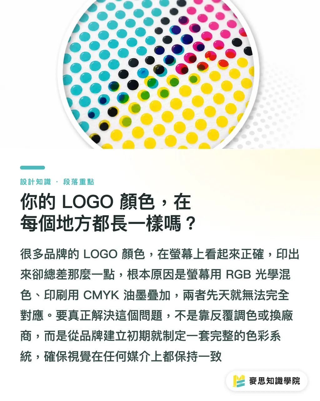
For many startups, the initial LOGO color might just be one a designer selected on a screen because it looked good. This might be fine for websites or social media posts, but as soon as you enter the printing process, problems arise: the colors on business cards, packaging, and marketing materials are slightly different from what was seen on screen. Sometimes they look too dark, sometimes too gray—it just doesn't feel right
The key behind this is the fundamental difference between 'optical color' and 'print color.' Screens use RGB (Red, Green, Blue), which is an additive color model where colors get brighter as they are added. Printing uses CMYK (Cyan, Magenta, Yellow, Key/Black), which is a subtractive color model where ink layers make colors darker. Inherently, these two can never be a perfect match
The solution is not to go back and forth adjusting colors or changing printing houses, but to establish a complete 'Brand Color System' from the start, allowing your brand to present a consistent visual identity wherever it appears
How to build an 'all-in-one' brand color system?
A professional color system is like a brand's DNA—it must be precise and versatile. I advise clients to define at least these types of colors:
・Primary Color: Usually the color of the LOGO, it's the brand's first impression and is used the most
・Secondary Colors: 1-3 colors used to complement the primary color, applied to website backgrounds, buttons, charts, or marketing materials to add visual depth
Crucially, for *every* color, four color values must be defined synchronously:
・RGB: Used for all screen displays, such as computers, mobile phones, and video walls; it is a light-based color model
・HEX: Essentially the web code representation of RGB. This six-digit code starting with '#' is the standard language for communicating with web designers or App developers
・CMYK: Used for the vast majority of color printing, such as flyers, catalogs, and posters; it is a color model based on overprinting ink
・Pantone (PMS): Also known as spot colors, these are pre-mixed standardized inks, similar to a paint color swatch system. Its value lies in 'absolute consistency.' Regardless of the printing house or material, as long as the same Pantone color number is specified, there will be no color deviation. It is best suited for defining your brand's primary color
Many brands struggle with CMYK not being saturated enough, especially with bright orange, turquoise, or certain neon greens. This is the physical limit of CMYK, while Pantone spot inks can break this barrier, perfectly rendering that key color the brand desires
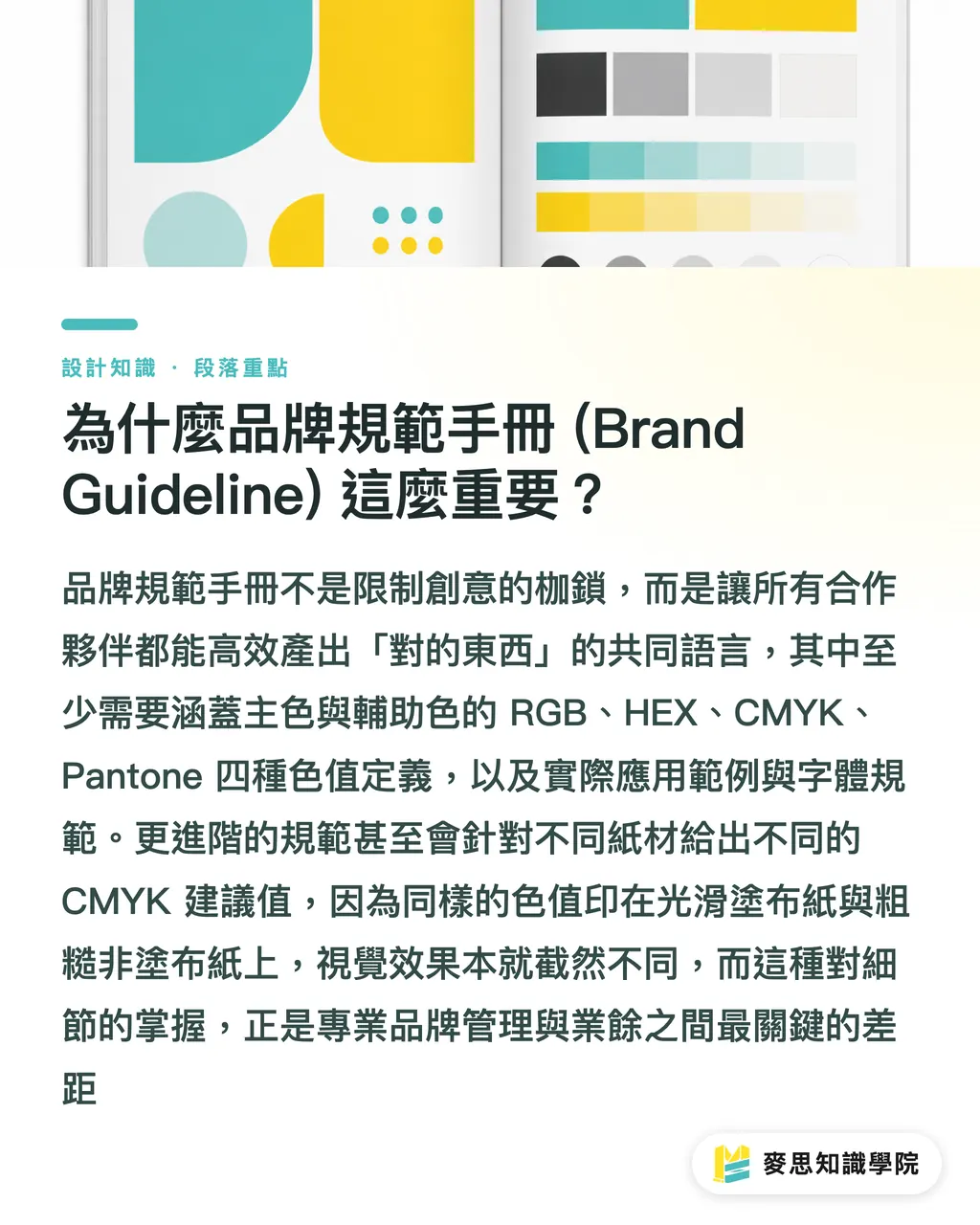
Why is a Brand Guideline so important?
After defining these colors, the next step is to record them all in a 'Brand Guideline.' This document is not meant to limit creativity; on the contrary, it ensures that as the brand expands, all internal and external partners (designers, marketers, printers, franchisees) can efficiently create the 'right' things
A good color guide should at least include:
・Color Definitions: Clearly list the four color values (RGB, HEX, CMYK, Pantone) for primary and secondary colors
・Color Application Examples: Show how colors should be used in different backgrounds and contexts
・Typography Guidelines: Which font is the brand standard, and which fonts and weights should be used for headlines and body text, respectively
More advanced guidelines also consider the challenge of 'cross-media consistency.' Based on my years of production experience, the same CMYK values will look different when printed on smooth, reflective 'coated paper' (like art paper) versus rough, absorbent 'uncoated paper' (like offset paper or ivory board)—the former looks vibrant, while the latter appears muted
Professional brand guidelines may even provide different suggested CMYK values for different paper types, or specify that Pantone ink must be used to print the LOGO on uncoated paper to maintain visual consistency. These details are exactly what make the difference in professionalism
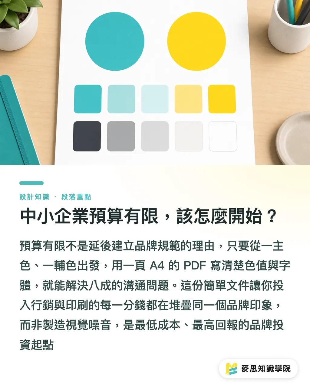
Budget-limited SMEs: How to get started?
Hearing this, many SME owners might think, 'It sounds complex and expensive.' In fact, it's not. Establishing an actionable color guide can be done within any budget; the point is to just 'start doing it.'
Here are some practical tips for entrepreneurs with limited budgets:
・Start with one primary color and one secondary color: Don't overcomplicate it; just clearly define the two most important colors first
・Use online tools: There are many Pantone to CMYK/RGB conversion tools available online that can serve as a preliminary reference, but remember, these are just 'simulations.' Always rely on professional color swatches or physical proofs as the final standard
・Create a one-page guide: You don't need a thick manual. A single A4-sized PDF clearly stating the LOGO, color values, and fonts, provided to everyone who needs it, can solve 80% of communication issues
This simple document is the first step toward protecting your brand assets. It ensures every dollar spent on marketing, packaging, and printing builds a clear, consistent brand impression rather than creating chaotic visual noise. In the long run, this is definitely the most cost-effective investment
From our perspective, the clearer the color guide a client provides, the more precise we can be in our front-end preparation and color management, reducing the cost of back-and-forth communication and proofing. Ultimately, it’s a win-win for both parties
Key Takeaways
・A complete brand color system must define four color values—RGB, HEX, CMYK, and Pantone—for each color
・Pantone spot colors are the best solution to ensure absolute consistency for the brand's primary color in print, overcoming the limitations of CMYK
・A Brand Guideline is a tool to improve collaboration efficiency, not a shackle to limit creativity
・Considering the ink absorbency of different paper types (coated vs. uncoated) is a professional detail for achieving print color consistency
・SMEs can start by defining one primary color, one secondary color, and creating a one-page PDF guide. This is the lowest-cost, highest-benefit starting point
Extended Reflections
For brand owners and designers, building a color system is not just an aesthetic issue, but a business strategy. It directly affects the speed at which brand equity accumulates. A clearly defined guideline can maximize marketing effectiveness, as every exposure deepens the customer's impression
For us on the printing and manufacturing side, the rise of AI tools in recent years has made creative brainstorming for color schemes easier. However, if AI-generated RGB color palettes are thrown directly into a printing press without professional 'translation,' it is almost destined to be a disaster. This communication gap is exactly where the value of experience and professional knowledge lies
My advice is to bring in a print consultant at the very early stages of brand building. We can provide suggestions for front-end color definitions based on back-end manufacturing feasibility. For example: How high is the similarity between your chosen Pantone color and its CMYK simulation? If it's very low, costs for large-scale flyer printing will be affected later. These are things that should be considered during the design phase—'Design for Manufacturing' (DFM). Define it right once, and the next ten years will be easy
FAQ
- Why can't I just use Photoshop colors for printing?
- Because design software like Photoshop uses the RGB color mode on screens, while printing uses the CMYK ink mode. The two principles are different, and direct conversion usually results in color differences. You must specify CMYK or Pantone color values specifically for print to ensure accurate colors
- Is printing with Pantone spot colors always more expensive?
- Not necessarily. If your design has only one or two specified colors (like for a business card or envelope), using Pantone can be very precise and cost-effective. However, if your design involves full-color photographs, you will still need to use CMYK four-color overprinting, and adding Pantone on top of that would increase costs
- Is it normal for my LOGO to look different on a T-shirt and a business card?
- Yes, this is normal because the material (fabric vs. paper), ink absorbency, and printing methods (screen printing vs. offset printing) are completely different. The best way to reduce this gap is to provide a Pantone color number in the brand guidelines as a unified reference standard for all vendors, allowing them to use it as a target for color matching
- There are many free color conversion tools online. Can I use them directly?
- They can be used for quick reference, but they are not recommended for official production. Because screen calibration varies, and online conversion tools are based on ideal formulas, they cannot replace the professional color management and fine-tuning that a professional printer performs by comparing against physical color swatch books, especially for critical brand primary colors