
Overview
Advertising print materials must capture attention in a second, and color is the primary driver. However, making colors pop without distortion involves many nuances. To use color creatively, we must first understand its "temperament" in printing to truly master it and make your brand as vibrant in the physical world as it is on screens
Why Does My Brand Color Always "Drift" When Printed?
I've met too many designers and brand owners who come to me with a proof on their screen saying, "Why does it look different when printed?" Actually, this isn't the fault of the printer, nor is it the designer's effort wasted. It's the fundamental difference between the color languages of the digital and physical worlds. Screens emit light to create color (RGB), while printing uses overlapping inks (CMYK); the principles of color production are completely different. If you don't have a clearly defined "Brand Color System" from the source, it's inevitable that colors will vary between your logo and promotional materials
My advice is that your brand shouldn't just have standard color swatches; it needs to define its "printing personality" clearly:
・Establish a cross-platform color specification: Define the RGB and CMYK values for your brand colors, and even specific Pantone codes, to ensure a consistent baseline from websites and social media to print materials. Establishing a brand color system is fundamental to ensuring brand image consistency
・Understand the impact of paper on color: The same ink will look visually different when printed on coated paper versus uncoated paper. Coated paper is smoother with lower ink absorption, making colors appear more saturated and vibrant; uncoated paper has high absorption, making colors appear calm and understated. Choosing the right paper allows color to reach its full potential
・Prioritize both digital and physical proofing: Before mass production, physical proofing is essential. Even if AI-generated images are precise, the final result must be based on the actual physical print. This step allows you to witness how colors perform on specific paper and under specific printing conditions, enabling you to detect and adjust any unexpected discrepancies early
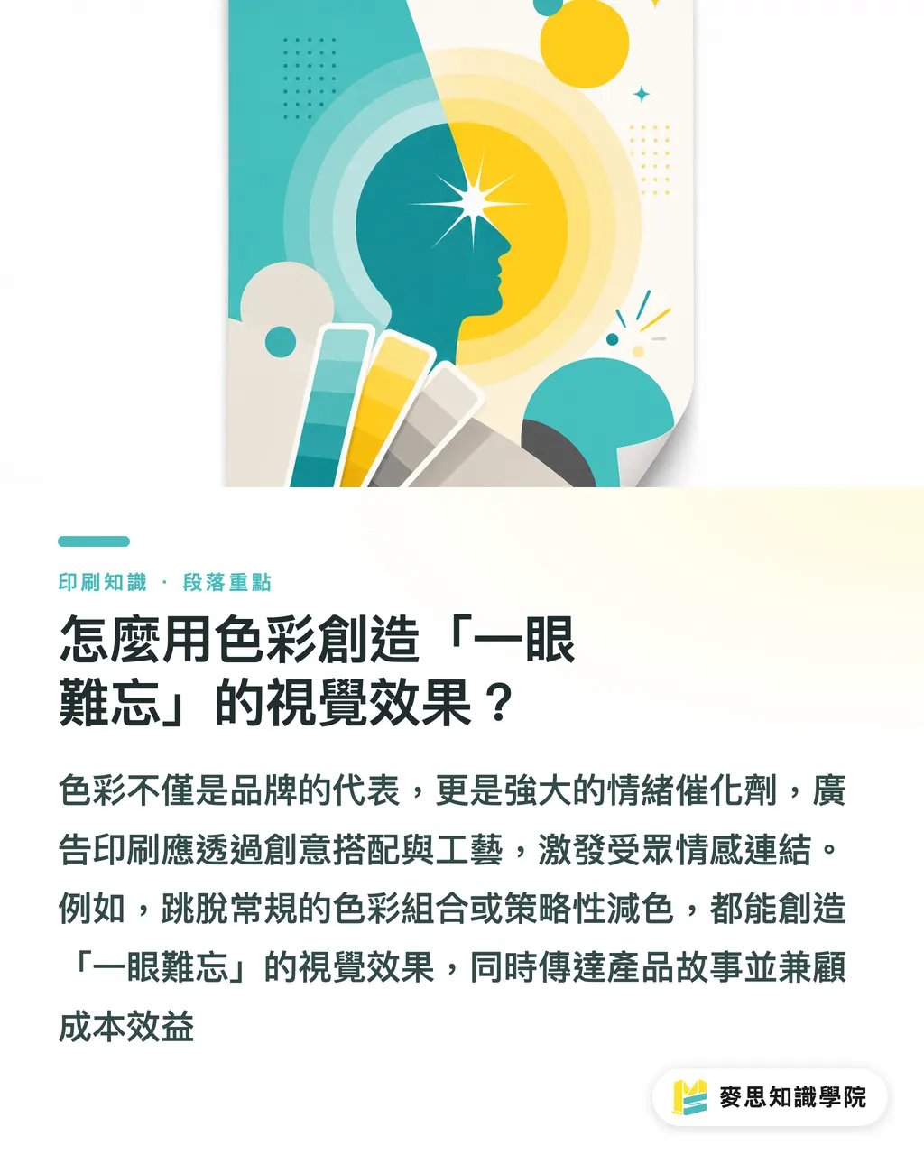
How to Use Color to Create an "Unforgettable" Visual Effect
Color represents more than just a brand; it is a powerful emotional catalyst. Color application in advertising printing goes far beyond faithfully restoring brand colors. It requires thinking about how creative combinations and craftsmanship can stimulate emotional connections with the audience, allowing the story of the product or service to speak for itself
In my experience, there are several aspects that can take color application to the next level:
・Out-of-the-box color combinations: Don't be afraid to use high-contrast or unexpected color combinations; if used cleverly, they create a strong visual impact. For example, for an eco-themed product, besides the common green palette, you can pair it with earth tones or light gray to emphasize naturalness and sustainability, rather than just "green environmentalism."
・Usage of special colors and metallic colors: If the budget allows, introducing Pantone Colors or metallic inks is a shortcut to instantly boost the premium feel of advertising materials. Spot colors ensure color purity and precision, free from the limitations of CMYK overprinting. I have seen clients use hot foil stamping or silver foil in combination with specific brand colors, instantly turning a simple card into a collectible; this is the magic that printing craftsmanship gives to color
・Subtractive color can also be creative: Don't assume more colors are better; sometimes "subtractive color" is a strategy. The European food giant Findus reduced their packaging from 6 colors to 4, reducing costs without compromising visual effect—this is the best case study. Selecting core colors and highlighting key points through design techniques and print layout makes information clearer while reducing costs for both the brand client and the printing house
In the Age of AI, How Can We Ensure Accurate Printing of Brand Colors?
AI-generated images are already a trend that can significantly improve design efficiency, but color issues often cause headaches for designers and printers. Colors generated by AI are often "very close but not exactly" your brand color, which is a major problem in the printing field that emphasizes precision
As a senior consultant, here is how I guide clients to manage printing colors in the AI era:
・Include color specifications in prompts: In the prompts for generating images, besides describing objects and styles, be sure to explicitly state the CMYK or Pantone values of your brand colors. For example: "Generate a product image primarily based on #FF0000." Although AI won't be 100% precise, it significantly improves the proximity
・Make good use of professional color correction software: After AI-generating an image, it must still be brought into professional design software (like Adobe Photoshop, Illustrator) for color correction. The key in this step is to utilize the software's color management functions to convert the AI image colors into a color mode that meets printing requirements
・Establish a color baseline with the printing house: Finally, communicate bi-directionally regarding the adjusted artwork with the printing house. Establish a mutually recognized color management workflow; from file transfer and color proofing to final sample printing, collaborate closely at every step to ensure brand colors remain precise and consistent in the AI era
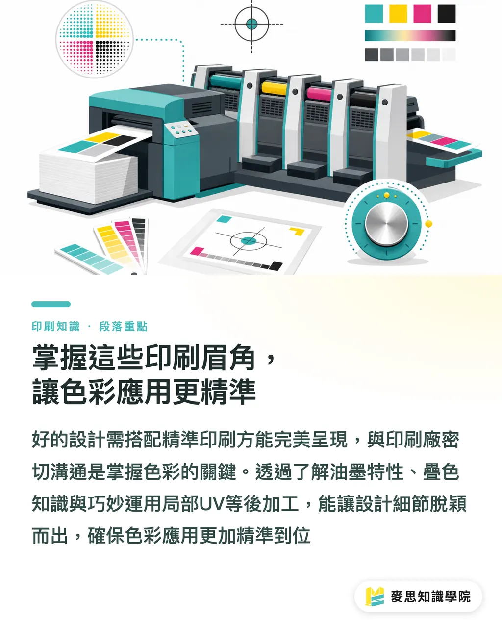
Master These Printing Nuances for More Precise Color Application
Having good design and the right colors isn't enough; the manufacturing stage is key to realizing these ideas. My years of accumulated experience tell me that printing houses are not just simple processors; they are your color consultants. The professional advice they can provide is often the secret to transforming your advertising materials
・Knowledge of ink properties and overprinting: Understanding the transparency and overprinting effects of different inks is the foundation of print color management. For example, Pantone spot colors can avoid color shifts that might be caused by CMYK four-color overprinting. Sometimes, cleverly using the semi-transparent nature of ink can even create unique visual layers
・The finishing touches of post-processing: Surface treatments such as matte lamination, gloss lamination, varnish, and UV spot coating can change the visual expression and tactile feel of colors. For instance, applying spot UV on a dark background can make specific patterns or text stand out, creating a visual contrast. Techniques like hot stamping and embossing can also allow colors to present varied textures under different lighting
・Complete communication from pre-press to post-press: Don't wait until it's printed to discover problems. Communicate closely with the printing house from the design finalization stage, confirming color settings, paper selection, post-processing details, and even delivery times and cost considerations. A good printing house can provide you with comprehensive solutions, just like MINDS Printing, which offers this one-stop integrated service from design conceptualization to finished product delivery, ensuring that design intent is perfectly presented in print to the greatest extent possible
Key Takeaways
The brand color system is the cornerstone of printing precision; ensure it is defined at the source
Breaking away from standard color combinations and utilizing special printing techniques can create a strong visual impact
Brand colors in AI-generated images require professional color correction and collaboration with the printing house to ensure print quality
Printing houses are not just processors; they are your color consultants. Early communication can save you a lot of wasted effort
Subtractive color can also be a creative strategy; strategically reducing ink quantity can achieve both cost and visual effects
Extended Thoughts
As a veteran in the printing industry, I truly feel that today's design and printing have entered an era of high integration. For designers, it's no longer just about understanding visuals but also comprehending the physical limits and infinite possibilities of printing. For printing houses, it's not just about being able to print; it's about providing comprehensive consulting services, from color management and paper recommendations to post-processing. Especially after the introduction of AI, while front-end efficiency has improved, the challenge of back-end color precision is greater, requiring a robust color workflow. In the future, partners who can provide "one-stop" services, seamlessly connecting the design end with the printing manufacturing end, will be the most trusted choices for brand clients
FAQ
- Why does my ad design look great on the computer, but it looks dark or has color differences when printed?
- Computer screens use the RGB additive color model, while printing uses the CMYK subtractive model. They work on different principles. If there is a lack of proper color management and proofing processes, color discrepancies in printed products are a common phenomenon
- Is it more expensive to use special colors (such as Pantone) compared to standard four-color printing?
- Usually, yes. Spot color inks require separate plate making and color mixing, but they ensure absolute color precision and saturation, which is difficult to achieve with CMYK overprinting. This investment is very worthwhile for companies that need to strictly maintain brand color tones
- Can AI-generated images be directly printed? Will the colors be accurate?
- It is not recommended to print them directly. AI-generated image colors are often geared toward digital screen display and require color correction and conversion using professional design software to meet the CMYK mode required for printing, ensuring accurate print colors
- How should I choose paper for advertising print materials? Will paper affect color performance?
- Paper has a significant impact on color. For example, coated paper is smooth with low ink absorption, making colors appear saturated and bright; uncoated paper is rough with high ink absorption, making colors appear more understated. When choosing, consider the brand tonality and budget, and discuss the most appropriate solution with the printing house
- To make advertising print materials more eye-catching, besides color, what printing techniques can be used to enhance them?
- Besides color, you can consider various post-processing techniques, such as spot UV, hot stamping, embossing, or die-cutting. These techniques can increase visual layering and tactile appeal, making advertising materials more textured and memorable