Why Your Brand Colors Shift Every Time You Switch Print Shops
For the past six months, my desk has been piled with AI-generated artwork from clients, all complaining about the same thing: why does the printed color look so different from what they saw on screen
Color drift across different printed materials is one of the most common pitfalls business owners run into
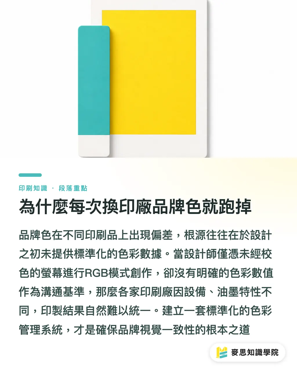
The root cause is rarely a technical failure on the print shop's end — the trap is usually set at the design stage
Many designers are in the habit of working in RGB mode on uncalibrated monitors, and some even hand AI-generated files directly to the printer
Every print shop runs different equipment, inks, and default color profiles
If all you provide is a vague color impression with no concrete data to bridge the gap, the final print might as well be a lottery
Solving this problem requires a system — not a fresh round of color matching every time you change vendors
What Specific Data Should a Complete Color Standard Include
If your brand logo always looks different on a phone screen versus a business card, it means you're missing a color standard that covers both digital and physical contexts
Based on my experience handling thousands of print projects, a standard that lets print shops and designers work together seamlessly must cover three core elements
・Precise Pantone spot color codes: the universal language of the print industry, ensuring absolute consistency for specific colors
・Standardized CMYK formulas: when the budget doesn't allow for spot colors, these values ensure four-color printing gets as close as possible to your brand color
・A clearly defined tolerance range (Delta E): perfect zero color difference isn't achievable in practice — we typically set Delta E to 3 or below as the acceptance standard for print quality control
Laying out these numbers clearly will save you the cost of endless back-and-forth and costly reprints
We now recommend that clients adopt cloud-based Brand Asset Management (BAM) tools
So that everyone — from marketing to design — pulls from the same cloud-based color settings, completely eliminating the chaos of version mismatches
How to Lock Down AI-Generated Image Colors at the Source
AI design tools are getting more powerful, but the colors they generate are always 'close but not quite' your brand color — and in printing, that gap is a serious problem
Even if you provide the correct color code, the AI-rendered poster may still shift your brand color due to lighting effects or filters
At this point, the human eye alone isn't enough — you need to rely on modern tools to keep things in check
There are now plenty of color detection tools on the market that can identify color deviations in a design before it goes to print
・Automatic out-of-gamut flagging: catches fluorescent and highly saturated colors that look vibrant on screen but can't be reproduced in CMYK
・Rapid comparison between AI artwork and brand standard colors: data analysis tells you exactly how many Delta E units the brand color has drifted in the file
Running these tools to sweep for hidden traps before handing files to the printer is the critical step that ensures your AI-driven creative lands perfectly in print
How Designers and Print Shops Can Sync Their Color Standards
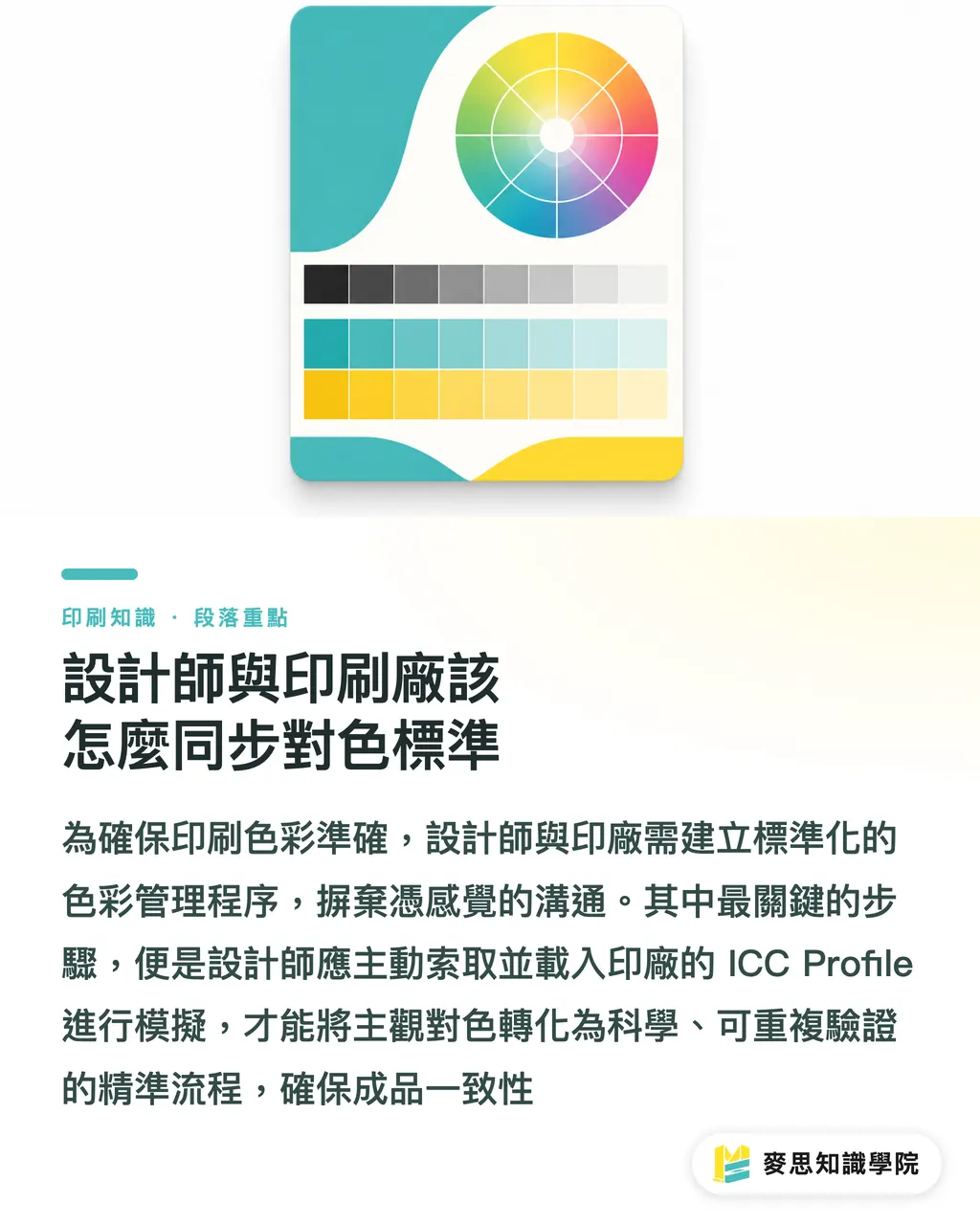
Before handing files to the print shop, the last mile of color management comes down to exchanging and confirming color profiles
This isn't something that can be handled with a verbal agreement — it requires a standard operating procedure that both sides have committed to
・Explicit ICC Profile exchange and loading: designers must request the print shop's ICC color profile for their equipment, then load it into their design software to simulate output
・Build a color handover checklist for switching print shops: include previously approved physical color samples, clear numerical specifications, and paper stock records so the new vendor has concrete benchmarks to match
・Insist on digital proofing: before going to press, require a color-corrected digital proof from the print shop — this is your last line of defense against errors
This process may sound tedious, but once it's in place, it transforms a gut-feel color matching exercise into a reproducible, science-based workflow
Key Takeaways
・Brand color drift is not a matter of luck — it's the absence of systematic data standards defined from source to output
・A complete color standard must include Pantone spot color codes, CMYK formulas, and a clearly defined Delta E tolerance range
・For color drift in AI-generated artwork, use detection tools to automatically flag out-of-gamut colors and run comparisons
・By properly exchanging ICC Profiles and insisting on digital proofing, you can get design and print speaking the same color language
Further Reflection
For design teams and print buyers, now is the time to audit your brand identity guidelines and check whether they're missing clear print values and tolerance ranges
Adopting a cloud-based Brand Asset Management system and establishing a standardized proofing approval process may increase communication overhead in the short term, but in the long run it's the best investment you can make in reducing reprint waste and protecting brand value
FAQ
- Why do colors that look perfectly normal on screen print out dull and muted
- Screens use RGB light emission, which covers a far wider color gamut than the CMYK inks used in printing. Sending files to print without converting through an ICC profile will produce significant color shifts
- My colors shifted when I switched to a new print shop — what should I do
- You need to provide a clear color handover checklist that includes previously approved physical color samples, Pantone color codes, and a defined Delta E acceptance threshold — giving the new vendor the scientific benchmarks needed to match your color
- Can I send AI-generated posters directly to the printer
- Absolutely not. AI files frequently contain highly saturated colors that CMYK cannot reproduce. You must first run the file through software checks and manually replace any brand colors with their standard values before it's safe to print
- What is Delta E and what does the value represent
- Delta E is a standardized measure of the visual difference between two colors. In print production, a Delta E of less than 3 is the commonly accepted threshold — a difference small enough that it's barely perceptible to the human eye
Related articles
- Avoiding Print Failures with AI-Edited Photos: The Correct Workflow for Product Image Background Removal and Lighting
- The Copyright Minefield of AI Designs in Print: Expert Guidance on Avoiding Infringement and Compliance Risks
- Automation Isn't Just for Large Enterprises: Three Practical Entry Points for Small and Medium-Sized Printing Plant Transformation