
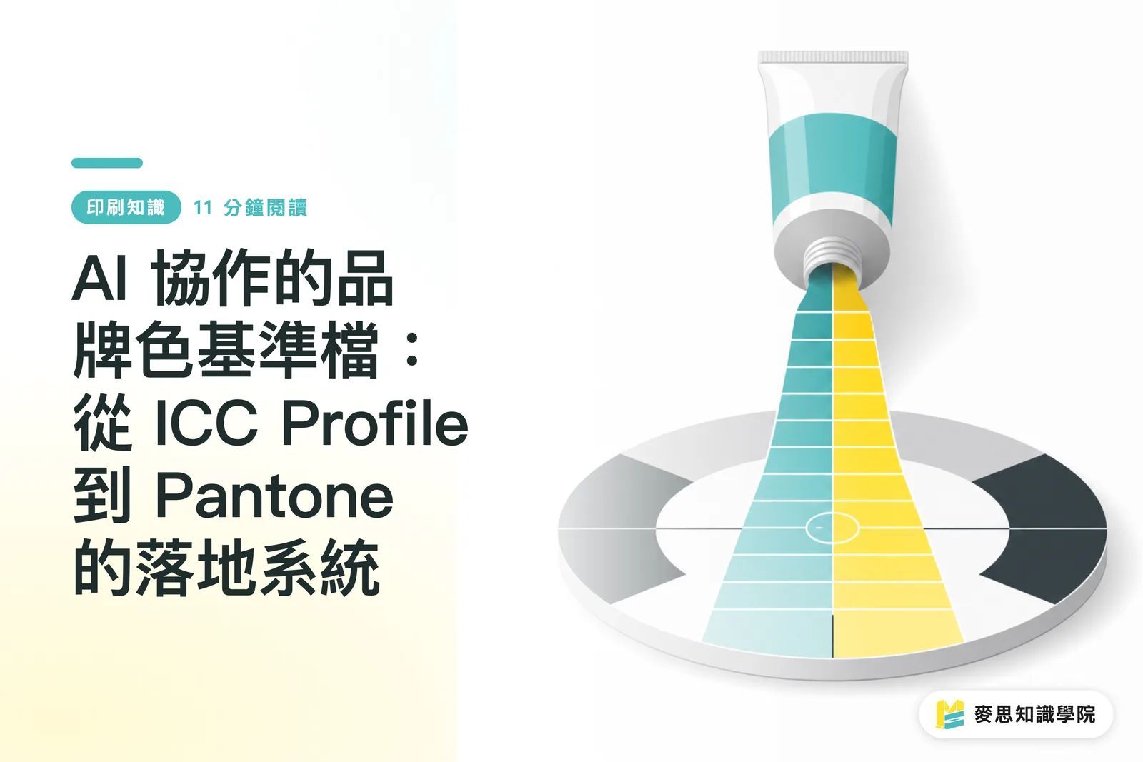
Why does AI-generated art always look 'almost right'?
The question I've been asked most in the past six months: 'I ran a visual in Midjourney or Firefly, it looks gorgeous on screen, but once it goes to print the Pantone swatch doesn't match.'
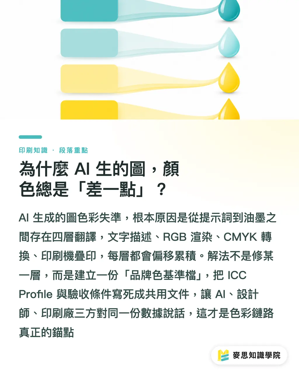
The problem isn't that the AI tool is dumb. It's that it has no idea what your Pantone is. It only understands semantic concepts like 'a magenta-leaning warm red.' Between that semantic idea and the ink on paper, there are at least four layers of translation:
・The 'brand red' in your prompt is just a string of text
・That text gets turned into RGB pixel values, and every AI tool uses its own default here
・RGB only gets a chance to become CMYK or a specified Pantone once it lands in Illustrator or Photoshop
・CMYK then hits the press and gets translated again by paper, dot gain, and trapping conditions
Four layers, and every one of them drifts. The fix isn't to push one layer harder, it's to tie the whole chain together with a single 'brand color baseline file.' Not something sitting in a senior designer's head, but written down as a file, written into the ICC Profile, written into the sign-off criteria, the one copy that AI, designers, and the print shop all share
This is the first of the three 'pre-press gates' Mai Strategy Knowledge Academy pushes with clients: anchor the brand color first
What role does an ICC Profile actually play in an AI workflow?
An ICC Profile is a color description file defined by the International Color Consortium. It records, for a given device or output condition, what color each numeric value actually produces within a certain gamut. In the print chain, keeping the design, the proof, and the press visually consistent comes down to a single tool that both ends agree on as 'the same ruler' — that's the ICC Profile
A lot of people think ICC Profiles are the print shop's job and that designers just need to install one. In practice it's the other way around: the ICC Profile has to travel from the design side all the way to output, and if any piece of software in the middle doesn't receive it or swaps the profile, the whole alignment collapses
Three things matter in practice:
・Calibrate the monitor first: use a calibrator (i1Display, ColorMunki, etc.) to bring the screen to D65 / 6500K with a stable color temperature, and store the monitor's own ICC Profile into the OS. If you skip this step, every later 'it looks right on screen' is a fake argument
・Sync the design software settings Photoshop, Illustrator, and InDesign should all lock to the same RGB Profile (sRGB IEC61966- 2.1 for screen display, Adobe RGB for photo editing) and the same CMYK Profile (GRACoL 2006 Coated or SWOP 2006 are common in Taiwan, depending on paper and press conditions). Set it up in one app, then use the others' 'Sync Settings' to match
・Align with the print shop: before sending to print, ask the shop which CMYK Profile they use (most mid-to-high-end commercial printers run GRACoL or Japan Color). Don't send your design-side profile straight to the press. When both sides match, the proof will actually resemble the screen
If you want the AI tools to play along with the ICC Profile, support is uneven across the board right now:
・Midjourney and Firefly mainly take prompts and reference images, they don't accept external ICC Profiles. The only workaround is indirect: color-correct the reference in Photoshop first, export a clean sRGB image, then feed it to the AI
・Photoshop's Neural Filters and Generative Fill inherit the working space settings, so if you pick the right CMYK Profile when creating a new document, AI-generated content converts to print colors more predictably
・Adobe Firefly inside Photoshop (Generative Fill / Expand) can read the document's Profile; the standalone web version can't
That limitation is the reality, so the baseline file can't live inside the AI tool. It has to be built back in from the design side

What should a brand color baseline file actually look like?
A baseline file that actually works on the ground needs to answer at least four questions:
・What is this color called in the Pantone system? (e.g., Pantone 186 C, a standardized swatch any printer with a fan deck can reproduce anywhere in the world.)
・What's the target value in CMYK digital proofing? (e.g., C 0 / M 100 / Y 76 / K 4 is the coated-paper approximation of Pantone 186 C, but that's a starting point, not a finish line.)
・What's the allowed color difference in Delta E? (For general brand colors I'd recommend ΔE ≤ 2; for core identity colors like the logo's primary, hold ΔE ≤ 1. ΔE is the color-difference formula defined by the CIE, the smaller the number, the harder it is for the eye to tell them apart.)
・On which paper stock and with which finishing does that number actually hold? (The same Pantone will have a different ΔE range on coated paper, art paper, and matte PP.)
In practice, I tell clients to build the brand color baseline as an Excel or Google Sheet, paired with a PDF swatch sheet, with these columns:
・Chinese color name and internal brand code (e.g., 'Primary Red')
・Pantone number (Solid Coated / Solid Uncoated / Metallics, each in its own column depending on what the brand uses)
・RGB value (for screens)
・HEX value (for web)
・CMYK target (for print, separate columns per paper)
・ΔE tolerance (separate columns per paper)
・Corresponding ICC Profile name (note which file and which version)
・Applicable use cases (key visual, secondary visual, documents, web, social)
・Last updated date and owner
This file should be something a designer can open and use, something a print shop can open and match against, and something the AI tools (via reference images or prompt templates) can also read. Anyone can maintain it, anyone can edit it, but there have to be version records, no 'we changed it in the LINE group' culture
The maintenance rules are simple. Three of them is enough:
・Any color change must update Pantone, CMYK, and ΔE together. Editing RGB alone is not allowed
・ΔE measurements for the same brand color across different papers should be re-proofed every quarter, especially after switching paper suppliers or presses
・The 'master version' of the baseline file is held by one owner on the brand side. Changes need a reason and a date. Everyone else is read-only
After AI generates an image, how do you verify the colors haven't drifted?
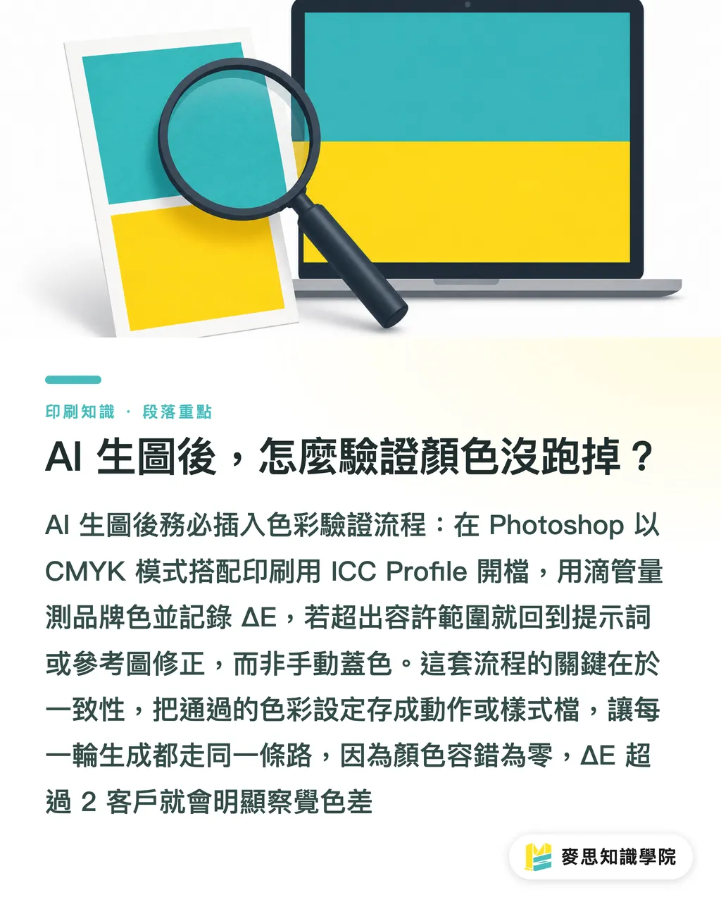
A lot of people think 'AI finishes the image, hand it to the printer and we're done.' In practice this is the step that goes wrong most often, because AI outputs are RGB pixels with no Pantone or CMYK logic attached
I'd recommend inserting a 'color verification' step right after AI generation. Here's the actual flow:
・When creating a new document in Photoshop, pick 'CMYK Color' mode straight away and assign the print ICC Profile, so anything AI generates (via Generative Fill or third-party plugins) lands in the correct gamut
・Once it's generated, use the Eyedropper and the Color Picker to measure the brand color blocks and record the ΔE. If it exceeds the tolerance in the baseline file, go back to the prompt or reference image, don't just sample and paint over it manually
・For core brand colors (logo primary, signage color), produce a 1:1 digital proof and send it to the print shop for color matching before deciding whether to go into production
Once you've iterated enough times, save the 'passing' color settings as a Photoshop Action or an Illustrator Style. Next time you run AI generation, you can apply the same Profile in one click and cut down on human skip-settings
The point of this verification flow isn't that it's strict, it's that every generation follows the same path. 'Remembering each time' is a failed design, because color has zero margin for error: past ΔE 2, the client already feels 'the color is off.'
How do you push the baseline file from design to print?
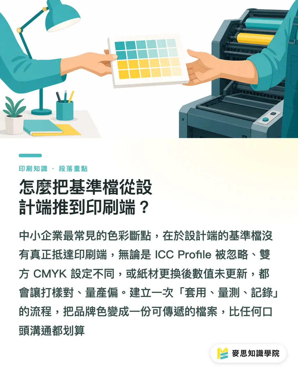
No matter how nice the baseline file looks, it does nothing if it never reaches the print shop. The three breakpoints I see most often in small-to-mid businesses:
・The design file ships with an ICC Profile embedded, but the shop's RIP (Raster Image Processor, the hardware/software that turns vector or page-description language into the dot data the press needs) ignores it and runs its own default
・Design and print are using different CMYK Profiles (e.g., design on SWOP, print on GRACoL) and nobody aligned them upfront
・The paper changes at the last minute, but the CMYK column in the baseline file doesn't get updated, proof matches, production drifts
Three simple moves clear those breakpoints:
・When sending to print, embed the ICC Profile in the PDF's Output Intent (PDF/X-4 or PDF/X-1a) and write the Profile name and version on the job sheet
・For a first-time vendor or a switched paper, require the shop to run a digital proof and measure ΔE before going into production. Don't skip the proof and print straight
・Attach the PDF swatch sheet and the Excel from the baseline file alongside the job. The shop will know exactly: 'this brand's red is this number, this ΔE, this paper.'
If you want to be even more solid, you can print the digital swatches from the baseline onto actual production substrates as a physical 'brand color reference card' (e.g., matte with matte lamination on one sheet, gloss with gloss lamination on another) and use it as a live reference for color matching. This is especially valuable for brands with physical signage, event booth prints, or cross-material extensions, different materials have different ΔE tolerances, and a physical reference beats both the screen and the PDF
The whole thing sounds like a lot of steps, but once you've set it up, daily operation just needs three actions: 'apply, measure, record.' Turning brand color into a file instead of a memory is the single best investment a small-to-mid business can make in its brand
Key Takeaways
Brand color shift isn't the AI being inaccurate, it's that there's no baseline file tying the four layers of translation together
ICC Profiles must align end-to-end: monitor calibration, design software, and the press RIP. If any layer breaks, everything breaks
A brand color baseline file needs at least five columns: Pantone, CMYK, ΔE tolerance, applicable paper, and ICC Profile name
Always measure ΔE after AI generation. Don't eyeball whether a brand color is correct
Attaching the baseline PDF swatch sheet and Excel to every print job is the cheapest and most effective brand protection a small-to-mid business can buy
Further Thinking
From a consultant's seat, color management is the easiest-to-overlook, highest-ROI piece of foundational work for small-to-mid businesses. Most owners spend on e-commerce platforms, CRM, and generative AI tools, and forget that the moment a customer holds the physical product, whether the color is right is the final gate on brand impression
Suggested next steps:
・First, audit your brand colors. Separate 'core identity colors' (logo, signage) from 'extended colors' (campaigns, social). Hold the core colors at ΔE ≤ 1; extended colors can sit at ΔE ≤ 2
・Pick 1–2 commonly used paper stocks and build the baseline file from there. Don't try to build a full swatch library on day one. Do what you'll use, skip what you won't
・Integrate the baseline file with the AI tool workflow. That way, even when designers or print shops change, the color standard travels with the brand
If you want a ready-made brand color baseline template (with Pantone, CMYK, ΔE, and ICC Profile columns), you can request one from the Mai Strategy Knowledge Academy consulting team. For full commercial printing, brand color swatch proofing, or cross-material extensions, the mid-to-high-end fully custom service at MINDS Print (MS, mid-to-high-end fully custom commercial printing) is worth a look
Further Reading
(This piece is a consultant's practical write-up; no external statistics or research sources are cited.)
FAQ
- A small color shift after AI generation, does it really affect print?
- Yes. Small differences on screen get amplified after the CMYK conversion and paper absorption; visible drift usually starts at ΔE 2 or above. Brand colors should be kept within ΔE 2, and core colors within ΔE 1
- Are ICC Profiles something only the print shop has to handle?
- Wrong. ICC Profiles need to travel from monitor calibration all the way to the press RIP. If any software in the middle drops the ball, the chain breaks. If the design side hasn't calibrated the monitor and set the Profile, every later color check is a fake argument
- Can I just take a Pantone number straight to print?
- No. Pantone is a reference standard; actual print still needs a specified CMYK target, paper stock, and ΔE tolerance. The same Pantone will have a different ΔE on coated paper versus art paper, and that needs to be recorded in separate columns in the baseline file
- We're a small-to-mid business with no calibrator, where do we start?
- Start with the baseline file. Translate your brand colors into a four-column Excel sheet: Pantone, CMYK, ΔE, and paper stock. Ask the print shop to help measure ΔE on one digital proof. The calibrator can come later, but the baseline file can't wait
- Can Midjourney or Firefly take a Pantone number directly?
- Not right now. Both tools mainly take prompts and reference images and don't accept external ICC Profiles. The workaround is to turn the correct colors from your baseline into a reference image (color-corrected in Photoshop and exported as sRGB), then feed that reference to the AI as a style anchor
Related articles



The Print × AI weekly
The print and AI know-how designers, brands and enterprises can use before they commit — one email, every week
Tool Library
RGB↔CMYK conversion, ΔE color difference and brand color print analysis — free color management tools, computed right in your browser.
MINDS Group
Need actual printing or gifting services?
From premium printing to online ordering and festive gifts — the MINDS Group sister brands take it from here.