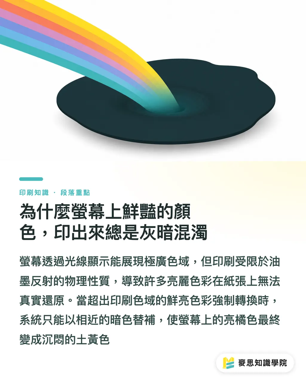
Why do vibrant screen colors always look dull and muddy in print?
This is the most common complaint and frustration I've heard over my decade-plus in the printing industry
It's not that your screen is broken, nor is it a blunder by the print shop; it's a fundamental difference between light emission and physical reality
Screens emit light through RGB sources, capable of displaying an extremely wide gamut, especially glaring neon greens or vivid blues and purples
Printing, however, relies on reflecting light using CMYK inks. Physics dictates that its gamut limit is far smaller than that of a screen
When you forcibly transfer those brilliant colors—which exceed the CMYK gamut—onto paper, the system has no choice but to automatically substitute them with the closest available darker tones
This is why a bright orange on screen often ends up looking like a dull, earthy yellow in the final print
According to the foundational concepts of 'Color Management and ICC Profiles,' the Adobe RGB gamut found on high-end monitors is nearly 30% larger than traditional printing standards
This means a huge proportion of the vibrant colors you see on screen simply cannot be replicated on a printing press
What is an ICC Profile, and why is it key to precise color matching?
To bridge the aforementioned gamut gap, we must rely on ICC Profiles (International Color Consortium profiles) as our communication bridge
Simply put, they act as specialized color translation dictionaries between different devices
Every monitor, every printer, and even every type of paper has its own unique 'temperament' and limits for interpreting color
Applying the correct ICC Profile tells the system how to safely translate RGB colors into the CMYK values that specific device can actually produce
To ensure this translation process is accurate, the first step must be monitor calibration
If your monitor is severely off-color, adjusting settings is like color-grading while wearing tinted glasses; no amount of numerical precision will fix the result
Currently, Japan Color is the standard commonly followed for general printing in Taiwan, while Fogra specifications are widely used in Europe and the US
This is why designers must confirm which profile to use with their printer before finalizing their files
Why does the color of the same file change when I switch paper?
Many believe that setting the correct CMYK values is foolproof, yet they overlook the biggest variable: the print substrate
The same set of values printed on smooth coated paper versus highly absorbent uncoated paper can look so visually different they appear to be two separate files
Coated paper has a surface layer that keeps ink on top, making colors appear saturated and sharp
Uncoated paper causes ink to sink and spread rapidly, causing the overall color to become dull and significantly reducing contrast
This is why you need to pair your design with a specific paper ICC Profile for different materials
Through 'Soft Proofing,' designers can simulate the absorption and reflection characteristics of specific paper on their screens in advance
By loading the correct profile in your design software, your monitor can accurately predict the dulling effect as ink absorbs into paper fibers, allowing you to manually adjust your values before sending the job to print
What should designers do? A consultant's fool-proof checklist
Theory aside, let's look at how to effectively avoid these reprint disasters in practice
Building a reliable color management workflow is about aligning standards from the start, rather than blindly converting files at the very last minute
I typically advise clients and design teams to strictly follow these operational principles at the project's inception:
・Establish a working gamut: Set your software color mode to CMYK early in the design phase and load the profile specified by the print shop
・Avoid extreme colors: Identify and remove hazardous, ultra-vibrant colors near the edge of the RGB gamut; if brand colors must be used, prepare a budget for spot colors
・Regular monitor calibration: Use a hardware calibrator periodically to reset your monitor's colors, ensuring you have an objective benchmark for what you see
・Make good use of soft proofing previews: Be sure to turn on the proof colors feature before exporting to simulate the actual color rendering of the paper and conduct a final check
By faithfully executing these steps and utilizing the professional prepress expertise of the MINDS team, you can minimize the risk of color discrepancies

Summary of Key Points
Screens and prints rely on different light principles; RGB's larger gamut compared to CMYK is an irreversible physical limitation
An ICC Profile is a cross-device color translation dictionary that ensures screen colors are accurately converted into instructions for the printing press
The ink absorption characteristics of different papers directly alter color representation; you must re-evaluate the same file if you switch paper stock
The starting point for precise color matching is monitor calibration; if the monitor is inaccurate, subsequent soft proofing and numerical adjustments become meaningless
From setting your working gamut to soft proofing previews, establishing a standardized workflow is the best solution for stopping reprint disasters
Extended Reflections
From my first-hand practical experience, color management isn't just about technical settings; it is the foundation for building trust between design and print teams
Many clients partnering with the MINDS Printing team first notice the drastic reduction in communication time and reprint costs
When we digitize print standards and paper characteristic data, and provide clear soft-proof predictions before printing, both sides no longer need to argue over color differences
For AI applications and software developers, the opportunity lies in integrating this complex logic directly into design workflows
Allowing non-professional users to automatically avoid dangerous colors that exceed print limits is the truly practical direction for solving industry pain points
FAQ
- Why is there still a color difference even though I use a high-end Apple monitor?
- High-end monitors have a wider gamut, meaning they can display colors that the printing press simply cannot reproduce. Without proper color mapping settings, the discrepancy will actually be more severe
- Can I just convert old RGB files directly to CMYK for printing?
- A forced conversion will cause the system to automatically compress the vibrant colors that exceed the limit, usually resulting in colors becoming dark and gray. We strongly recommend turning on proofing mode in your software to compare and fine-tune your values
- How should I adjust color settings for printing on uncoated paper?
- Uncoated paper has high ink absorption, which makes colors appear flatter. We recommend increasing the contrast of your photos during design and loading the specific 'Uncoated' profile in your software to preview the effect
- Is it accurate for a designer to check colors using an office printer?
- The ink and paper characteristics of office printers are completely different from commercial equipment in factories. Printing them yourself is only useful for checking layout proportions; for color accuracy, you must look at the digital proof provided by the print shop