

Overview
Getting consistent color across every order can't rely on a press operator's eye and experience alone. It requires G7 print standardization and ICC color management
When the Mai Strategy Knowledge Academy consulting team works with a company, they start by establishing gray balance standards, giving screen design and final output an objective data trail to follow
Why does the printed color shift every time, even when the file hasn't changed?
A lot of clients have asked me this: the file link hasn't been touched, so why does the reprint look different from last time
It's not the print shop being difficult. There are just too many physical variables in the production process
Moisture content varies by paper batch, temperature and humidity shift on the shop floor, ink batches differ, and even the blanket's condition on a given day can throw off the color
The old industry habit was to chase color by eye, with the operator looking at the previous batch's sample and manually adjusting CMYK ink volumes
The risk with that approach is that the standard changes the moment you swap operators or machines
The systemic root cause behind screen-to-print color mismatch is the same story: without a defined standard, color drift is inevitable
ICC Profile: a device color description file defined by the International Color Consortium. Like a translation dictionary, it records a specific device's color gamut, ensuring design files map accurately and render consistent color when converted between screen and press
What problems does G7 print standardization actually solve?
Fixing the error margin of eyeball judgment means relying on objective data
Print shops have spent the past few years talking about getting G7 certified, and this standard differs from the old approach that only tracked dot gain
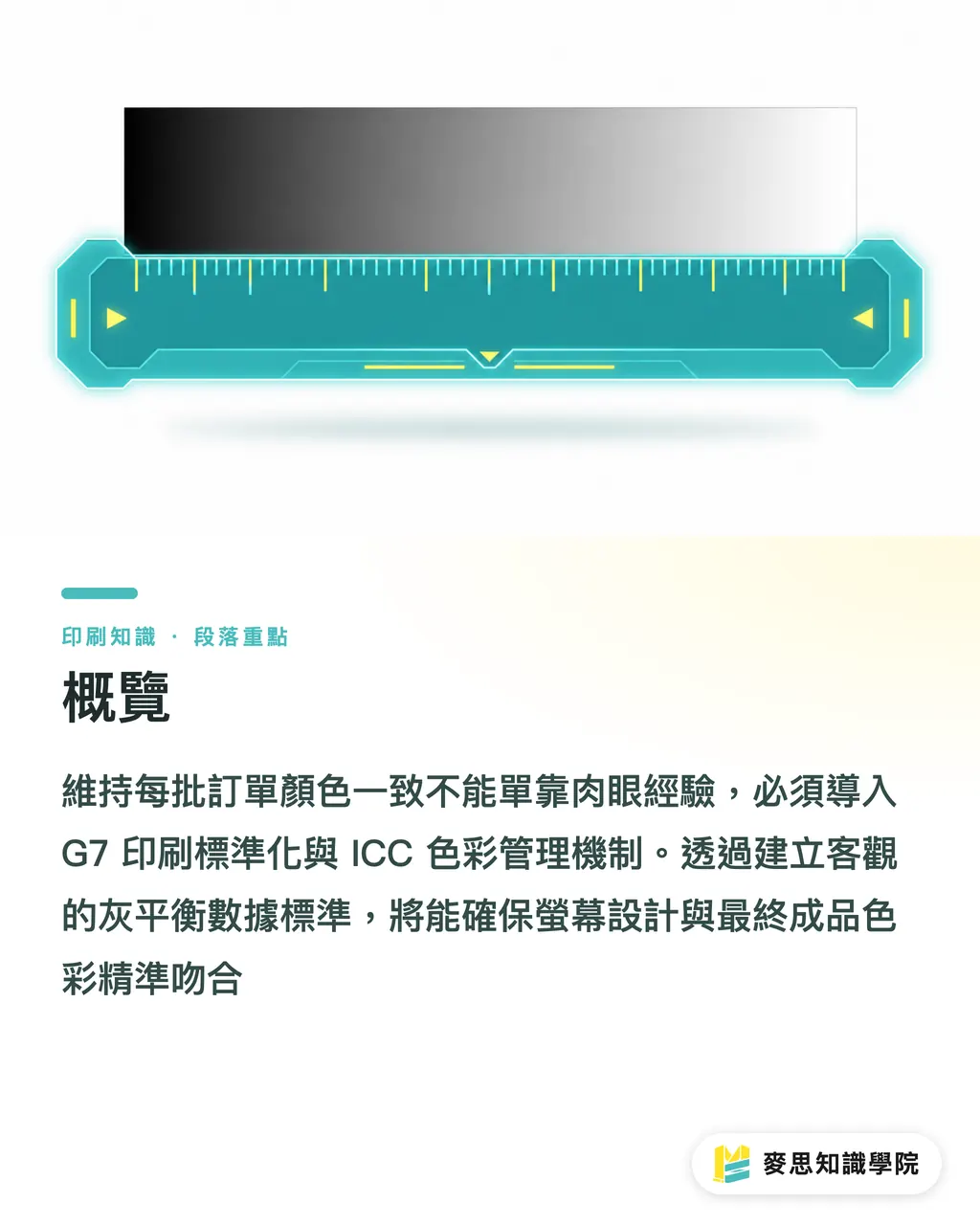
It targets the soul of color science: gray balance
G7 standardization: a perception-based color control method that precisely defines the gray tone produced by overprinting CMY, ensuring consistent neutral gray and color rendering across different presses and substrates
The logic behind G7 is straightforward: nail the neutral gray scale, and the highlights, shadows, and color layering of a full-color image fall into place naturally
Once a factory has this data standard, every press run just means reading the values off a control strip with a spectrophotometer, and the job doesn't proceed until it hits target
That's what keeps color stable across different batches, or even when the same file goes to different plants in Taipei and Taichung
What should the brand side do? MINDS' (MS) three-gate color management framework
You don't need to buy your own measuring instruments, but procurement and design still need a management framework
I usually recommend clients work through MINDS' (MS, mid-to-high-end fully custom commercial printing) three-gate color management framework to tighten up internal process and minimize variables
・Build a brand color system: lock down digital and print specs at the source, including exact RGB, CMYK, and Pantone values, and confirm the color tolerance on commonly used substrates
・Define when to use spot color versus four-color: for large areas of brand identity color, or special substrates like kraft paper that absorb color heavily, specify Pantone spot color directly. Four-color overprinting has its limits, so don't skimp on the extra plate cost when it's warranted
・Set a standard proofing acceptance benchmark: every job order should require a digital proof with a color control strip attached, signed off by both sides as the sole standard for bulk-run acceptance. If your team lacks the judgment experience for this, the Mai Strategy Knowledge Academy consulting team can review the proof data directly, avoiding disputes that only surface once the job is already on press
Does standardization still hold up on special substrates?
Printing on uncoated or fine art paper, ink absorption behaves nothing like it does on coated stock
This is where the value of an ICC Profile really shows
By building a dedicated characterization profile for a specific paper, we can preview on screen how the ink will look once it sinks into that dull, absorbent surface
Standardization isn't magic. It can't make rough gray cardstock print with the sheen of photo paper
But it can predict the outcome, letting the designer decide before sending the job whether to adjust contrast or switch to a spot color
Matching spot color choices precisely to the digital workflow is what keeps brand identity consistent across every substrate
Key Takeaways
Batch color drift comes from physical variables and eyeball color-matching. The fix is a data-driven color management process
G7 standardization controls gray balance to keep color consistent across different equipment and batches
Brands should build a complete color system spanning digital and print from the source, and use spot colors to protect key brand identity elements
Food for Thought
Treat color management as risk control. Plenty of companies try to save a few hundred dollars on proofing fees and end up scrapping and reprinting an entire batch. Setting clear standards and requiring suppliers to provide data proving they hit target is what actually protects brand image and cuts communication costs in the long run. If you want to build color literacy inside your own team, start by subscribing to the Mai Strategy Knowledge Academy newsletter for practical guides on avoiding these pitfalls
FAQ
- We only have designers on staff, no color management equipment. Can we still hold our print shop to standard?
- Yes. When placing an order, just ask the print shop directly whether they hold G7 certification, and require a color control strip to be printed on both the proof and the bulk run. Asking them to provide a passing measurement report is itself a form of quality pressure
- Why does an orange that looks bright on screen always come out looking muddy and dull when printed?
- That's a device gamut mismatch. A backlit screen's color gamut is far wider than what print ink can reproduce. The fix is to preview with the correct print ICC Profile loaded during the design stage, or switch to a Pantone spot color for that kind of saturated hue
- We have leftover flyers from the last print run. Can we just hand those to the print shop as a color reference this time?
- Strongly not recommended. Paper and ink oxidize and fade over time, so matching color against an old sample only drifts the color further with each generation. The correct approach is always to use a fresh standard digital proof output from the original file as the acceptance benchmark
Related articles




The Print × AI weekly
The print and AI know-how designers, brands and enterprises can use before they commit — one email, every week
Tool Library
RGB↔CMYK conversion, ΔE color difference and brand color print analysis — free color management tools, computed right in your browser.
MINDS Group
Need actual printing or gifting services?
From premium printing to online ordering and festive gifts — the MINDS Group sister brands take it from here.