

Why Do Brand Colors Always Seem a Little Off in Print? The Problem Usually Starts Earlier
"The logo red was supposed to feel bold and energetic, but it printed like tomato red." "That blue on the swatch turned grayish blue on coated paper." I have heard complaints like these for more than a decade. Most of the time, the issue is not the press at the print shop. The mistake was already made somewhere between choosing the swatch, setting up the file, and handing it off
When MINDS (MS, mid- to high-end fully custom commercial printing) reviews client files, the most common situation is this: a designer picks a Pantone code on screen, saves it as CMYK, and sends it to the print shop. Of course the printed result is wrong. Screen display, CMYK simulation, and Pantone premixed ink are three completely different paths. You have to decide which path you are taking from the start
The core rule is simple: if the color has to print accurately, print it as a spot color. Use CMYK only when simulation variance is acceptable
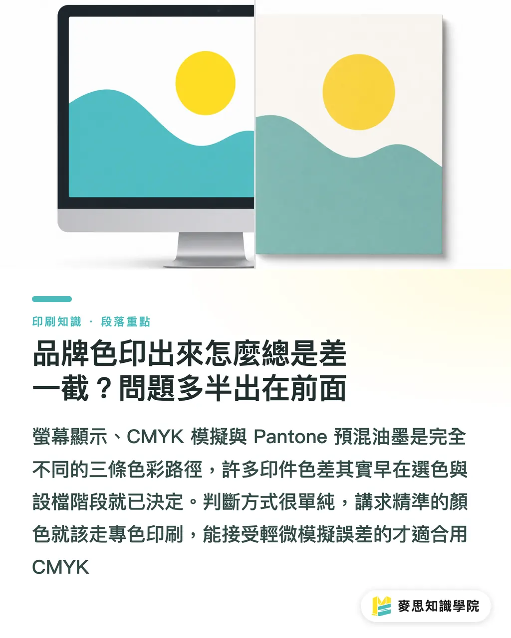
What Is the Difference Between Spot Color and CMYK?
Many people treat Pantone as a "color number." In reality, it is a standard for premixed inks. Once you understand that, everything else makes sense
・Spot Color: The ink is mixed in advance according to the Pantone formula before it reaches the press. During printing, it is applied directly with its own plate and hits the target in one pass. The color is stable, predictable, and not affected by overprinting blends
・CMYK: Four plates, cyan, magenta, yellow, and black, are used to simulate colors through halftone overprinting. The printable gamut is limited. Metallic colors, fluorescent colors, and some saturated colors simply cannot be built with CMYK
・Why it matters: If a brand logo color, metallic color, or corporate identity color is simulated in CMYK, color variation will show up from run to run. With spot color printing, as long as the ink batch is stable, the piece printed in Taipei and the piece printed in Kaohsiung will look the same
The practical rule is plain: if CMYK can print the color well enough, CMYK is fine. If CMYK cannot print it, or if the color must stay consistent every time, the brand's primary color should be printed as a spot color
How Do You Choose the Right Pantone Swatch? The Paper Version Has to Match
Many designers look only at the number when choosing color, Pantone 185 C or 185 U, for example, but that C and U are very different
・Coated (C): Coated papers such as art paper and gloss-coated stock have a smooth surface. Once the ink sits on the sheet, the color appears more saturated
・Uncoated (U): Uncoated papers such as woodfree paper and offset paper absorb ink. Colors look deeper and more muted
・Metallics: Used for metallic foil, silver foil, or metallic ink, with its own dedicated swatch book
・Why it matters: The same color code printed on coated paper and woodfree paper can show a visible difference of more than 20%. Choosing the wrong paper version is one of the most common reasons brand colors go off track
My own process is this: when a project comes in, I first check what paper the client has specified, then choose the color from the matching swatch book. If the client gives only a color code without specifying the paper surface, I confirm what paper it will be printed on, then pick the corresponding version from that swatch book. Spending five extra minutes here saves a lot of back-and-forth later
When Is It Worth Adding a Fifth Spot Color?
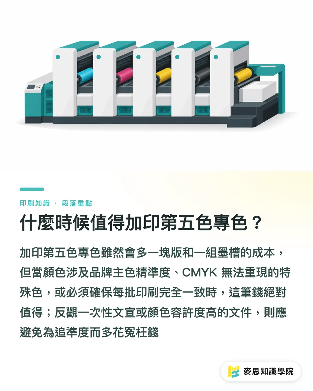
Adding a spot color means adding another plate and another ink unit. For small and mid-sized businesses, every color is a cost. The industry's decision logic is clear
・High accuracy is required for the brand's primary color: Logo red, corporate identity blue, annual standard colors. If a color like this prints wrong once, the cost to the sales side can far exceed the cost of one plate
・Colors CMYK cannot reproduce: Fluorescent colors such as fluorescent yellow and fluorescent pink, certain highly saturated oranges and greens, metallic colors such as silver and gold, and some Pantone fluorescent swatch colors. No amount of overprint adjustment will get them there
・The color has to be the same every time: Continuously produced packaging boxes, manuals, and annual gift boxes need spot color to keep one carton consistent with the next
・When not to spend the money: One-off flyers, event DMs, and internal documents with loose color requirements do not deserve the extra cost of another plate just for accuracy
The framework often used by MINDS (MS) is the first gate in the "MINDS (MS) three print submission gates": first confirm whether this color is worth printing as a spot color, then move on to file setup and proofing
How Should Files Be Set Up So Spot Colors Are Not Automatically Converted to CMYK?
This is the most common trap on the design side, and one of the biggest headaches for print shops
・Illustrator / InDesign setup steps: Open the Swatches panel, choose New Swatch, set the color mode to Spot Color, then enter the Pantone code, for example Pantone 185 C. Once this is set, the color blocks in the file carry spot color attributes and will not be converted to CMYK at output
・What you must never do: Do not manually enter the RGB or CMYK approximation of a Pantone code into a CMYK swatch. The system will treat it as an ordinary four-color build, so the printed result will be wrong
・Preflight before conversion: When exporting PDF, check Preserve Spot Color Channels. Illustrator has this under Advanced output options, and InDesign has it in the Output settings of the Adobe PDF preset. If every Pantone color in the PDF you send out has been converted to CMYK, this option was missed
・Another common mistake: When copying colors from a website or the Pantone official color lookup tool, the tool usually provides an sRGB or CMYK approximation by default. You still have to change it to Spot Color inside the design software
I once saw a typical case: the client's logo red was clearly specified as Pantone 185 C, but when I opened the supplied PDF, every red object had been converted to CMYK. Of course it printed wrong, and both sides argued for a while before discovering that the design assistant had forgotten to preserve spot colors during export. File setup mistakes can cost an entire reprint
What Limits Do Spot Colors Have on UV Coating, Synthetic Paper, and Metallic Foil?
Special substrates and finishing processes change how Pantone colors appear. Many designers do not know this until they run into trouble
・UV coating: After coating, colors tend to look darker and glossier. This variable should be considered during color selection. Proof first before mass production
・Synthetic paper, such as uncoated PP and PET: The surface does not absorb ink. Colors look saturated but somewhat dry. Whether the corresponding swatch should be Uncoated or another series needs to be confirmed with the print shop first
・Metallic foil, or hot stamping: This is a transfer of metallic film, not ink. Pantone Metallics swatches refer to metallic ink, not hot stamping foil. The two effects are different. Gold foil comes in many versions, including gold, bright gold, antique gold, and champagne gold. You cannot specify it with a Pantone code
・Why it matters: Colors on these materials cannot be judged directly against a Pantone swatch printed on coated paper. You must proof and match the color on the actual substrate
How Do You Tell the Print Shop to "Preserve Spot Colors"? The Right Handoff and Proofing Process
The final mile is about how to say it and how to confirm it. Many disputes happen because this step was not handled firmly enough
・Information to include when handing off files:
・Full color name, for example Pantone 185 C, not just "185" or "red"
・Specified paper version, such as Coated, Uncoated, or Metallics
・Planned paper material, so the print shop can judge whether the swatch version matches
・Preservation status of the special color channels inside the PDF
・Standard proofing procedure:
・When asking the print shop for a digital proof or physical proof, include the matching Pantone swatch
・Match color under a standard light booth, D50 or D65, not beside a window or under office lighting
・Color difference tolerance is usually within ΔE 2, depending on industry. Food, medical, and brand-primary colors are stricter
・Full process for the MINDS (MS) three print submission gates:
・① Color selection gate: Choose from a physical swatch, match the paper version, and confirm whether the color is worth printing as a spot color
・② File gate: Set Spot Color, preserve spot color channels in PDF, and confirm with Acrobat preflight after export
・③ Proofing gate: Proof on the actual substrate, match color under standard lighting, and confirm the ΔE tolerance in writing
・Why it matters: If all three gates are handled properly, the chance of the print coming out wrong is very low. If any one gate is skipped, the discussion later turns into an argument over whose monitor is more accurate
From the cases that have passed through my hands, eight out of ten problems came from unclear communication, not print quality itself. Write it down, sign it off, and keep a record. That works better than anything else

Key Takeaways
・Pantone is a premixed ink standard, not a screen color number. If the color has to print accurately, it must be printed as a spot color
・Coated and Uncoated are two different swatch systems. Choosing the wrong paper version is the most common reason brand colors drift
・The file must be set as Spot Color, and the PDF must preserve spot color channels. You need both
・Metallic colors, fluorescent colors, and brand-primary colors that CMYK cannot reproduce are the ones worth paying for as a fifth color
・Color matching must be done in a standard light booth with a proof on the actual substrate. Comparing colors by eye in daylight is not accurate
Further Thinking
This spot color workflow may look tedious, but for brand owners, every print run adds to the brand impression. For print shops, every color dispute burns time and reputation. The lesson for designers and buyers is simple: turn color selection, file setup, and color matching into a standard SOP. Follow the checklist every time a project comes in. What you save is not only the cost of rejected proofs, but also the client's trust in you. For small and mid-sized businesses looking to bring in AI, these three gates are also among the easiest parts to automate: automatically detecting whether spot colors have been converted to CMYK, or using AI to compare proof samples against swatches and calculate ΔE values. Tools like these are already changing how smaller print shops take orders, and they are worth watching
Further Reading
This article is original practical training content, based on the author's years of consulting experience in the printing industry and the existing knowledge materials below. It does not cite third-party statistics or research reports
FAQ
- Can Pantone color codes be converted directly to CMYK for printing?
- Yes, but there will be color difference. Pantone has a wider gamut than CMYK, so after conversion, some saturated colors, especially fluorescent colors, metallic colors, and certain blue-violet tones, will become visibly darker or muddier. If it is a brand-primary color, spot color printing is recommended instead of CMYK simulation
- How different are Coated and Uncoated swatches?
- The same color code on coated paper (C) and woodfree paper (U) usually shows a visible difference of more than 20%. Coated paper produces saturated, vivid color, while woodfree paper produces deeper, more muted color. Color selection must match the version for the actual paper being used, otherwise the printed result will definitely drift
- How can I confirm that the exported PDF has preserved spot colors?
- Open the PDF in Acrobat and check Output Preview or inspect the objects to see whether the color channels are still marked as Spot Color, such as Pantone 185 C. If they show as CMYK, the preserve spot color option was not checked during export, and the file must be exported again
- Can hot stamping be specified with a Pantone code?
- No. Hot stamping is metallic film transfer, not ink. Pantone Metallics refers to metallic ink, and the effect is different. Hot stamping should be selected from the foil supplier's color cards, such as gold, bright gold, antique gold, or champagne gold. It cannot be matched by Pantone code
- What is a standard light booth, and why should color matching be done there?
- A standard light booth is a lighting setup that simulates D50 or D65 standard light sources. It removes variables such as daylight, office lighting, and phone screens so each color check happens under consistent lighting conditions. The printing industry commonly uses D50 as the standard, so color difference comparisons are meaningful
Related articles



The Print × AI weekly
The print and AI know-how designers, brands and enterprises can use before they commit — one email, every week
MINDS Free Tools
Spine width and imposition calculators — skip the manual math, free in your browser.
MINDS Group
Need actual printing or gifting services?
From premium printing to online ordering and festive gifts — the MINDS Group sister brands take it from here.