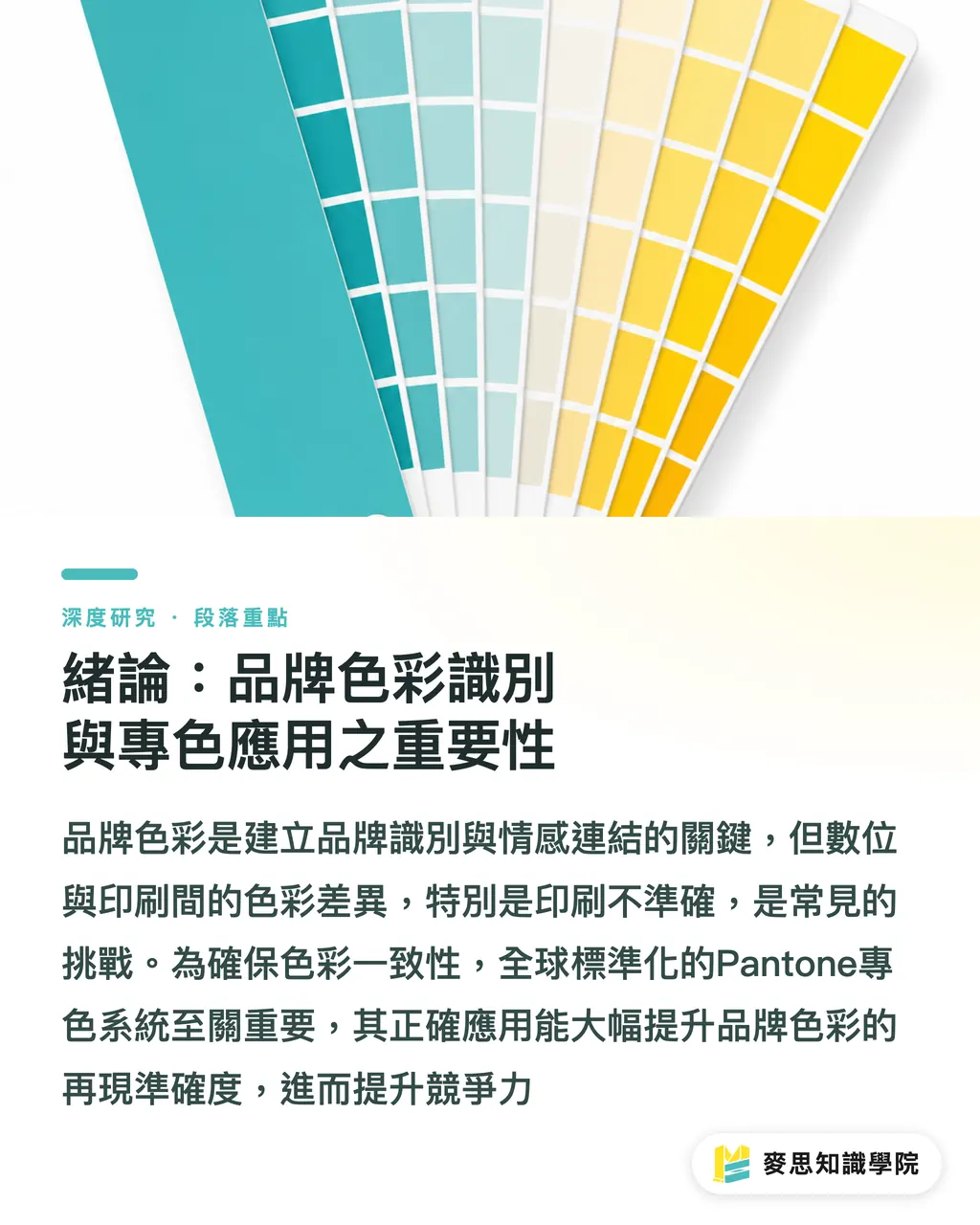
Introduction: The Importance of Brand Color Identity and Spot Color Application
・In the contemporary business environment, brand color is not just a core element of visual identity, but a key factor in conveying brand value and emotional connection. However, from digital screen displays to physical printed materials, color discrepancy remains a shared challenge for designers and brand owners, with 'inaccurate brand color reproduction' being the most common pain point. This phenomenon not only affects the consistency of brand image but can also lead to repeated proofing and reprints, wasting both time and economic costs
・To ensure consistency of brand colors across diverse media, a precise color management system is essential. Among these, the Pantone Matching System (PMS) is a globally standardized spot color system widely used in design, printing, textiles, and plastics industries. However, despite its prevalence, the correct selection logic, the way it is specified in digital design software, and the details of communication and collaboration with print shops remain common points of confusion in the industry. This study aims to take a closer look at the application principles of the Pantone Spot Color System, providing a systematic guide for designers and print procurement personnel to improve the reproduction accuracy of brand colors. This article starts from the essential differences between spot and process color printing, then analyzes spot color selection strategies, technical specifications for digital workflows, and limitations and communication essentials under special printing conditions. For Taiwan's design and printing industry, effective mastery of Pantone spot colors will help SMEs and brand owners enhance international competitiveness and optimize production efficiency
Literature and Current Status Review: The Essence of Spot vs. Process Printing and Standardization Challenges
・The core of color reproduction technology lies in how to achieve accurate color communication across different physical media. Current printing technologies are mainly divided into two categories: Process Color (CMYK) and Spot Color. Process color printing simulates thousands of colors through the superposition of halftone dots in different proportions using four basic inks—Cyan, Magenta, Yellow, and Black—with its color gamut limited by the CMYK color space [this article's analysis]. In contrast, spot color printing uses pre-mixed single inks to print specific colors directly, ensuring high color purity and consistency. This characteristic of direct printing makes spot colors superior to CMYK layered simulation in terms of color accuracy [Material 1]
・The Pantone Matching System (PMS) is the most widely adopted spot color standardization tool currently available, providing precise color references through standardized swatch books. However, color perception is not only affected by the ink itself but is also closely related to the physical properties of the printing substrate. For instance, the same Pantone shade will appear significantly different on Coated and Uncoated paper due to differences in paper absorbency, gloss, and surface texture [1, 3, 5]. Therefore, the Pantone system provides dedicated swatches for different substrates. Designers must select the corresponding swatches based on the actual printing material during color selection to ensure consistency between the expected and final results
・Although spot colors offer higher color precision, issues often arise when converting Pantone spot colors to CMYK process printing. This is because the CMYK color gamut is generally smaller than that of spot colors, especially for special colors like high-saturation or fluorescent colors, which CMYK struggles to fully reproduce [Material 1]. While the Color Management functions in digital design software can provide Pantone to CMYK previews or conversions, these are merely simulations; the final result still relies on the print shop's ink mixing and press calibration. Existing literature focuses mostly on instrument-measured reflectance and transmittance analysis to ensure quantitative color standards [1, 2, 3, 4, 5]. However, there is still a need for more systematic practical guidance on how designers and print procurement staff can effectively bridge the gap between digital specification and physical reproduction in real-world applications, as well as how to handle the limitations of spot colors across different materials and special finishes. This is the research gap this article aims to bridge
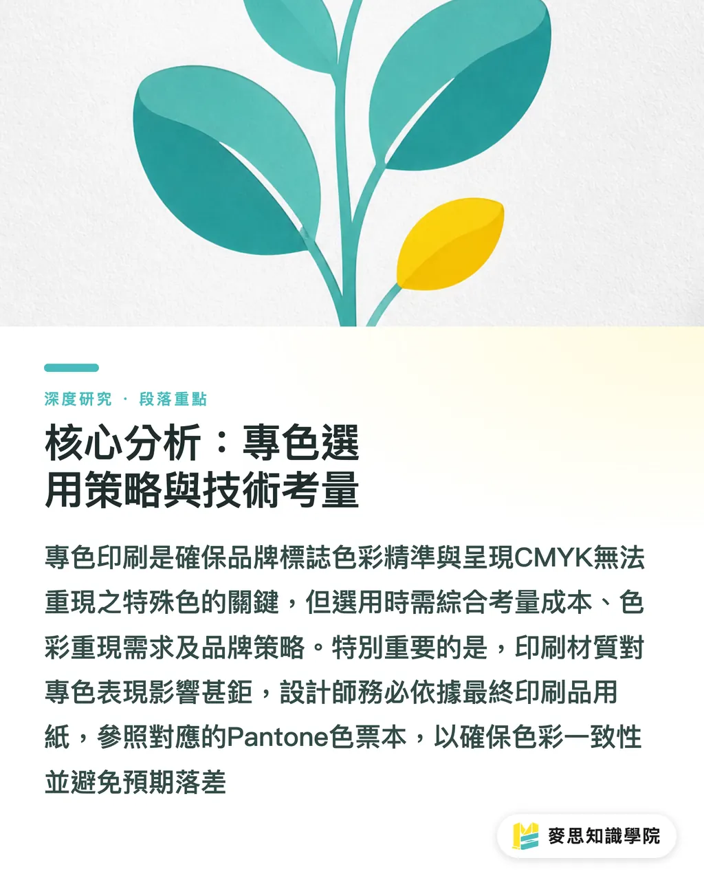
Core Analysis: Spot Color Selection Strategy and Technical Considerations
・The selection of spot color printing should not be based solely on color uniqueness; it requires a comprehensive assessment of cost, color reproduction needs, and brand strategy. Brand logos or corporate standard colors, due to their pivotal position in brand identity, are usually considered the primary application scenario for adding a fifth spot color to ensure the highest precision in all printed materials [Material 1]. Furthermore, special colors that the CMYK gamut cannot reproduce, such as fluorescent colors, metallic colors, or specific high-saturation colors, are also necessary conditions for adopting spot color printing. These colors, printed directly with pre-mixed inks, can achieve visual effects that CMYK layering cannot reach
・The impact of the printing substrate on spot color performance is critical. The Pantone swatch system is designed with series such as Coated and Uncoated (e.g., offset paper) to reflect color differences caused by ink on different materials [1, 3, 5]. Coated paper, having a coating layer that absorbs less ink, typically results in more vibrant and glossier colors; whereas Uncoated paper, due to ink penetration, makes colors appear softer and slightly less saturated. Designers should refer to the corresponding Pantone swatch books based on the final actual printing paper material during the initial selection phase to avoid discrepancies caused by material differences. This step is key to ensuring color consistency and should be part of a standard workflow
Pantone Specification and Output Specifications in Digital Design Workflows
・In digital design workflows, correctly specifying and managing Pantone spot colors is a key step to avoiding output errors. Professional design software such as Adobe Illustrator or InDesign provides a Spot Color Swatch feature, allowing designers to select Pantone codes directly. Importantly, these spot colors should be specified as independent swatches, not merely as Pantone simulation values within a CMYK color mode. When preparing design files for output, ensure that the spot color option is retained as 'Spot Ink' rather than automatically converted to CMYK before output. If not set correctly, the print shop might lose spot color information during plate-making, causing all spot color content to be converted into a four-color superposition, leading to color shifts [Material 1]
・Screen calibration and Soft Proofing play an auxiliary role in ensuring color consistency between digital drafts and final prints. With precisely calibrated monitors and correct color management settings, designers can preview color effects close to the final printed product on screen, thereby discovering potential color issues before sending to print [Existing view: Screen colors are always inaccurate]. However, soft proofing is always a simulation; especially for demanding spot colors, a Hard Proof remains the gold standard for final color confirmation. Designers should understand the limitations of digital previews and establish a clear proofing confirmation process with the print shop
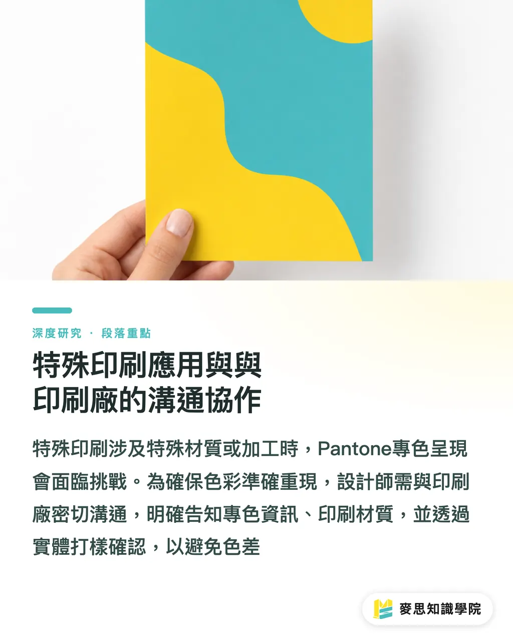
Special Printing Applications and Communication/Collaboration with Print Shops
・When printing involves special substrates or finishing, the application of Pantone spot colors faces additional limitations. For example, on non-traditional ink-absorbing materials like synthetic paper or metallic foils, ink adhesion and color rendering characteristics are quite different from standard paper, potentially requiring special ink formulas or printing processes [Material 1]. Additionally, surface treatments such as UV coating or spot varnishing may also alter the gloss and hue of the spot colors, which designers must take into account. In these complex situations, preliminary communication, sample testing, and technical evaluation with the print shop become particularly important
・Effective communication is at the core of ensuring the correct reproduction of Pantone spot colors. Designers and print procurement personnel should clearly inform the print shop to 'Retain Spot Color' and provide the precise Pantone code, the selected swatch version (e.g., Pantone 293 C or U), and the expected printing material. When submitting files, providing the complete design file (usually in PDF/X format) and attaching physical Pantone swatch samples as the final basis for color calibration is the best practice. For critical colors, it is recommended to conduct hard proofing and have it confirmed by the designer or a brand representative in person to reduce the risk of 'batch color deviation' during mass production [Existing view: Why is the color printed this time different from last time?]. Using scientific methods, such as color measurement instruments and standardized lighting, can reduce color differences between batch productions and ensure the consistency of brand visuals [Existing view: Why is the color printed this time different from last time?]
Implications for Taiwan's Design and Printing Industry
・For Taiwan's design and printing industry, precise application of Pantone spot colors has positive implications on multiple levels. For small and medium-sized print shops, mastering precise color mixing techniques for water-based or other inks, allowing them to achieve custom colors close to the Pantone swatch level, is key to enhancing market competitiveness [Existing view: Water-based ink color mixing technique]. This not only meets customers' strict requirements for color accuracy but also expands their service scope to take on more high-value-added spot color printing orders
・For designers, gaining an in-depth understanding of the principles and applications of the Pantone system will enable them to more effectively establish a 'Brand Color System,' ensuring visual image consistency from brand logos to all types of printed materials [Existing view: Building a brand color system]. This not only reduces design rework caused by poor color communication but also enhances their professional competence and communication efficiency with clients. Brand owners and procurement departments should treat the selection of Pantone spot colors as part of brand asset management. Strategically utilizing spot colors for core identity elements and establishing standardized communication protocols with printing suppliers will help optimize the print procurement process, control costs, and maintain a stable brand image
Conclusion and Limitations
・The Pantone spot color system is an indispensable tool for achieving precise brand color reproduction. This article provides a systematic analysis and guidance, starting from the essential differences between spot and CMYK, selection strategies, digital workflow specifications, to communication and collaboration under special printing conditions. Correctly understanding and applying the Pantone system not only significantly improves color accuracy and consistency but also effectively lowers communication costs and production risks caused by color discrepancies. This is an essential practice for enterprises pursuing an excellent brand image and for the design and printing industry committed to providing high-quality services
・The limitation of this article lies in its primary focus on Pantone spot color applications in traditional printing environments. It does not look in detail at new developments in digital printing technology regarding spot color simulation and reproduction, nor the potential application of AI in the field of color management and prediction. Future research could further explore how these emerging technologies influence the application scope and accuracy of Pantone spot colors and provide more diversified color management solutions for Taiwan's design and printing industry
Key Takeaways
・Pantone spot colors use pre-mixed inks, achieving higher color precision than CMYK four-color layering
・When selecting a Pantone code, one must refer to the corresponding swatch based on the actual printing material (such as Coated or Uncoated)
・In digital design software, Pantone colors should be designated as independent spot swatches to avoid automatic conversion to CMYK during output
・When communicating with print shops, it is necessary to clearly specify to 'Retain Spot Color' and provide physical swatches for calibration
・Mastering spot color application accurately enhances brand visual consistency and optimizes printing costs and schedules
Further Reflection
・For the printing and manufacturing industry, this article emphasizes the importance of precise color matching and collaboration with clients, encouraging the introduction of color measurement instruments and standardized processes. The design industry should integrate Pantone knowledge into brand design guidelines to enhance color management capabilities from digital to physical. The introduction of AI and SaaS is expected to play a more important role in color prediction, automated color calibration, and supply chain color communication in the future, especially in scenarios involving complex materials and special ink applications, providing more efficient solutions and further reducing human error and communication costs
References
・[1] C14 Committee (None). Practice for Instrumental Reflectance Measurement of Color for Flat Glass, Coated, and Uncoated. DOI: 10.1520/c1650-25
・[2] C14 Committee (None). Practice for Instrumental Transmittance Measurement of Color for Flat Glass, Coated and Uncoated. DOI: 10.1520/c1649-14
・[3] C14 Committee (None). Practice for Instrumental Reflectance Measurement of Color for Flat Glass, Coated, and Uncoated. DOI: 10.1520/c1650-14
・[4] C14 Committee (None). Practice for Instrumental Transmittance Measurement of Color for Flat Glass, Coated and Uncoated. DOI: 10.1520/c1649-14r21
・[5] C14 Committee (None). Practice for Instrumental Reflectance Measurement of Color for Flat Glass, Coated, and Uncoated. DOI: 10.1520/c1650-14r21
FAQ
- What is the fundamental difference between Pantone spot colors and CMYK process printing?
- Pantone spot colors are printed directly using pre-mixed single inks for pure and precise color; CMYK process printing simulates colors through the superposition of halftone dots using Cyan, Magenta, Yellow, and Black inks
- Why does the same Pantone color number appear differently on different papers?
- This is due to the different surface properties, absorbency, and gloss of various papers (such as Coated vs. Uncoated), which leads to differences in how ink is rendered on the paper
- How can I ensure that Pantone colors are not automatically converted to CMYK in design software?
- Designers must specify the Pantone color as an independent 'Spot Color Swatch' in the software and ensure the 'Retain Spot Color' option is enabled in the output settings
- What is the most important thing when communicating Pantone colors to a print shop?
- The most important thing is to clearly inform the print shop to 'Retain Spot Color' and provide the precise Pantone code, the selected swatch version, and physical Pantone swatch samples as the final basis for calibration
- When should one consider using the more costly Pantone spot colors?
- When the color accuracy requirements for brand logos or core identity colors are extremely high, or when the required colors fall outside the CMYK gamut (such as fluorescent or metallic colors), Pantone spot colors should be considered