
Overview
The right way to use a Pantone guide is to choose the Pantone number and paper-surface version from a physical swatch first, set the design file as a Spot Color, then compare the printed sample against the same swatch book under a standard light source. For MINDS (MS, mid- to high-end fully custom commercial printing), the three checkpoints before print can be broken into three steps
・① Choose the swatch: pick C or U based on the paper, do not choose colors from a screenshot
・② Set up the file: keep the Spot Color in Illustrator, InDesign, or the PDF
・③ Check color on press: compare the printed sample against the physical swatch, specified paper, and same light source
What Is a Pantone Guide, and Why Is a Screen Not Enough?
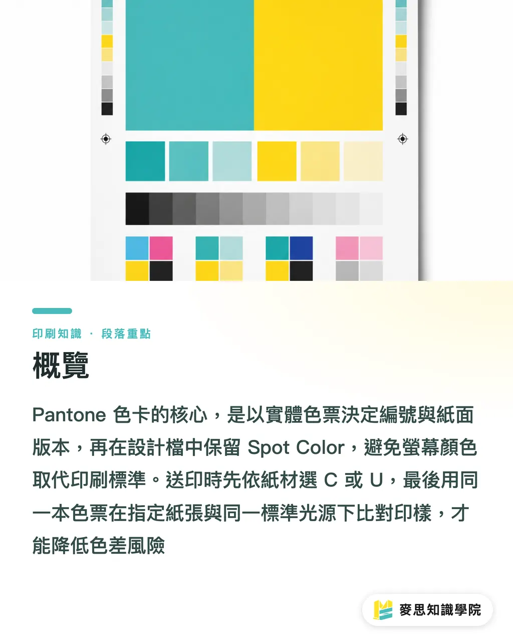
A Pantone guide is a standard color reference that prints specific ink formulas on physical paper. Designers specify colors by number, and printers use the same numbers to mix ink and check color. It controls the result of ink on paper, not RGB display on a screen
Screens show light-emitting RGB. Offset printing usually works with CMYK inks plus paper absorption. They are not speaking the same language to begin with. When a client sends a phone screenshot and says, "I want this blue," it is very hard to match on press, because turning the phone brightness up by 20% already changes the color
The value of a Pantone spot color is that it turns "brand red" from a feeling into a number people can discuss. For example, PANTONE 186 C and PANTONE 186 U point to different paper-surface versions of the same color. C is for coated paper surfaces, U is for uncoated paper surfaces. They cannot replace each other
The sentence I least like hearing on press is, "It looks close enough on screen," because close enough usually becomes very different on delivery day
How Do You Choose a Pantone Guide, C or U?
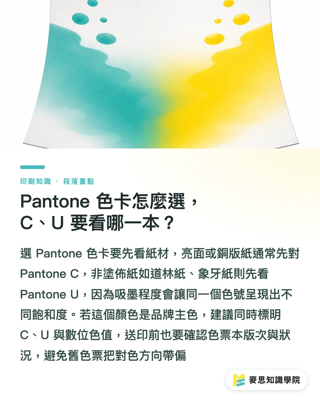
Start with the paper. If the job prints on art paper, matte coated paper, or a gloss-laminated box, you usually look at the Coated C guide first. If it prints on woodfree paper, ivory board, cotton paper, or fine art paper, you usually look at the Uncoated U guide first
・Art paper and glossy paper: start with the C swatch, because the paper absorbs less ink and the color looks more saturated
・Woodfree paper and uncoated paper: start with the U swatch, because the paper fibers absorb more ink, so the same color looks flatter and deeper
・For the same brand manual: list PANTONE C, PANTONE U, approximate CMYK values, and RGB/Hex together, so print, packaging, and web teams do not each tell a different story
・If a swatch book has been used for more than 1 year, often exposed to light, or handled frequently, check the version and condition with the printer before sending the job. An old guide can easily pull the color match in the wrong direction
If a brand is making business cards, DM pieces, packaging boxes, and stickers at the same time, I ask two things first: where the color will appear most often, and whether this color is the main brand identity color. Those two answers directly decide whether the spot color cost is worth paying
When Should You Use a Pantone Spot Color, and When Is CMYK Enough?
Pantone spot colors work well for primary brand colors, large flat color areas, LOGOs, fluorescent colors, metallic colors, and packaging that needs stable color across repeat runs. CMYK is better for photos, gradients, short-run promotional materials, and commercial printing where reasonable color variation is acceptable
・Use Pantone when: a slight shift in the brand color will trigger complaints, such as chain-brand packaging, corporate identity manuals, skincare boxes, or the main visual for food packaging
・Use Pantone when: CMYK cannot reproduce the color, such as fluorescent orange, a special blue, or a metallic color. Forcing it into four-color process only makes it dirty
・CMYK is fine when: the job is a DM piece, event poster, or social extension, and the visual focus is photography and layout rather than one specific brand color
・CMYK can be adjusted with a dedicated plate curve when: the budget is limited, but one color block needs to be closer than a normal conversion. Ask the printer to review the color sample first
・A spot color is not recommended when: the color only appears in a 5mm small icon and the client has no specified brand standard. That money usually will not buy a visible difference
The cost has to be said plainly. CMYK offset printing normally uses 4 plates. Add 1 Pantone spot color and it becomes 5 plates. Add 2 more spot colors and it may become 6 plates. There is also extra ink mixing, wash-up, color calibration, and waiting time. A higher quote is production reality, not the printer casually adding fees
How Should the Design File Be Set Up So the Printer Knows It Is a Spot Color?
The Pantone color in the design file must be a Spot Color. You cannot just name a color block Pantone, and you cannot convert the Pantone color to CMYK and then verbally say it should print as a spot color. When the printer checks separations in the PDF, they need to see that independent color plate outside the 4 CMYK plates
・In the swatches panel, choose the Pantone library and create a Spot Color, not a Process Color
・Keep the standard swatch name, such as PANTONE 186 C. Do not manually rename it to "brand red" and leave the output team unable to find it
・Do not let the same spot color appear under 2 names, such as PANTONE 186 C and Pantone 186C. The RIP may treat them as two plates
・Before exporting the PDF, open Separations Preview and confirm that, besides black, cyan, magenta, and yellow, the specified Pantone plate is also there
・For overprint, white ink, spot UV, and foil stamping, mark the finishing layers separately. Do not mix finishing plates with Pantone ink plates
For projects with sensitive brand colors, the consulting team at Mai Strategy Knowledge Academy usually suggests checking a screenshot of the PDF separations first, because a naming error in the file is far cheaper than an error on press
How Should Color Be Checked on Press So Everyone Is Speaking the Same Language?
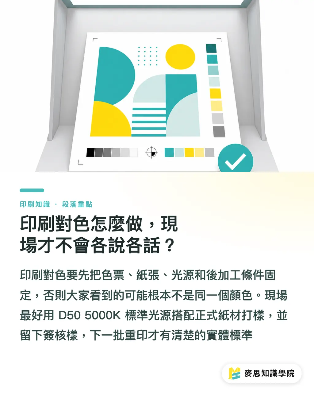
Press color checking needs 4 fixed conditions: the same Pantone guide, the same paper, the same light source, and the same finishing setup. Miss one condition, and the color you are seeing may no longer be the same thing
・Light source: D50 5000K standard lighting is commonly used for print color checking. Do not judge color under yellow office lights, window daylight, or a phone flashlight
・Paper: proof on the actual production paper. Whiteness, ink absorption, and surface coating all change how Pantone color looks
・Finishing: gloss lamination makes color look brighter, matte lamination lowers saturation, and spot UV may create light-dark differences in the same color
・Timing: wet ink fresh off the press and dried ink the next day can differ. The approved proof should state clearly which condition is the reference
・Retained sample: repeat-print jobs need an approved retained sample, so the next batch has a physical standard instead of chasing color from memory
If your company has long-term needs for brand color, packaging color, or retail display color, subscribing to the Mai Strategy Knowledge Academy newsletter is worth it. Building the habit of color management, paper selection, and prepress checks day to day saves far more than fixing problems after they happen
Key Takeaways
・A Pantone guide is for defining physical ink color, not for validating a screen
・Add 1 spot color, and you add 1 plate plus 1 more layer of on-press control. Spend the money only when it is needed
・If the design file has no Spot Color, verbally saying Pantone means almost nothing
・Color checking needs fixed swatches, paper, lighting, and finishing. Miss one condition and the argument shifts off target
Further Thoughts
For print manufacturers, Pantone management starts with incoming file checks and proof approval workflows. For designers, brand color standards should put Pantone C/U, approximate CMYK values, RGB/Hex, and applicable paper stocks on the same page at minimum. For AI image generation and SaaS tools, the most practical use is not deciding colors for people, but warning them before final output when a Spot Color has fallen back to Process Color, when a PDF contains an incorrect extra plate, or when a brand color has no physical swatch reference. These small checks directly save 1 file rejection or 1 round of reproofing
FAQ
- Can I choose Pantone colors directly from a screen or online image?
- Not recommended. Pantone colors should be chosen from physical swatches. Screen RGB is affected by brightness, color gamut, and ambient light, so it cannot serve as the print color-matching standard
- What is the difference between PANTONE 186 C and PANTONE 186 U?
- C means Coated, used as a reference for coated papers such as art paper and glossy paper. U means Uncoated, used as a reference for uncoated papers such as woodfree paper and ivory board. The same color can look noticeably different on the two paper types
- Can CMYK be converted to Pantone?
- You can find the closest Pantone match, but software conversion should only be the first pass. Final comparison still needs a physical swatch or Pantone Color Bridge, because some fluorescent colors, special blues, and bright oranges are outside the printable CMYK range
- Is printing with a Pantone spot color always more accurate?
- A Pantone spot color gives the ink target a clearer standard, but paper, lamination, drying time, and press condition all change the visual result. Color matching still depends on proofing, signed approval samples, and retained sample management
- How do I confirm the spot color has not been lost before sending the PDF to print?
- Use Acrobat or the design software's Separations Preview to check separations. Outside the 4 CMYK plates, you should see the specified Spot Color plate. If only CMYK remains, the Pantone spot color has usually been converted away
Related articles




The Print × AI weekly
The print and AI know-how designers, brands and enterprises can use before they commit — one email, every week
Tool Library
RGB↔CMYK conversion, ΔE color difference and brand color print analysis — free color management tools, computed right in your browser.
MINDS Group
Need actual printing or gifting services?
From premium printing to online ordering and festive gifts — the MINDS Group sister brands take it from here.