
What should you watch for when converting Pantone colors for print?
When using Pantone spot colors in printed materials, the biggest problem usually is not "I cannot find the matching color number." It is "there is no traceable color-matching path from screen to press." My workflow at MINDS (MS, mid-to-high-end fully custom commercial printing) has three print checkpoints: ① choose the Pantone number with a physical swatch on the target paper → ② set it as a Spot Color in the design file and add the color-number note → ③ match the prepress proof against a physical color guide, calibrate it, then go on press. Skip any one of these, and color becomes a dispute between the client and the print shop
・Spot Color: a color printed with its own separate ink plate, instead of being separated into CMYK. It is often used for brand colors, metallic inks, fluorescent colors, and other color ranges that CMYK struggles to reproduce
・CMYK: the four print colors, cyan, magenta, yellow, and black, layered as halftone dots to simulate color. Its color gamut is smaller than Pantone Solid Coated, so some vivid or high-chroma colors will shift after conversion
The Pantone number you found: is it C or U?
The same Pantone number can have two versions: C, for Coated paper with a glossy coated surface, and U, for Uncoated paper such as woodfree or offset paper with a matte surface. The two behave very differently in paper gloss, ink holdout, and visual appearance. This is the first trap beginners usually step into
・Coated paper's coating layer makes ink look more saturated and visually brighter. The same color printed on uncoated paper will look duller, grayer, and lower in chroma
・Packaging boxes, business cards, and book covers often use uncoated paper, but design files are often matched against the C version. Only after printing does everyone realize, "Why is it so much darker than the screen?"
・The right move: during color selection, place the physical swatch book directly on the actual paper to be printed and compare there. Do not rely only on a screen or a single swatch
Paper-based color matching is something a screen cannot do, but a paper sample can. I have seen it too many times on the production floor: the designer matches a C swatch against an uncoated-paper proof, both sides insist their version is correct, and the final cost is wasted paper and time
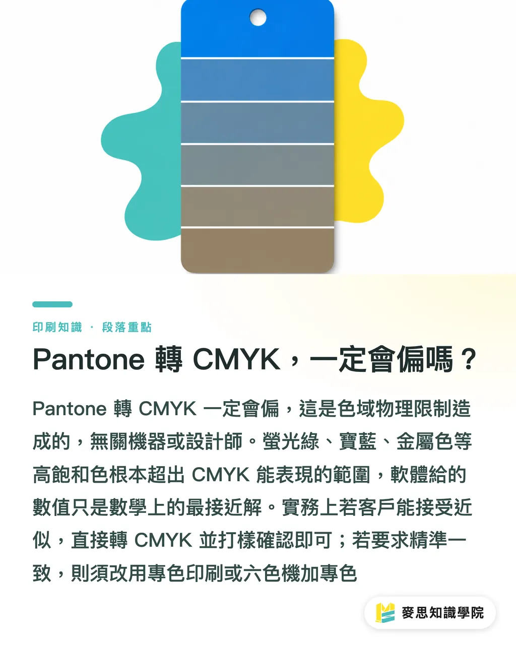
Will Pantone to CMYK always shift?
Yes. And that shift is a physical limitation, not the fault of the machine or the designer. The Pantone Solid Coated gamut is larger than CMYK. Some saturated colors, especially royal blue, bright orange, fluorescent green, and metallic colors, are simply outside the range CMYK can reproduce
・The Pantone → CMYK values shown in software are only the closest mathematical match inside the gamut. They are not necessarily the closest visual match
・Classic case: Pantone 286 C, a bright royal blue, loses obvious chroma and turns slightly purple after conversion to CMYK. You may not notice it on screen, but in print it can look like a dirty dark blue
・For high-chroma brand colors, such as Coca-Cola red, Tiffany blue, or IKEA yellow, if you insist on printing in CMYK, accept up front that the color will shift. Use a physical proofing guide during proofing to confirm the acceptable range
・If the color is central to the brand, use Pantone spot-color printing or multi-color overprinting, such as a six-color press plus spot color. Do not force it into CMYK
My own rule: if the client can accept "close, but not exactly the same," CMYK conversion plus proof approval is enough. If the client says it "must be identical," talk about the budget and paper for spot-color printing right away. The gray area in between only leads to arguments on site
How should the design file be set up to avoid mistakes?
The file itself is often where color disputes begin. When a Pantone color has to be converted for CMYK printing, the most common disaster is this: the designer picks a color on screen, the software silently converts it to CMYK, and no one notices until it reaches the print side
・Always set the color as a Spot Color and label the Pantone number. Do not let Illustrator or InDesign automatically convert it to CMYK during output
・In the PDF export settings, choose to preserve spot colors, or convert to CMYK according to the print shop's requirements. Before handoff, use Acrobat Preflight to confirm the spot-color list
・Add paper and color-number notes to the file name, such as cover_P286C_c2s.pdf, to prevent job mix-ups on the production line
・Monitor calibration is basic discipline: use a wide-gamut display and calibrate it regularly with a colorimeter. Otherwise, the Pantone number you see on screen and the actual ink are two separate things
Another common trap: choosing Pantone colors while the design file is in RGB mode, then exporting with mismatched color-management settings. By the time the file reaches the print side, the color has already shifted once. I recommend choosing Pantone colors in a CMYK working space and noting the ICC profile used in the file information, such as GRACoL or Fogra39
How do you keep proofing and mass production color stable?
Proofing is not a formality. It is the contractual act of locking down color. Digital proofing, meaning on-screen simulation, and traditional proofing, meaning an actual press proof, differ a lot when matching Pantone colors. If budget and time allow, traditional proofing is always more accurate than digital proofing
・Before proofing, ask the print shop to provide a CMYK color guide or Pantone simulation guide for that paper, then compare it under the target light source, such as a D50 standard light booth
・When signing off on the proof, ask the client to clearly mark the acceptable color-difference range on the proof sheet. The industry often uses ΔE ≤ 2, but for brand colors I recommend tightening it to ΔE ≤ 1
・During mass production, ask the print shop to provide color checks for the first sheet and mid-run samples. This prevents discovering an ink drift only after the whole batch is finished
・Different presses, ink brands, and paper batches will all change the color. The same color number printed on different presses can show visible differences
In practice, I tell clients this: for the first proof, go to the print shop in person or check it under a standard light booth. Do not approve color only by looking at a photo or PDF on a screen. It is the lowest-cost step, and also the one people most often skip
Should you choose Pantone spot color or CMYK? How do you discuss it with clients?
There is no standard answer, but there is a decision framework. Look at cost, quantity, and brand importance, and the path becomes clear
・Small quantity + color is central to the brand: use spot-color printing. The budget goes up, but the color can be controlled
・Medium quantity + close color is acceptable: use CMYK four-color printing plus proof-based color approval. This balances cost and quality
・Large quantity + multiple colors that are not brand colors: use CMYK as the base, then add one or two spot colors if needed, such as Pantone 286 C, as accents
・Paper with strong color or texture: proof the CMYK result on that paper first, then decide whether spot color is needed
I often tell clients: color is a budget issue, not a technical issue. The same Pantone number may cost 30% less if printed in CMYK, but you have to accept that "the color will shift." Instead of arguing on site about whether it is accurate, spell out that trade-off during quotation
Key Takeaways
・The first checkpoint in converting Pantone colors for print is not software. It is paper-based color matching. The difference between C and U versions can make the same number look like two different colors
・CMYK cannot reproduce Pantone's high-chroma colors because of physical limits. It is not the designer's fault or the print shop's fault. Budget and expectations need to be aligned first
・The design file must be set as a Spot Color and labeled with the number. Preserve spot colors during output so the software does not automatically convert the color to CMYK and flatten it
・Proof approval should be done in person under a standard light booth. The ΔE value and acceptable range should be written clearly on the proof sheet
・Choosing spot-color printing versus CMYK is a triangle of brand importance, quantity, and budget. Precision is never free
Further Thoughts
From the client projects I have handled over the past few years, about 80% of Pantone-to-print disputes do not come from the press. They come from a lack of alignment during color selection. The designer chooses color in front of a screen, the print shop matches color on paper, and the client reviews the proof in an office. Everyone is looking at a different screen and a different light source, so of course the color does not match
For designers, treating a Pantone number as a "print contract" rather than a "reference value" is a necessary shift in mindset. Color notes, paper notes, and proof sign-off may feel administrative, but their cost is far lower than reprinting or having a job rejected after the fact. For print shops, proactively offering paper-specific color guides and standard light-booth matching is a concrete way to separate yourself from low-price competitors
Next step: if you are about to send a design file with a Pantone color to print, open the file now and check three things: color-number labeling, paper notes, and spot-color settings. If you are not sure how the Pantone color in your hand will look on the target paper, bring the color number and paper to the consulting team at Mai Strategy Knowledge Academy. We can walk through the full color-matching process with you. To keep getting practical print-floor knowledge like this, you can also subscribe to the Mai Strategy Knowledge Academy newsletter and receive one production-ready concept each week
Further Reading
This article is based on the author's practical experience. It does not cite specific URLs from external materials, so no source links are listed
FAQ
- Does a Pantone color always have to be converted to CMYK before printing?
- Not always. If the job is printed with Pantone Solid Coated spot-color ink, the design file can stay in Spot Color mode and go on press. CMYK four-color simulation is needed only because of budget or press limitations, but high-chroma colors will definitely shift
- How different are Pantone C and U versions?
- The same number in C, for Coated paper, and U, for Uncoated paper, can look visibly different. Because U paper has no coating layer, the ink is absorbed into the paper, reducing chroma and making the color look grayer and duller. I recommend placing a physical swatch directly on the actual paper to be printed for comparison
- Can I trust the CMYK values generated by software?
- Software conversion gives the closest mathematical match within the gamut. It does not mean the closest visual match. Vivid colors, royal blues, and metallic colors will shift after CMYK conversion, so use a physical proof as the reference
- What light source should be used for proof color matching?
- The industry standard is a D50 standard light source, with a color temperature of 5000K, checked in a standard light booth. Avoid matching color under office fluorescent lights or window-side daylight, because those light sources can seriously distort judgment
- The print shop says ΔE within 2 is acceptable. Is that reasonable?
- ΔE ≤ 2 is a common general tolerance in the printing industry and is reasonable for most printed materials. For brand standard colors, such as corporate identity colors, I recommend requiring ΔE ≤ 1. Anything above that should be treated as a failed match. The exact number should be written clearly on the proof approval sheet
Related articles


The Print × AI weekly
The print and AI know-how designers, brands and enterprises can use before they commit — one email, every week
Tool Library
RGB↔CMYK conversion, ΔE color difference and brand color print analysis — free color management tools, computed right in your browser.
MINDS Group
Need actual printing or gifting services?
From premium printing to online ordering and festive gifts — the MINDS Group sister brands take it from here.