

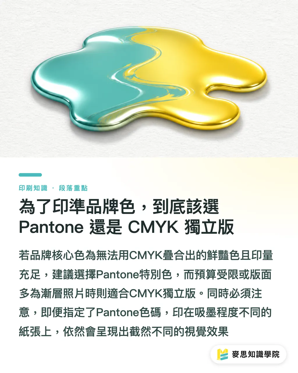
To print brand colors accurately, should you choose Pantone or a CMYK custom plate?
Many clients ask why their logo looks bright and sharp on screen, yet always turns dull and gray when printed on a business card. Should they really stretch the budget and add a Pantone spot color?
Here is the direct answer: if your core brand color sits in a fluorescent range, a special metallic range, or a vivid color space CMYK cannot build, and every print run is large enough, choose Pantone. If the layout is full of gradients, photos, or the budget is simply tight, choose a CMYK custom plate
When Mai Strategy Knowledge Academy helps small and midsize businesses build brand color systems, the first step is mapping where each color actually sits
Many people think specifying a Pantone code means they can relax. But paper absorbency varies a lot. The same Pantone code can feel completely different on coated art paper than it does on highly absorbent woodfree paper
When spot colors get more expensive and cause trouble
Every extra spot-color plate adds real plate-making and ink-mixing costs on the production line
Sometimes people spend a lot and still end up with a mess. Usually, it is because these artwork traps were not avoided
・Gradient and opacity traps: Pantone is physical ink. Once a design file applies gradients or transparency to a spot color, the screened result from the press often looks muddy
・Inconsistent naming: this is the fatal issue I catch most often on the production line. If an AI file contains both "PANTONE 185 C" and "Pantone 185C," the RIP system may read them as two different plates and create errors
・Color shifts across materials: getting Pantone ink mixed correctly is one thing. Printing it on kraft paper or plastic packaging is another. The substrate color will directly eat into the saturation of the spot color
Instead of blindly paying extra to open another plate, consult the Mai Strategy Knowledge Academy advisory team first about material fit, and confirm whether that spot color actually suits your product packaging
If you only use a CMYK custom plate, how do you keep the color from drifting?
If the budget does not allow for spot colors, a CMYK custom plate is currently the best value choice
A custom plate means the ink control and pressure on that press setup serve only your file. It will not sacrifice your color the way gang-run printing often does to accommodate someone else's artwork
To get as close as possible to the designer's expectations on a custom plate, we use a practical internal process called the "MINDS (MS, mid- to high-end fully custom commercial printing) three color-matching checkpoints."
・① Lock the values: at the design stage, open a CMYK print swatch book and identify the closest values directly. Never rely on automatic RGB conversion from a screen
・② Approve the proof: ask the print vendor to provide a digital proof or an actual press proof, and use the proof signed by both sides as the only color standard for mass production
・③ Adjust on press: for important projects, you must go to the production line in person to check color. Ask the press operator to fine-tune the ink keys on site, keeping the color difference within a range the human eye can accept
Why does a reprint batch have color differences when the file was not changed?
The file is exactly the same, yet a catalog reprinted six months later looks different from the last batch
Many designers blame the print shop for being careless, but the production environment is full of variables
・Temperature and humidity changes: ink flow in summer and drying speed in winter are completely different, and both directly affect how much ink the paper absorbs
・Paper batch differences: even from the same paper mill, each batch has small variations in whiteness and grain direction
・Machine condition: the aging level of a press blanket changes dot gain, which can make color darker or lighter
Experienced buyers ask the print shop to keep the previous "reference sample." Every reprint is produced by comparing against that sample. That is the scientific way to reduce color differences between batches
If you have long-term, high-volume packaging needs with extremely strict consistency requirements, you can also subscribe to the Mai Strategy Knowledge Academy newsletter for the latest hands-on methods in batch color difference management

Key Takeaways
・If your brand color falls outside the CMYK gamut, go straight to Pantone. If the budget is limited or the design has many gradients, choose a CMYK custom plate
・Spot-color naming inside an AI file must be perfectly consistent, or the RIP system may misread it and create unnecessary plate charges
・For custom-plate printing, the three checkpoints are mandatory: lock the values, approve the proof, and adjust on press
・The key to reducing color differences in reprints is comparing against a reference sample signed by both sides, not relying only on file values
Further Thinking
Building a brand color system is not just choosing a good-looking color. It is a connected workflow from the digital source to physical print
The moment a designer decides on a logo color, they should already be thinking about the future cost and risk of printing it on business cards, corrugated boxes, or acrylic signs
Managing where colors sit with intention can save a company from countless rounds of back-and-forth and expensive reprints after mistakes
FAQ
- What is a spot color?
- A spot color is a single ink mixed by the print shop in a specific ratio before printing. It can produce colors that are more saturated and vivid than CMYK four-color overprinting, but each dedicated color adds separate plate-making and ink-mixing costs
- What is a CMYK custom plate?
- It is a plate-making and production method dedicated to a single client's file. The press serves only your design, and the operator can independently adjust ink volume during printing based on the approved proof. It costs more, but its color accuracy is far better than gang-run printing
- Why do screen colors always look different from printed colors?
- A screen is an RGB light-emitting device, while print uses CMYK ink that absorbs and reflects light. Their color gamuts are naturally different. Paper absorbency also affects the result, so a visual gap is unavoidable
- What is the difference between C and U in a Pantone swatch book?
- C stands for Coated paper, such as art paper, where the smoother surface makes colors appear brighter. U stands for Uncoated paper, such as woodfree paper, where the paper absorbs more ink and the color appears darker and duller
Related articles


The Print × AI weekly
The print and AI know-how designers, brands and enterprises can use before they commit — one email, every week
MINDS Free Tools
Spine width and imposition calculators — skip the manual math, free in your browser.
MINDS Group
Need actual printing or gifting services?
From premium printing to online ordering and festive gifts — the MINDS Group sister brands take it from here.