
Why does Pantone 293 C easily shift purple in four-color printing?
To solve the common color-shift problem with a highly saturated deep blue like Pantone 293 C, the most direct answer is to look at the budget first, then choose the production method: if the budget is there, go straight to a Pantone spot color for the most accurate result; if the budget is limited, use the MINDS (MS, mid- to high-end fully customized commercial printing) three-gate print submission framework, run a dedicated CMYK press form, and be on press in person to check and fine-tune the color
After more than a decade on the production floor, I have handled countless customer complaints about failed print colors
Just like the 427C gray I often mention, which easily turns dull, or 032C warm red, which can become liver red, Pantone 293 C, this pure jewel blue, is another monster on press
Clients see it on screen, in the RGB gamut, and think it looks elegant. But once it is converted to standard CMYK four-color printing, around C100, M69, Y0, K4, the print either shifts purple or becomes dirty and gray
The root problem is the limit of the color gamut
Traditional four-color cyan ink carries a tiny bit of green, while magenta carries a tiny bit of yellow
To mix a clean deep blue like 293 C, you have to push cyan to a solid area (C 100), while adding a large amount of magenta (M60- 70) to deepen it
At that point, if the press operator adds just a little too much magenta, the whole blue area immediately turns purple; if the cyan density is not strong enough, the color looks thin and weak
This is a physical limitation, not a matter of the operator being careless
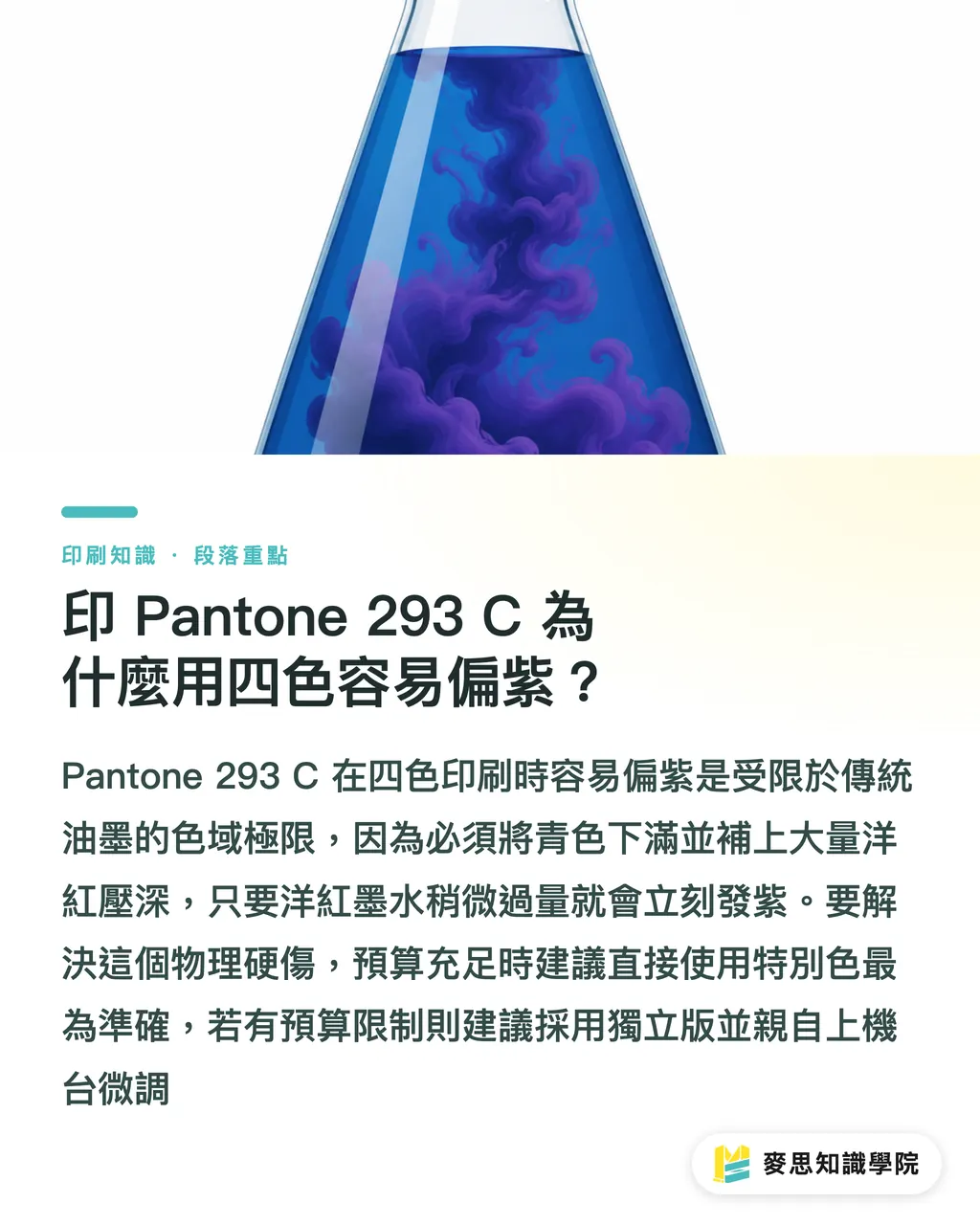
For accurate brand color, should you pay for a spot color or run a dedicated CMYK form?
Many clients come to me with a swatch and ask: for this blue, should I spend more on a spot color, or run a dedicated CMYK form and ask the operator to adjust it?
This is a standard forced choice between cost and quality
・Pantone spot color: This is the least controversial approach. The ink supplier directly mixes this bucket of 293 C from a blue base ink, so what prints is a pure single color. The upside is that the color is saturated, clean, and free of the coarse feel caused by four-color halftone overprinting. The downside is cost. You have to pay extra for the spot-color plate and wash-up fee, meaning the labor cost of cleaning the ink duct on the press. For a short run, the unit cost can be shockingly high
・Dedicated CMYK form: If the budget is limited, the next best option is a dedicated form. The benefit is that the whole press is printing only your job, so the press operator can manually open up the cyan ink key for your blue area and control the magenta feed more precisely. It still cannot reach 100% of the fluorescent clarity of a spot color, but at least it can keep the blue from turning into disaster purple
・Gang-run printing, absolutely not: Sending 293 C into a gang run with other people's files is asking for trouble. Gang-run printing averages everyone's colors together. Your deep blue may get dragged down by another client's loud reds and purples, and the blue will come out different every time
MINDS (MS) three-gate print submission: how do you keep deep blue from crashing on press?
If you eventually choose a dedicated CMYK form because of cost, I usually suggest that designers and print buyers use the MINDS (MS) three-gate print submission process to control the risk
・Gate 1: Align expectations with a digital proof. Before the official press run, always ask the plant to produce a color-managed digital proof. It is inkjet, but it can simulate about 80% of the limits of four-color printing. The blue on the proof will usually be slightly darker than the Pantone swatch. That gives both sides a reasonable acceptance baseline
・Gate 2: Fine-tune the file values. When handing off the file, confirm that the CMYK values are clean. Some software, when automatically converting 293 C, will introduce single-digit yellow (Y) or black (K). Manually set them to zero. Keeping C100 with an appropriate amount of M gives the press operator the cleanest room to work
・Gate 3: Be on press to check the color yourself. Do not be lazy when printing blue. Go to the print shop and watch the run. When the first stack comes off the press, ask the operator directly to push the C ink a little heavier and pull back the M ink a little, driving the blue as far as possible without hurting the other images on the layout
If your project is currently stuck in the mud because the brand color is hard to match, and you do not know how to communicate with the plant, I suggest consulting the Mai Strategy Knowledge Academy advisory team directly. We will bring color swatches and physical samples to help you evaluate the production route that best fits your budget and quality target
Key Takeaways
・Pantone 293 C easily shifts purple or turns gray when converted to four-color printing because the physical CMYK gamut cannot fully cover highly saturated deep blue
・If you want the cleanest possible blue, go straight to a spot color. If the budget is limited, choose a dedicated CMYK form, and never use gang-run printing
・When setting up the file, keep C and M as clean as possible. Remove unnecessary Y and K values so the blue does not become dirty
・Use the MINDS (MS) three-gate print submission process, from digital proofing and value cleanup to on-press color checking, to reduce the color-difference risk of four-color printing as much as possible
Further Thoughts
For SaaS developers, this real production pain point is a strong feature opportunity
Current design software often gives only a stiff set of numbers when converting from Pantone to CMYK, without warning that the result can easily shift purple on an actual press
If future design-assist tools can combine production-line data, actively warn users when they choose landmine colors such as 293 C, and suggest cleaning up YK values, they could greatly reduce the back-and-forth communication cost between design and print production
FAQ
- Why does Pantone 293 C look bright on my screen but print darker?
- A screen uses the light-emitting RGB gamut and can show extremely bright blues. Printing relies on light-reflecting CMYK inks. The two systems produce color in completely different ways. Overprinted ink inevitably absorbs light, so the printed deep blue will always look visually darker than it does on screen
- If I must print the feel of Pantone 293 C in four-color process, what compromise can I use?
- You must run a dedicated form, and the blue area should be intentionally separated in the file design. Do not place it on the same horizontal ink path as skin tones or warm-toned images. This lets the press operator focus on pushing the cyan ink volume to full strength without damaging other images that need magenta
- If I do not have the budget for Pantone and I am worried about ruining it in four-color printing, can I change the paper stock?
- Paper stock does matter. Coated papers, such as art paper and matte art paper, have better ink holdout and can make the blue look more saturated. If you choose uncoated woodfree paper or specialty paper, the ink sinks into the paper fibers, and the blue will drop another two levels in brightness. Printing four-color on art paper with a water-based gloss coating can lift the brightness slightly
Related articles

The Print × AI weekly
The print and AI know-how designers, brands and enterprises can use before they commit — one email, every week
Tool Library
RGB↔CMYK conversion, ΔE color difference and brand color print analysis — free color management tools, computed right in your browser.
MINDS Group
Need actual printing or gifting services?
From premium printing to online ordering and festive gifts — the MINDS Group sister brands take it from here.