
Why Does Pantone 289 C Tend to Print Purple?
289 C is a standard deep navy in the Pantone color guide. It has a cool hue, low lightness, and moderate saturation. Combined, these three traits place it right on the outer edge of the CMYK gamut
Printing deep blue in CMYK relies on mixing cyan (C) with magenta (M), then adding black (K) to deepen the tone. Here lies the problem: a tiny bit too much magenta, and it swings purple. Too much black, and the entire block turns muddy and dull, like it gathered a layer of dust. Reaching the depth of 289 C takes a very high C value plus a set amount of K. Because ink control varies across presses, the final print easily drifts between deep blue, violet-blue, and blackish-blue
Screens only make things worse. An RGB display has a much wider blue gamut than CMYK. A designer looks at the monitor and thinks the color looks right, but on paper the color shrinks, dropping in both brightness and saturation. This is a classic headache in printing deep blues, and 289 C is no exception
How to Set CMYK Values Without Losing Color Control
Pantone publishes an official Color Bridge swatch book, available at major art supply stores. Next to each Pantone swatch, it prints a recommended CMYK breakdown, making it the most dependable four-color benchmark today. These are not numbers spit out automatically by design software, but formulas tested and matched on actual paper
The Color Bridge recommendation for 289 C calls for high cyan (C), medium-high black (K), lower magenta (M), and zero yellow (Y). The magenta level is the real tipping point. Bump it up even slightly and the hue shifts purple. Drop it too low and the blue loses its rich saturation. Before sending files to press, take a physical Color Bridge swatch to the press room and compare it side by side with the press proof. Never trust a screen
Here is a detail people often overlook: identical CMYK values print differently with different ink brands. A quality print shop will fine-tune ink density based on calibration results that day. That is why the press check matters so much. You need to sign off on what this specific press, this ink batch, and this sheet of paper produce, not theoretical numbers
Pick the Right Paper and Cut Color Shifts in Half
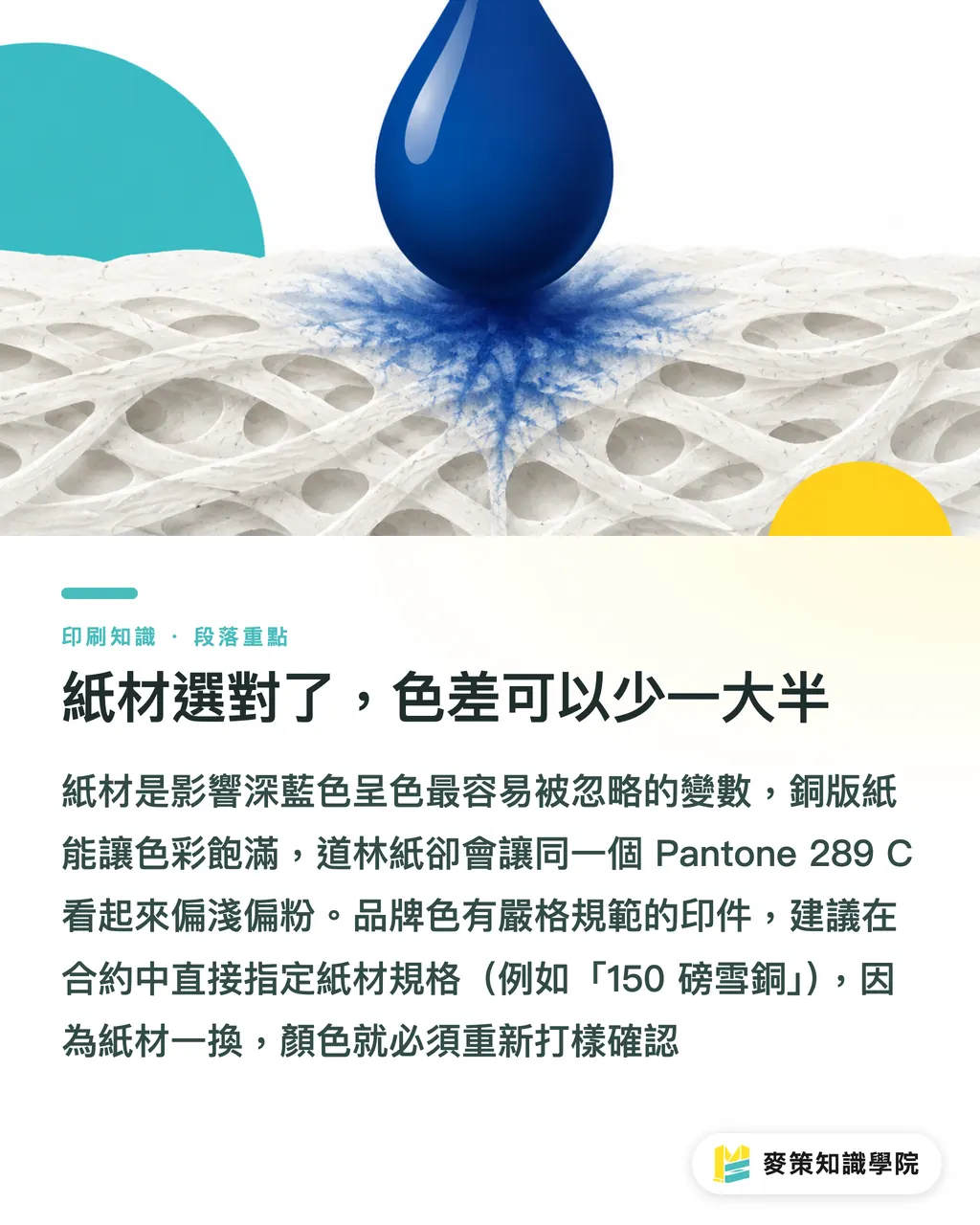
Paper affects deep blues far more than most clients realize. Coated paper, with its smooth double coating, keeps ink sitting on the surface, producing rich, saturated color. Uncoated woodfree paper has a rougher texture and absorbs ink heavily. The same 289 C printed on uncoated stock looks lighter and less saturated, ending up chalkier and paler
Be extra cautious with specialty textured stocks. Certain cotton or recycled papers absorb ink unevenly, which can cause mottled ink patches across deep blue areas and ruin the polished feel of your brand identity
If your print project has brand color guidelines, state the exact paper specification right in the contract, down to details like 150 gsm matte coated paper. If the stock changes, you must run a new proof to verify the color. The printer is not being difficult, color truly changes with the paper
When Should You Switch to Pantone Spot Ink?
Four-color (CMYK) process printing is essentially color mixing, and it has built-in limits. Pantone spot color uses premixed ink put straight onto the press, delivering the highest color fidelity and the best consistency across batches
In these situations, I advise clients to go straight to spot color:
・This blue is a corporate brand color, and items like business cards, envelopes, and collateral need repeated print runs with batch-to-batch consistency
・The piece uses only one or two dominant colors without full-bleed photos, making full four-color process unnecessary
・The client has a history of color discrepancy claims or has zero tolerance for color variance
・Luxury packaging or high-ticket print jobs where quality demands are high but print runs are relatively small
Spot color adds the cost of an extra printing plate, making total production slightly more expensive than CMYK alone. But the time and money saved on reprints, back-and-forth communication, and inspection disputes make it well worth it. Many clients hesitate when they first hear about the extra fee, but after seeing accurate color in print, almost none regret it
If you are unsure whether to upgrade to spot color, reach out to the Mai Strategy Knowledge Academy consulting team with your specific use case to weigh the practical benefits before deciding
What to Check Before Signing Off on Proofs
Deep blue causes the most trouble in that gray zone where things look fine on screen, but nobody is quite sure if the proof passes. Here is the checklist I always run through on brand deep-blue projects:
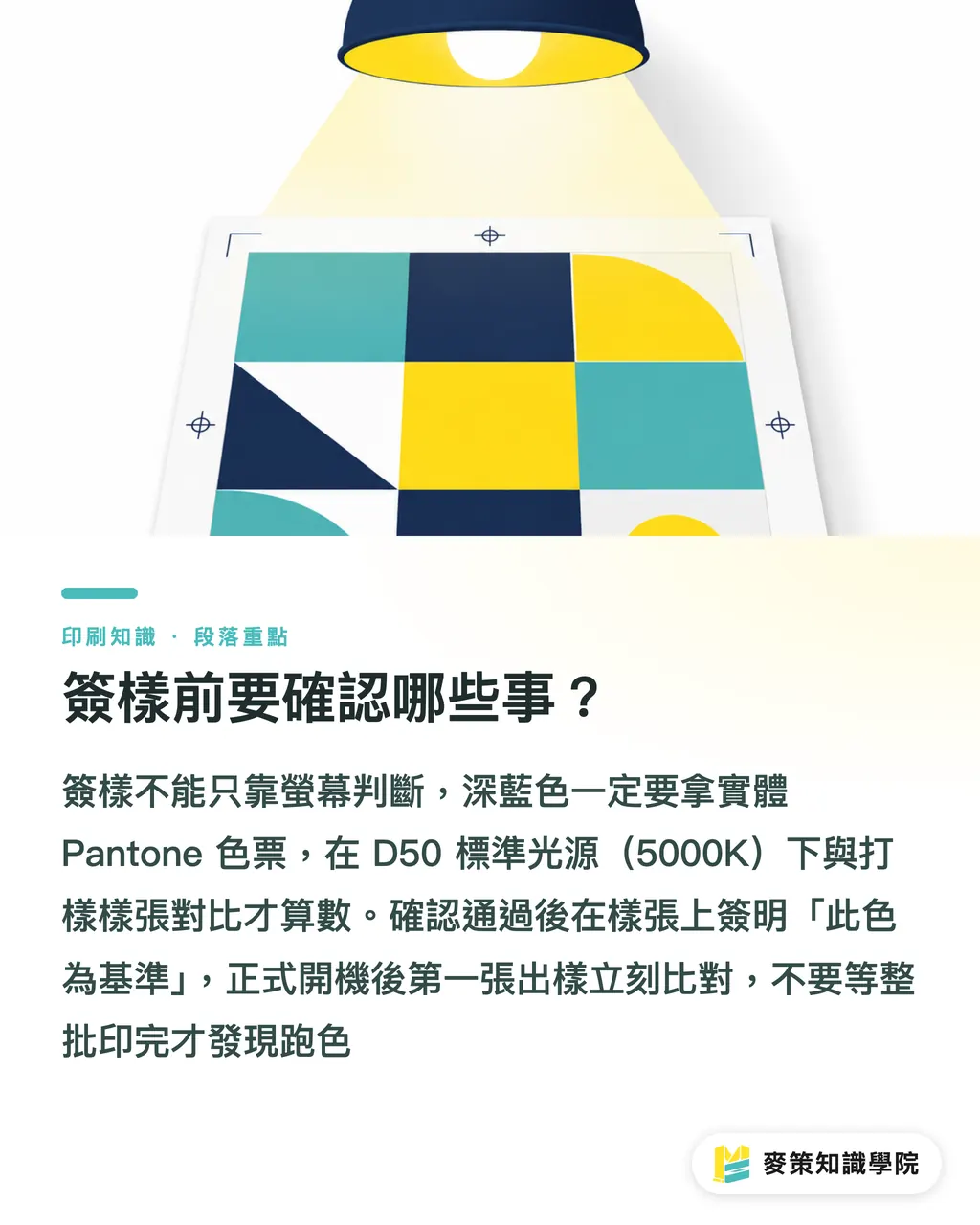
1. Grab a physical Pantone Color Bridge swatch book, never rely only on a screen
2. Check the press proof under natural daylight, not under office fluorescent tubes or next to a monitor
3. Ask the vendor for color settings recorded during proofing, including paper stock, ICC profile, and ink density settings
4. If there is any doubt, sign directly on the proof as 'Approved Color Standard' and keep it on file for reference
5. Once the main production run starts, check the first sheet off the press against the approved proof immediately, rather than waiting until the entire batch finishes
One extra nuance: lighting completely changes the blue you see. The print industry standard is D50 lighting (5000K color temperature), which gives the most accurate comparison. If your finished piece will be displayed under warm retail lights or cool white LEDs, check it under those simulated conditions too, so you do not get an unpleasant surprise after delivery
Key Takeaways
・Pantone 289 C shifts purple in CMYK primarily due to gamut limitations, not printer error
・For four-color printing, always rely on a physical Pantone Color Bridge guide, never just software auto-conversions
・Paper stock directly affects how deep blue renders, so changing paper requires a new proof rather than reusing old values
・For brand colors or recurring print runs, spot ink is the choice that saves the most trouble
・Sign off on proofs under D50 standard lighting against a physical swatch book, because screens are never an acceptable acceptance standard
Further Thoughts
After working on deep blue print jobs for years, the most common issue I see is not a lack of technical skill, but a broken chain of communication. The designer looks at the monitor, sales goes by client feedback, and the printer trusts their own proof. All three operate on different reference points while insisting the color is right. To nail a tricky shade like 289 C, the real solution is establishing a shared baseline: physical swatch book plus paper proof plus confirmed lighting. That gets everyone aligned to the same benchmark before files ever go to press
Before planning print collateral with a brand deep blue, clarify three things first: Is this a one-off job or a recurring print run? Does the budget allow for spot color? What lighting will the final printed piece sit under? Once you answer these three questions, you will know exactly where to focus your effort. If you need to discuss specific options, feel free to talk with the consulting team at Mai Strategy Knowledge Academy
FAQ
- What are the CMYK values for Pantone 289 C?
- The official Pantone Color Bridge guide lists recommended CMYK values, roughly high cyan (C), medium-high black (K), low magenta (M), and zero yellow (Y). Because equipment and inks vary across print shops, use a physical Color Bridge swatch as your benchmark rather than relying on software auto-conversions
- Does 289 C have to be printed with spot color? Can CMYK work?
- You can print it in CMYK, but color fidelity has built-in limits and the risk of color shifting is higher. For brand identity colors, recurring print jobs, or zero-tolerance color requirements, Pantone spot color is recommended. For general event flyers or one-time print runs, dialing in the CMYK values and verifying with a proof is usually acceptable
- Why does the same file look different when printed by different print shops?
- CMYK color is shaped by press equipment, ink brand, paper stock, and daily ink density calibration, which vary from shop to shop. That is why deep blue projects especially require press proofs. You are confirming what this specific press, this paper, and this ink batch actually output, rather than relying on file numbers
- What lighting gives the most accurate color inspection?
- The print industry standard is D50 lighting (5000K color temperature). Any color-critical inspection should be conducted in a standard light booth. Warm tungsten bulbs or cool LED lights alter the appearance of deep blue hues, making them unsuitable for color checks
- What is the difference between Pantone 289 C and 286 C?
- Both are deep blues, but 289 C is darker and deeper, leaning toward navy. 286 C is closer to royal blue, with slightly higher saturation and brightness. In CMYK printing, 286 C shifts toward purple even more noticeably. Because 289 C contains more black ink, its hue tends to be somewhat more stable, but capturing its true depth still requires a proof. Do not skip that step
Related articles
The Print × AI weekly
The print and AI know-how designers, brands and enterprises can use before they commit — one email, every week
Tool Library
RGB↔CMYK conversion, ΔE color difference and brand color print analysis — free color management tools, computed right in your browser.
MINDS Group
Need actual printing or gifting services?
From premium printing to online ordering and festive gifts — the MINDS Group sister brands take it from here.