
Overview
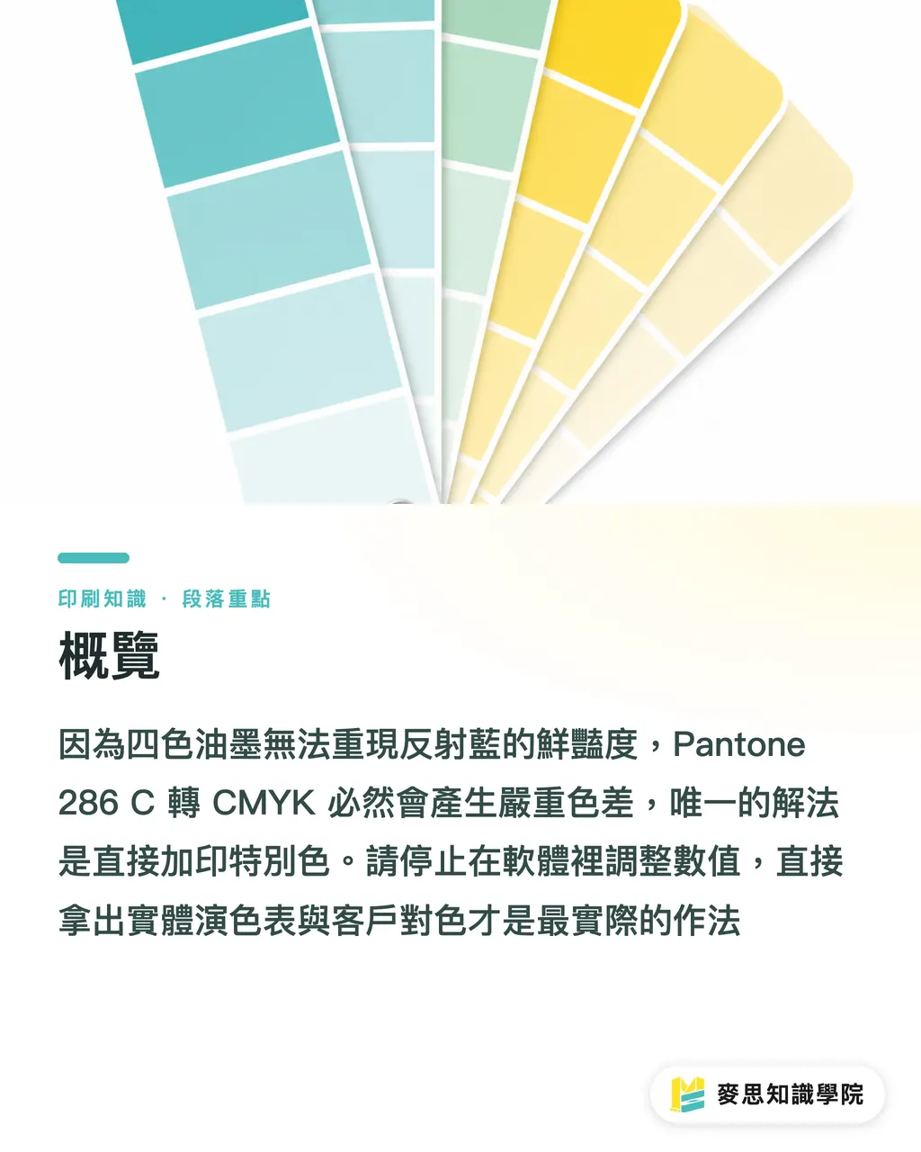
Converting Pantone 286 C to CMYK will always create a serious color shift, because four-color inks cannot reproduce the unique vibrancy of its Reflex Blue character. The only real fix is to print it directly as a spot color
If this issue already has you stuck, the consulting team at Mai Strategy Knowledge Academy recommends that you stop adjusting values in the software right away. Take out a physical color guide and match the color with the client in person
What Is Pantone 286 C, and Why Is It So Hard to Print?
Pantone 286 C is a highly saturated royal blue with a purplish cast, often used in brand identities for technology and financial companies
Its core formula contains a large amount of Reflex Blue, an extremely vivid pigment with a metallic-looking sheen
The problem starts when you try to simulate it with CMYK, cyan, magenta, yellow, and black. CMYK cyan is not bright enough to begin with. Once you add magenta to pull out that purplish cast, the whole color drops immediately, turning dull, grayish, or even purple-black
It is the same kind of problem I have run into before with Pantone 032C warm red or 427C gray. RGB colors that glow on a software screen are a completely different thing once they go onto a press. A standard four-color offset press simply cannot cover the vividness of 286 C within its color gamut
Why Does It Look Accurate on Screen but Fail So Badly in Print?
This is one of the client complaints I have handled most often on the production floor over the past decade-plus
A designer enters Pantone 286 C in Illustrator, and the software automatically calculates a set of CMYK values. The screen uses RGB light to trick your eyes into thinking those values will print close to the original color
But a print shop prints physical ink on paper. Based on my own shop-floor tests, when the software's default values are printed directly on 150g coated paper, the finished color shift is usually severe enough for the brand side to reject the job
The bright blue shown on screen turns into a lifeless deep purple-blue on paper
If the Budget Cannot Cover a Spot Color, What Should Small and Mid-Sized Printers Do?
If you are handling a few thousand posters and the client's budget absolutely will not allow a fifth color, this is how we deal with it in practice:
・Set expectations first: before sending the job out, take out a physical CMYK color guide, turn to the patches around C100 M80, point them out to the client, and state clearly that this is as bright as it gets with four-color printing only
・Test and fine-tune: if you really have to push ahead, I usually suggest pulling Cyan up to 100%, keeping Magenta somewhere between 65% and 75%, and absolutely avoiding black, K=0. I would rather sacrifice a little of the purplish cast to preserve the brightness of the blue
・Use a dedicated plate for color approval: if the quantity is large enough, choose a dedicated run and go to the print shop for press check yourself. At that point, you can ask the press operator to open the cyan and magenta ink keys a little heavier to force the saturation up. But this will also affect other images on the sheet, so you have to make a tradeoff
For companies that need long-term control over brand color, it is better to subscribe to the Mai Strategy Knowledge Academy newsletter than to compromise at the press every single time. We regularly share this kind of frontline print-production advice, helping you build a sound understanding of color management
How Can You Eliminate 286 C Color Disputes at the Source?
If you are the designer leading the project, build the safety net when you create the brand identity guidelines:
・Set up a dual-track standard: in the CI manual, besides naming Pantone 286 C as the standard color, personally use a CMYK color guide to choose a visually acceptable four-color substitute and define its values clearly
・Separate digital and physical expectations: clearly define the expected difference between this color on webpages, physical packaging, and general printed materials. Do not let downstream vendors each convert it randomly with their own software
・Make good use of digital proofs: before mass production, require a digital proof with an embedded color profile and use it as the signed-off proofing standard. This can expose possible dullness early, while there is still time to stop the loss
Key Takeaways
・The CMYK values automatically converted by software are a trap. The Reflex Blue character of Pantone 286 C absolutely cannot be reproduced perfectly with four-color inks
・If you are not printing a spot color, give up on screenshots. Use a physical CMYK color guide with the client to confirm the acceptable lower limit for dullness
・Defining the CMYK substitute values for 286 C directly in the CI guidelines is the lowest-cost way to prevent downstream printing disasters
Further Thinking
I often tell clients that color management is 70% early communication and 30% press adjustment
Extreme colors like Pantone 286 C test whether the design side really understands the limits of print
For SaaS platforms or online print-file checking tools, if they can accurately catch this kind of high-risk spot-color-to-CMYK conversion the moment a designer uploads a file and proactively warn about the expected color shift, they can greatly reduce return rates and communication costs
FAQ
- When I convert Pantone 286 C to CMYK in Illustrator, what values are the most accurate?
- There is no most accurate value, because four-color inks cannot print Reflex Blue. In practice, it usually lands somewhere around C100 M75 Y0 K0, but the print will definitely look darker and duller. Always check against a physical color guide
- Why does 286 C look different when the same design file was printed last week and this week?
- If you are using gang-run printing, the CMYK values are affected by the ink coverage of other jobs on the same sheet. A color shift of around 10% is normal. If you need accurate color, you must run a dedicated plate and specify a spot color
- Will 286 C look different on coated paper and woodfree paper?
- The difference is huge. Coated paper has a coated surface, so the color looks brighter and more saturated. Woodfree paper absorbs ink, so even Pantone 286 C printed as a spot color will look deeper and darker. Always check a physical swatch on the actual paper stock before choosing the paper
Related articles

The Print × AI weekly
The print and AI know-how designers, brands and enterprises can use before they commit — one email, every week
Tool Library
RGB↔CMYK conversion, ΔE color difference and brand color print analysis — free color management tools, computed right in your browser.
MINDS Group
Need actual printing or gifting services?
From premium printing to online ordering and festive gifts — the MINDS Group sister brands take it from here.