

Why Do People Mistake Pantone 7549 C for Dark Blue?
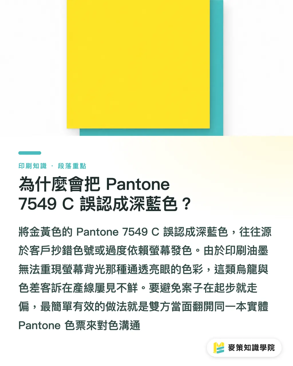
Most of the time, the client simply copied down the wrong color code or took a wild guess. It is the most common mix-up I have seen on the production floor lately. A designer came to me with the client's requested Pantone 7549 C and asked: "How do I convert this dark blue to CMYK without shifting the color?" Hold on. I told him straight up that Pantone 7549 C is a rich sunflower golden yellow (around 0, 29, 100, 0 in CMYK). It has nothing to do with blue
What the client actually wants is usually Pantone 2749 C (a deep blue), or 289 C and 293 C, which banks and tech companies love. I have dealt with this client complaint countless times. The root cause is always relying too much on screen colors. The client picks a punchy, vibrant blue on a glowing monitor, not realizing that 4-color press inks cannot reproduce the backlit clarity of an RGB display. The easiest way to keep a project on track from day one is simple: sit down together and flip through the exact same physical Pantone swatch book
Why Do Dark Blues Shift to Purple or Turn Muddy in 4-Color Printing?
In the CMYK color space, blue and purple sit right next to each other. When you pile on black (K) to make the color deeper, purity drops fast. Even if you pick the right color code, dark blue remains a nightmare on the press floor. Take Pantone 293 C or the grayish 432 C. Both look solid on screen, but once they run through a 4-color press, they often come out with a purple tint or sink into a muddy, dark blue
This has nothing to do with whether the print shop is good or bad. It comes down to the color gamut limits of dark blue itself. To make blue look deep enough, people tend to bump up magenta (M) and black (K). If magenta creeps up by even a few percentage points, or if dot gain spreads on press under pressure, the blue visibly flips to dark purple in an instant. That ruins the print
Also, with muted dark shades like 432 C, running even slightly heavy on black ink wipes out the blue tonal range, leaving you with a flat, lifeless black. When converting to 4-color process, mixing heavy amounts of cyan (C), magenta (M), and black (K) all at once tanks the ink's light transmission. That is why dark areas always end up looking cloudy and dirty
How Paper Characteristics Kill Dark Blue Tonal Detail
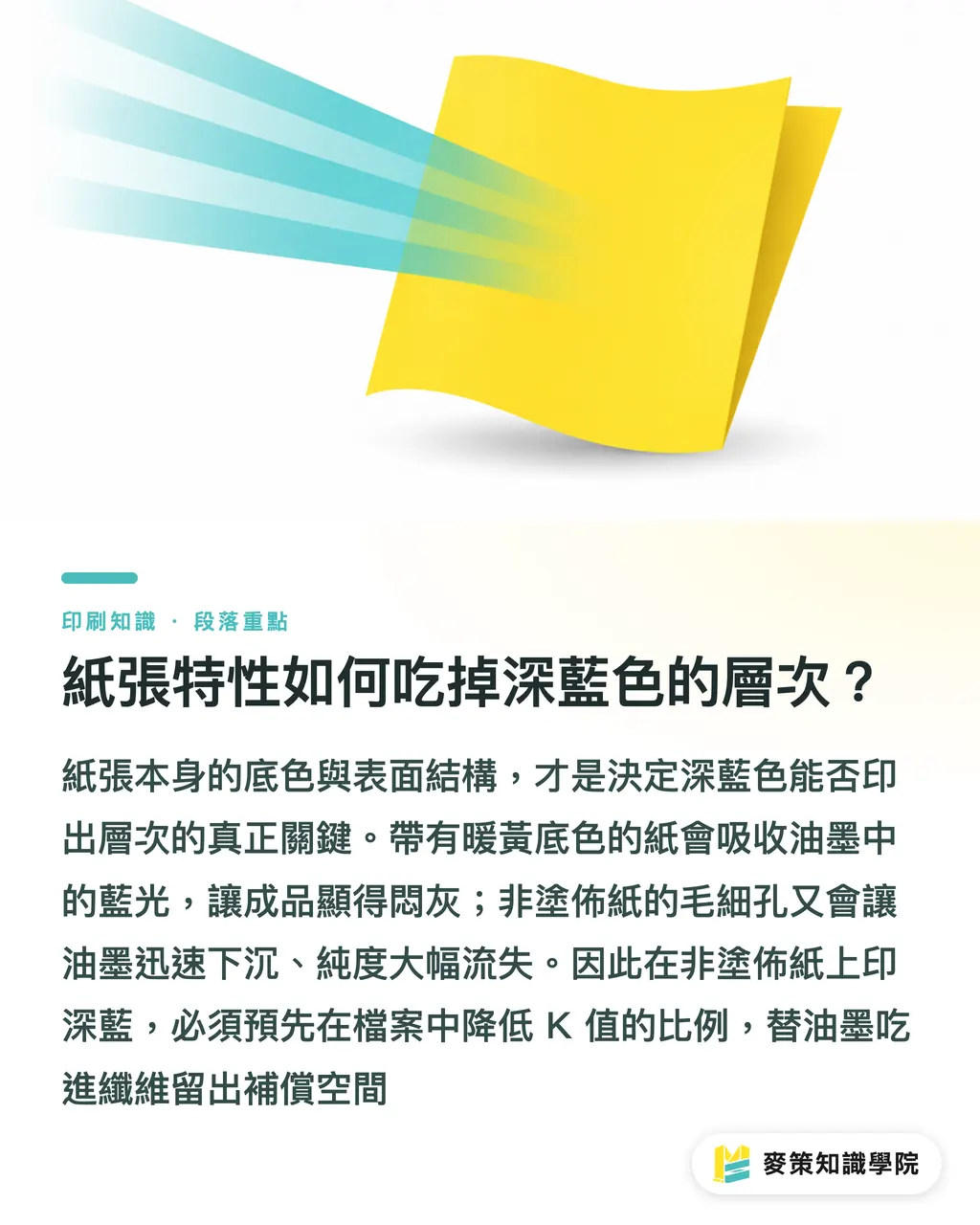
A yellowish paper base cancels out blue tones, while rough, porous paper sucks the ink in, dragging purity way down. Dialing in your file values is only step one. The paper stock is what actually makes or breaks the job
Take cream-tinted paper stocks, similar to what happens when picking paper for warm beiges like Pantone 7499 C. The paper's yellow tone eats up part of the blue light in the ink, so the printed blue turns out dull and murky
The coating on the paper surface matters just as much. Coated papers like gloss and matte art paper have a smooth surface and reflect light well, keeping dark blue rich, saturated, and glossy. Uncoated papers like woodfree offset paper and fine art text paper have open pores. Ink sinks straight into the paper fibers, leaving the blue looking gray and dull every single time. If you have to print deep blue layers on uncoated stock, cut back the black (K) percentage in your file in advance. Give the ink room to sink in
FAQ
- What color is Pantone 7549 C?
- Pantone 7549 C is a rich sunflower golden yellow (around 0, 29, 100, 0 in CMYK), not dark blue. Standard corporate navy blues are typically Pantone 2749 C, 289 C, or 293 C. Any confusion usually comes from a typo in the color code or relying solely on screen previews
- Why does dark blue turn purple when printed?
- Dark blue shifts to purple mainly because the magenta (M) value is set too high in the artwork, or dot gain expands on press during the run. In the CMYK color space, blue and purple hues sit very close together. When you add magenta ink to deepen the color, even a tiny ink variance pushes the visual appearance from navy to dark purple
- Why does CMYK dark blue look muddy and dirty in print?
- Dark blue turns muddy because heavy layers of cyan (C), magenta (M), and black (K) pile up at the same time, cutting ink transparency way down. If black ink goes on too heavy, it destroys the vibrancy and fine tonal details of the blue, flattening the final piece into a dirty, dead black
- Why does dark blue look gray and dull on woodfree or fine art paper?
- Uncoated stocks like woodfree paper and fine art paper lack a surface coating and have open fiber pores that rapidly soak up ink, killing color saturation. In addition, the yellowish undertone of the paper cancels out blue light. If you need rich dark blue detail on these stocks, reduce the black ink percentage in your artwork before sending it to press
Related articles
The Print × AI weekly
The print and AI know-how designers, brands and enterprises can use before they commit — one email, every week
MINDS Free Tools
Spine width and imposition calculators — skip the manual math, free in your browser.
MINDS Group
Need actual printing or gifting services?
From premium printing to online ordering and festive gifts — the MINDS Group sister brands take it from here.