
How much can Pantone 349 C change when converted to CMYK?
There is no single set of CMYK values that will make Pantone 349 C look the same across different stocks and printing conditions
Converting a spot color to CMYK means translating its appearance into a combination of cyan, magenta, yellow, and black inks. The result depends on the output profile, paper whiteness, and printing conditions
A spot color is a brand color printed with its own plate and specially mixed ink. It suits fixed colors that need independent control
Any CMYK values for Pantone 349 C you find online are, at most, a starting point for reference. They are not production acceptance criteria
When you hand off the file, make clear whether the target is a Pantone swatch, a previously approved printed proof, or an on-screen preview. These are three different references
Once the target is clear, the printer can decide whether to keep the spot color or convert it to four-color process for the actual output conditions
Why can a deep green look gray or black in print?
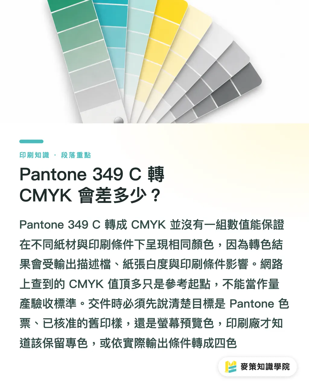
After Pantone 349 C is converted to CMYK, the deep green may look grayish or too dark, or lose definition in the shadows. Four-color printing cannot always reproduce the look of a spot color in full
Artwork can look saturated on a bright display, but paper whiteness, ink, and printing conditions all change how it looks on paper
For example, the same deep green logo may look different as a small mark on a white background than as a full packaging background
A small logo can look heavy, while a large area of deep green can make shadow details hard to see
If you only add more black to deepen the color, the green can turn dull too, and its details can disappear
I look at the green hue and tonal range first, then judge whether the overall color is close enough to the target. That keeps us from guessing back and forth based only on CMYK numbers
Should Pantone 349 C be printed as a spot color or in CMYK?
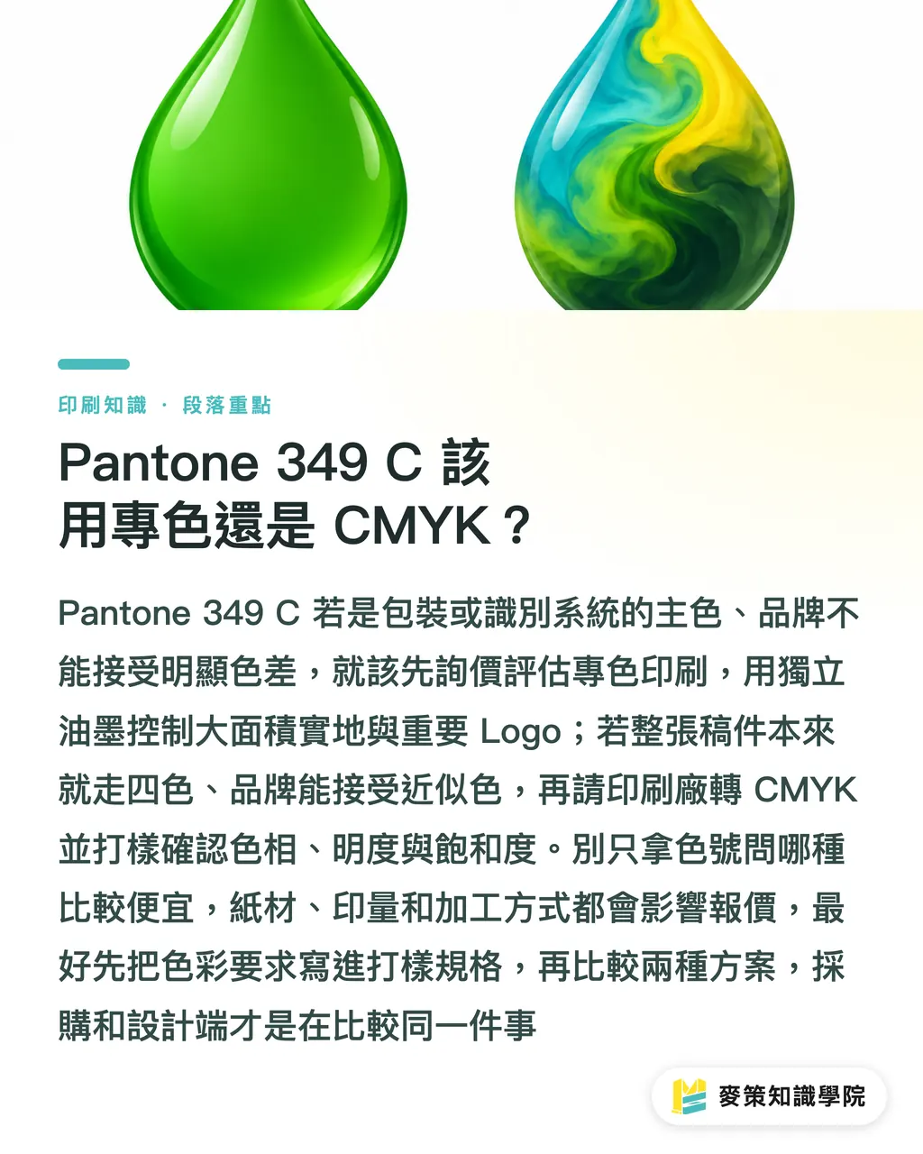
If Pantone 349 C is the main color in packaging or a visual identity system, and the brand cannot accept a noticeable color shift, get a quote for spot-color printing first
If the entire job is already set up for four-color printing and the brand can accept a close match, ask the printer to convert to CMYK for the actual conditions and confirm it with a proof
・Spot-color printing: The brand green can be controlled with its own ink. It suits large solid areas and key logos. Confirm the paper stock, ink mixing, and number of plates first
・CMYK printing: This fits a job already using the four-color process, especially one with multicolor text and images. First confirm that the converted hue, lightness, and saturation are acceptable
Don't just ask which option is cheaper based on the color code. Stock, run length, and finishing all affect the quote
If Pantone 349 C is a fixed brand identity color, put the color requirements in the proofing specs before comparing spot and process options. Then procurement and design are comparing like with like
How should you set up the design file, and what should you check before handoff?
When handing off a file with Pantone 349 C, tell the printer whether to preserve the spot color or output CMYK, then check the PDF separations and stock settings
An output profile records how a specified printing process renders color. It lets design software interpret CMYK values for those conditions. Without a specified profile, values may look precise but still fail to reproduce under another set of printing conditions
・1. In Illustrator's Swatches panel, confirm Pantone 349 C is set as a Spot Color. If the job will use four-color printing, convert it for the output conditions specified by the printer
・2. After exporting the PDF, check the separations preview. Make sure the spot plate has not been kept while a four-color version was also output, and check that small black text has not accidentally become four-color
・3. After revising the artwork, export a new PDF and check separations again. Make sure the deep green background extends to the trim edge, and set bleed to the printer's specifications
When resizing an old file or switching stocks, review the swatch settings again
Was an old CMYK value carried over? Was a Spot Color accidentally converted to a Process Color? These small oversights often delay a print job more than the color code itself
How should you approve a proof to reduce color differences in production?
Before Pantone 349 C goes into production, approve it against a physical proof and production conditions agreed on by both sides. An on-screen preview alone is not a final color standard
Mai Strategy's three print approval gates are simple: set the target, proof under actual conditions, then sign off on the proof as the production reference
・1. Set the target: Agree whether the reference is a Pantone 349 C swatch or a specified previously approved proof, and note whether the job uses spot color or CMYK
・2. Proof on the same stock: Use the production paper and planned finishing where possible. If the job includes lamination, varnishing, or other surface treatments, account for those in the proof too
・3. Sign off for production: Confirm the color under viewing conditions agreed on by both sides, keep the signed proof, and record stock, printing method, and finishing conditions on the job ticket
A standard digital preview can help check the layout, but it may not show how Pantone 349 C will look on the actual production stock
If the brand color directly affects package recognition, bring the swatch, paper, and finishing specs to the Mai Strategy Knowledge Academy consulting team and confirm proofing and acceptance criteria with prepress first
Key takeaways
・CMYK values for Pantone 349 C are a starting point for conversion, not a guaranteed match across stocks
・With deep green proofs, check the green hue and tonal range first, then judge whether the overall color is close to the target
・Before printing, consider spot-color printing if the brand's primary color is non-negotiable
・After revisions, recheck PDF separations, swatch settings, and bleed
・Use a physical proof as the production reference, and record stock and finishing conditions
Further thoughts
Design files can preserve Pantone 349 C as a spot color, but the brand database should also record whether the job uses spot color or CMYK, the stock, output profile, and approved proof version. Don't keep only a single web color value. AI-generated packaging mockups work for discussing composition, but they cannot approve print color. If the SaaS job ticket keeps the swatch, stock, finishing, and proof records together in one project, there is one less round of color guessing when the artwork changes or suppliers change
Further reading
FAQ
- Can Pantone 349 C be converted directly to a fixed set of CMYK values?
- There is no single set of values that will produce the same color across different stocks and printing conditions. Have the printer convert it for the actual output conditions, then confirm the result with a proof
- Does Pantone 349 C always need to be printed as a spot color?
- No. If the brand's primary color cannot tolerate a noticeable shift, prioritize evaluating spot-color printing. For four-color printing, first confirm that the proof is acceptable
- What paper should I use for a CMYK proof of Pantone 349 C?
- Use the production stock if possible, and include the planned surface finishing so the signed proof looks closer to the final product
- Can I approve Pantone 349 C by looking at the screen alone?
- Not recommended. An on-screen preview alone cannot represent the printed color. Before production, use a physical proof approved by both sides as the acceptance reference
Related articles

The Print × AI weekly
The print and AI know-how designers, brands and enterprises can use before they commit — one email, every week
Tool Library
RGB↔CMYK conversion, ΔE color difference and brand color print analysis — free color management tools, computed right in your browser.
MINDS Group
Need actual printing or gifting services?
From premium printing to online ordering and festive gifts — the MINDS Group sister brands take it from here.