
How much does Pantone 3005 C shift when converted to CMYK?
When Pantone 3005 C is converted to CMYK, there is no fixed deviation that remains valid regardless of paper stock and printing conditions. Pantone 3005 C is the name of a spot color based on a coated paper swatch. A spot color is a single ink mixed in advance. CMYK is built by overprinting four plates, Cyan, Magenta, Yellow, and Black. The two methods differ from the very start of the color-matching process
When a client asks, 'How far will it shift?', I do not start by throwing out a set of C, M, Y, and K values, because without the paper stock and ICC profile, those numbers cannot be used as acceptance criteria. The screen image, the Pantone swatch, and the printed proof must first have a designated target
ΔE converts the difference between two colors in a color space into a number. The larger the number, the easier the difference usually is to see. It must be interpreted together with the measurement light source, substrate, and measurement method. Without on-site proofing and measurement data, it is not honest to claim that the shift is 'fixed at X'. The answer you can actually deliver is to proof under the same conditions first, then measure the difference
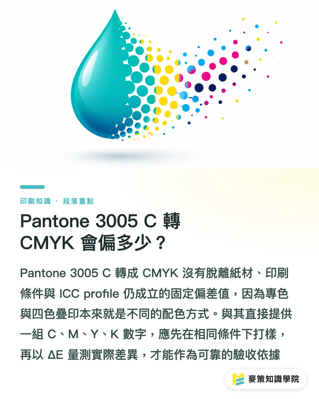
Why does Pantone 3005 C tend to print darker or grayer?
After Pantone 3005 C is printed, the most common change is a loss of vividness in the blue. It looks darker and grayer, and under some printing conditions it can also drift toward purple. This is not a fault in one machine. The gamut of a spot color and the range that four-color ink can reproduce are not exactly the same
Screens use three RGB light-emitting channels. Printing uses four CMYK inks that absorb light. A blue on screen can look bright because of emitted light, but on paper it depends on light reflected from the Cyan, Magenta, Yellow, and Black ink layers. When the high-chroma area of 3005 C falls outside the range that the four-color process can reproduce consistently, the conversion sacrifices saturation, and the blue is no longer as clean
The easiest mistake to make on press is to blame the entire color shift on the printer. If the same file looks bright blue on screen but is printed on uncoated paper without a coating, the paper white, ink absorption, and surface reflection all change the way it looks. First determine whether the hue has shifted, the lightness has dropped, or the saturation has decreased. Otherwise, you will keep adjusting back and forth
How do paper stock and an ICC profile change Pantone 3005 C?
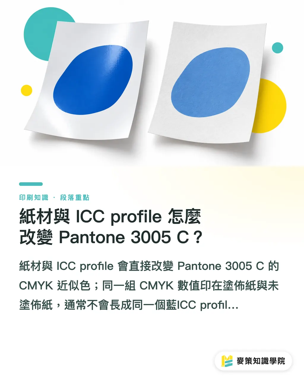
Paper stock and the ICC profile directly change the CMYK approximation of Pantone 3005 C. The same CMYK values printed on coated and uncoated paper will usually not produce the same blue
An ICC profile is a color-conversion file that describes how a specific device, ink set, and paper stock render color. Design software uses it to convert spot-color or RGB content to CMYK. The International Organization for Standardization (ISO) provides the ISO 12647 series as a standard framework for controlling color conditions in the printing process. It does not decide the Pantone 3005 C formula for every printer
The C after Pantone 3005 C already signals that the target substrate is coated paper. If you take a coated-paper swatch and demand an exact match on uncoated paper, you started from the wrong premise. Paper whiteness, ink absorption, dot gain, varnish, or lamination can all make the blue look deeper or more shifted. At a minimum, the print order should clearly state the paper stock, printing method, and ICC profile
How does the Mai Strategy three-gate print workflow work?
Mai Strategy's three-gate print workflow is a practical way to judge the color shift in Pantone 3005 C: define the target first, perform a controlled conversion, then approve with a proof and measurements
・1. Define the target: State Pantone 3005 C, the paper stock, surface finishing, and printing method in the file and quotation. Decide first whether the brand needs to hold the hue, lightness, or saturation
・2. Controlled conversion: Run one CMYK conversion using an ICC profile matched to the paper stock and printing conditions. Keep the original spot-color layer and the converted version. Do not keep changing the numbers in different software
・3. Proof approval: Use a proof produced under conditions close to the production run, ideally on the planned paper stock, and compare it with the Pantone swatch under a fixed viewing light source. When the brand-color requirement is high, use a spectrophotometer to measure the CIE L*a*b* color coordinates, then record the difference between the target and the proof with ΔE
I treat the approved proof as the shared reference for later batches. If a brand needs to use the color across business cards, packaging, display stands, and a SaaS interface, the Mai Strategy Knowledge Academy consulting team can help turn the swatch, CMYK fallback, paper stock, and approval rules into brand-color guidelines
When should you keep the spot color, and when is CMYK acceptable?
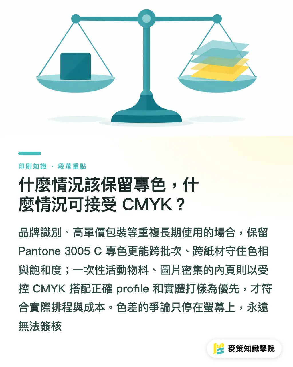
Whether to keep Pantone 3005 C as a spot color depends on the job it needs to do in the finished piece. If the color must stay recognizable across different batches and paper stocks, a spot color is usually more stable than a four-color approximation. For flyers or interior pages that use a lot of imagery, controlled CMYK is more practical
・Keep Pantone 3005 C as a spot color: The hue and saturation are easier to hold, making it suitable for brand manuals, packaging key visuals, and repeat print runs over time. The downside is an extra plate and ink management. Short runs or multi-color jobs bring higher cost and scheduling pressure
・Convert to CMYK: It can be produced in the same run as photos and other four-color elements, making it suitable for ordinary promotional materials. The downside is that the same formula can turn darker or grayer when the paper stock or printing conditions change. You cannot confirm it from the screen alone
・Use a fifth color: This can fill in the brand blue when four-color printing cannot reproduce it well. The downside is that the printer must confirm whether the equipment, plate count, and post-processing support it. It is not the standard answer for every job
My view is straightforward: for a signature brand color, corporate identity, or premium packaging, put spot color in the plan from the start. For one-off event materials, interior pages, and image-heavy work, spend the budget on the right profile and a physical proof. If the color difference is argued over on screen alone, you will never have an approved version
Key takeaways
・Pantone 3005 C has no CMYK conversion value that remains valid across paper stocks, ICC profiles, and printing conditions
・Answering 'How far will it shift?' requires a proof and measurement on the same paper stock. You cannot guess from a screen color or a single formula
・The C in Pantone 3005 C points to coated paper as the target. Switching to uncoated paper means reassessing it
・Evaluate a spot color first for the brand's key visual. Use a controlled CMYK approximation only for ordinary four-color materials
Further thoughts
The production side can add paper stock, ICC profile, proof, and approved sample as fields in the job ticket. Designers should keep the original Pantone 3005 C spot color and the CMYK fallback. Procurement should require the printing conditions to be stated in the quotation. AI-generated images and SaaS design systems should also use the same brand guideline, at minimum separating RGB for screens from CMYK for print, and stating whether the brand's primary color may be replaced by a spot color. For the next job, make a small sample on the same paper stock first and approve it before going into full production. That usually saves more trouble than reprinting later
Further reading
FAQ
- Does Pantone 3005 C have a fixed CMYK value?
- No fixed value works for every printing condition. The CMYK formula must be confirmed together with the paper stock, ICC profile, printing press, and proofing conditions. Pantone 3005 C is the target color, not a four-number formula that every device can reproduce
- Why does Pantone 3005 C look darker when printed than it does on screen?
- Screens emit light through RGB, while printing uses CMYK inks that absorb light. The vivid blue of Pantone 3005 C may lose saturation when converted to four-color printing, and the paper white and ink absorption can make it look darker or grayer
- How do you measure the color difference of Pantone 3005 C?
- Start with a proof on the same paper stock. Then use a spectrophotometer to obtain CIE L*a*b* values and compare the target color with the printed sample using ΔE. The measurement light source, substrate, and profile must stay fixed, or the numbers cannot be compared directly
- Does brand printing always require Pantone 3005 C as a spot color?
- A spot color is more stable for a brand key visual, repeated print runs, or consistency across paper stocks. Ordinary four-color promotional materials can use a controlled CMYK approximation, but the proof must be approved before sending the job to print
- Is it enough if the printer only provides one set of CMYK values?
- No. At a minimum, the paper stock, ICC profile, printing method, and approved sample must be stated as well. Only then can the next batch be reproduced under the same conditions, without mistaking a formula for a complete color standard
Related articles

The Print × AI weekly
The print and AI know-how designers, brands and enterprises can use before they commit — one email, every week
Tool Library
RGB↔CMYK conversion, ΔE color difference and brand color print analysis — free color management tools, computed right in your browser.
MINDS Group
Need actual printing or gifting services?
From premium printing to online ordering and festive gifts — the MINDS Group sister brands take it from here.