
Why Does Pantone 300C Always Turn Dull and Purple in CMYK?
Pantone 300C becomes darker and more purple when converted to CMYK four-color printing because its optical wavelength range exceeds the gamut limit that CMYK process inks can reproduce
In the Pantone system, a spot color matching system that uses premixed physical inks to keep print colors consistent worldwide, 300C is a highly saturated electric royal blue. Its light-reflection behavior is very distinctive in conventional printing. When we force it into four-color values in design software, the system usually gives a mix such as C100 M44 Y0 K0
In light physics, CMYK magenta ink has strong light-absorbing properties. When magenta exceeds 35% to build the depth of blue, it absorbs a large amount of green and yellow light, which severely limits the blue light reflected back from the printed sheet
Over more than a decade on print production lines, I have seen this countless times. Designers see a clean, bright highlight blue on screen, but the physical print comes out like settled muddy purple. Judged against ISO 12647, the International Organization for Standardization's print color management standard that defines color-matching benchmarks for different papers and inks, the color space created by four-color overprinting simply cannot reach the saturation peak of a physical Pantone 300C swatch
When Is Pantone 300C Worth Printing as a Spot Color?
Whether Pantone 300C needs its own spot color ink depends on how much area the brand mark occupies on the layout and the total print quantity
When the total run exceeds 2,000 copies and Pantone 300C is used as a large background color, taking up more than 30% of the layout, spot color printing is usually the better choice for both cost efficiency and quality control
Many marketing managers back away as soon as they hear that spot colors add wash-up fees and separate plate fees, usually around NT$1,500 to NT$3,000 per color. What they miss is the hidden cost of chasing color in CMYK
Based on my production experience, the decision usually breaks down like this:
・Small runs, under 500 copies: CMYK simulation is recommended because the fixed wash-up cost cannot be spread out, making the unit cost too high
・Medium to large runs, over 2,000 copies: Spot color printing is strongly recommended. Spot color ink stays extremely stable at high press speeds and saves the waste sheets and makeready time needed for CMYK ink control
・Core brand VI marks: Regardless of print volume, if this blue is the soul of the brand identity, spot color printing ensures printed materials across all stores stay free of visible color variation
・Supporting graphics and lines: If the color is only used for fine lines or secondary interior-page decoration, the slight color shift from CMYK simulation is usually within what consumers visually tolerate
How Can You Minimize Color Difference When the Budget Only Allows CMYK?
When the budget does not allow a spot color, the core method for reducing color difference is to manually adjust the CMYK mix and choose the paper stock and ICC Profile carefully
Using the default Pantone-to-CMYK values from design software is often where the trouble starts. The software algorithm converts by averages and does not account for the real overprint physics of printing inks
In the color adjustment cases I have handled, lowering the default magenta value to around 38% while keeping cyan at 100% visually reduces the purple cast and makes the blue feel a little cleaner
If you need high color accuracy but are working within a tight budget, contact the Mai Strategy Knowledge Academy consulting team before placing the order so they can help review the file's color mix and reduce color risk upfront
Four key actions for reducing color difference in CMYK simulation:
・Lower magenta for a brighter feel: Keep magenta (M) between 36% and 40%. Never let the M value exceed 45%, or the color will start shifting purple
・Choose high-whiteness coated paper: Select coated paper with ISO whiteness above 90%. The whiter the paper base, the higher the saturation of the reflected blue light
・Load the correct ICC Profile: Match the prepress file against FOGRA39 or FOGRA51 standards to avoid a second compression of the color space during file conversion
・Avoid woodfree paper and duplex board: Uncoated paper, such as woodfree paper, has large pores and absorbs ink heavily, turning CMYK-simulated bright blue straight into a dull, muted color
How Should a Team Build a Color Approval Workflow?
The key to avoiding a large gap between the final printed piece and the expected result is to build a physical approval and color-matching process across teams
Many designers and clients end up arguing because one side is looking at an RGB screen while the other is holding a CMYK print. They do not share a common language for judging color
The "Mai Strategy Three-Gate Print Submission" standard operating procedure used by MINDS on the production line can solve this kind of color perception gap cleanly:
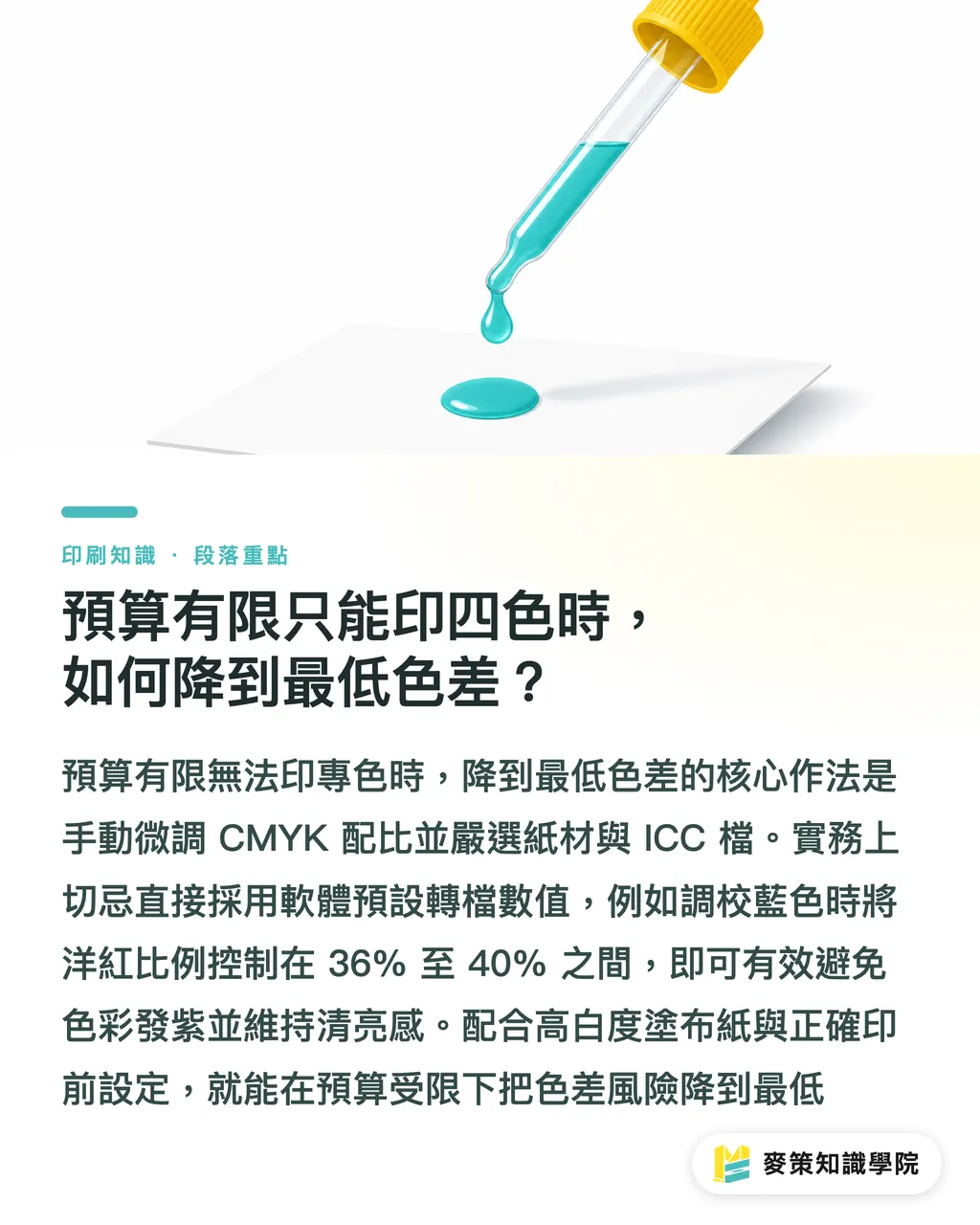
1. Gate one: Confirm the physical swatch first. Before printing, always use the latest Pantone Solid Coated physical swatch and compare it under natural daylight or a 5000K standard viewing light to clarify the physical limit of that color number
2. Gate two: Choose the paper stock and ICC Profile. Select the print color profile based on the final paper properties, then estimate the expected color difference (Delta E) between CMYK simulation and the spot color swatch
3. Gate three: Approve a physical proof. Use a press proof made on the same machine and same paper as the final production run. Only after approval should mass printing begin
To keep improving your team's prepress quality and technical knowledge, subscribe to the Mai Strategy Knowledge Academy newsletter for first-hand analysis on printing craft and color management
Key Takeaways
・The main reason Pantone 300C turns purple in CMYK is that magenta ink absorbs too much light. Lowering magenta to 38% can reduce the dull cast
・When the print run reaches 2,000 copies or more and the background color area exceeds 30%, spot color ink is more cost-effective for total cost and quality control
・Using high-whiteness coated paper raises light reflectance and greatly improves the visual vividness of CMYK-simulated bright blue
・Follow the Mai Strategy Three-Gate Print Submission process strictly, using physical swatches and press proofs as the only color-matching standards to avoid screen-based communication gaps
Further Thinking
Looking at the transformation of print manufacturing and brand design over the past few years, color management has moved beyond pure press operator experience and become a data-driven, standardized control process. When small and midsize businesses face a difficult brand color such as Pantone 300C, they do not need to chase expensive spot colors blindly, and they should not accept severe CMYK color shifts without question. The next practical step is this: bring physical swatch comparison into the early design stage, move color evaluation forward into file preparation, and build a strict physical proof approval system. That is how you find the ideal crossing point between budget control and brand image
FAQ
- What is the best recommended CMYK value for converting Pantone 300C?
- The software default is usually C100 M44 Y0 K0, but in practice I recommend lowering magenta to C100 M38 Y0 K0. This effectively reduces the purple cast in the final print and improves visual brightness
- Why does Pantone 300C look bright on screen but print so dark?
- Screens use the RGB light-emitting color space, which can show electric bright blue with ease. Printing uses CMYK subtractive offset printing, where coated ink absorbs light. The print gamut limit cannot cover the screen-level saturation of Pantone 300C
- If the budget is not enough for a spot color, does paper choice matter much?
- It matters a great deal. Choosing high-gloss coated paper with ISO whiteness above 90%, such as art paper, maximizes reflected light. If printed on uncoated woodfree paper, CMYK bright blue will absorb heavily into the sheet and appear dull and earthy
- What is a wash-up fee, and what other extra costs come with spot color printing?
- A wash-up fee covers the labor and consumables needed to clean the ink fountain and rollers when a print shop changes ink. Spot color printing usually also includes wash-up fees, separate plate fees, and spot color ink mixing fees
Related articles
The Print × AI weekly
The print and AI know-how designers, brands and enterprises can use before they commit — one email, every week
Tool Library
RGB↔CMYK conversion, ΔE color difference and brand color print analysis — free color management tools, computed right in your browser.
MINDS Group
Need actual printing or gifting services?
From premium printing to online ordering and festive gifts — the MINDS Group sister brands take it from here.