
Why Does Pantone 663C Lose Accuracy When Converted to CMYK?
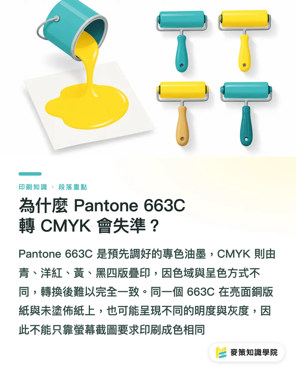
Pantone 663C loses accuracy in CMYK conversion because a Pantone spot color is a pre-mixed ink in a single formulation, while CMYK builds color by overprinting four plates, cyan, magenta, yellow, and black. Their color gamuts and rendering methods are fundamentally different
A spot color is a single pre-mixed ink printed from its own dedicated plate, without any CMYK overprinting. Pantone swatches are the standard reference for color matching
CMYK is a four-color printing process that builds images by overprinting cyan, magenta, yellow, and black. The final color shifts with paper stock and production conditions
Powder purple often looks like two different colors on screen versus paper. A screen emits light, which amplifies brightness and vibrancy. Paper absorbs ink, and overprinting can make the color go gray or muddy
Put the same 663C logo on gloss coated stock versus uncoated paper, and the visual weight shifts. Handing the press room a screen screenshot and asking for "the same" gives them nothing to actually work with
Is There a Fixed CMYK Value for Pantone 663C?
There is no single CMYK value for Pantone 663C that works across all printing conditions. Online conversion tables give you a starting point, not a final production value
An ICC profile is a color data file that describes how a device reproduces color, letting design software, proofers, and presses convert colors under matching conditions
The same CMYK values on coated paper versus offset paper can look like different shades of powder purple. Even when the stock is the same, swapping the press, ink, or surface finish will shift the result
See the actual paper first, then talk numbers
Don't guess the color
Before submitting files, spell out three things:
・① Whether the stock is coated, offset, or another uncoated paper
・② Which ICC profile and printing conditions the printer uses
・③ Whether Pantone 663C stays as a spot color or gets simulated in CMYK
How to Keep Pantone 663C Consistent on the Production Line
To keep Pantone 663C consistent in production, lock in three steps in order: color definition, proofing, and sign-off. Skip any one of them, and everyone down the line starts judging color by imagination
・① Color definition: the design team specifies whether Pantone 663C stays as a spot color or converts to a CMYK simulation, and names the stock and surface finish
・② Proofing: produce a proof on the same stock under the same color conditions. Check the powder purple's brightness, saturation, and gray cast. A phone photo does not substitute for this
・③ Sign-off: the design team, client, and printer approve the same physical proof together. Document the version and acceptable tolerance, so any reprint has a clear reference
ISO 12647, the standard set by the International Organization for Standardization to regulate printing processes and color conditions, can serve as a shared language between printers and designers. But the final call on Pantone 663C still comes down to the physical proof, because paper and finishing are part of the end product
Should You Keep Pantone 663C as a Spot Color or Switch to CMYK?
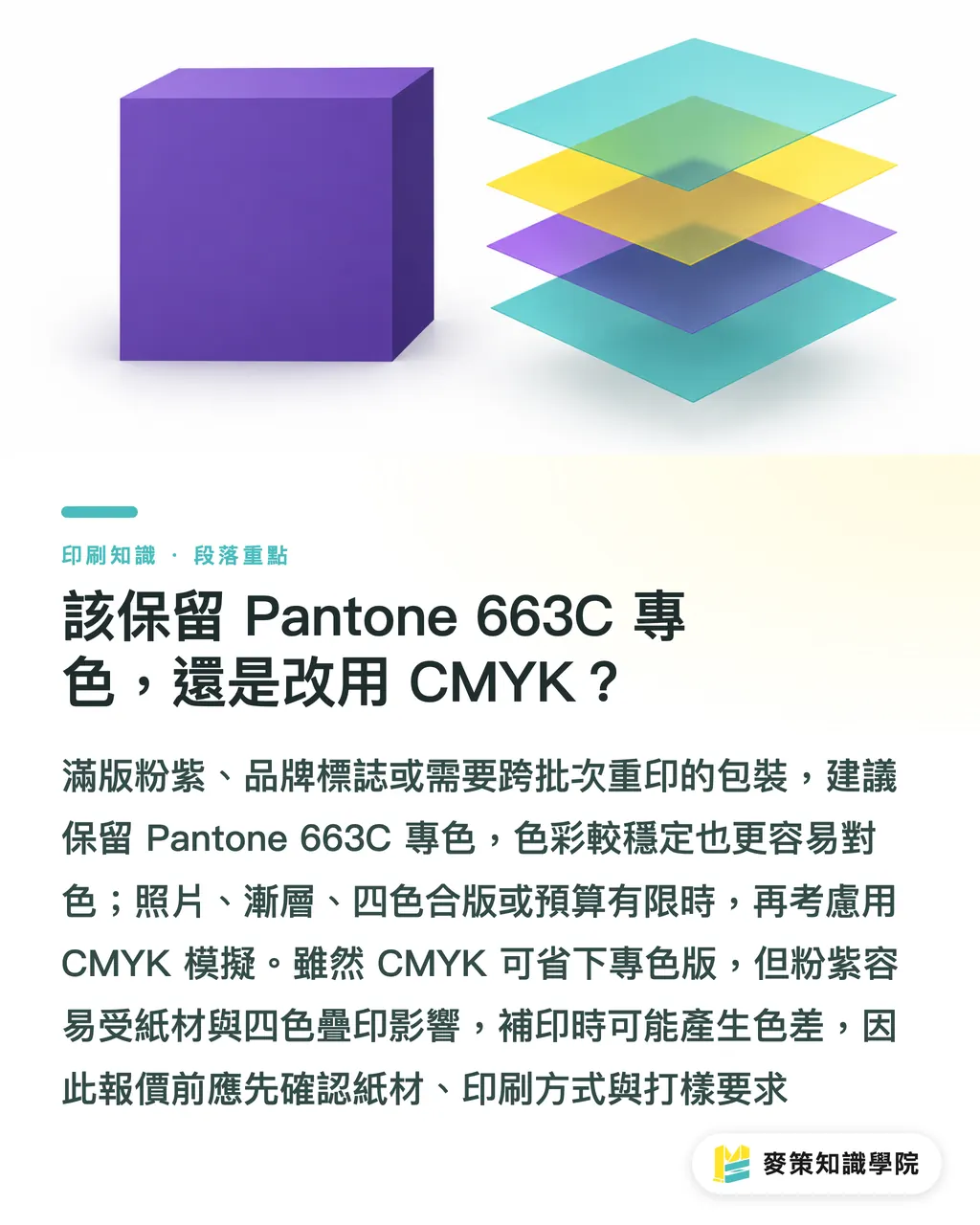
For full-bleed powder purple, brand logos, and jobs that need reprinting across batches, I'd go with spot color first. Photos, gradients, gang-run jobs, or tight budgets, that's when CMYK simulation makes sense
・Spot color: Pro: solids and logos hold color better, easier to match on reprints. Con: adds a plate and ink management; short-run costs may go up
・CMYK simulation: Pro: works well for gang runs and layouts with photos or gradients. Con: the powder purple is sensitive to stock and overprinting; you'll need to re-verify between batches
A full-bleed powder purple packaging box that switches to CMYK looks like it saves the spot plate cost. Then the reprint shows up with a color drift, and the back-and-forth confirmation rounds eat through that savings fast
Lock stock, print method, and proofing requirements into the spec sheet before quoting. When the trade-offs get tangled, the Mai Strategy Knowledge Academy consulting team can help sort it out
Key Takeaways
・There is no universal CMYK value for Pantone 663C. Paper stock and ICC profile come before the numbers
・Screen color is for direction only. Physical proofs are the basis for print sign-off
・Brand logos and full-bleed powder purple: evaluate spot color first. Gang runs: that's when you use CMYK simulation
・Keep stock, profile, proof version, and sign-off results on file. That's the only way reprints have a consistent reference
Further Considerations
Printers can build Pantone 663C stock, ICC profile, proof version, and sign-off fields directly into their quote forms. If you're using AI color tools or SaaS color platforms on the design side, treat their CMYK output as a proposal, not a print-ready answer. That way reprints, cross-vendor jobs, and client conversations all have something concrete to hand off
FAQ
- Does Pantone 663C have an official fixed CMYK conversion value?
- No single value covers all paper stocks, ICC profiles, and printing conditions. A conversion table gives you a starting point; final verification still requires a proof under matching conditions
- Why does Pantone 663C print gray or darker than expected?
- When Pantone 663C's spot color effect is rebuilt with CMYK overprinting, it's affected by gamut limits, paper absorption, and production conditions. A screen screenshot cannot replace a physical proof
- When should Pantone 663C be kept as a spot color?
- Brand logos, full-bleed powder purple, and jobs that need cross-batch reprints should keep Pantone 663C as a spot color. Photos and gang-run jobs are where CMYK simulation makes more sense
- How do you reduce Pantone 663C color deviation before printing?
- Confirm the paper stock and ICC profile first, then run a proof under matching conditions, and have the design team and client sign off against the physical proof. Write all three into the spec sheet
Related articles
The Print × AI weekly
The print and AI know-how designers, brands and enterprises can use before they commit — one email, every week
Tool Library
RGB↔CMYK conversion, ΔE color difference and brand color print analysis — free color management tools, computed right in your browser.
MINDS Group
Need actual printing or gifting services?
From premium printing to online ordering and festive gifts — the MINDS Group sister brands take it from here.