Why Do Vibrant Colors on Screen Always Print Out Dull and Muddy?
The systemic root cause behind this lies in the physical differences in light emission principles and color gamut
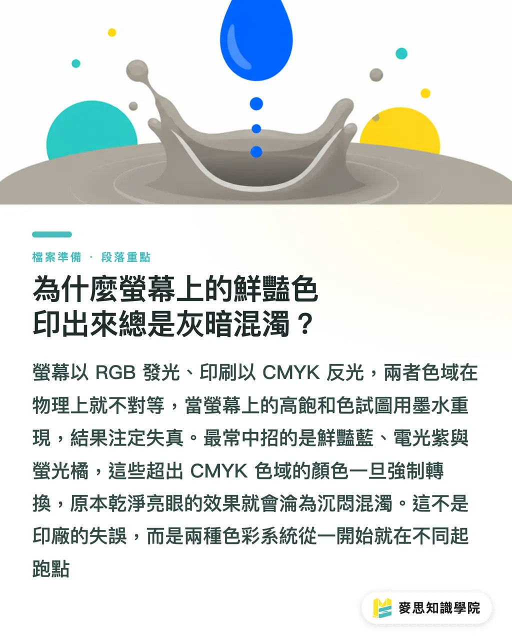
Screens emit light using the RGB (Red, Green, Blue) primary colors, which can easily mix to produce extremely high-saturation colors. In contrast, printing relies on CMYK (Cyan, Magenta, Yellow, Black) inks to absorb and reflect light
When you try to reproduce the highly saturated, emissive colors of RGB with CMYK inks, it is physically impossible
Based on my long-term observations on production lines and client sides, the most common 'danger colors' that cause issues are vibrant blue, electric purple, and fluorescent orange
If your design uses a large amount of these colors that exceed the CMYK gamut, a brute-force conversion will turn what was once a clean, striking glow directly into a muddy, dull mess
This isn't a printing error by the print shop; rather, the two color modes start from completely different baselines
Why You Shouldn't Simply Change the Image Mode to Convert RGB to CMYK
Ideally, you should select the CMYK mode right from the start when creating the file
However, if you take over a project midway or must convert from RGB, most people's intuitive reaction is to click 'Image > Mode > CMYK' in Photoshop. This is actually a crude and risky approach
Direct conversion causes the software to crop out-of-gamut colors in a default, rigid manner, resulting in broken color gradients
The correct operation path is 'Edit > Convert to Profile'
In this interface, you can manually specify the target print shop's ICC color profile
The value of this step is that it allows the software to perform color gamut compression algorithms based on the profile; while narrowing the color range, it preserves the relative relationships between adjacent colors as much as possible
Files converted this way will have a much smaller visual discrepancy
How to Preview the Actual Printed Colors Before Sending Files to Print
Before sending files to the print shop, you actually have the ability to perform a 'soft proof' yourself
By enabling 'View > Proof Colors' in Photoshop, the software will simulate the CMYK printing effect while keeping the file in RGB editing mode
Illustrator and InDesign also have corresponding proof setup interfaces
However, there is an absolute prerequisite here: your monitor must be hardware-calibrated
I've seen too many designers adjusting colors on laptop screens with a blue tint, which is like using a broken scale to weigh yourself
On an uncalibrated monitor, the colors from a soft proof carry zero reference value
Regularly using a colorimeter to align your monitor's display standards with the real world is your first step in color management
How to Best Align Color Expectations in Cross-Departmental and Vendor Communication
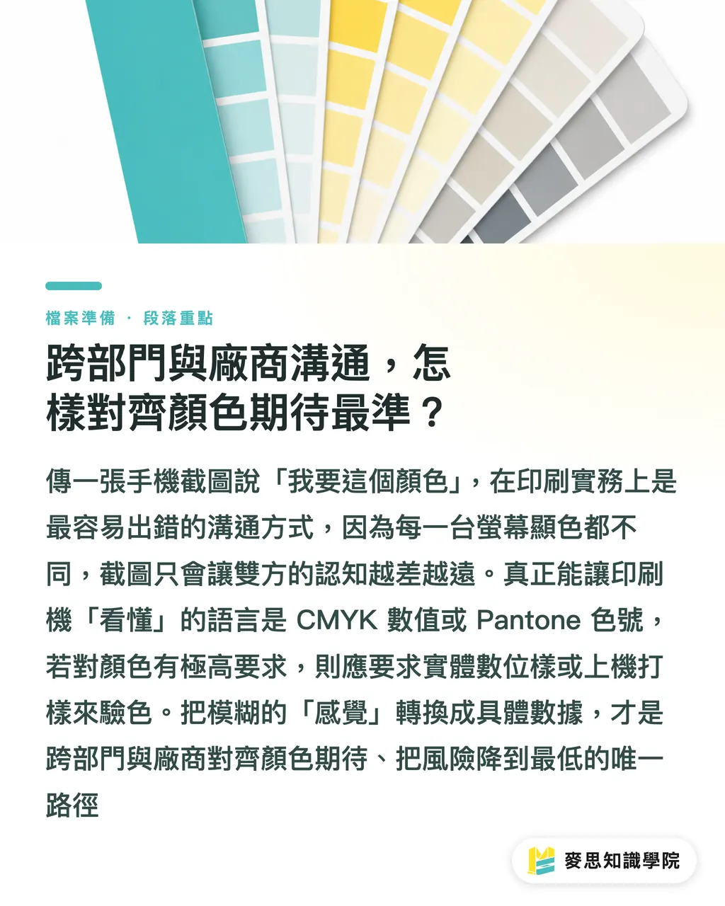
We have handled countless cases where a client sends a mobile screenshot saying, 'I want to print this blue.'
This is completely ineffective communication in printing practice. Every mobile phone and monitor displays color differently, and screenshots only push both parties' understanding further apart
To achieve precise matching, please directly provide CMYK values or designated Pantone color codes; numbers are the only common language printing presses recognize
If you have extremely high standards for color, requesting a physical digital proof or press proof is the safest solution
The integrated services of MINDS Printing actually focus on converting vague 'feelings' into concrete data and workflows at each of these touchpoints, minimizing the risk of out-of-control results for our clients
Key Takeaways
・Vibrant blue, electric purple, and fluorescent orange are danger colors that exceed the CMYK gamut; they should be avoided or have their saturation reduced during the design stage
・Avoid direct color mode changes; instead, use 'Convert to Profile' to apply ICC profiles, which preserves color gradients to the greatest extent
・Enabling 'Proof Colors' allows you to simulate print outcomes in an RGB environment, provided that the monitor is regularly hardware-calibrated
・Stop using screenshots to communicate colors; providing CMYK values or Pantone codes is the standard way to align expectations
Further Thoughts
Mastering precise color conversion is, in essence, establishing a predictable standard of communication
For designers, this drastically reduces the overhead of back-and-forth revisions; for print shops, standardized incoming files directly improve production line utilization
As SaaS tools become widespread, conversions that rely on human eyes will gradually be replaced by systems with built-in ICC verification, but the underlying physical principles of color remain an unchanging rule
FAQ
- I set up my file in CMYK from the start, so why is there still a color difference in the printout?
- CMYK is merely a color mode. The final printed color is also influenced by the paper stock (such as the ink absorption of coated vs. uncoated paper) and the condition of the printing equipment
- If I convert a file that was changed to CMYK back to RGB, can the original colors be recovered?
- No, they cannot. The color information that exceeds the gamut is discarded the moment you convert it to CMYK. Repetitive conversion will only degrade image quality and detail
- Can HEX color codes commonly used in web design map directly to CMYK?
- No. HEX codes are based on RGB optical mixing. Directly relying on software to convert them is highly likely to cause severe color deviation, so they must be recalibrated manually