
Overview
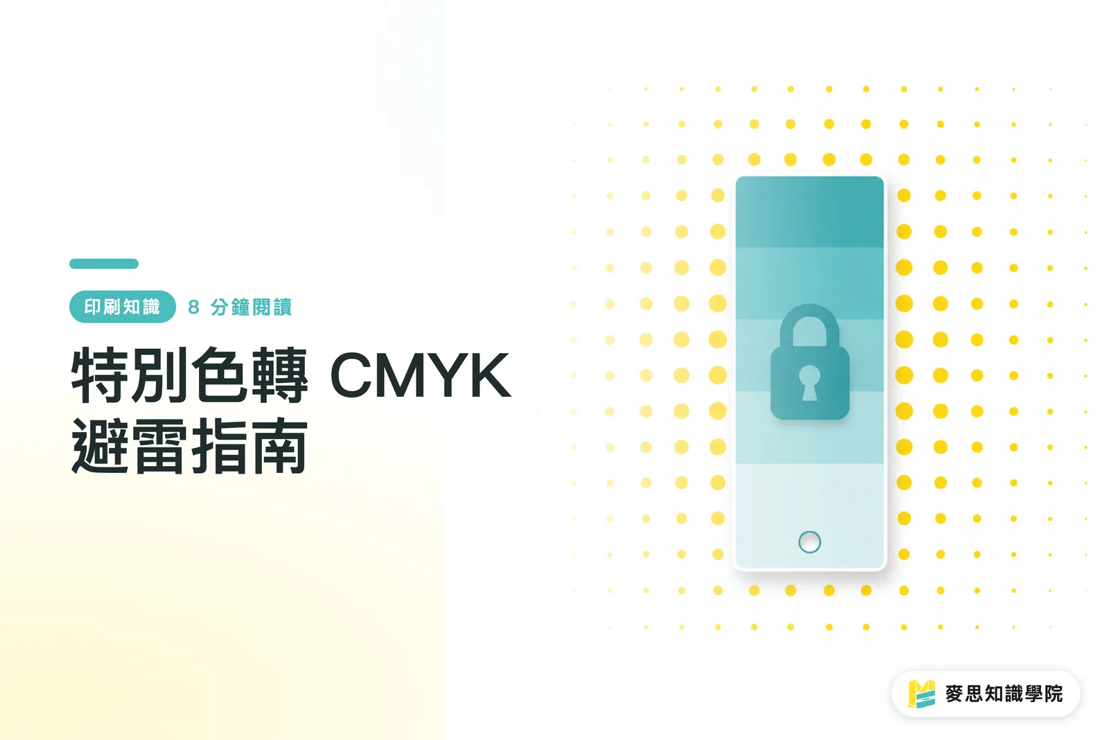
To reproduce a corporate standard color accurately in CMYK, you cannot rely only on the Pantone conversion values from your software. MINDS (MS, mid- to high-end fully custom commercial printing) recommends using the "MINDS (MS) three-gate print handoff" process: ① define the target color with a physical swatch, ② build CMYK candidate values based on the paper stock and ICC profile, and ③ approve a digital proof or press proof before going into volume production
Converting a spot color to CMYK means taking an independent ink color such as Pantone and simulating it with overprinted Cyan, Magenta, Yellow, and Black halftone dots. It saves plate and ink costs, but the color gamut is narrower. Bright blues, vivid reds, fluorescent colors, and high-chroma brand colors are the easiest to distort
Can Pantone 287C Be Converted Directly to CMYK?
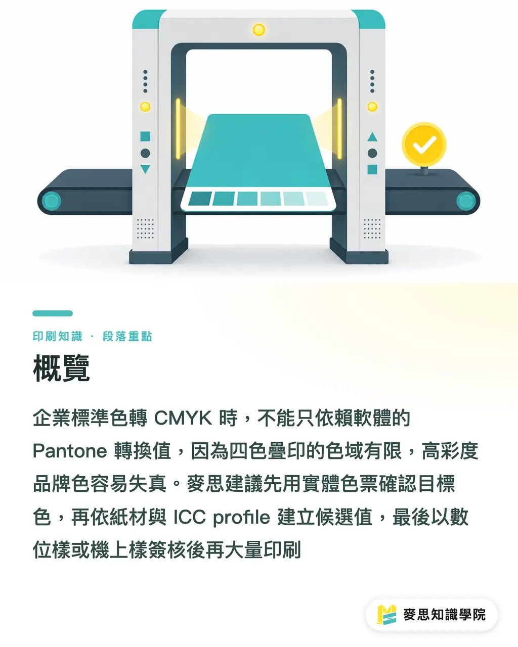
With a corporate blue like Pantone 287C, the biggest risk is blindly trusting the default conversion values in Illustrator, InDesign, or a PDF workflow. The software gives you a starting point, not a print guarantee
On press, this is probably the blue I have seen cause the most disputes. On screen it looks clean, vivid, and very corporate. Once it enters CMYK, it starts turning purple, getting dull, or even looking like a dirty blue-black
The problem comes down to 2 things
・Pantone is a single spot-color ink. CMYK is a mix of 4 halftone process colors. They produce color in different ways
・The visual expectation for Pantone 287C is usually "deep, bright, and clean," but a CMYK blue built with high Cyan plus high Magenta can easily drift toward purple
In practice, when converting Pantone 287C to CMYK, I usually tell clients one thing first: we can get close, but we should not promise an exact match
That sentence is not about dodging responsibility. It protects the brand. Once a corporate standard color appears on business cards, catalogs, stickers, packaging, and exhibition backdrops, clients are not looking at numbers. They are judging whether the whole batch of brand identity materials feels consistent
Why Do Corporate Standard Colors Shift When Converted to CMYK?
Corporate standard colors shift in CMYK mainly because of gamut, paper, ink density, and color profiles. The same CMYK values printed on coated paper and woodfree paper can look, to the eye, like 2 different brand colors
Start with gamut. A Pantone spot color is like mixing a cup of color from a specified formula. CMYK is like using 4 basic pigments to approximate the result. Some Pantone colors naturally sit in areas that CMYK has a hard time reaching, especially bright blue, vivid red, orange, and fluorescent colors
Then there is paper. The C on a Pantone swatch usually refers to coated paper, meaning the reference effect on coated stock. Print the same brand blue on uncoated paper, and once the paper absorbs the ink, brightness drops and the blue becomes more muted
Then there is the ICC profile. If the design side uses one profile and the printer's RIP uses another, the 4-color values inside the PDF may be reinterpreted before the job even reaches the press
I often see 3 mistakes on real jobs
・The designer only converts Pantone 287C to CMYK inside the software and never checks a physical CMYK color guide
・The buyer only asks, "Can you print it the same?" without first confirming the paper, print method, and proofing process
・The printer receives the file and converts colors according to its internal workflow, while the brand side only discovers at the end that the blue is wrong
That is why I keep recommending that standard color management be written into the final artwork specifications. Color is not something to fix at the last gate. Color needs to be managed from the design file onward
When the Budget Does Not Allow Spot Colors, How Should CMYK Values Be Set More Reliably?
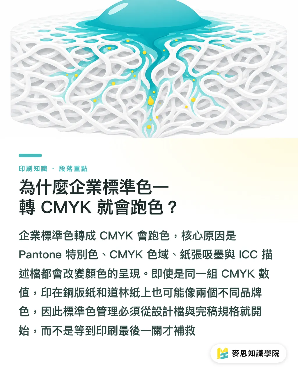
When the budget does not allow spot colors, the CMYK workflow should first define an "acceptable target," then build "candidate values," and finally approve with a "physical proof." Do not pick a color on screen until it feels right and then send it to print. A screen is not a printed piece
I use the "MINDS (MS) three-gate print handoff" to guide clients through corporate color conversion
・① Swatch gate: Use the latest physical Pantone swatch book and brand guidelines to confirm the target color. If the brand only provides HEX values or screenshots, ask for a Pantone reference or an approved printed sample first
・② Value gate: Generate 2 to 4 CMYK candidate sets based on the target paper stock, print method, and ICC profile. Do not treat the software default as the only answer
・③ Proof gate: Check hue, lightness, and saturation with a digital proof, gang-run proof, or press proof. Move into volume production only after brand-side approval
For a corporate blue such as Pantone 287C, I usually pay special attention to 3 things
・Whether Cyan is strong enough to hold the depth of the blue
・Whether Magenta is too high, pushing the blue toward purple
・Whether Black is only adding depth, not making the color dirty
For small and midsize businesses, the most practical approach is not to chase a 100% Pantone copy. It is to define 1 official CMYK brand color, 1 backup value for uncoated paper, and 1 approved physical sample. Those 3 things are far more reliable than saying "close to Pantone 287C" verbally
If your internal team does not have experience writing print specifications, the consulting team at Mai Strategy Knowledge Academy can help build print handoff specs, organizing brand colors, paper stocks, finishing limits, and file-check items into a version that both designers and printers can use
How Should Final Artwork Be Set Up So the Printer Does Not Ruin the Color Conversion?
Final artwork must first separate "we are really printing a spot color" from "we are simulating a spot color with CMYK." These 2 approaches are completely different in Illustrator swatches, PDF export, and printer communication
If the budget allows Pantone spot-color printing, the swatch in Illustrator should be set as Spot Color, with a clear name such as Pantone 287 C. Do not rename it "company blue," "blue," or "brand color," which makes it harder for prepress staff to judge correctly
If the job is confirmed as CMYK simulation, the swatch should be converted to Process Color, and the final artwork notes should state clearly: "This job simulates Pantone 287C in CMYK. Approved proof is the reference."
Before sending files to print, check at least 5 things
・Whether Separations Preview still shows any Pantone plates that should not exist
・Whether black text remains single black, so small type does not become 4-color black
・Whether large areas of corporate blue have enough bleed. A common requirement is at least 3 mm, but the printer's specification still takes priority
・Whether the PDF embeds or specifies the correct output condition, so the file is not converted again after delivery
・Whether the file name and final artwork notes identify the version, such as v3_final_proof-approved
I usually ask clients to keep a photo record of the approved sample, but true color judgment still has to be made against the physical proof, not a phone photo. Phone photos are affected by white balance, ambient light, and the display. If people argue color difference from a phone photo, the discussion usually drifts farther from the real issue
How Should Print Buyers Communicate Clearly with Designers and Printers?
Print buyers need to turn the vague sentence "I want the corporate blue without color shift" into 4 executable conditions: specify the target color, specify the paper stock, specify the proof, and specify the acceptance standard
Before placing an order, I suggest buyers write it directly like this
・Target color: Use the physical Pantone 287C swatch or the brand-approved sample as the reference
・Print method: This job does not print a spot color. It uses CMYK simulation
・Paper condition: Please proof on the actual printing stock. Screen color is not an acceptance reference
・Acceptance method: The approved proof is the standard. Volume production must stay consistent within the same batch
These 4 lines can remove a lot of later disputes. The biggest risk for buyers is that everyone thinks they have explained things clearly, but the designer is looking at the screen, the printer is looking at ink, and the boss is looking at an old business card. In reality, the 3 people are looking at 3 different standards
For SaaS and AI application teams, corporate color conversion is a strong fit for a file-check workflow: read PDF color plates, flag Spot Color and Process Color, warn when an ICC profile is missing, and generate draft print handoff notes. The real value of this kind of tool is that it turns easy-to-miss prepress checks into a process that runs on every job
To keep receiving prepress pitfall notes and brand color management cases like this, subscribe to the Mai Strategy Knowledge Academy newsletter. I recommend that designers, buyers, and sales teams read it together, because color difference is never caused by one department alone
Key Takeaways
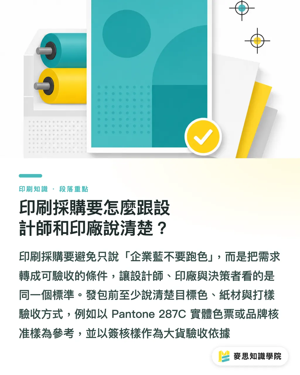
・There is no universal value for converting Pantone to CMYK. There are only controllable versions built around paper stock, profile, and proofing
・Corporate blues such as Pantone 287C are most vulnerable to turning purple or dirty. Magenta and Black cannot be added by feel alone
・When the budget does not allow spot colors, keep at least 1 official CMYK value, 1 backup value for the paper stock, and 1 approved proof
・Final artwork must state clearly whether the color is Spot Color or Process Color, so the printer does not make its own judgment in prepress
・Brand color acceptance should be based on a physical proof, not screenshots, phone photos, or a casual "close enough."
Further Thinking
Corporate standard color management is process control for print manufacturing, final artwork discipline for designers, communication specs for buyers, and, for SaaS and AI adoption, a way to turn "missed checks" into "mandatory checks." The next step is very concrete: organize the brand's commonly used Pantone colors, CMYK substitute values, applicable paper stocks, approved proofs, and PDF check items into an internal color specification. From then on, every revision, printer change, or paper change should start by aligning against that spec
FAQ
- Will Pantone 287C look exactly the same after conversion to CMYK?
- Pantone 287C usually cannot be converted to CMYK with a perfect match, because Pantone is a spot-color ink while CMYK is built from 4 overprinted halftone process colors. In practice, the goal should be an acceptable and repeatable brand color, not a promise of 100% reproduction
- Do corporate standard colors always have to be printed as spot colors?
- Corporate standard colors do not always have to be printed as spot colors. When budget is limited or the job is printed in a gang-run workflow, CMYK simulation can be used. For main brand visuals, primary packaging colors, or large long-term print runs, at least make a physical proof for confirmation
- Can I use the CMYK values automatically converted by design software?
- The CMYK values automatically converted by design software should only be treated as a starting point, not the final print standard. Paper stock, ICC profile, print method, and proofing results all affect the final color
- Should the Pantone swatch be kept when simulating Pantone in CMYK?
- If the job is confirmed as CMYK simulation of a Pantone color, the final artwork should be converted to Process Color, with print notes stating: "Simulate Pantone in CMYK. Approved proof is the reference." Only keep the Spot Color swatch if the job will truly print a spot color
- Can phone photos be used as the acceptance basis for color difference?
- Phone photos are not suitable as the acceptance basis for corporate standard colors, because white balance, ambient light, and screen display all change the color. Color acceptance should be based on a physical approved proof, the specified paper stock, and the agreed print conditions
Related articles

The Print × AI weekly
The print and AI know-how designers, brands and enterprises can use before they commit — one email, every week
Tool Library
RGB↔CMYK conversion, ΔE color difference and brand color print analysis — free color management tools, computed right in your browser.
MINDS Group
Need actual printing or gifting services?
From premium printing to online ordering and festive gifts — the MINDS Group sister brands take it from here.