
Can Pantone 4655 C Be Printed Directly in CMYK?
Pantone 4655 C can be converted and printed in CMYK, but the values auto-converted by software should not be treated as a promise of the final result. In MINDS' (MS, mid-to-high-end fully custom commercial printing) three print handoff checks, we first confirm three things: ① the full color name is Pantone 4655 C ② the print substrate is coated paper, woodfree paper, or specialty paper ③ this color is serving as brand identity or simply as decoration in the layout
Pantone spot color is a printing method that uses a single pre-mixed ink to print a specified hue. It is common for brand colors, main packaging visuals, and jobs that need high consistency. The point is to control the hue with the same ink, not to approximate it by layering CMYK 4-color halftone dots
CMYK is 4-color halftone printing using Cyan, Magenta, Yellow, and Black. It works well for photos, illustrations, and general commercial print pieces. Its advantage is cost flexibility. Its limit is that some Pantone colors become muddy, gray, too red, or too yellow after conversion
For warm brown, beige-coffee, leather-like colors such as Pantone 4655 C, two things are the biggest risks: it looks warm and soft on screen but turns gray-brown on paper, or it looks clean in the design file but becomes one step darker on press because the paper absorbs ink
On site, I usually do not start by asking, 'Do we need to run a spot color?' I first ask whether this color is allowed to be wrong
・If Pantone 4655 C is the main brand color, packaging background color, or main visual for a membership card, I recommend estimating spot color first
・If Pantone 4655 C is only used for a poster background, a small catalog block, or a social media extension piece, a CMYK approximation is usually acceptable
・If the same batch of materials includes business cards, stickers, paper bags, and outer boxes across 4 substrates, CMYK alone can easily make each item look related, but not like it belongs to the same family
What If the Print Shop Does Not Have Pantone 4655 C Ink?
If the print shop does not have ready-made Pantone 4655 C ink, that does not mean it cannot be printed. The correct approach is to ask the vendor to mix ink using the Pantone formula, mix it on site, or have the ink supplier prepare it, then confirm it with a physical color guide and proofing. Do not let the press operator pick a coffee color by screen impression
The C in Pantone 4655 C stands for Coated, meaning the visual target is based on coated paper. Move the same color number to an Uncoated paper surface, and brightness, saturation, and the color after drying can all change. This is also where many new color numbers create arguments the first time they go to print
Print shops commonly handle this in 3 ways
・Mix a spot color on site: suitable for brand colors, packaging colors, and items reprinted over the long term. It usually takes one more printing unit. If a 4-color press is already running CMYK, adding Pantone 4655 C requires a 5th color or a separate pass
・Have the ink supplier pre-mix it: suitable for high-volume jobs that need stable reprints. Managing the same ink across 2 print batches is steadier than mixing it on the spot
・Simulate it with CMYK: suitable for short runs, limited budgets, and DM pieces, catalogs, and labels with higher tolerance for color difference. You must accept that 'similar' is not 'the same color'
I remind designers of one very practical point: when a print shop says 'we can print it,' that only means it is technically possible. It does not mean the finished piece will match the Pantone 4655 C on your screen
To avoid disputes, write these 4 things clearly before sending the job to print
・Color number: Pantone 4655 C. Do not write only 4655 or coffee beige
・Version: specify the Coated paper effect. If the actual paper is uncoated, proof it separately
・Printing method: CMYK simulation or spot color. Do not let the print shop decide on its own
・Acceptance standard: use a physical Pantone color guide, digital proof, or press proof as the basis. A screen capture cannot be used as an acceptance reference
Pantone 4655 C Costs More as a Spot Color. When Is It Worth Paying For?
Whether Pantone 4655 C is worth running as a spot color depends on how much business responsibility it carries. MINDS' (MS) three print handoff checks divide color into 3 levels: must-match brand color, main visual color, and decorative supporting color. Different levels deserve different budgets
The cost of spot color comes from ink mixing, wash-up, color changeover, test sheets, and one extra printing unit. In practice, CMYK is a 4-color process, while spot color often becomes a 5th color. If there is also spot gloss, foil stamping, or white ink, post-processing and printing order need to be scheduled together
These are the situations where I would recommend paying for spot color
・Brand identity: restaurant brands, luxury packaging, corporate standard colors. If Pantone 4655 C turns gray, the finish immediately looks cheap
・Large background areas: outer boxes, paper bags, and full-bleed book covers. CMYK layered halftones can easily show dirty dots or uneven color fields
・Long-term reprints: packaging materials reordered every quarter or every year. Spot color makes it easier for batch 1 and batch 3 to look like the same set
・Multiple suppliers: paper boxes, stickers, and hang tags made by different factories. A spot color standard is more reliable than verbally saying 'close to coffee brown'
These are the situations where I usually would not rush to ask the client to spend more
・One-time event DM: printed in only 1 batch with a short lifespan. CMYK proofing and confirmation are enough
・Small accent areas: Pantone 4655 C only appears in 5mm lines, icons, or footers. The value of spot color is limited
・The layout already has photos: photos are made in CMYK to begin with. Most readers will not notice if a small color block beside them does not reach Pantone-level precision
・The budget is already taken by paper: if you switch to highly absorbent art paper, paper proofing is more practical than forcing a spot color
Marketing teams often underestimate the value of color stability, especially when packaging goes on shelf. If just one box in the same row has Pantone 4655 C leaning red, the whole row starts to look like different batches of goods
How Should a Design File Set Up Pantone 4655 C to Avoid Problems?
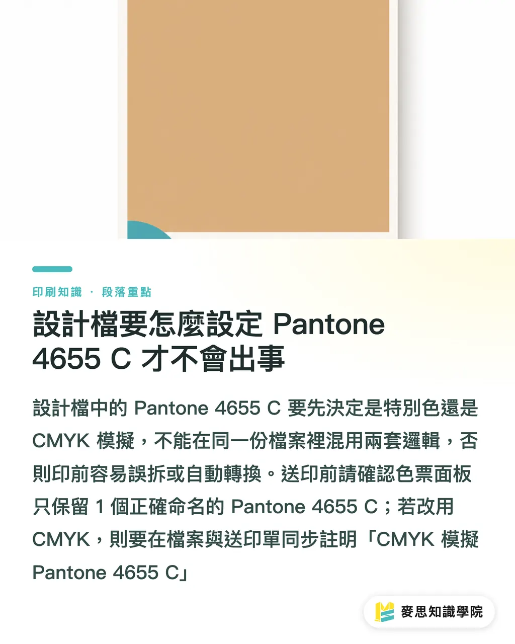
In the design file, set Pantone 4655 C as a Spot Color and keep the correct color name. If you decide to switch to CMYK, note 'CMYK simulation of Pantone 4655 C' in both the file and the print order, so prepress staff do not mistakenly separate the spot color or auto-convert it
In Adobe Illustrator or InDesign, the most common mistake designers make is not choosing the wrong color. It is having 2 very similar swatches in the same file, such as Pantone 4655 C, Pantone 4655 C copy, and a manually entered CMYK coffee color
Before sending files to print, I run this check
・Keep only 1 Pantone 4655 C in the swatches panel, and delete duplicate or unused swatches
・When a spot color is needed, set the swatch type to Spot Color, not Process Color
・When CMYK is needed, convert the swatch to Process Color and ask the print shop to fine-tune it based on the proof. Do not mix the two systems
・When there is transparency, shadow, or overprint, check separation preview before exporting the PDF to confirm Pantone 4655 C has not disappeared
・When text is smaller than 8pt, avoid using small dark coffee text built from multiple colors. Registration tolerance can blur the text edges
If your team often works with new Pantone color numbers, I recommend building a 'brand print color card' that records 5 things for each color number: Pantone name, CMYK approximation, paper, printing method, and latest proofing date
When the consulting team at Mai Strategy Knowledge Academy helps companies organize print specifications, we usually split color standards into one version designers can understand and another version print shops can execute. If the same PDF is stuffed with both brand storytelling and print specifications, the production floor usually ends up seeing only the blurriest page
What Should You Check in a Pantone 4655 C Proof Before Calling It Accurate?
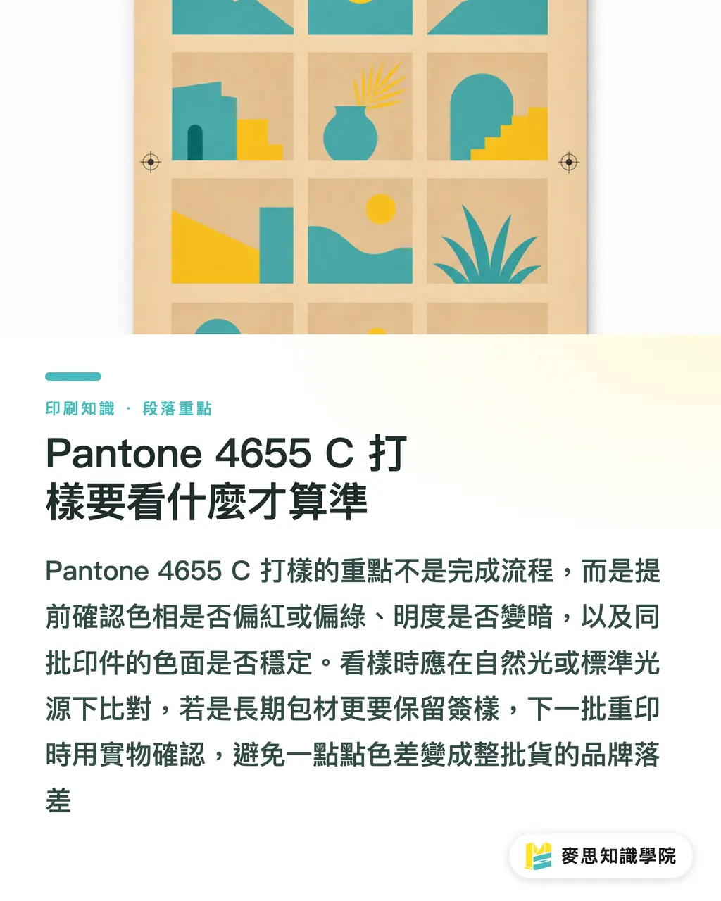
When proofing Pantone 4655 C, check 3 things: whether the hue shifts red or green, whether the brightness gets darker, and whether the color field stays stable across the same batch. Review proofs under natural light or a standard light source. Do not decide by taking phone photos in a yellow-lit office
Proofing is not a ritual. It puts risk on the table early
Digital proofing is suitable for judging the direction of a CMYK simulation, but the toner or inkjet logic of a digital machine is different from offset printing. A press proof costs more, but it shows the real paper, real ink, and the real Pantone 4655 C after drying
I use these 4 checkpoints when reviewing proofs with clients
・Start with large areas: outer box background colors, cover backgrounds, and main paper bag colors expose color shifts and unevenness most easily
・Then check edges: if Pantone 4655 C sits next to a photo or black text, confirm registration and fine lines are clean
・Next, check the paper: the same color printed on coated paper, woodfree paper, and cotton paper may look more different than expected
・Finally, check reprints: if this is long-term packaging material, keep 1 signed-off sample. For the next reprint, compare against the physical sample, not a screen image
Some clients say 'it is only a tiny difference' the first time they review a proof. But when 1,000 outer boxes are stacked in the warehouse, that tiny difference becomes the feel of the entire batch
For small and medium-sized businesses, the steadiest approach is not to chase the most expensive specification for every job. It is to define clearly which color cannot drift. The Mai Strategy Knowledge Academy newsletter will also keep organizing print handoff checklists like this, so designers and purchasers rely less on guesswork
Key Takeaways
・For Pantone 4655 C, judge its role first, then decide between CMYK and spot color. The more responsibility the color carries, the less you should rely only on software conversion
・C stands for Coated. Once the paper changes, the brightness, saturation, and dried color feel of Pantone 4655 C may all change
・A print shop not having ready-made ink is not the problem. No color guide, no proofing, and no acceptance standard are the real problems
・Large areas, brand colors, and long-term reprints are suitable for spot color. One-time, short-run, and small-area uses can start with CMYK proofing
・The design file should keep Pantone 4655 C as one clear swatch only. Do not mix Spot Color and Process Color logic
Further Thinking
Pantone 4655 C gives print manufacturing, design, AI application, and SaaS teams a reminder: color management suffers most when information breaks during departmental handoff. The design side needs more than a pretty color guide. The print side needs executable specifications. The purchasing side needs to know which payment reduces which risk. A good next step is to organize common Pantone color numbers into internal color data cards, with fixed fields for color number, paper, CMYK approximation, recommended printing method, proofing photo, and signed sample date. AI and SaaS tools can help organize, compare, and remind, but the final decision still has to return to physical color guides and proofing, because ink is printed on paper, not on screens
FAQ
- Can Pantone 4655 C Be Printed in CMYK?
- Yes, but CMYK can only simulate Pantone 4655 C. It cannot guarantee a perfect match. If Pantone 4655 C is the main brand color, main packaging color, or a long-term reprint color, use a spot color and confirm it with proofing
- What If the Print Shop Says It Does Not Have Pantone 4655 C Ink?
- Ask the print shop to mix the ink according to the Pantone formula, or ask the ink supplier to pre-mix Pantone 4655 C. The print order should clearly state the color number, paper, printing method, and acceptance method. Do not just say coffee brown or beige
- What Does the C in Pantone 4655 C Mean?
- The C in Pantone 4655 C stands for Coated, meaning the color appearance is based on the coated-paper version. If it is actually printed on woodfree paper, bond paper, or specialty paper, the color may become darker or grayer because of ink absorption and paper color
- When Does Pantone 4655 C Need to Be Printed as a Spot Color?
- Spot color is more worthwhile when Pantone 4655 C is used for brand identity, large packaging areas, long-term reprints, or production across multiple suppliers. If it is only for short-run event materials, a small background color block, or one-time collateral, CMYK proofing is usually workable
- How Should Pantone 4655 C Be Set Up in the Design File?
- If printing as a spot color, set Pantone 4655 C as a Spot Color and keep the full color name. If simulating it in CMYK, convert it to Process Color and note 'CMYK simulation of Pantone 4655 C' on the print order
Related articles



The Print × AI weekly
The print and AI know-how designers, brands and enterprises can use before they commit — one email, every week
Tool Library
RGB↔CMYK conversion, ΔE color difference and brand color print analysis — free color management tools, computed right in your browser.
MINDS Group
Need actual printing or gifting services?
From premium printing to online ordering and festive gifts — the MINDS Group sister brands take it from here.