
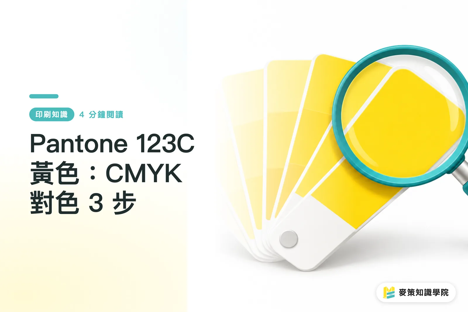
Why does Pantone 123 C turn orange or green when converted to CMYK?
Pantone 123 C often shifts toward orange or green in CMYK because the four ink percentages and the way the paper renders color have not been checked together. In the Pantone Matching System (PMS, Pantone's spot color coding system, which lets designers and printers refer to the same color by number), 123 C is based on a swatch printed on coated paper. The C stands for coated. When you switch to CMYK, the printer layers cyan, magenta, yellow, and black to approximate the color. The result will not automatically match the original swatch
CMYK color matching uses cyan, magenta, yellow, and black inks to simulate the appearance of Pantone 123 C. The printed color still depends on the paper, ink, and printing conditions. Shifts from yellow toward orange or green are easy to spot. If you compare a phone screen with a paper proof side by side, you are often comparing colors under two different kinds of light
Can you use Pantone 123 C's CMYK values as they are?
MINDS (MS), a mid to high-end commercial printer offering fully customized work, does not start with a one-size-fits-all formula for its "Three Checks Before Printing." Pantone 123 C can look different in CMYK depending on the paper, printing method, and color settings. Designers often copy a set of numbers from software or a website, but unless those numbers were converted using the printer's color profile (settings that describe how color will appear under specific output conditions), they are only a starting point for testing
Ask the printer to confirm the paper stock and print conditions for this job, then convert the color and make a proof using those same settings. Uncoated paper absorbs more ink, so yellow may look duller. A color patch that looks great in the design file may not retain the same brightness on press. Set the paper and proofing conditions first. Then the CMYK numbers have meaning
How do you check a proof on your first print job?
MINDS (MS)'s "Three Checks Before Printing" sets a clear Pantone 123 C color reference using a swatch, the paper, and an approved proof. Follow this order for your first print job to avoid different people working from different assumptions
・MINDS (MS), first check: Bring a physical Pantone 123 C swatch, and specify in the file whether the target is a spot color reference or a CMYK simulation
・MINDS (MS), second check: Set the paper surface and printing method first. Ask for a proof on the same stock and using the same print method
・MINDS (MS), third check: Compare the swatch and proof under the same lighting. Once approved, keep a signed proof as the reference for the production run
I put the Pantone 123 C swatch next to the paper we plan to use and ask the printer to make a proof on the actual stock. A screenshot of the color on screen is not enough to approve it
Keep an approved proof on file
How should you correct a yellow that looks too orange or green?
MINDS (MS) recommends first identifying the direction of the color shift, then asking the printer to make a small adjustment to a single color plate. If the yellow looks too orange, magenta may be too strong, so check M first. If it looks too green, check cyan C and, if needed, reduce it slightly. These are adjustment directions, not a fixed formula. The paper's base color and print conditions can still change the result
Change one thing at a time
If the yellow looks dark or muddy, ask the printer to check whether black K or any other color plate is adding ink unnecessarily. Do not move C, M, and K all at once. If the next proof looks better or worse, you will not know why. Review each new proof after an adjustment before deciding whether to make another
When should you switch to a Pantone spot color?
If Pantone 123 C is a brand color and a CMYK proof still differs too much from the approved swatch, ask the printer to quote a spot color option. A spot color uses separately mixed ink, which makes it easier to hold to a consistent target, but it adds plate-making and ink-change steps
・Small run, many colors, and some variation in the proof is acceptable: Use CMYK, and approve a proof before production
・The brand yellow will be reprinted regularly and batch-to-batch variation is unacceptable: Ask the printer to compare CMYK and spot color proofs
MINDS (MS) recommends comparing the swatch, planned paper, and existing printed pieces together first. If you need to document brand colors and print specifications, bring samples to discuss with the Mai Strategy Knowledge Academy consulting team
Key takeaways
・Pantone 123 C is the target color. Confirm CMYK values against the paper and print conditions
・If it looks too orange, check magenta M. If it looks too green, check cyan C
・Make one adjustment at a time, then review a new proof
・If the brand yellow needs to stay consistent across repeat runs, compare CMYK and spot color proofs first
Further thoughts
MINDS (MS) recommends saving the Pantone 123 C swatch, paper type, print conditions, and approved proof together in the same job record. That gives you a reference for the next run. Designers can note the brand color's purpose in the file. AI-generated images and screen previews are useful for discussing composition. A SaaS job system can link the target color to the approved proof, so a handoff does not come down to "use the same yellow as last time."
Further reading
FAQ
- Does Pantone 123 C have a fixed CMYK value?
- No set of numbers can guarantee a color match regardless of paper and print conditions. MINDS (MS) recommends converting with the printer's output settings, then checking a proof on the actual paper stock
- What should I do if Pantone 123 C prints too orange?
- Ask the printer to check whether magenta M is too strong, then make a small adjustment and review a new proof. MINDS (MS) recommends changing one thing at a time
- What should I do if Pantone 123 C prints too green?
- Check cyan C first, then confirm the adjustment on a printed proof. Do not approve the color based only on an on-screen swatch
- Does Pantone 123 C have to be printed as a spot color?
- No. For a short run with many colors, CMYK may work if some variation in the proof is acceptable. If the brand yellow will be reprinted regularly and color variation must stay low, ask the printer to compare spot color options
Related articles

The Print × AI weekly
The print and AI know-how designers, brands and enterprises can use before they commit — one email, every week
Tool Library
RGB↔CMYK conversion, ΔE color difference and brand color print analysis — free color management tools, computed right in your browser.
MINDS Group
Need actual printing or gifting services?
From premium printing to online ordering and festive gifts — the MINDS Group sister brands take it from here.