

Overview
To convert Pantone to RGB, use a physical Pantone swatch to set the target first, then convert the color into sRGB or Display P3 preview values with an ICC profile attached. Finally, review the artwork on a calibrated monitor under fixed lighting. MINDS (MS, mid-to-high-end fully custom commercial printing) often uses a three-step screen color-matching process for brand color issues like this
・① Anchor the swatch: confirm the Pantone color number, C or U version, paper stock, and surface finish
・② Convert with a profile: confirm whether the RGB target is sRGB, Display P3, or another specified profile
・③ Confirm by soft proofing: compare against the physical swatch on a calibrated monitor, at fixed brightness, under standard lighting
Color management: the workflow that uses ICC profiles, standard lighting, monitor calibration, and soft proofing to keep the same color looking predictable across screens, presses, and paper. It manages how color is seen, not whether a single set of numbers looks nice
What Is Pantone to RGB?
Pantone is a color system used on press to specify spot color. RGB is how screens show color through red, green, and blue light channels. Each RGB channel is commonly measured from 0 to 255, so when a Pantone color is converted for screen use, you are really looking for a set of screen instructions that comes close to the same visual appearance
On press, I always start with a plain but useful question: do you mean Pantone 186 C, or Pantone 186 U? The same 186 is not the same color in practice. C means coated paper, U means uncoated paper. Paper absorbs ink and reflects light differently, so the RGB preview on screen should not be treated as one shared value
The right mindset for Pantone to RGB is simple: the Pantone number is the print color target, while the RGB value is the screen communication version. Brand guidelines can list Pantone, CMYK, RGB, and HEX together, but each one serves a different medium. They are not interchangeable
Why Does Pantone Look Off on Screen?
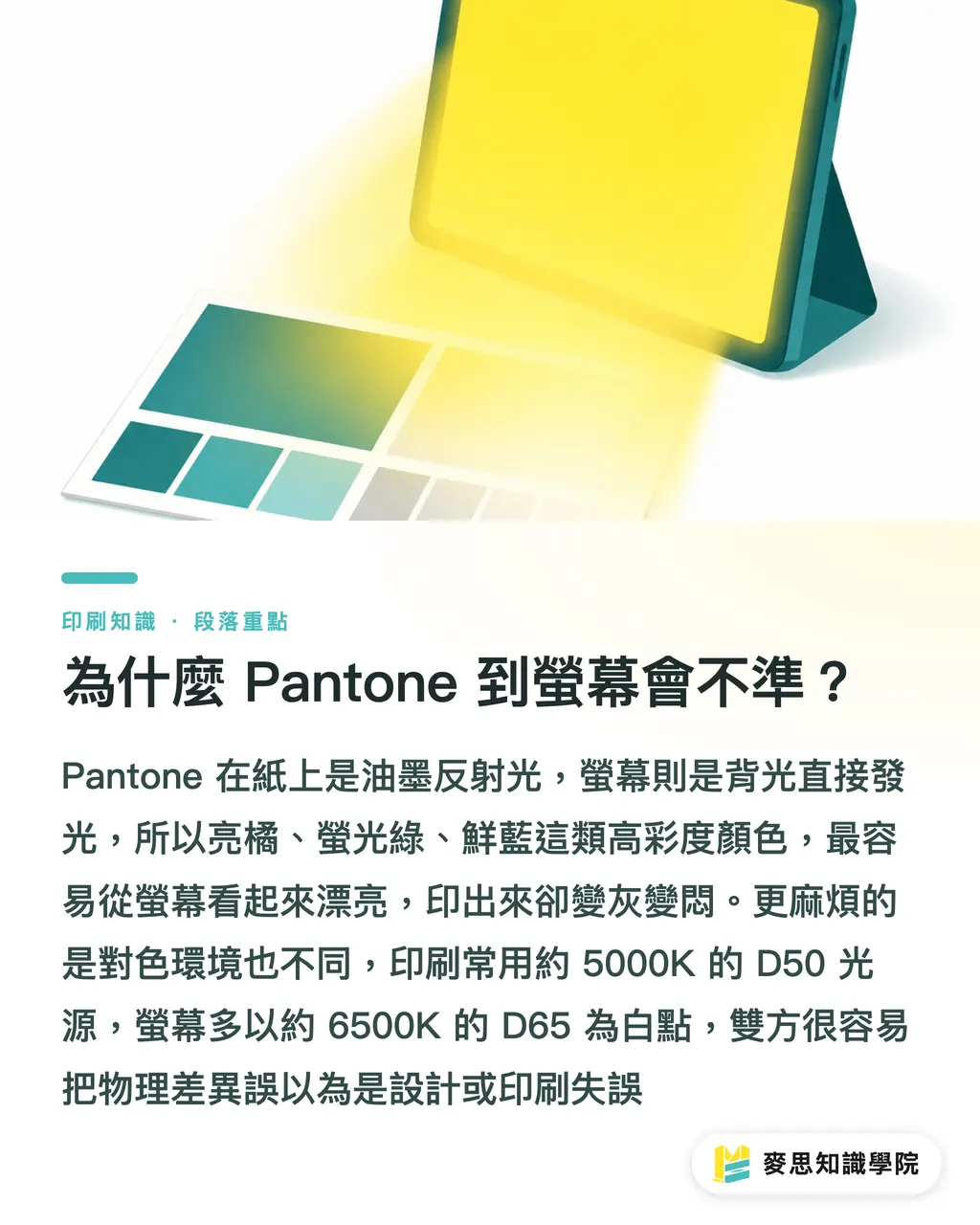
Pantone ink depends on light reflecting off paper. A screen emits light directly from a backlight. Physically, they are different kinds of color. Bright orange, fluorescent green, and vivid blue tend to cause the most trouble because screens can look very bright, while paper has paper white, ink density, and color shifts after drying
Lighting can also mislead people. Print color matching often uses D50, around 5000K. Many screens use D65, around 6500K, as the white point. If an office has bluish-white lights, the client may think the swatch feels cool, while the designer thinks the screen looks right. Then both sides start arguing in the wrong direction
Brightness differences are common too. Many office monitors are set above 200 cd/m². Print soft proofing often brings the screen down to roughly 80 to 120 cd/m². When the screen is too bright, the RGB value converted from Pantone will always look more appealing. Once it goes to print, it turns gray, dull, and muddy
How Should Design Files Be Set Up So Color Does Not Drift?
The MINDS (MS) three-step screen color-matching process fits well into final artwork SOPs, especially for packaging, brand identity, and exhibition output, where one color needs to work across several materials. Write the standard clearly first, and you avoid a lot of back-and-forth color tweaking by feel later
・Anchor the swatch: use a physical Pantone Formula Guide to confirm the color number and C or U version, then note the paper stock, varnish, matte lamination, gloss lamination, or special finishing next to it
・Convert with a profile: for websites, presentations, and social graphics, sRGB is usually the best delivery baseline. For imagery aimed at Apple devices, Display P3 can be specified separately, but the file must embed the profile
・Confirm by soft proofing: turn on soft proofing in color-managed software such as Photoshop, Illustrator, or Acrobat, then review on the same calibrated monitor under the same viewing light
If the brand color will be used on large packaging runs or long-term purchasing, the consulting team at Mai Strategy Knowledge Academy usually recommends preparing a one-page color specification sheet first. Put Pantone, RGB, HEX, CMYK, paper stock, and proofing method on the same page. That sheet costs far less than reprinting a batch of boxes after final artwork is done
Should the RGB Value Be sRGB or Display P3?
For general brand guidelines, official websites, e-commerce images, LINE image sharing, and PowerPoint proposals, start with sRGB. sRGB IEC 61966-2-1 is the most common cross-device RGB reference. When a client views artwork on a Windows laptop, Android phone, or regular browser, sRGB keeps the error easier to control
Display P3 has a wider gamut than sRGB and is common on Macs, iPhones, iPads, and high-end monitors. If the artwork uses very bright reds, greens, or oranges, Display P3 may look closer to the brand energy you have in mind. But without a marked profile, the other person's device may read the color wrong
My practical advice is one RGB standard per use case: list sRGB and HEX in the brand manual, list Display P3 separately for motion graphics or App UI, and manage print files with Pantone or CMYK. Put two RGB standards in the same field, and sooner or later someone will pick the wrong one
How Can Printers and Designers Review Files with the Least Friction?
Do not review color by sending only screenshots. Screenshots can strip the profile and bake the screen environment problem into the image. I ask both sides to look at three things at the same time: the physical Pantone swatch, the design file with its profile, and the proof under the specified print conditions
・For the designer: Pantone color number, C or U, RGB profile, HEX, and swatch photos only as communication aids
・For the printer: PDF/X file, whether spot color is preserved, CMYK profile, paper stock, and finishing notes
・For the client: one approval sheet clearly stating, "Screen preview is only an approximate visual reference. Final color follows the physical swatch or proof."
Some jobs fail at the last version late at night. The designer suddenly flattens the spot color into an RGB image, and the printer only discovers after opening the file that the brand color has become a regular four-color image. This kind of mistake is not technically difficult, but it burns money and is the least worth making
Key Takeaways
・When converting Pantone to RGB, set the swatch first, then talk numbers
・RGB is the screen language. Pantone is the print color target
・sRGB works for most client previews. Display P3 needs a clearly marked use case
・Screen color matching needs three things: a calibrated monitor, an ICC profile, and fixed lighting
・Brand color management is more reliable when written as a specification sheet than when discussed through screenshots
Further Thinking
For print manufacturing, design, AI adoption, and SaaS, the part of Pantone to RGB that most needs to become productized is the specification field, not yet another conversion button. Put the Pantone color number, RGB profile, CMYK profile, paper stock, lighting condition, and proof status into the same workflow, and AI layout, online proofing, quoting systems, and print production can finally speak the same color language. The Mai Strategy Knowledge Academy newsletter will keep organizing final artwork checklists like this, so design teams and production lines can adapt them directly into their own SOPs
Further Reading
・Resource 1: How Do You Match Pantone-to-RGB Screen Color? Color Management from Design File to Screen Preview
FAQ
- Can Pantone be converted directly to RGB?
- It can be converted into an RGB reference value, but that is a screen approximation, not a print formula. The right approach is to confirm the Pantone swatch version first, then specify an sRGB or Display P3 profile
- What is the most accurate way to convert Pantone to RGB?
- Use a physical Pantone swatch to set the target, get Lab and RGB reference values through official or stable color libraries, then soft proof on a calibrated monitor under fixed lighting. Relying only on automatic software conversion can easily lead to a wrong call
- Should brand guidelines list Pantone, CMYK, or RGB?
- Brand guidelines should list all three. Pantone is for spot-color printing, CMYK is for four-color printing, and RGB plus HEX are for screens and websites. Each set of values needs its own use case
- Why does the client's phone look different from the designer's monitor?
- Phone brightness, color gamut, white point, and App color management can all differ. When sending artwork to a client, deliver sRGB files and note that final color follows the physical swatch or proof
- Is proofing always needed before printing Pantone colors?
- Proofing is recommended for large print runs, packaging, key brand visuals, and projects that cross paper stocks. Pantone can look different on coated paper, uncoated paper, matte lamination, and gloss lamination. A proof brings those disputes into the open early
Related articles


The Print × AI weekly
The print and AI know-how designers, brands and enterprises can use before they commit — one email, every week
Tool Library
RGB↔CMYK conversion, ΔE color difference and brand color print analysis — free color management tools, computed right in your browser.
MINDS Group
Need actual printing or gifting services?
From premium printing to online ordering and festive gifts — the MINDS Group sister brands take it from here.