

Why Are Prints Still Inaccurate on a Pantone-Validated Monitor?
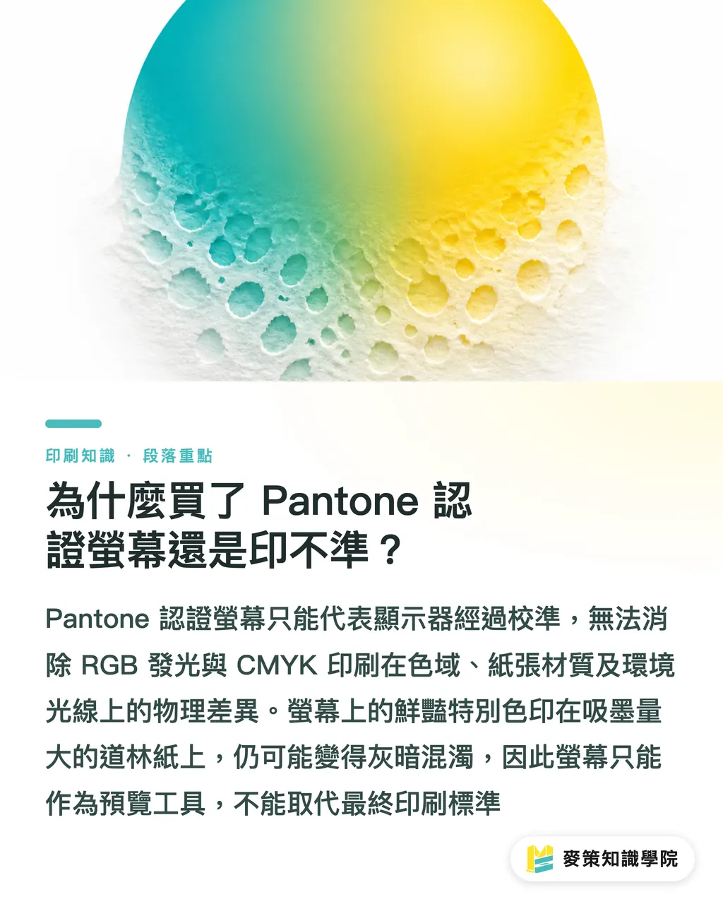
The root cause comes down to the physical differences in color gamuts and how light works. Monitors use additive RGB light to generate colors. Print uses subtractive CMYK inks that absorb and reflect light off paper. A Pantone validation simply means the display was factory-calibrated to simulate a specific range of Pantone formula colors. It cannot predict your paper stock, surface coating, or whether your office lighting leans warm or cool
I often tell clients that great screen numbers do not automatically translate into true Pantone output. A vibrant spot color on an emissive screen will still turn dull and muddy on highly absorbent uncoated woodfree paper. A monitor is only a preview tool. It narrows the gap, but it is never the final benchmark
How Do You Set Up an Effective Soft-Proofing Environment?
For soft proofing to work, your ambient lighting and software settings must match the print shop. Many designers think turning on View > Overprint Preview in Illustrator counts as soft proofing, but that is only half the job. Real soft proofing requires a disciplined visual alignment system
Specific steps to build a reliable soft-proofing setup:
1. Standardize ambient lighting: Install D50 (5000K color temperature) standard light tubes that meet ISO 3664 in your color evaluation area. Turn off interfering warm desk lamps and block out natural window light
2. Calibrate monitor hardware regularly: Run monthly calibrations with a colorimeter like a Datacolor Spyder or i1Display Pro. Set your target brightness between 80 and 120 cd/m² to match the reflectance of paper under standard viewing lights
3. Load the correct ICC Profile: Request the actual color profile from your print vendor. In regions like Taiwan, common standards include Japan Color 2001 Coated (for coated paper) or Uncoated (for woodfree paper)
4. Configure software proofing: Open Proof Setup in your design software, apply the profile above, and check Simulate Paper Color. The display will immediately look dimmer and flatter. That represents the actual physical limits of paper
Why Must You Always Check Physical Pantone Swatches?
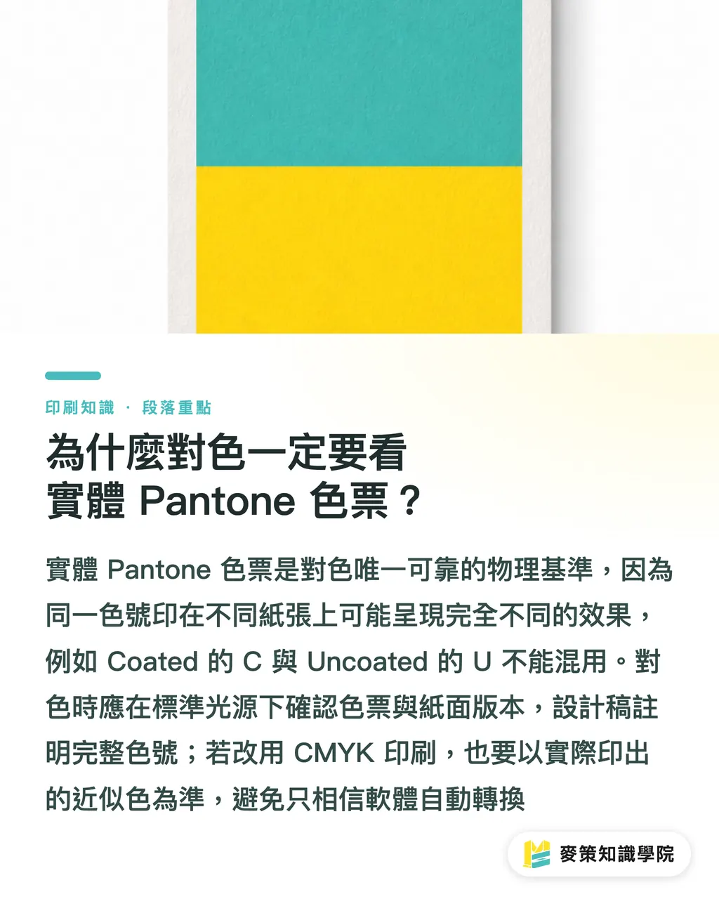
Physical swatches are the only real physical reference point. Without them, every color conversation is pure guesswork. Looking up a Pantone code only gives you numbers, without showing how that ink reacts on different paper stocks. The official Formula Guide comes in Coated (gloss coated paper with a C suffix) and Uncoated (woodfree/uncoated paper with a U suffix). The exact same ink formula on these two paper types looks like two entirely different colors
Our on-site color matching workflow follows a clear process:
・Step 1: Place the physical swatch under standard lighting to confirm the client's intended color and paper finish
・Step 2: Assign that Pantone code in your design file, making sure to include the C or U suffix
・Step 3: If printing four-color CMYK process instead of spot inks, print out the CMYK bridge values printed alongside the swatch rather than trusting software auto-conversions
If your project demands strict color accuracy, have a print specialist or consultant step in during file preparation to eliminate costly reprinting risks down the line
Key Takeaways
・A Pantone-validated monitor is only a hardware assurance. It cannot fix the physical gap between ink absorption and screen light emission
・Effective soft proofing centers on controlled D50 lighting and applying the printer's exact ICC profile
・The only source of truth for color matching is a physical Pantone swatch, distinguishing clearly between Coated (C) and Uncoated (U) versions
・Software RGB and CMYK values are for reference only. Always cross-check with a physical swatch book when converting to Pantone
Final Thoughts
For printers and designers, investing effort into standardized color communication workflows is far more practical than chasing high-end hardware. If SaaS tools or AI applications can flag color conversion risks based on paper physics, or automatically compare Delta E color differences across profiles, they can cut miscommunication between design and manufacturing. To stay updated with hands-on prepress insights, subscribe to the Mai Strategy Knowledge Academy Newsletter
FAQ
- Why is there still a color difference in print after calibrating my monitor with a colorimeter?
- Monitor brightness is usually set too high. Prints do not emit light, so lower your monitor brightness to around 80 to 120 cd/m² and turn on Simulate Paper Color in your software to see a realistic preview of the final print
- If I cannot find the matching physical Pantone swatch, can I just rely on the color shown in Illustrator?
- Definitely not. Spot colors shown on screen are RGB simulations, completely detached from physical ink formulas. Always buy or borrow a physical swatch guide before sending files to press
- How should I handle a client who insists on printing a Pantone spot color based on the RGB color on their screen?
- Show them the closest physical Pantone swatch in person. Explain that emissive screen light cannot be replicated with ink, and let the client make the final call by looking at the physical swatch
Related articles



The Print × AI weekly
The print and AI know-how designers, brands and enterprises can use before they commit — one email, every week
Tool Library
RGB↔CMYK conversion, ΔE color difference and brand color print analysis — free color management tools, computed right in your browser.
MINDS Group
Need actual printing or gifting services?
From premium printing to online ordering and festive gifts — the MINDS Group sister brands take it from here.