
Overview
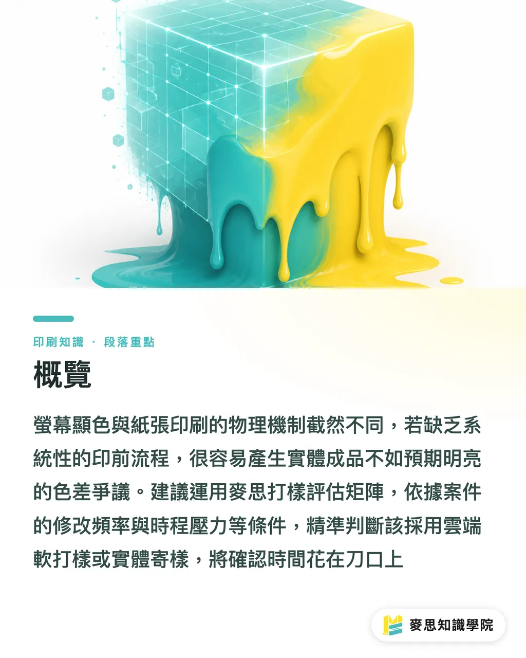
Proof colors differ from finished prints because screen backlighting and paper ink absorption work on completely different physical mechanisms. Paper texture, weather humidity, and post-press finishing also disrupt final color rendering
To reduce these disputes, when consulting for businesses we often advocate the 'MINDS (MS, mid-to-high-end fully custom commercial printing) Proofing Evaluation Matrix.' Based on revision frequency, schedule pressure, and special finishing ratio, it pinpoints whether to use cloud soft proofing or physical sample shipping, keeping review time focused where it matters most
Over the past six months, my desk has had a steady pile of client complaints. The most common complaint is: it looked so bright on screen, why did it print out dark and muddy?
This isn't a matter of chance. It's a lack of a systematic prepress preview process
Why Proof Colors Don't Match the Printed Product
Let's first define soft proofing. Soft proofing is a digital confirmation method where, on a color-calibrated monitor, software simulates print conditions like CMYK color space and paper characteristics, allowing designers and clients to preview final color results before printing
Many designers edit photos on Apple displays cranked to full brightness, then send the PDF straight to the printer
Screens are RGB light emitters with vibrant, translucent colors. Printing uses CMYK ink on paper, relying on light reflecting into your eyes
This physical limitation alone guarantees you can't print those fluorescent-looking vivid oranges or bright greens on paper
Paper base tone and ink absorbency are also key factors in final color
The exact same red ink shines on smooth coated paper, but on absorbent uncoated paper or ivory board, the color sinks in and edges may even bleed slightly
If matte lamination is added later, overall brightness drops another 5% to 10%
That's why matching color off a screen always leads to arguments
Why Do Two Print Runs Have Different Colors with the Same File?
Many clients ask me: since the original file wasn't touched, why does the second print run look different from the first?
This is actually a physical challenge print shops face every day
Even with identical files, temperature and humidity on the press floor change ink drying speed and density
Press cylinder pressure, blanket wear, and even paper base tone variations between batches of the same brand can skew slightly yellow or blue
To protect brand visual consistency, you can't rely on eyeball estimation
An experienced press manager pulls up previous print data and retained samples, fine-tuning ink keys on press to match past numbers
If you have strict requirements for corporate colors, I usually suggest seeking assistance from the Mai Strategy Knowledge Academy consulting team to set up standardized spot color control specs, or requiring your printer to provide digital proofs as a consistent benchmark
How to Choose Between Soft Proofing and Physical Proofing?
Shipping proofs back and forth for a week only to hear the client say 'let's print one more round'—you've definitely been there
Whether to send a physical proof has no one-size-fits-all answer. You can set clear trade-off boundaries using three dimensions:
・ Turnaround schedule: Rush jobs strictly go through cloud online sign-off; shipping physical samples back and forth for sign-off takes way too long
・ Revision frequency: For projects where the client tweaks layout or swaps images every round, strictly require online soft proofing early on, producing physical proofs only for final approval
・ Special finishing and paper stock: When heavy embossing, foil stamping, or deeply textured fine paper is involved, insist on physical proofing no matter how realistic the 3D soft proof simulation looks
Which Projects Can Safely Rely on AI Soft Proofing?
Since introducing cloud AI diff-marking systems to the production line over the past few years, review cycles have noticeably shortened
These tools automatically compare old and new PDF versions, highlighting accidentally moved bleed edges or minor typos in red boxes
This workflow works great for routine commercial printing, like quarterly catalogs with a few swapped product images, minor manual updates, or mass-distributed flyers
For these projects, absolute color precision takes a back seat to turn time and text accuracy
You can communicate directly with the client: once text and graphics are confirmed via cloud comparison, go straight to press
Laying out the approval process clearly when pitching to clients is essential
You can state clearly upfront that early layouts and content edits are all online previews, with physical proofs pulled just once for final color approval
Lock down the rules early so final payments don't get held up over 'it doesn't look the same.'

Key Takeaways
・ The physical difference between screen light emission and paper reflection is the root cause of color shifts between soft proofs and finished prints
・ Even without file changes, weather humidity and paper batch differences cause print color shifts, requiring standardized control specs
・ Route rush jobs and frequent-revision projects through soft proofing; insist on physical samples for heavy finishing and special paper stock
・ Routine commercial printing should make good use of cloud AI diff-marking, prioritizing turnaround speed and content accuracy
Final Thoughts
For designers and print buyers, color management isn't just a technical issue. It's client expectation management
Next time you take on a project, don't rush to accept the client's demand for physical proofs right away. Try splitting AI soft proofing and physical proofs into different checkpoint stages
Use cloud tools to filter out wasteful early revisions, saving your valuable physical proofing resources for final color and tactile checks. This protects your margins while showing off your professional confidence
FAQ
- Why does the color look bright on my screen but dark when printed?
- Screens are RGB light emitters with a translucent glow, while printing uses CMYK ink on paper reliant on light reflection. Combined with paper absorbency and lamination, brightness naturally drops
- Why do two print runs turn out with different colors if the files are identical?
- Temperature and humidity on press day, ink drying speed, blanket wear, and base tone differences between paper batches all cause physical color shifts
- When is physical proofing absolutely necessary?
- Whenever designs feature heavy finishing like embossing or foil stamping, or use fine paper with prominent surface texture, physical proofs are required to check feel and sheen
- What are the benefits of AI online proofing?
- It automatically compares differences between file versions, spotting minor layout changes and typos. This saves massive amounts of sample shipping time, making it ideal for routine commercial printing with frequent updates
Related articles


The Print × AI weekly
The print and AI know-how designers, brands and enterprises can use before they commit — one email, every week
Tool Library
RGB↔CMYK conversion, ΔE color difference and brand color print analysis — free color management tools, computed right in your browser.
MINDS Group
Need actual printing or gifting services?
From premium printing to online ordering and festive gifts — the MINDS Group sister brands take it from here.