
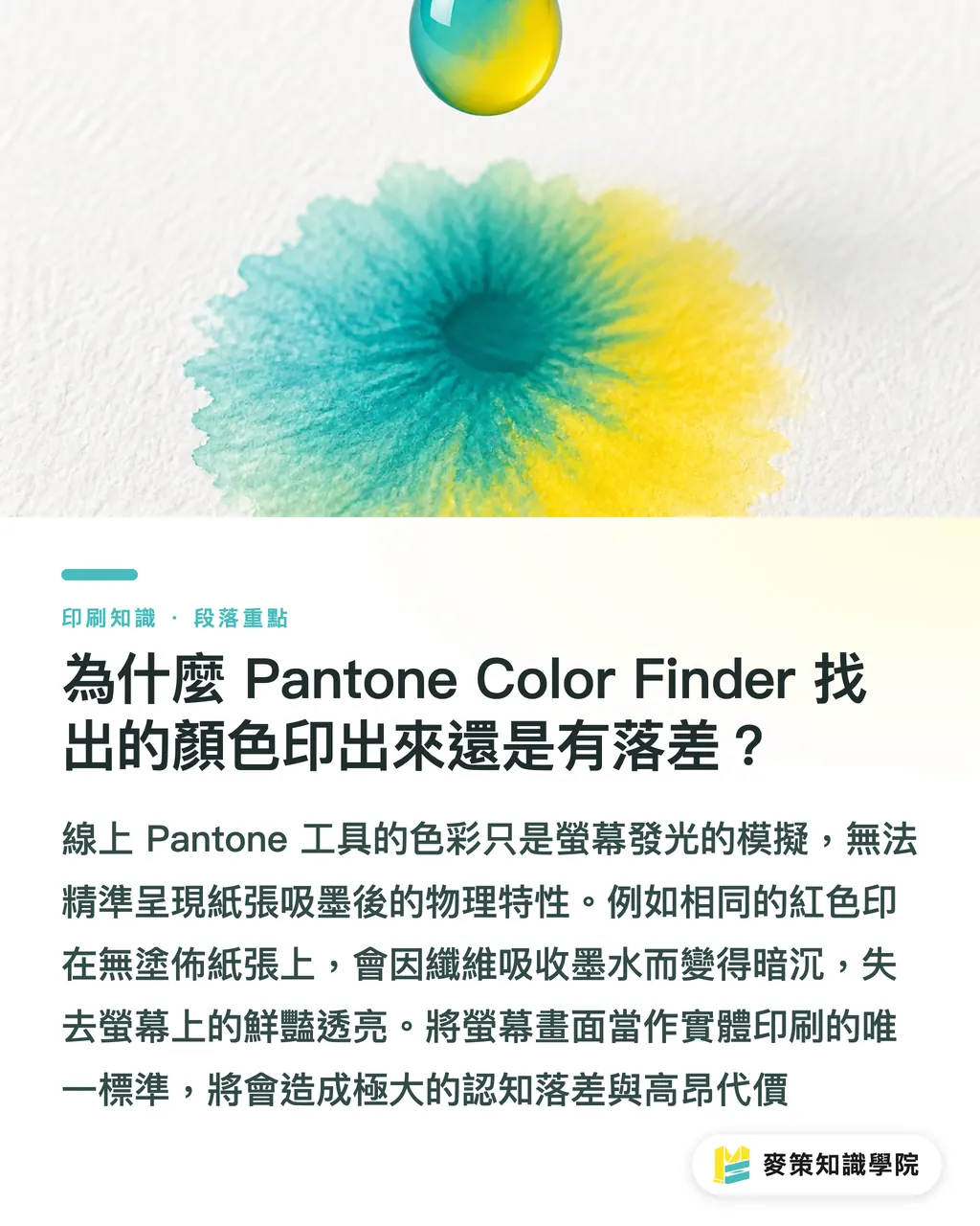
Why Does the Color from Pantone Color Finder Look Different in Print?
Screens emit light in RGB mode, while paper absorbs light as a physical material. The color swatches and values from online tools are just screen simulations, not guarantees of how ink looks on paper
A lot of new clients come to us asking the exact same question: "I picked this color straight from the Pantone website, so why does it look so dark in print?" It is by far our most common complaint. Screens are backlit, so colors always look brighter and punchier. Paper stock is the real dealbreaker
Take Pantone 185 Red. On coated paper, it prints as a vivid, brilliant red. On uncoated stock, paper fibers soak up the ink, turning it muted and grayish right away. Online tools cannot replicate these physical differences. Production reality is much messier than clean hex codes on a monitor. Treating your screen as the source of truth is the costliest mistake in prepress
How Should You Actually Use Pantone Color Finder?
Treat it like a search engine for physical swatches to narrow down your options, not as the final visual standard
Its real strength is helping you pinpoint colors quickly. When a client gives you a brand color spec, you do not have to flip through a physical swatch book page by page. Here is the right workflow:
1. Enter your target color family or existing RGB/Hex value online to pull up the 3 to 5 closest Pantone candidates
2. Write down those color codes and grab your physical Pantone Formula Guide
3. Place the physical swatches in a standard light booth (such as D50 or D65) or under natural daylight to see which one delivers the look you want
That is all it takes. Digital tools help you find the way, while physical swatches make the final call
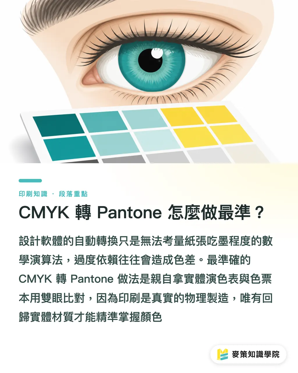
What Is the Most Accurate Way to Convert CMYK to Pantone?
The most reliable method is to stop relying on auto-conversions in design apps and compare a physical CMYK color chart directly against a physical Pantone swatch book
Many designers assume that double-clicking a swatch in Illustrator and switching from CMYK to Pantone gives them the exact match. That is a major mistake. Software uses mathematical algorithms. It does not know how much ink your paper stock absorbs, nor does it factor in press speed or cylinder pressure on the day of printing
To find the closest match, do it manually by eye:
・Pull out a physical CMYK color chart you trust
・Grab a physical Pantone swatch book
・Use your eyes to find the visual match between both physical prints
This might sound old school. But printing is physical manufacturing. Skipping physical materials when talking color will only lead to an expensive reprint bill
How Should You Set Up Design Files for Print Shops to Understand?
You must create a dedicated Spot Color swatch in your software and keep the full official suffix, like C for coated or U for uncoated
Picking the right swatch does not help if your file is configured incorrectly. Press operators look at separated black-and-white plates, not the color art on your monitor. To keep everyone on the same page, we recommend running through Mai Strategy's three-step prepress checklist:
1. Check your Swatches panel. If you are printing Pantone, you need a dedicated spot color channel in the file, not mixed into the four CMYK process plates
2. Specify the paper finish. Pantone 185 C and Pantone 185 U use completely different ink formulas. If you leave it vague, the print crew has to guess
3. Include a physical color reference. When handing off files, attach an approved digital proof alongside a small swatch chip of that Pantone number so the press technician has a clear visual target
How Can Small Teams and Design Studios Avoid Color Matching Traps?
Build a cross-team communication standard centered on physical swatches and guided by digital tools, and stop discussing color by looking at screens
Most disputes come down to "whose screen is calibrated right." When sales uses an iPad, design works on a Mac, and the client checks on a standard office laptop, all three see different tones on Pantone Color Finder. Arguing over who is right gets you nowhere
The fix is straightforward: get an up-to-date Pantone Formula Guide. Old swatch books fade, yellow, and lose accuracy over time. During meetings, lay that paper swatch on the table, and everyone aligns on the exact same physical sample. If you want more hands-on workflows for cross-department prepress, subscribe to the Mai Strategy Knowledge Academy Newsletter for real-world print production tips. Aligning on physical standards before moving through digital steps is the fastest way to avoid costly rework

Key Takeaways
・Search color codes online, confirm final colors with physical swatches. Screen values are only a reference
・C and U define how ink interacts with paper absorption, so always include the suffix with your color code
・Software CMYK conversions are math problems, but color matching is pure physics. Production only cares about physical results
・Spot color swatches inside your file are the real language for communicating with the print shop
Final Thoughts
Digital tools drastically cut down the time spent hunting through massive color libraries. But for SaaS builders and AI teams, understanding the physical boundaries of manufacturing is what makes products work in production. Digital tools exist to hand off specs cleanly, not to replace physical verification. Next-generation color management tools should integrate physical verification directly into the workflow to reduce friction between the digital and physical worlds
FAQ
- Can I use the RGB values from Pantone Color Finder directly in web design?
- Yes. The official RGB or Hex values are Pantone's recommended screen approximations for digital displays, so applying them directly in web design works fine
- Why can't I find the client's Pantone color code in Illustrator?
- Pantone regularly updates its libraries, so older software versions might lack recent codes. You can update libraries through the Pantone Connect plugin or manually create a spot color with a custom preview. As long as the name (such as PANTONE 17-3938) is spelled correctly, the print shop will recognize it during plate separation
- Why do my Pantone stickers look different from the last print run?
- The print shop may have changed ink brands, used a different paper batch, or your Pantone swatch book might have faded with age. Swatch books should generally be replaced every one to two years
- Can I convert the CMYK colors in photos directly to Pantone?
- No. Pantone colors are spot colors printed as solid, flat inks on dedicated plates. Photos and images rely on overlapping halftone dots across four CMYK process inks, so you cannot directly convert an entire image into a single Pantone color
Related articles



The Print × AI weekly
The print and AI know-how designers, brands and enterprises can use before they commit — one email, every week
Tool Library
RGB↔CMYK conversion, ΔE color difference and brand color print analysis — free color management tools, computed right in your browser.
MINDS Group
Need actual printing or gifting services?
From premium printing to online ordering and festive gifts — the MINDS Group sister brands take it from here.