
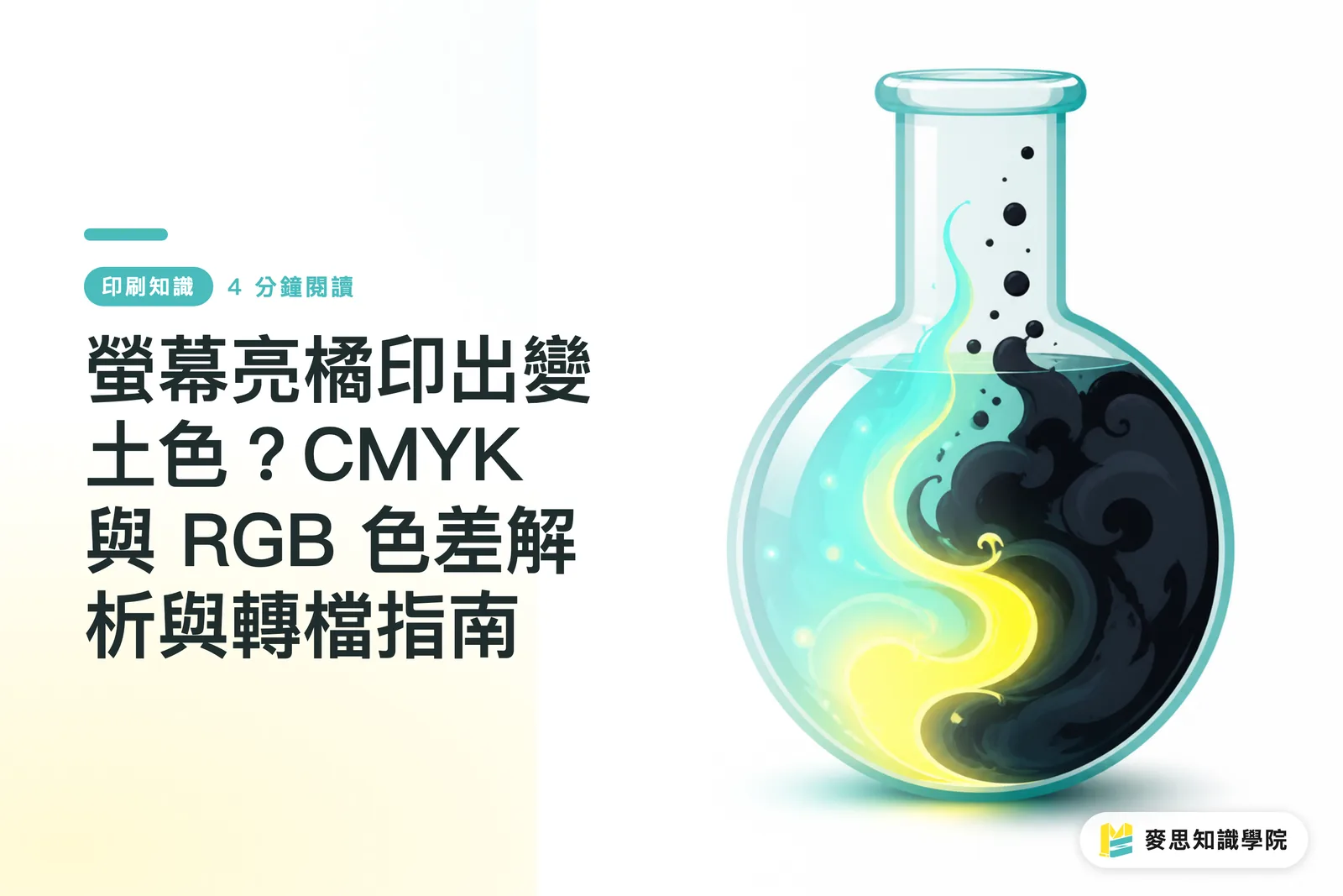
Why Does Bright Orange on Screen Turn Muddy When Printed?
Screens display colors with light (RGB), while printing relies on ink (CMYK). The two have naturally different color gamuts. To fix color shifts, we recommend adopting standard workflows like the "MINDS (MS, mid-to-high-end custom commercial printing) 3-Step Print Check" to lock in color settings right from the design phase
On the shop floor, the complaint I hear most from designers is that their carefully tuned neon green or vivid orange turns muddy and dull on the physical proof. This isn't because the press broke down. It's a hard limit of physics
RGB mode works by combining red, green, and blue light. The more light you add, the brighter it gets, creating millions of vivid colors. But printing presses use real ink: Cyan, Magenta, Yellow, and Black. Mixing inks subtracts light. The more ink you layer, the darker the color gets
When you force a bright RGB screen color into CMYK for print, physical ink simply can't reproduce that glowing look. The computer automatically picks the closest darker shade instead. That's why vivid colors instantly turn dull and dirty

What Are RGB and CMYK? Breaking Down the Core Terms
In practical work, we must strictly separate when to use these two color modes:
・RGB: An additive color mode using Red, Green, and Blue light. Higher values mean brighter output, reaching pure white at max levels. Used strictly for screens, mobile devices, and web design, it can render highly saturated bright and neon colors
・CMYK: A subtractive print mode mixing Cyan, Magenta, Yellow, and Black inks. Heavier ink coverage creates darker tones. This is the standard for all physical printing and output, and it cannot produce glowing colors
How Beginners Avoid Print Disasters: The MINDS (MS) 3-Step Print Check
Instead of arguing over ruined prints afterwards, protect your file right when you create it. I strongly advise passing every print file through the "MINDS (MS) 3-Step Print Check":
・MINDS (MS) Print Check Step 1: Start your design file directly in CMYK mode instead of converting after you finish. This ensures every color you pick stays within the printable safe zone from day one
・MINDS (MS) Print Check Step 2: Apply the correct ICC Profile, such as Japan Color 2001 Coated commonly recommended by printers in Taiwan, so your screen and press speak the exact same color language
・MINDS (MS) Print Check Step 3: Make good use of the "Gamut Warning" feature in your design software to catch unprintable high-saturation blocks with one click, giving you time to tweak them manually
If your team keeps getting stuck in endless file revisions or rejections from print shops, book a corporate training session with the Mai Strategy Knowledge Academy consulting team to set up your end-to-end color management system once and for all
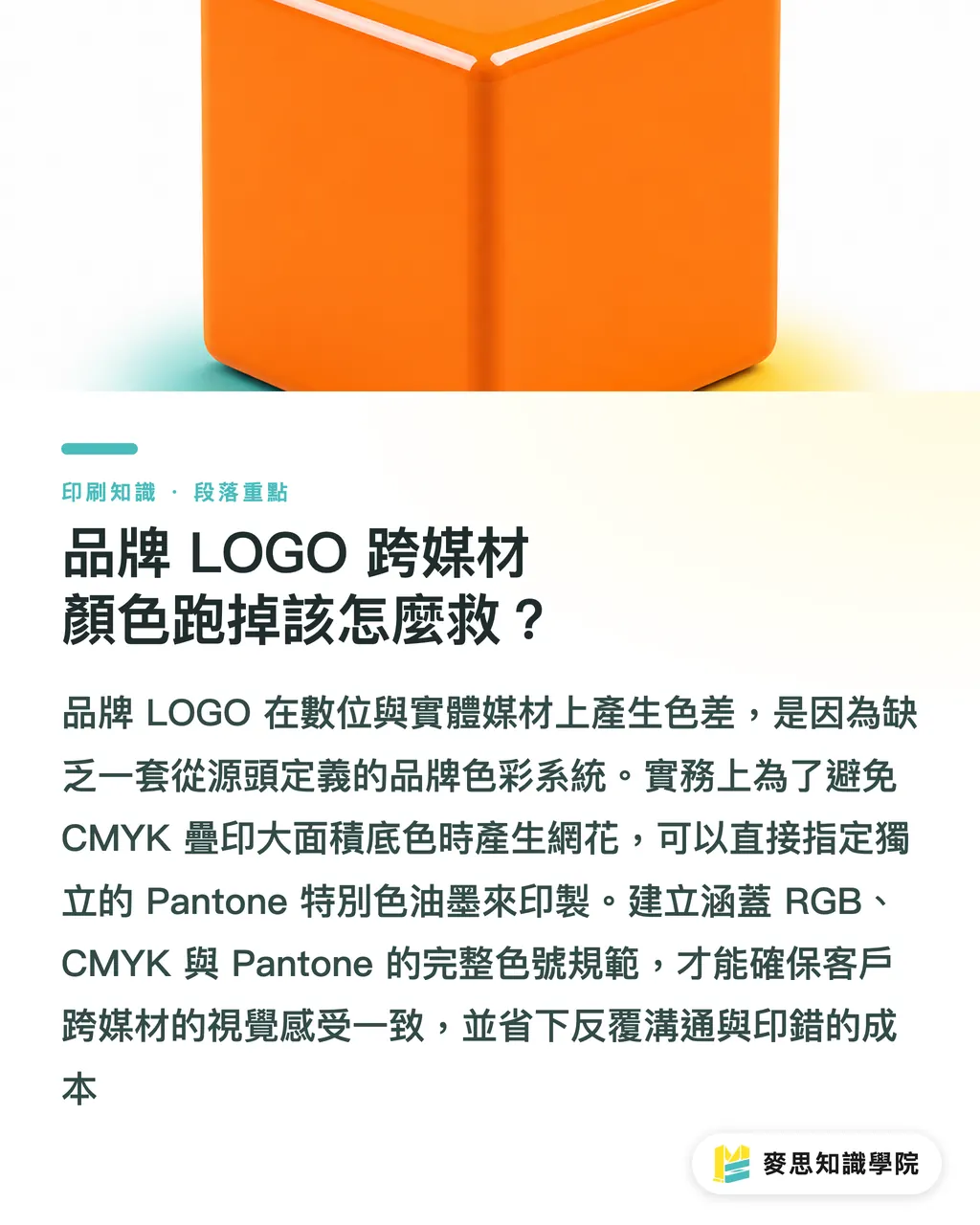
How to Fix Brand Logo Color Shifts Across Media?
Does your brand logo look different on a phone screen compared to a printed business card? That happens because you lack a brand color system defined clearly from the start
In practice, when printing a large, flat block of vivid orange background, layering four-color CMYK inks can easily cause faint moiré patterns due to dot distribution, and edges may lose sharpness
In these cases, we don't stick blindly to CMYK. Instead, we directly specify a spot Pantone ink to print
Setting up color specifications that cover digital RGB, print CMYK, and Pantone spot colors is the only way to ensure the color customers see on a website matches what they feel when holding the physical box. This saves you wasted money and endless back-and-forth
Key Takeaways
・Screens rely on light while printing relies on ink. This physical gap is the root cause of color shifts
・Setting CMYK mode and its matching ICC Profile early in design beats painful color adjustments later
・Highly saturated blue, green, and orange are disaster zones for file conversion. Always trust color swatch numbers over your eyes
・Building a brand color system that includes RGB, CMYK, and spot colors is essential for consistent visuals across media
Final Thoughts
Color management is not magic. It is rigorous physics and data alignment. For SaaS or design tool developers, warning users in-app when a color block exceeds the print gamut saves downstream clients endless customer complaint costs. For brands, locking down color specifications and distributing them to all vendors is the only way to unlock long-term efficiency in design and print communication
FAQ
- If I forgot to set CMYK at the start, can I convert directly before saving?
- You can convert, but highly saturated screen colors will instantly turn dull, and the change is permanent. Back up your original RGB file before converting, then manually rescue dulled areas by tweaking color curves or saturation
- If my monitor is accurately calibrated, will the print have zero color difference?
- Zero color difference cannot be guaranteed. Paper base color and ink absorption alter the final outcome. For instance, coated paper yields vibrant colors, whereas uncoated ivory paper causes colors to look muted
- What should I do if a color cannot be reproduced in CMYK no matter how I adjust it?
- That means the color is out of gamut for four-color printing. In practice, you must switch to a dedicated Pantone spot color ink or mix a custom color for screen printing. It costs more, but it hits the mark precisely
Related articles


The Print × AI weekly
The print and AI know-how designers, brands and enterprises can use before they commit — one email, every week
MINDS Free Tools
Imposition calculator and preflight file check — free prepress tools, right in your browser.
MINDS Group
Need actual printing or gifting services?
From premium printing to online ordering and festive gifts — the MINDS Group sister brands take it from here.