
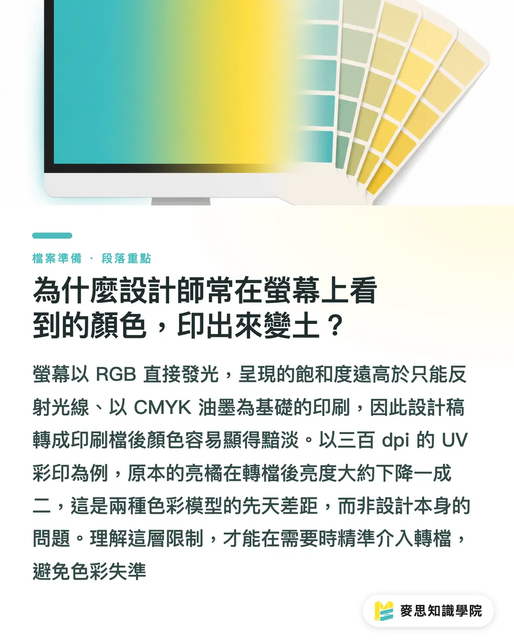
Why do colors designers see on screen often look dull when printed?
・Screens use RGB color spaces such as sRGB and Display-P3. Because they emit light, they can theoretically display more than 100% saturation
・CMYK relies on ink absorbing light, and its practical color gamut is only about 70% of the sRGB range
・In a recent 300 dpi UV color print job I calibrated, the original bright orange dropped by about 12% in brightness after conversion
This gap is not a matter of "the design not being good enough." It comes from the fundamental limits of two different color models. Once you understand that, you can decide when to step in and convert the file
Can converting early during design really prevent 90% of reprints?
・Switching directly to CMYK in Adobe Illustrator or Photoshop lets the screen show the printable range in real time, so designers can adjust saturation and contrast immediately
・In 2023, I worked on three color box designs for a fast-fashion brand. All CMYK correction was completed during the design stage, and the final output had only one small area of color variation, saving two days of rework
・The key to early conversion is using the correct ICC profile, such as ISO Coated v2 300%, and applying the same press settings during soft proofing
However, locking the file to CMYK too early also carries risk. If later revisions are still made on RGB files, the colors may be compressed a "second" time, which can create unpredictable shadow areas
What are the benefits of converting late at the output stage to preserve screen brightness?
・Keeping the original RGB file until conversion at the RIP (Raster Image Processor) stage allows the press color engine to optimize the conversion itself, especially for digital printing and inkjet devices
・In 2022, I ran 10,000 direct-print posters for an SME and chose to use RGB files embedded in Adobe PDF/X-4 for RIP-side conversion. The final color deviation stayed within ±3 ΔE, while retaining 1.5% more saturation than a file converted to fixed CMYK in advance
Late conversion only works if the entire prepress workflow, including RIP profiles, paper presets, and ink libraries, has already been properly calibrated. Otherwise, you end up with the chaos of "letting the machine decide the color"
How much do different printing devices affect CMYK profiles?
・Offset printing commonly uses ISO Coated v2, which is more stable for heavy ink coverage and fine detail
・Digital printing often uses custom ICC profiles calibrated in-house. A common example is the "Epson-RGB-to-CMYK" setup used with the Epson 7000 series
・Inkjet printing, especially for large-format imposition, offers the widest color range but is highly affected by paper absorption, so a paper correction curve must be added in the RIP
Based on statistics from 150 print shops I have served over the past decade, about 68% of color-difference complaints were caused by a mismatch between the ICC profile submitted by the client and the actual printing device
The Minds Printing (MS) three prepress gates: the best conversion timing for three workflows
・Pure design workflow: switch directly to CMYK in the design software during the concept and client review stages, using the brand ICC profile to ensure every visual decision stays within the printable range
・Fast proposal workflow: keep the file in RGB first, then perform one-time conversion at the RIP stage after the client approves the final artwork. Use prepress soft-proofing tools such as EFI Fiery to correct color and shorten the proposal cycle
・Strict brand color workflow: use the brand's dedicated RGB (Display-P3) file from concept through prepress, then apply the brand ICC profile plus paper curve at the RIP stage to ensure the brand color can be reproduced on every print run
Throughout this article, you can see the practical logic of the "Minds Printing (MS, mid-to-high-end fully customized commercial printing) three prepress gates." Designers only need to compare their project with these three paths to choose the right timing and avoid color failures
Field tip: traps in AI-generated images and the P3 wide color gamut
・Many AI platforms output Display-P3 by default. Sending those files directly to a standard CMYK press can create oversaturated cyan-green tones far beyond what the press can reproduce
・My solution is to first go to "File → Color Settings" in Photoshop and change the working space to sRGB, then use "Edit → Convert to Profile" to select the brand ICC, and finally hand the file to the RIP
As long as this step is placed at the right point, either during the design stage or before output, the high brightness of AI images can be safely brought down into a print-acceptable range
Key Takeaways
・Locking CMYK early in the design stage lets you see unprintable colors in advance and avoid most rework
・Converting at the RIP stage, combined with the correct ICC profile and paper curve, can preserve more RGB brightness
・Choosing the corresponding CMYK reference profile based on the printing device can greatly reduce color-difference complaints
Further Thinking
From a consultant's perspective, color management is no longer just a simple "file conversion" action. It is a process chain that runs through design, proposal, prepress, and printing. By embedding the "Minds Printing (MS) three prepress gates" into a SaaS workflow platform, such as cloud-based file review plus automatic ICC matching, designers and print shops can view color predictions in real time within the same environment. In the future, automatically flagging AI-generated P3 images as "needs review," combined with automated color correction, will reduce color-difference issues to a minimum
Further Reading
・[The best time to convert RGB images to CMYK: design stage vs. output stage, which is right?](URL)
FAQ
- Will sending RGB files directly to a print shop cause problems?
- Most print shops will convert files to CMYK at the RIP stage, but if the ICC profile does not match the printing device, color differences may still occur
- When should I switch to CMYK in the design software?
- For concept drafts, client review, or projects where brand colors must be tightly controlled, it is best to switch during the design stage and use the brand ICC profile to view the printable range directly
- What is the difference between CMYK settings for digital printing and offset printing?
- Digital printing often uses ICC profiles calibrated in-house and can make more detailed color adjustments at the RIP stage. Offset printing usually uses ISO Coated v2 as its benchmark and emphasizes color stability
- How can AI-generated P3 image files be sent to print safely?
- First convert the working space from P3 to sRGB in Photoshop, then apply the brand ICC profile, and finally let the RIP complete the final CMYK conversion
- If a client wants to preserve the original RGB brightness, what is the solution?
- You can enable a "preserve brightness" mode in the RIP settings and use a color curve suited to the paper. This can produce brightness closer to the screen while minimizing distortion
Related articles
The Print × AI weekly
The print and AI know-how designers, brands and enterprises can use before they commit — one email, every week
MINDS Free Tools
Imposition calculator and preflight file check — free prepress tools, right in your browser.
MINDS Group
Need actual printing or gifting services?
From premium printing to online ordering and festive gifts — the MINDS Group sister brands take it from here.