

Why Does the Exact Same File Shift Color at a New Print Shop?
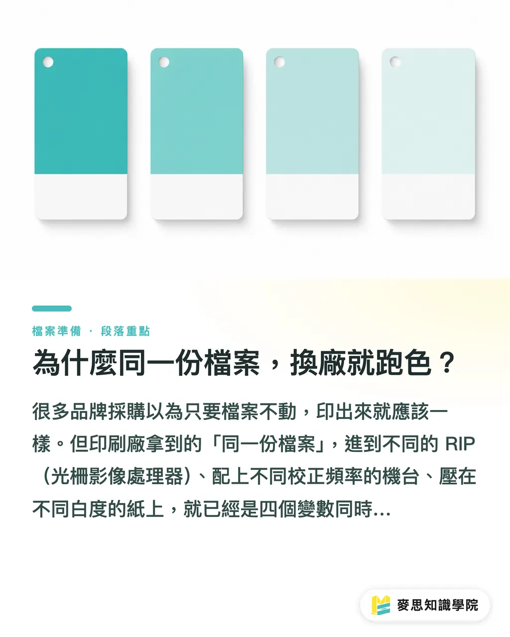
Many procurement teams assume that if the file does not change, the printed piece should look identical. But that 'identical file' enters different RIPs (Raster Image Processors), runs on presses with different calibration routines, and lands on paper with different base whiteness. That is already four separate variables running at the same time
The deeper problem is that most brand guidelines list only RGB swatches or HEX codes, maybe with a single Pantone number thrown in. That gives graphic designers enough to work with, but for press operators, it forces them to translate 'design language' into 'print language' on the fly. That translation step alone is where the errors creep in
In projects I have worked on, converting the exact same Pantone 485C (bright red) into CMYK produced values ranging from C: 0 M: 96 Y: 91 K: 2 all the way to C: 0 M: 100 Y: 100 K: 0 across different vendors. They look similar on paper, but the visual difference on coated stock is striking, not to mention when you switch to uncoated paper or specialty substrates
A brand guide is not a prepress specification. That single statement is the heart of this article. If a business only hands over a brand guide, it is dumping the responsibility of color matching onto the printer and gambling on the outcome
What Belongs in a Prepress Brand Specification?
When MINDS (custom commercial printing) helps clients build this document, we break it down into three tiers: color definitions, paper baselines, and file export settings. Miss any of these three, and every print job is still a roll of the dice
Tier 1: Color Definitions, Starting with Color Profiles
・Pantone numbers (Pantone Matching System, PMS): This is the common language for communicating brand colors across shops. You must specify whether it is Pantone C (coated/gloss) or Pantone U (uncoated/matte), because the same number looks noticeably different on the two surfaces
・CMYK conversion baseline: State clearly which ICC Profile is used for the conversion. The most common options are Japan Color 2011 Coated (the standard in Japanese and Taiwanese commercial print) or ISO Coated v2 (European standard). If you do not specify one, each vendor picks their own, and the numbers drift apart
・Lab values (optional, but highly recommended for premium brands): The Lab color space is device-independent, making it the most precise way to communicate color. Vendors can measure the printed piece with a spectrophotometer, letting hard numbers settle disputes instead of subjective eyesight
Take a corporate blue for business cards as an example. Going from just 'Pantone 2945C' to adding 'Target CMYK: C 100 M 60 Y 0 K 20 (Japan Color 2011 Coated)' plus Lab values 'L 27 a 4 b -49' gives the pressroom exact targets to aim for
Tier 2: Standard Paper Library, Building Your Own Substrate List
This is the part most companies overlook. The exact same CMYK values printed on 150gsm coated paper versus 200gsm pearl paper can show a saturation difference of over 15%, and the depth of black is night and day
Building a paper library is straightforward:
・List your main collateral categories (business cards, catalogs, packaging, marketing collateral)
・Assign a baseline substrate for each category: paper mill, paper type, weight in gsm, gloss or matte finish
・If possible, keep an approved physical proof sample (an A5 swatch card is plenty) as your master color reference
Once this list exists, telling a new vendor 'Per our material specs, business cards use 350gsm coated art card, and catalog inside pages use 100gsm woodfree paper' locks down more than half of the substrate variables right out of the gate
Tier 3: PDF Export Presets (Job Options)
Designers often export PDFs straight out of InDesign or Illustrator. But that single export step involves dozens of variables: font embedding, image compression, color conversion, bleed settings, and whether ICC profiles are embedded
The cleanest approach is creating a standardized Job Options file (.joboptions) for all internal designers and outside agencies to apply:
・Set the color space strictly to CMYK (no stray RGB objects)
・Embed the designated ICC Profile (such as Japan Color 2011 Coated)
・Fix bleed settings at 3mm
・Resolution: images at 300 DPI, vector graphics uncompressed
・Choose standard PDF/X-1a or PDF/X-4 (your printer can tell you which one their RIP handles best)
Once this Job Options file is established, it serves as your standard prepress preset. When you onboard a new designer or switch print vendors, handing over this single file locks in export quality and cuts out endless back-and-forth
Why This Specification Is a Business Asset, Not Bureaucratic Paperwork
In my view, a prepress spec sheet belongs in the same category as trademark licensing. It is a brand asset, not an internal procurement memo
The practical payoff shows up quickly:
・A solid prepress spec expands your vendor pool from 'the one or two shops we always use' to any printer in the market with suitable equipment, opening up immediate room for price negotiation
・During rush reprints or massive production runs split across multiple facilities, brands with clear specs can divide orders freely. Those without are stuck bottlenecking everything through a single vendor
・When designers leave or agencies change, your print output standards stay anchored in the documentation instead of walking out the door with people
I have seen mid-sized companies shift from 'only calling familiar shops' to 'comparing quotes, checking lead times, and signing off against clear specs.' Their printing costs dropped 10% to 20% within two years, while color drift complaints virtually vanished

Where Do Teams Make the Biggest Mistakes?
Putting this specification together comes with a few common pitfalls worth noting
Pitfall 1: Leaving Pantone Numbers Unqualified Without C, U, or M
Pantone 493C and Pantone 493U share the same number, but the C swatch (coated reference) and U swatch (uncoated reference) look completely different. Mixing them up leaves the pressroom guessing which swatch book to match against, leading operators to eyeball the mix
Pitfall 2: Listing CMYK Values Without an ICC Profile
'Our brand blue is C 100 M 85 Y 0 K 0.' That exact formula produces visibly different hues under Japan Color 2011 Coated compared to US Web Coated SWOP v2, yet countless brand books never name an ICC profile at all
Pitfall 3: Skipping Output Verification After Sending the PDF
Even with thorough specs, if the vendor never returns an output proofing confirmation (stating received color mode, ICC profile, and resolution check), pinpointing who is at fault when something goes wrong turns into a messy guessing game. A half-page sign-off sheet solves this, yet many buyers skip it entirely
How Can SMBs Without In-House Prepress Staff Get Started?
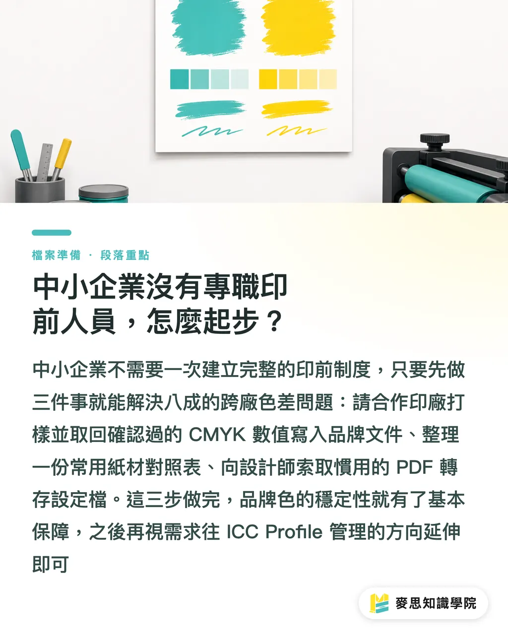
I get asked this all the time. My advice is not to build everything in one go. Start with three basic steps:
Step 1: Lock in your two primary CMYK values
Pick a trusted print vendor, run a press proof for your primary and secondary brand colors, and ask them to log the exact CMYK values and ICC profile used on press. Verify the result, then lock those numbers permanently into your brand documentation
Step 2: Build a substrate lookup sheet
List your three to five most frequently printed items, specifying the paper stock and gsm weight for each. Plain text on a single page is enough. Attach it every time you send out a job
Step 3: Request a Job Options file from your designer or print shop
If you work regularly with an outside designer, ask for their current PDF export presets. Confirm that the settings match your printer's pressroom requirements, then archive the file as your company standard
Completing these three steps eliminates 80% of cross-vendor color drift at the root. If you want to refine things later, you can expand into ICC profile management and Lab target calibration
If your print volume reaches a certain scale or brand presentation demands tighter control, consider partnering with print specialists like MINDS to build a customized prepress specification from the ground up, setting a solid foundation that any vendor can execute seamlessly
Key Takeaways
・A brand guide is not a prepress specification. Without an ICC profile baseline and PDF export presets, sending out jobs dumps color responsibility entirely onto the vendor
・Pantone numbers must specify C, U, or M versions, and CMYK values must state the ICC profile used. Missing either gives you only half a specification
・A standard paper library controls substrate variations, forming your most direct line of defense for multi-vendor consistency
・A standardized Job Options file serves as your prepress template. When designers or vendors change, output quality stays stable
・Starting with three steps (locking in two CMYK values, creating a substrate list, and securing a Job Options file) builds an effective defense against 80% of color drift issues
Further Thoughts
Taking a longer view, this comes down to shifting brand consistency away from the tacit knowledge of specific people or vendors into a documented, auditable system. Print shops do not just execute orders; they are often the first ones handed flawed specs, even if they do not always say so. When your prepress documentation lets printers confirm upfront that their equipment matches your specifications before quoting, your supply chain options genuinely open up. For teams implementing brand management systems or evaluating SaaS print platforms, my advice is to nail down these three specification layers before picking software. Without solid specifications, tools only make broken workflows move faster, not more accurately. You can test this by walking through the online ordering flow at MINDS to see where the platform prompts for color modes and paper stocks. Those exact checkpoints show you what your internal specs must cover
FAQ
- Does switching print vendors always cause color shifts?
- Not necessarily, but without standardized prepress specs, color drift is almost guaranteed. The primary driver is rarely poor vendor craftsmanship; it is that different shops use different ICC profiles, paper stocks, and RIP presets. As long as your brand provides a clear color profile baseline (such as Japan Color 2011 Coated), designates exact paper specs, and supplies a unified PDF/X export preset, color consistency becomes fully controllable
- Should I provide both Pantone swatches and CMYK values to the printer?
- Yes, provide both together. The Pantone number defines your design intent, while the CMYK values give the pressroom concrete ink mixing targets. If you only provide Pantone codes, vendor conversions can easily wander 5% to 10% from what you expect. When specifying CMYK values, always name the ICC Profile, since the identical formula renders differently across different color profiles
- What is the PDF/X standard, and is it necessary?
- PDF/X is an ISO standard subset of PDF built specifically for printing. It requires embedded fonts, defined color spaces, and strips out interactive elements that could break output on press. The most common versions are PDF/X-1a (CMYK-only space, broadest compatibility) and PDF/X-4 (supports live transparency and multiple color spaces). For commercial printing, using it as a rule helps prevent output errors caused by missing fonts or lingering RGB objects
- Our print volume is small. Is building this specification worth the effort?
- Even if your yearly volume is only a few thousand pieces, putting together a baseline spec takes just two to three hours upfront. The time and money saved avoiding reprints, disputes, and back-and-forth communication across vendors will quickly pay that back several times over. Starting with three simple items, locked CMYK values, a substrate list, and a Job Options file, requires minimal effort and yields immediate results
- How do I verify if a designer's PDF used our required settings?
- Use the Preflight tool in Adobe Acrobat, or ask your printer to send an output confirmation slip upon receiving the file, noting the detected color modes and embedded ICC profiles. Having your vendor return this confirmation during prepress review creates a reliable checkpoint to catch mistakes before the press starts rolling
Related articles




The Print × AI weekly
The print and AI know-how designers, brands and enterprises can use before they commit — one email, every week
Tool Library
RGB↔CMYK conversion, ΔE color difference and brand color print analysis — free color management tools, computed right in your browser.
MINDS Group
Need actual printing or gifting services?
From premium printing to online ordering and festive gifts — the MINDS Group sister brands take it from here.