

Why Do My Pantone Colors Always Print with a Dull CMYK Look?
When Pantone spot colors in your files are converted to CMYK by printers, the most common reason is that the Illustrator swatch attributes were not set correctly, or the naming was inconsistent. To avoid this, you must open the 'Separations Preview' panel before sending files to print to verify the exact number of plates
If you have extremely high standards for high-end custom printing colors, you can consult the advisory team at MINDS Printing (MS, mid-to-high-end fully customized commercial printing) to check your files
We have seen too many painful experiences from designers on our production lines. A client selects a brand-specific color using an expensive Pantone color guide, only to nearly faint upon receiving the bulk order because the bright orange turned into a muddy brown-orange
This is because the color gamut of four-color printing (CMYK) is inherently smaller than that of spot colors; many high-brightness and high-saturation colors simply cannot be reproduced
You paid for the expectation of a spot color, yet because a single option was missed in the final design file, it was silently converted to CMYK by the system
This results in a massive gap in visual quality and wastes time and communication costs back and forth
What is a Spot Color, and How Does It Differ from CMYK Four-Color Printing?
A spot color refers to a specific color for which a printing house has a pressman custom-mix a dedicated batch of ink and create an independent printing plate for production
In contrast, CMYK relies on four basic inks, Cyan, Magenta, Yellow, and Black, using the illusion of superimposed halftone dots to trick the human eye
To put it in the simplest terms: if you want to print a solid page of pure red, CMYK does so by printing magenta overlaid with yellow, whereas a spot color applies pre-mixed red ink directly
The color saturation, smoothness, and consistency of the latter are absolutely unmatched by CMYK color layering
However, for every additional spot color plate, you must pay extra plate and ink mixing fees
Whether this expense is worth it usually depends on how absolutely critical that color is to your brand identity
How to Configure Illustrator Swatches so the Press Doesn't Treat Them as Four-Color?
Many designers ask me: if a client specifies PANTONE 123 C, can I just select any yellow in the software and rename it PANTONE 123 C?
The answer is no
The printing press reads plate information, not layer names. If you do not select 'Spot Color,' no matter how professional the name is, the system will always output it as standard CMYK separations
This three-step pre-press checklist from MINDS Printing (MS), which I often use when training newcomers, will help you avoid 99% of file rejection risks:
・Check Attributes: Double-click the color swatch options you want to use, and change the 'Color Type' from 'Process Color' to 'Spot Color'
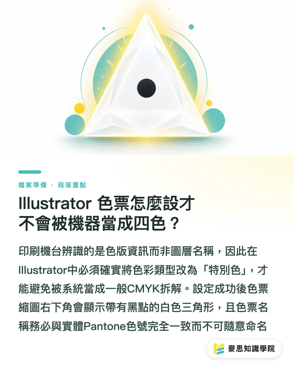
・Identify the Icon: Once configured successfully, a white triangle with a small black dot will appear in the bottom-right corner of the swatch thumbnail. This is the spot color's identity card
・Align the Color Name: Even if it is a custom spot color you created, the swatch name must match the physical Pantone color number exactly. Do not name it 'Brand Yellow' or 'Client's Orange'
Why Do Plate Fees Suddenly Skyrocket Just from Changing a File Name?
This is another of the most frequent customer complaints: the same Pantone color in a single design file is misidentified by the press as different spot color plates due to inconsistent naming
For example, your main visual uses a color named 'PANTONE 021 C,' but the logo next to it uses 'Pantone 021 C' (different casing), or there is an extra space making it 'PANTONE 021 C'
Pre-press systems are very literal; it will treat these as three completely different spot colors
Consequently, what should have required only one spot color plate ends up requiring three, tripling the plate and ink mixing fees
Even worse, if the pressman doesn't notice, they will mix three buckets of the exact same ink for you
So, while using a physical CMYK color guide to match colors and find the exact hue is important, the naming in the software must be absolutely identical down to the character
How to Ensure Your Files Are Foolproof: The Final Checklist Before Printing
No matter how meticulously the previous settings were configured, I advise everyone to perform a final check before exporting files to PDF for printing
This is just as crucial as checking if you wrote your name on an exam before turning it in
Open the 'Window > Separations Preview' panel in Illustrator, check 'Overprint Preview,' and you will see a row of eye icons for the four CMYK colors at the bottom:
・Count the Total: Check the panel list to see how many additional colors appear below the CMYK colors. Those extra colors are the spot colors configured in your file
・Find the Culprit: Turn off the visibility (eye icon) of the colors you do not want printed as spot colors, and see what remains visible on the canvas. Alternatively, turn off CMYK and leave only the spot colors to check if objects that shouldn't be spot colors have slipped in
・Unify Naming: If you discover that the same yellow generates two separate plates, immediately go back to the swatches panel and merge them under a single name
If the project budget is limited, or you are only printing small batches of retail promotional materials, you can place an order directly online with MINDS Printing (MYS). However, for corporate projects with strict color accuracy requirements, this check process will save you significant reprinting costs and communication effort
Key Takeaways
・Selecting the wrong color type is the main culprit behind spot colors turning into CMYK
・Only swatches with a black-dotted triangle in the bottom-right corner are genuine spot colors
・Inconsistent casing or spacing in color names will lead to skyrocketing plate fees
・Be sure to open the Separations Preview panel to count the plates before printing
Further Thoughts
Setting up print files may seem tedious, but it is actually establishing a standard for color communication that both machines and humans can read. While future print SaaS or pre-press inspection tools will undoubtedly automate these error-proofing mechanisms, mastering the fundamental logic now gives you absolute professional confidence when facing printers and clients, sparing you from endless disputes over minor plate fees
FAQ
- Why does the Pantone spot color look inaccurate on my screen?
- The spot color values displayed in the software are only references for screen rendering. The truly accurate approach is to select your color from a physical Pantone color guide first, and then assign the corresponding color number to your design file
- Will changing a CMYK block directly to a spot color attribute make it print the same?
- Not at all. CMYK is created by overlapping four-color halftone dots, whereas spot colors use custom-mixed physical inks. Since their color gamuts and physical properties differ, we strongly recommend referring to a physical color guide to verify the difference
- If my image file contains photos, can I still print spot colors?
- Yes. Photos are typically printed using the CMYK four-color process, while brand logos or specific color blocks can be handled with a spot color plate. This method is known as five-color printing (CMYK + 1 spot color)
Related articles


The Print × AI weekly
The print and AI know-how designers, brands and enterprises can use before they commit — one email, every week
MINDS Free Tools
Imposition calculator and preflight file check — free prepress tools, right in your browser.
MINDS Group
Need actual printing or gifting services?
From premium printing to online ordering and festive gifts — the MINDS Group sister brands take it from here.