
Overview
Color rendering index is a light source's ability to reveal an object's true colors. Whether a printed piece looks accurate does not depend on the press alone. It also depends on whether the light source, paper substrate, ink, ICC Profile, and proofing conditions align. MINDS (MS, mid-to-high-end fully custom commercial printing) handles this in print consulting through the MINDS (MS) Three Inspection Gates: 1. Proofing under standard lighting 2. File color management 3. Physical proof acceptance
What Is Color Rendering Index?
In Taiwanese press rooms, color rendering index is often discussed in terms of CRI or Ra. It measures how faithfully a light source presents an object's color compared to natural daylight or a standard light source. CRI is commonly rated on a scale of 0 to 100, where higher numbers generally mean less color distortion
Many clients assume getting a great print job is entirely up to the printer. On the press floor, I see something else far more often. The same proof looks warm under warm office lights, cool by a sunny window, and washed out or grayish in retail store lighting
Printed materials do not emit light themselves. They reflect ambient light back into your eyes. So when the light source changes, how you perceive reds, blues, skin tones, and metallic colors can all shift
Color rendering index is not about how vivid a color looks. It is about whether the light source distorts the color
I usually ask clients to keep 3 key judgment points in mind:
・CRI / Ra: A common color rendering metric typically capped at 100, perfect for quickly rating how well a light source reveals true colors
・Color Temperature: Press proofing often uses D50 (around 5000K), while design monitors and general office spaces often use D65 (around 6500K). Looking at the exact same paper under these two conditions gives different results
・Viewing Environment: Wall colors, desktop glare, daylight from windows, and office LEDs can all skew your judgment of a printed piece
As we say on the press floor: reviewing colors under the wrong light is like wearing the wrong glasses for a vision test. You can debate for hours without reaching a conclusion
Why Do Prints Feel Off at Delivery Even When Proofs Looked Right?
Color variance in printing rarely comes down to a single cause. It usually happens when one link in the chain, files, proofing, press run, or viewing, falls out of alignment
For instance, a designer works in RGB on an uncalibrated monitor, the printer runs the job in CMYK, and the client inspects the final print in a 3000K warm white office. Colors viewed across these three environments will never match
Print color performance depends on at least 5 factors:
・File Color Mode: RGB displays bright screen colors that CMYK cannot always reproduce, particularly neon-like purples, vivid greens, and bright oranges
・ICC Profile: The same CMYK values can render differently when applied to different paper substrates, press conditions, and output equipment
・Paper Whiteness and Ink Absorption: Coated paper, woodfree paper, linen paper, and eco-friendly recycled paper will shift lightness and saturation differently for the exact same color block
・Ink and Dot Gain Control: Large solid brand colors, gradients, and skin tone photos suffer most when dot gain and gray balance drift out of control
・Viewing Light Source: The gap between a standard D50 light source and standard office LEDs is big enough to turn cream yellow, gray green, and skin tones muddy
That is why I dislike asking printers a broad question like 'Do you have good color rendering?'
Here are much more useful questions to ask:
・Does your proofing area use a standard D50 light source?
・Are digital proofs, press proofs, and mass production samples checked under the exact same lighting?
・Can you supply an ICC Profile suited to our paper and printing method?
・Can we confirm brand colors together using Lab, CMYK, Pantone, or physical color chips?
・Can we agree on an acceptable ΔE tolerance range for inspection before production?
When a client asks questions at this level, the print shop can bring out true expertise. Otherwise, both sides get stuck with 'It looks darker to me' versus 'The press operator says it is normal.'
What Is the Difference Between CRI, D50, ICC Profiles, and Color Rendering?
CRI describes the light source itself. D50 specifies standard viewing conditions. ICC Profiles govern how colors translate between devices and materials
People often blur these three terms together, but their roles in the printing process are distinct
・CRI / Ra: Evaluates the color rendering capability of a light source, typically rated from 0 to 100, which helps determine if a viewing lamp is trustworthy
・D50: A standard viewing light source at roughly 5000K used for print proofing and inspection, ensuring both sides evaluate colors under identical light
・ICC Profile: Defines the color traits of screens, presses, paper, and inks, setting clear rules for converting RGB into CMYK
・Soft Proofing: Simulates print output on a calibrated monitor, commonly used during prepress checks in Adobe Illustrator, Photoshop, and InDesign
・ΔE: A metric that quantifies color differences, turning 'looks a bit off' into a clear number for discussion
I like to break them down into simple takeaways:
・CRI tells you whether your viewing lamp is reliable
・D50 ensures everyone evaluates colors under the exact same standard light
・ICC Profiles ensure files take the right path when converting for print
・ΔE helps eliminate endless back-and-forth arguments during final inspection
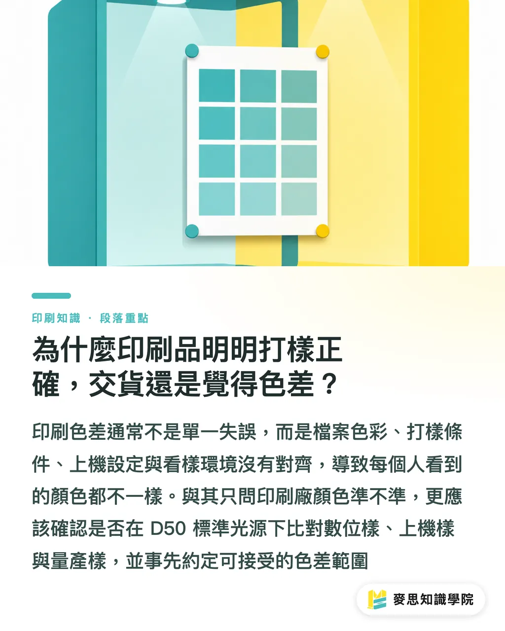
Take a common case: a strawberry photo on food packaging looks vivid red on screen, but turns a shade darker on a matte-laminated carton. View it under warm light with low color rendering, and the red becomes dull while the fruit textures disappear
You cannot solve a job like that by simply telling the printer to 'add a little more red.' You need to check the light source, paper substrate, ICC Profile, proofing, and post-press finishing together
How Can Designers and Buyers Tell If a Printer Has Stable Color Quality?
Judging a printer's color stability is not about reading glossy marketing material. It comes down to whether they state standards clearly, keep reference samples on file, and document production conditions
I recommend that designers and buyers use the MINDS (MS) Three Inspection Gates to evaluate printing partners
・1. Proofing under standard lighting: Verify whether the printer uses a D50 environment, so office fluorescent light, window daylight, or phone photos do not become color standards
・2. File color management: Verify that design files are properly converted to CMYK with assigned ICC Profiles, preserving brand color specs, black plate settings, spot colors, and image resolution
・3. Physical proof acceptance: For key projects, review digital proofs or press proofs. Solid brand colors, skin tones, food imagery, and large background fills require physical samples as delivery references
For a run of 1,000 business cards, you can keep the process simple
For 30,000 folding boxes, holiday gift boxes, retail packaging, or a brand identity refresh, do not skip physical proofing
Print buyers can put these questions directly to the printer:
・What light source specifications does your viewing booth or color review area use?
・Do proofs and final production use the exact same paper substrate and post-press finishing?
・Do you recommend using spot colors or Pantone matching for large solid brand color areas?
・Will matte film, gloss film, varnish, or foil stamping make colors look darker or brighter?
・Can we sign off and retain a press proof before delivery as a baseline for future runs?
When the consulting team at Mai Strategy Knowledge Academy helps brands set up prepress workflows, we turn brand colors from 'nice color blocks in design files' into 5 clear spec fields: screen values, print values, paper conditions, physical proof samples, and allowed tolerance. That way, switching designers, printers, or production batches will not send colors off track
How Do Paper Substrates and Post-Press Finishing Impact Color Rendering and Appearance?
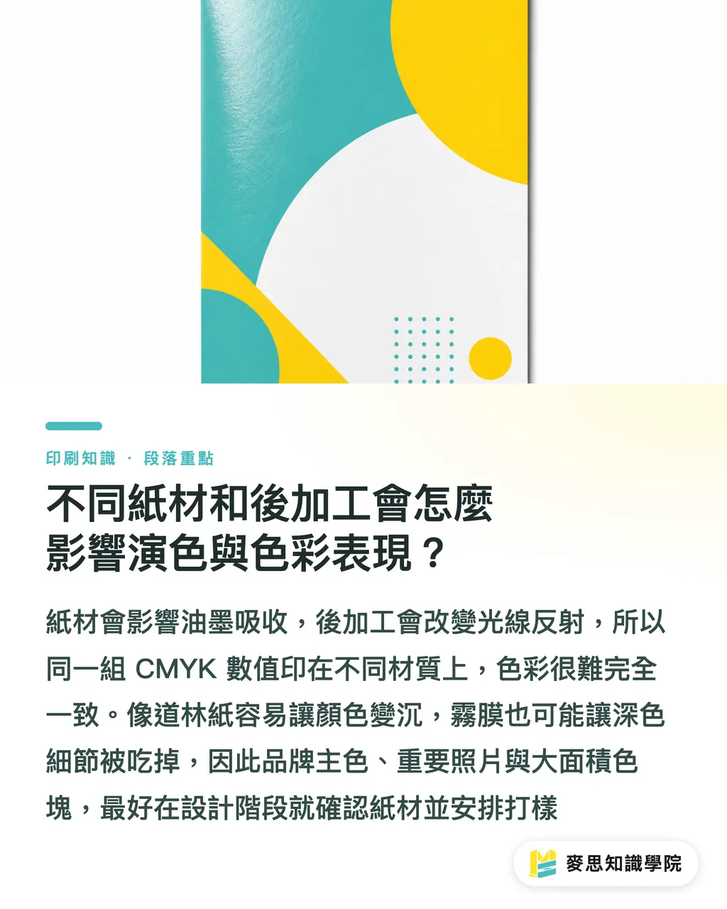
Paper substrates alter where ink rests, while post-press finishing alters how light reflects. That is why identical CMYK values rarely yield identical results across different materials
This step gets overlooked on the press floor more than almost anything else
Here is how common differences play out:
・Coated Paper: Smoother surface with stronger color saturation, widely used for photos and food packaging, though gloss reflections can affect viewing angles
・Woodfree Paper: Absorbs more ink, making colors look slightly darker and flatter than screen previews, ideal for books, manuals, and tactile collateral
・Art Paper: Wide variations in paper tint, texture, and ink absorption cause the same gray to shift warm or cool, making proofs mandatory for brand colors
・Recycled Eco Paper: Often carries a beige or gray tint that directly affects white-background designs. Light-toned photos require extra care
・Matte Lamination: Colors look softer and muted, while black and deep shadow areas tend to lose fine detail
・Gloss Lamination: Increases saturation while amplifying reflections, which magnifies differences across viewing angles
・Varnish / Spot UV: Localized gloss shifts visual focus, perfect for highlighting logos or hero visuals, though large coated areas create glare
・Gold / Silver Foil Stamping: Relies on metallic reflection. Standard CMYK screen previews cannot predict the final look
I often tell designers that paper is not just a background, paper is part of the color
If a brand's primary color is a low-lightness forest green, navy, or burgundy, paper choice and finishing affect the outcome far more than tweaking ink coverage by 5%
For high-risk jobs, I suggest 4 actions to keep color variance down:
・Lock in your primary paper substrate during the design phase instead of swapping paper last minute after receiving quotes
・Include brand color guidelines when delivering files, covering at least CMYK, RGB, Pantone, or Lab standards where applicable
・Run digital proofs for key color blocks and imagery, followed by press proofs when necessary
・Compare samples under fixed lighting during final acceptance, never rely on mobile phone photos to evaluate color shifts
To receive regular prepress checks and printing tips like these, subscribe to the Mai Strategy Knowledge Academy newsletter and turn easily missed prepress details into a routine checklist
Key Takeaways
・Color rendering index evaluates a light source's ability to reveal true colors. You cannot blame press machines alone for color inaccuracy
・True color management connects D50 viewing lighting, ICC Profile conversion, and physical proofing into one seamless workflow
・Paper substrates and post-press finishing change how colors appear. Identical CMYK values do not equal identical visual results
・Asking if a printer has 'good color rendering' is too vague. Ask about lighting, proofing, ICC Profiles, and acceptance standards instead
・Manage brand colors as technical specifications, not subjective feelings
Further Reflection
Print manufacturers can build standard operating procedures around viewing light sources, paper ICC Profiles, signed sample archives, and batch logs. Designers should complete soft proofing before finalizing artwork and convert RGB design drafts into print-ready specs. Print buyers should clarify paper stock, finishing, proofing methods, and acceptance standards right at the quotation stage. AI and SaaS tools help compile file checklists, brand color guidelines, and print production logs, but final color verification must return to physical proofs under fixed lighting because printed products are held in human hands, displayed on retail shelves, and seen under real light
FAQ
- Does a higher color rendering index guarantee accurate print colors?
- A high CRI means the light source reveals colors accurately, but print accuracy also depends on ICC Profiles, paper substrates, inks, proofing, and finishing. High-CRI lighting lowers the risk of misjudging color, but it cannot replace complete color management
- Why is D50 standard lighting commonly used for print proofing?
- D50 is roughly 5000K, the standard lighting condition for print proofing and inspection. Using D50 ensures designers, printers, and clients review colors under identical light, reducing misjudgments caused by office lighting or window daylight
- How can designers prevent color shifts before handing off files?
- Before file handoff, verify that artwork is set to correct CMYK or specified color profiles, use suitable ICC Profiles for soft proofing, provide CMYK, Pantone, or Lab specs for critical brand colors, and inspect physical proofs for high-risk jobs
- Do paper substrates affect color rendering index?
- Paper is not a light source, so it does not have a color rendering index, but paper directly impacts color performance. Coated, woodfree, art, and recycled papers vary in whiteness, ink absorption, and surface texture, causing the same printed color to shift in lightness and saturation
- How can print buyers confirm color quality with a print shop?
- Print buyers can directly confirm 5 points: whether D50 lighting is used for viewing, whether ICC Profiles are provided, whether physical proofing is available, whether signed press proofs are retained, and whether ΔE or clear acceptance criteria are established. These questions evaluate a printer's color management capabilities far better than asking if their color rendering is good
Related articles


The Print × AI weekly
The print and AI know-how designers, brands and enterprises can use before they commit — one email, every week
Tool Library
RGB↔CMYK conversion, ΔE color difference and brand color print analysis — free color management tools, computed right in your browser.
MINDS Group
Need actual printing or gifting services?
From premium printing to online ordering and festive gifts — the MINDS Group sister brands take it from here.