
Why the Same CMYK Values Change Color When You Change Paper
Paper isn't just a background for color; paper itself is part of the color. The color blocks on your screen and the CMYK values in Photoshop are all ultimately translated by the paper surface. This translation process hinges on three factors: whiteness, coating, and moisture content. In the color matching stage of the three pre-print checkpoints at MINDS (MS, mid-to-high-end custom commercial printing), these three factors are what we explain to clients every day
Let's start with the most intuitive factor: whiteness. Paper white is rarely pure white. It carries a slight tint, such as warm cream or bright white, which subtracts directly from the ink color. Both ISO 12647 and TAPPI standards list paper whiteness as a primary variable in print color reproduction for this exact reason. For example, uncoated recycled paper leans warm yellow, making a 50% blue overlay look muddy. High-whiteness coated paper leans cool and bright, noticeably boosting the chroma of printed red. The exact same Pantone Warm Red can show a visual difference of over ΔE 3 between these two paper types (the human eye threshold of perception is roughly ΔE 1)
Next, consider coating. The coating layer uses minerals like calcium carbonate and china clay to fill paper fibers so ink isn't swallowed directly by the paper. Uncoated paper (such as woodfree paper, offset paper, or book paper) absorbs ink into its fibers instantly upon contact, thinning the ink film and dulling the color. Coated paper (like art paper, ivory board, or glossy fine paper) keeps a thick ink film on top, delivering high saturation and sharp detail. That is why color pages in high-end magazines, medicine boxes, and cosmetics packaging almost exclusively use coated paper
The third factor, moisture content, is less obvious but most often ignored. When paper moisture runs high, moisture escaping from the sheet pushes against drying ink, leading to poor trapping and hue shifts. When paper is too dry, static builds up and ink absorption becomes uneven. The recommended paper moisture range sits between 6% and 8%. In Taiwan's island climate, humidity frequently exceeds 80% RH, leading to immediate issues if a print shop lacks temperature and humidity controls
Putting all three factors together, choosing paper is not just picking a texture or thickness. You are picking a final color outcome
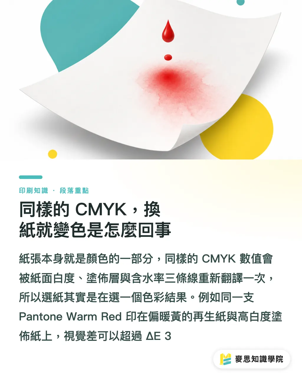
Coated vs. Uncoated: How Visual Color Rendering Differs
The difference in color rendering between coated and uncoated paper is the single most important topic for designers and buyers to clarify
Coated paper (Art Paper / Coated Paper) features a mineral coating that smooths the surface and maximizes ink holdout. This shows up across three dimensions:
・ Color saturation: CMYK overlays stay rich with strong contrast and clear image depth
・ Sharpness: Fine lines, small text, and gradients reproduce faithfully
・ Gloss: Available in glossy and matte finishes. Higher gloss makes colors punchier; matte surfaces make reading more comfortable
Uncoated paper (Offset Paper / Uncoated) leaves raw fibers exposed on the surface. Ink sinks in, producing a softened look with visible grain. This shows up across three dimensions:
・ Color saturation: The same CMYK values lose an average of 10% to 15% saturation on uncoated paper, a standard industry rule of thumb
・ Texture: Warm, natural tactile feel with excellent writeability, ideal for notebooks needing stamps, signatures, or notes
・ Visual tone: Conveys an eco-friendly, understated, organic feel that many modern brands deliberately choose
In practice, a simple two-step decision framework helps narrow down paper selection quickly:
・ Step 1: Look at the primary content. Photos, gradients, skin tones, product packaging boxes → Coated paper; Text, illustrations, cultural products, books, kraft bags → Uncoated paper
・ Step 2: Look at brand tone. Tech-forward, high saturation, clean sharpness → Coated paper; Handcrafted feel, warmth, eco-conscious aesthetic → Uncoated paper
When these two factors clash (for instance, an organic brand tone paired with product color packaging), printers usually bridge the gap with spot UV or specialty fine paper rather than forcing a rigid choice
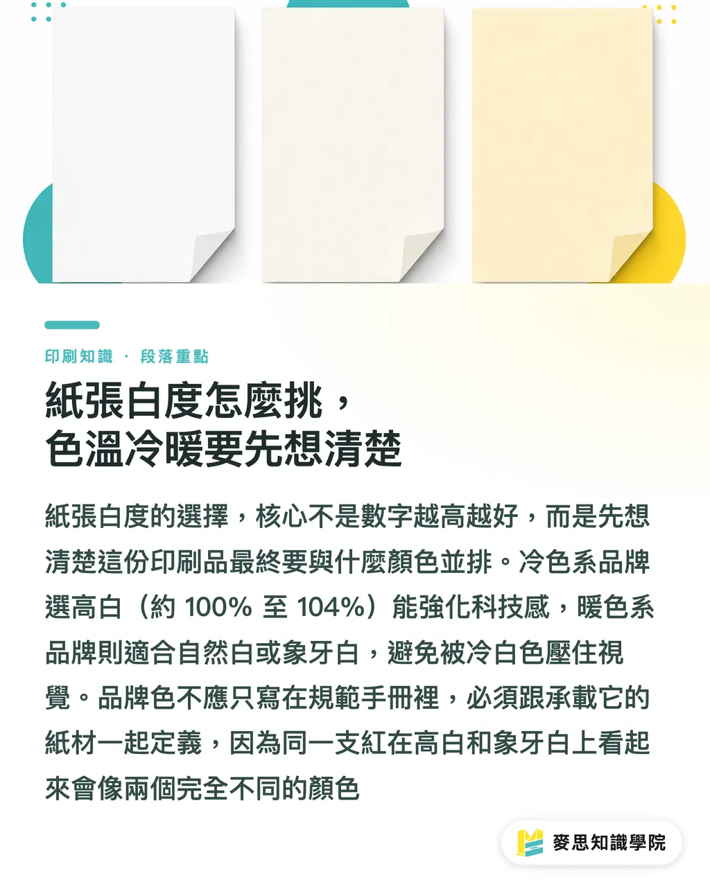
How to Pick Paper Whiteness: Settle on Color Temperature First
Paper whiteness (Brightness) is quantified using CIE whiteness or ISO whiteness values, typically ranging from 80% to 104%. The printing industry in Taiwan commonly categorizes paper into three terms: Bright White, Natural White, and Ivory White
・ Bright White (approx. 100% to 104%): Cool color temperature, crisp visual style, suited for medical, tech, cosmetics, and modern brands
・ Natural White (approx. 90% to 95%): Neutral color temperature, highly versatile, standard for most office documents, reports, and books
・ Ivory White (approx. 80% to 88%): Warm color temperature, soft appearance, perfect for creative goods, cafes, lifestyle, wedding, and artisanal brands
A practical trick for selecting whiteness works in reverse: consider what colors will sit next to the printed item. If your primary logo color leans cool (blue, green, purple), choosing bright white paper enhances the high-tech edge. If your main color leans warm (orange, red, brown), natural white or ivory white keeps the cool background from washing out your brand color
This perspective aligns with what I wrote in Building a Brand Color System: From Logo to Print, Mastering Color Management in One Go: brand colors cannot live solely inside a design manual. They must be defined alongside the paper that carries them. The exact same red on 104% bright white vs. 85% ivory white looks like two completely different color swatches
Buyers often fall into a common trap: assuming higher whiteness is always better. That holds true for coated commercial prints, but on items meant for writing, heavy full-bleed dark printing, or post-press finishes (foil stamping, embossing, spot UV), excessively high whiteness makes dark inks look washed out and weakens finishing contrast
Moisture Content and Environmental Control: The Most Frequent Cause of Production Line Issues
The previous sections covered the chemical and physical traits of paper; this section focuses on the environment. In Taiwan print shops, uncontrolled moisture content is the single leading cause of paper color shifts
Paper is a hydrophilic material that absorbs and releases moisture matching its surroundings. When relative humidity rises from 50% RH to 80% RH, paper moisture content can surge from 6% to over 10%. At that point, ink drying times, trapping sequences, and color saturation drift completely out of spec. Four common breakdown symptoms occur:
・ Dimensional warping: Paper curl, misregistration, and crooked die-cutting
・ Slow drying: Ink set-off and smudging, color bleeding at overprints (like K over M turning muddy dark red)
・ Loss of gloss: Coated sheets meant to shine come out looking dull and hazy
・ Hue shifts: Color variations appear between the start and end of the same print run overnight
I recommend a two-stage quality control protocol:
・ Receiving stage: Do not send incoming paper straight to press. Store it in a climate-controlled zone for 24 hours of paper conditioning so it balances with pressroom humidity
・ Production stage: Maintain pressrooms at 22°C ± 2°C and relative humidity at 50% to 60% RH. Run dehumidifiers in Taiwan's spring and summer, and humidifiers in autumn and winter. Never run climate controls only for human comfort
This extends the principle discussed in Why Proof Color Doesn't Match the Final Print: Soft Proofing vs. Hard Proofing: proofing environment ≠ production environment. If paper moisture during proofing differs from mass production, color variation begins accumulating right at that gap
Practical Paper Selection and Color Matching Workflow: How to Use the Three Pre-Print Checkpoints at MINDS (MS)
To condense these concepts into an actionable workflow, follow the sequential order of the three pre-print checkpoints at MINDS (MS):
① Synchronize Design and Paper Selection
Do not wait until artwork is finalized to pick paper. Factor paper whiteness, coating, and moisture content into your design phase choices from day one. Build your color scheme within the physical limits of the paper rather than scrambling for paper to match finished art
② Perform Proofing on Target Stock
Soft proofing (on-screen proofing) only verifies layout and general direction. Color must be verified with physical proofing on the actual production stock. Ask the printer to record the paper brand, model, and whiteness value on the proof; this data forms the baseline for mass production color matching
③ Base Production Color Matching on Instruments
When the first sheet goes on press during mass production, measure Lab values using a spectrophotometer and compare ΔE against the approved press proof. Keeping ΔE within 2 is the standard acceptable tolerance across the industry; anything over 3 requires stopping the press for adjustments. Never rely solely on visual inspection. No matter how sharp a supervisor's eyes are, fatigue during long shifts inevitably dulls judgment
The order of these three checkpoints cannot be reversed: select paper first, perform proofing second, and match color on press last. Skip any step and you save a little time while risking the entire print run
If you are a designer or brand client, introducing these three checkpoints into your project proposals will make conversations with printers far smoother. For deeper insights into paper stocks and pre-press nuances, feel free to reach out directly to the consulting team at Mai Strategy Knowledge Academy. Discussing your real-world project specifics yields far more actionable results than reading articles alone. For ongoing analysis on paper, color, and AI applications, subscribe to the weekly Mai Strategy Knowledge Academy newsletter to stay updated

Key Takeaways
・ Higher paper whiteness is not always better; choose based on main color temperature and brand identity
・ Coated paper delivers high saturation and sharpness, while uncoated paper offers tactile warmth and soft tones. The two differ in visual color intensity by an average of 10% to 15%
・ Maintaining paper moisture content between 6% and 8% is standard industry practice, requiring climate-controlled pressroom conditions
・ Proofing must be performed on the target stock; production color matching should rely on spectrophotometers to keep ΔE within 2
・ Paper selection must happen concurrently with design, never as an afterthought after artwork finalization
Further Thoughts
For print manufacturers, paper conditioning zones and pressroom climate control are basic prerequisites. Without them, taking on high-end color boxes is out of the question. For designers, moving paper selection up into the pitch phase marks true professionalism. For AI and SaaS providers, color management software could automate alerts combining whiteness, coating, and moisture metrics to warn designers instantly when an incompatible paper stock is chosen inside a PDF. This simple feature could save substantial reprint costs. The MINDS team can validate this direction in the next phase of its color management module development
Further Reading
(This article is based on practical consulting experience in the printing industry and does not cite external sources.)
FAQ
- Will the color always change if I switch paper using the same CMYK values?
- Yes. Paper whiteness, coating, and moisture content all alter color rendering. Even with the exact same file, the visual saturation difference between coated and uncoated paper averages 10% to 15%
- Does higher paper whiteness mean more accurate print color?
- Not necessarily. Bright white paper has a cool color temperature suitable for cool color palettes and tech brands. Using bright white paper for warm brand colors causes the cool tone to mute saturation, reducing accuracy
- Can I proof on Paper A and switch to Paper B for mass production?
- Not recommended. Mismatched proofing and production paper is the single most common cause of color discrepancies. Proofing must take place on the target production stock, with paper model and whiteness values documented as the matching baseline
- What ΔE threshold is considered acceptable?
- ΔE ≤ 2 is the standard acceptable tolerance across the industry, where the human eye detects almost no difference under standard viewing conditions. A ΔE above 3 warrants stopping the press for adjustments
- What should I do if the printer insists the paper is fine, but colors are inconsistent every run?
- First, verify whether the pressroom meets temperature and humidity standards and if paper underwent 24-hour conditioning. Then ask the printer for moisture content and whiteness test data for that batch. These three factors form the primary sources of production line color variance
Related articles


The Print × AI weekly
The print and AI know-how designers, brands and enterprises can use before they commit — one email, every week
Tool Library
RGB↔CMYK conversion, ΔE color difference and brand color print analysis — free color management tools, computed right in your browser.
MINDS Group
Need actual printing or gifting services?
From premium printing to online ordering and festive gifts — the MINDS Group sister brands take it from here.