
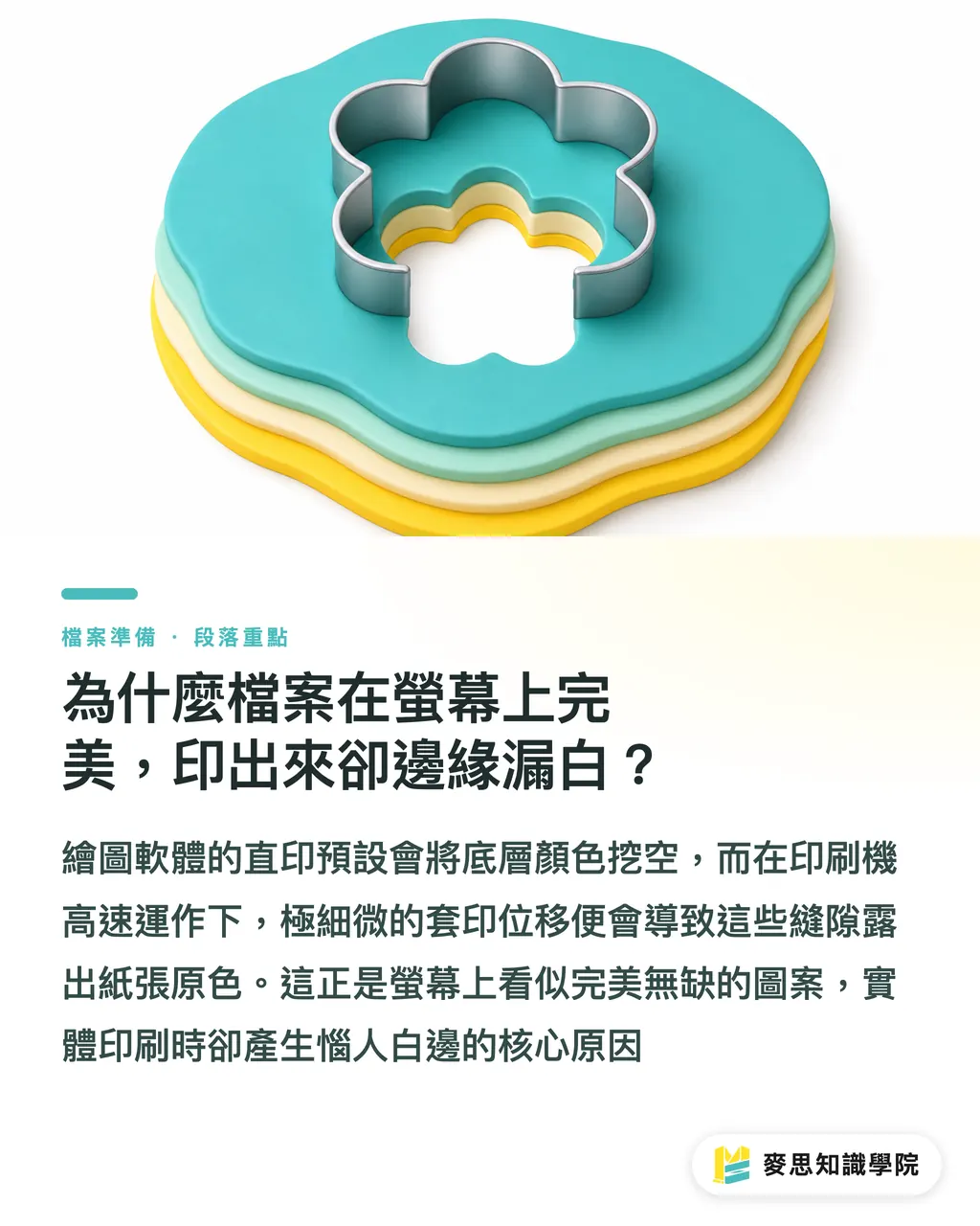
Why does a perfect on-screen file result in white gaps at the edges when printed?
Many designers are accustomed to using the same default software settings for every project, which is highly dangerous in printing practice
In graphics software like Illustrator, the default processing method for overlapping layers is called a "Knockout."
This means the upper color block acts like a cookie cutter, completely carving out the color underneath
While this physical carving looks perfectly logical on a screen, printing presses are massive physical machines
During high-speed printing (such as offset printing at tens of thousands of sheets per hour), paper absorbs moisture and undergoes tension, making it impossible for every color plate to align with 100% precision
As long as there is even a 0.1mm shift (known in the industry as misregistration), the carved edges will reveal the base color of the paper, which is the culprit behind those annoying "white edges" on prints
The double-edged sword of Overprint and K100 pure black
To solve the white-edge issue, prepress operations utilize the "Overprint" technique
The logic of overprinting is that the top color is printed directly on top of the bottom color without the bottom being knocked out; the pigments mix to create a blended effect
The standard solution I encounter most often on the production line is to set small black text and black lines to K100 and enable overprint
Because black ink can usually cover the background color, the result visually remains black while perfectly masking the tolerance of machine misregistration
This is why pure black (K100) text is usually requested to be set to overprint before being sent to press
Why shouldn't large color blocks be set to overprint directly?
Setting black to overprint sounds great, but it is often the start of another disaster
If you have a large K100 black area with a vibrant photo or color block behind it, enabling overprint will cause the underlying pattern to show through faintly
In the industry, this is called "color show-through" or "uneven color blocks," making the printed black look dirty or patchy
Looking at recent client complaints, this mostly happens because designers don't understand the chemical overlay principle that "overprint means transparency."
To solve printing for large black areas, the correct approach is to disable overprint and set the color to "Rich Black."
The safest value is K100 plus C30 (cyan). This ensures the black is deep and rich while avoiding the awkward issue of the base image showing through
How is transparency setting different from overprint?
Many young designers like to use "Multiply" or lower the opacity in their software to simulate color overlays
On screen, transparency does produce a visual effect similar to overprinting, but to the backend RIP (Raster Image Processor), these are two completely different languages
Transparency involves complex rasterization calculations. If your file is still in the older PDF/X-1a format, transparency will be forced to flatten during export
This easily causes mysterious white lines to appear at the edges of layers or color banding
My advice: if you can solve it with clear color swatches and overprint settings, avoid transparency effects as much as possible, as this significantly reduces the risk of RIP interpretation errors
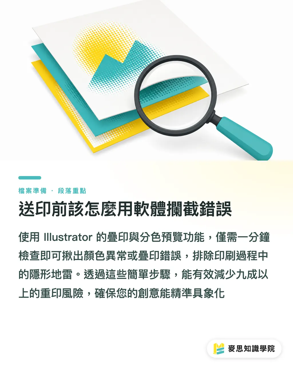
How to use software to catch errors before sending to print
You don't need advanced technology to avoid these three invisible traps; just utilize two "rulers" built into your software:
・Open Illustrator's "View > Overprint Preview." This simulates the real state of ink overlay and catches abnormal color show-through
・Open "Window > Separations Preview." Toggle the CMYK channels individually to check if the area under your black text is truly not being knocked out
・Delete all unnecessary hidden layers to prevent the RIP from counting invisible objects during processing, which can cause interference
These actions take less than a minute but can stop over 90% of reprint risks, allowing your creativity to be realized exactly as intended
Key takeaways
・Always set small black text and lines to K100 and enable overprint; this is the most effective way to avoid white edges from misregistration
・Never set large black areas to single-color black overprint. Use K100 + C30 and disable overprint to print a rich, solid black
・Knockout is a physical cutout susceptible to machine tolerances; overprint is a pigment overlay that requires attention to show-through risks
・Before finalizing files for print, always enable your software's Overprint Preview and Separations Preview; this is your last line of defense against errors
Extended thoughts
From the perspective of SaaS and automated tools, many prepress inspection systems can now automatically flag K100 text that hasn't been set to overprint. However, it is difficult for systems to distinguish between a designer's "intentional use of transparency" and "incorrect settings."
This is precisely the value of integrated services like MINDS Printing: we use systems to catch basic mistakes while retaining the experiential judgment of senior print specialists
When enterprises introduce standardized workflows from design to print, they must list "Overprint and Knockout Preview" as a mandatory requirement for their design teams. This can save companies significant costs in reprint wastage and back-and-forth communication
FAQ
- Why do my black characters have white gaps around them when printed?
- Because the software default is "Knockout" (carving out), which removes the background color beneath the black text. Combined with the micro-shifts of high-speed printing presses, this reveals the white edges of the paper. Please ensure you set small black text to "Overprint."
- I set a large black background to overprint; why can I see the outline of the photo underneath?
- Overprinting allows pigments to overlay each other, and pure K100 black ink actually has a slight translucency. For large black areas, please disable overprint and add C30 to create a rich black to increase opacity
- Can I use "Multiply" to replace overprint?
- They look similar on screen, but the logic for how the backend RIP handles transparency versus overprint is completely different. Over-reliance on transparency effects without proper flattening easily creates mysterious white cutting lines during printing
Related articles
- Preparing Print Files for Specialty Stocks: How Paper Characteristics Influence Prepress Settings
- How to Design English Business Cards: A Consultant’s Guide to Layout and Prepress Pitfalls
- Printing Typography: From Font Size and Leading to Knockout Text—Avoiding the Visual Trap Between Screen and Print