
Why Do White Objects Disappear in Print?
One of the most frustrating rejected print jobs I have seen was not caused by low resolution or a major color shift. It was a white logo that was clearly visible on screen but completely disappeared in print
The reason is often just one thing: the white object was set to Overprint
Overprint means the upper object does not knock out the ink underneath. Instead, it prints directly on top of the lower color
On colors that contain ink, this creates a blending effect. But in standard CMYK printing, white usually means no ink is printed
So once a white object is set to Overprint, the output effectively tells the machine: do not print here, and do not knock out the background either
The result is disappearance
Knockout is the opposite. It removes the lower color so the upper object keeps its own shape
Think of it as the difference between stamping and cutting a hole:
・Overprint: the upper ink prints on top of the lower ink, and the two mix together
・Knockout: the upper object first cuts out the area underneath, then prints its own color
・White objects: because there is usually no white ink, they must rely on Knockout to reveal the white of the paper
・Fine black text: it usually needs Overprint to avoid white gaps caused by registration errors
There is no gray area in this decision
White elements should never be set to Overprint, especially white text, white logos, white rules, and white icons
If even one of them is checked by mistake, the printed piece may lose a visual element you thought was perfectly safe

Why Is Black Text Often Set to Overprint?
The biggest risk with black text is not that it becomes too black. It is that its edges show white gaps
Standard CMYK printing involves at least four plates: C, M, Y, and K. Paper expansion and contraction, press adjustments, trimming, and on-press conditions can all cause tiny registration shifts
If small K100 text is set to Knockout, the text shape is first cut out of the background color, and then the black plate is printed on top
If the black plate shifts even slightly against the background, a thin white edge appears around the text
This kind of white gap is hard to notice on screen, but it becomes painfully obvious in the finished product
That is why pure black K100 text is usually set to Overprint as a prepress convention
The benefit is straightforward: black type prints directly over the background, the background is not knocked out, and minor registration errors are less likely to reveal white edges
But this rule only applies to fine pure black text and small objects
When dealing with large black areas, black headline blocks, or black text over dark backgrounds, you cannot rely on habit alone
Because Overprint allows the color underneath to show through, the black can become muddy, darker than expected, or color-shifted
In practice, you can judge it with three key points:
・K100 small text: usually set to Overprint, with the main goal of preventing white gaps
・Large black areas: do not rely on the screen preview alone; confirm whether Rich Black is needed and follow the printer’s specifications
・Black text over a complex background: turn on Overprint Preview first and check whether the background affects readability
Rich Black requires even more care
Some designs use multiple CMYK colors to build a deeper black. This kind of black is not a single K plate, and total ink coverage plus paper absorption will affect the result
Different print shops may recommend different Rich Black formulas, so clarify this before sending files to print
Do not apply the K100 small-text rule directly to large four-color black blocks
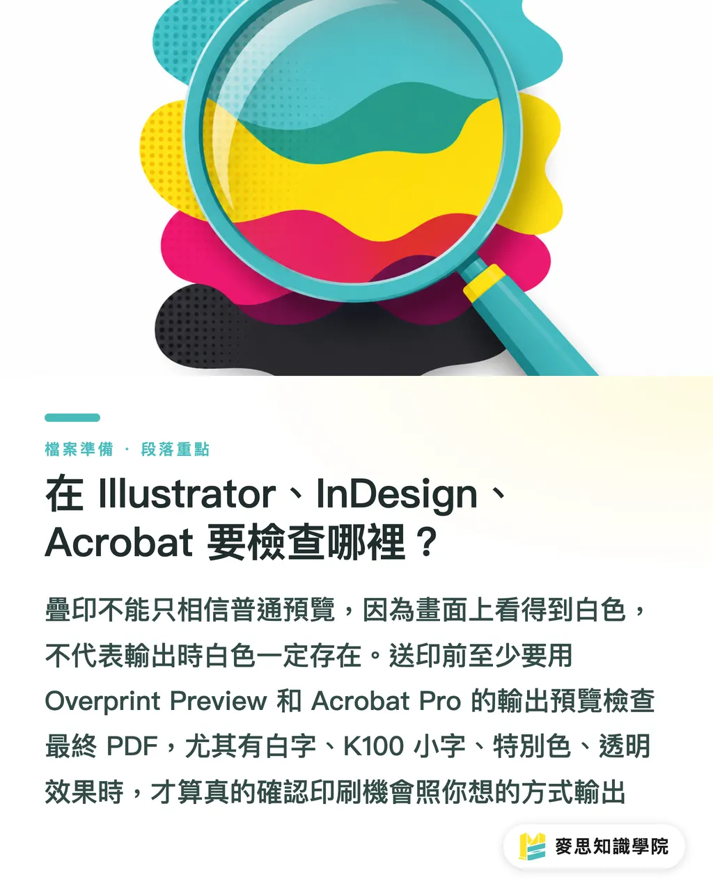
What Should You Check in Illustrator, InDesign, and Acrobat?
The most troublesome part of overprint issues is that they are often invisible in a normal preview
The white object you see on the layout and the white object that survives in output are not necessarily the same thing
Before sending files to print, you should perform at least three layers of checks
・Illustrator: after selecting an object, go to the Attributes panel or Window > Attributes to confirm whether Overprint is checked for fill or stroke
・InDesign: turn on View > Overprint Preview to directly inspect the output effect after overprinting
・Acrobat Pro: use Output Preview to check individual separations and Overprint behavior in the PDF
My own approach is simple: if a file contains white text, black text, spot colors, or transparency effects, I do not trust the regular preview
Regular preview is for layout review. Overprint Preview is closer to a real prepress judgment
Especially before a PDF leaves your hands, check it once in Acrobat Pro
Many clients do not submit the original AI or INDD files. They submit an exported PDF
The Overprint settings, transparency, and color separations inside the PDF are what the print shop actually has to process
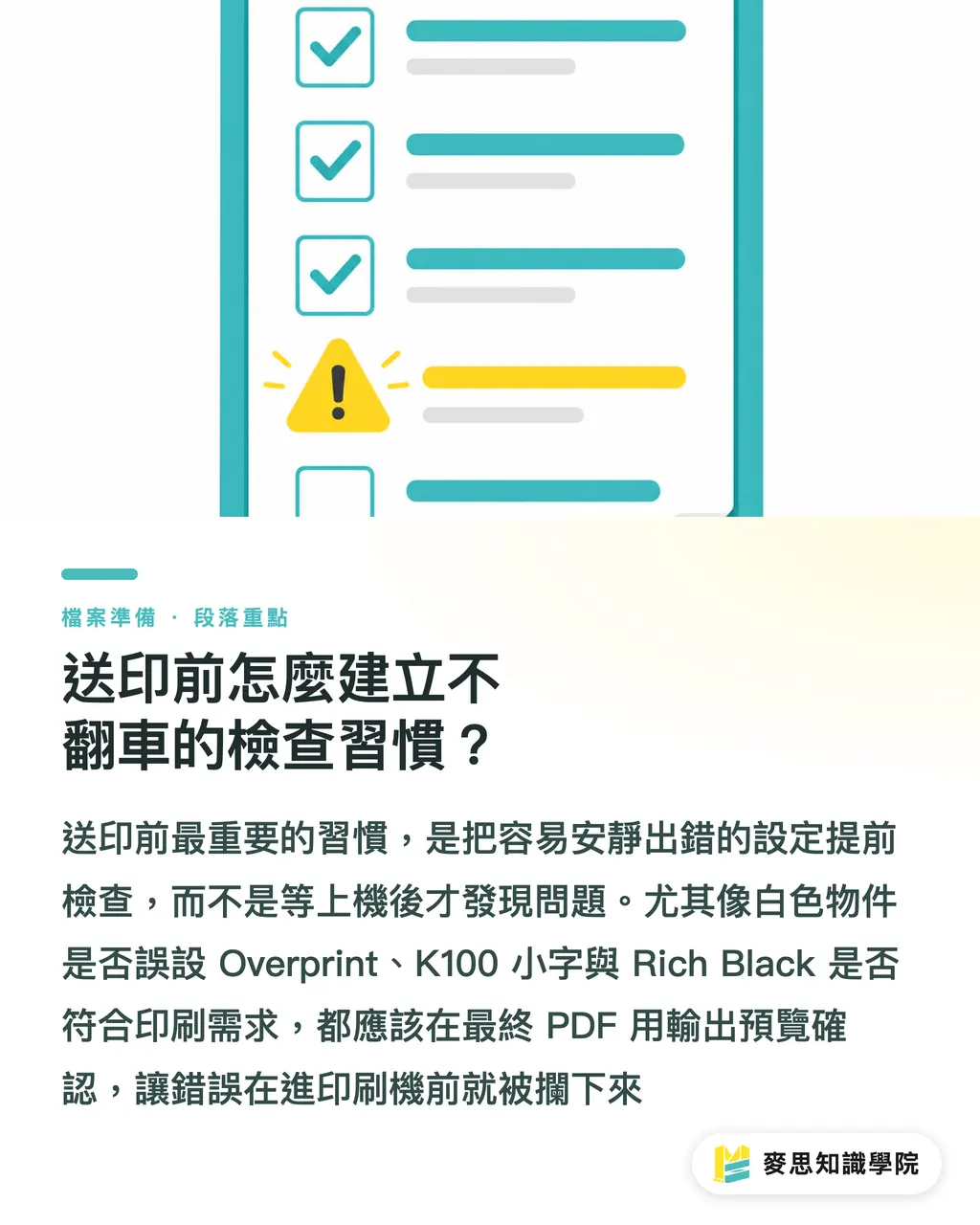
For self-checking, follow these five steps:
・Step 1: find all white objects and confirm none of them are set to Overprint
・Step 2: find all small K100 text and confirm whether it meets the overprint requirement
・Step 3: check Rich Black and confirm the printer’s recommended CMYK build and total ink coverage
・Step 4: turn on Overprint Preview and check whether white text, black text, and lines behave abnormally
・Step 5: use Acrobat Pro Output Preview to inspect the final PDF, rather than checking only the source file
These five steps do not take long, but they can prevent a lot of reprint costs
Final artwork is not just about arranging the visual layout. It is about translating that layout into instructions the machine can print correctly
Why Are Spot Colors and Transparency Effects More Likely to Cause Problems?
Spot Color is one of the most easily overlooked areas in overprint decisions
In packaging, stickers, foil stamping, white ink, spot UV, and brand-color printing, a spot color is often not just a normal CMYK color. It is a separately specified plate
In these cases, Overprint is sometimes necessary
For example, white ink underprinting, spot UV, and foil-stamping plates often need to preserve the artwork underneath or define a finishing position
But precisely because this does not follow ordinary CMYK logic, a wrong setting is harder to fix
Spot-color overprint settings depend on their purpose:
・White ink plate: commonly used on transparent or dark materials; confirm whether it is used as a white underbase
・Foil-stamping plate: the key issue is whether the finishing position is accurate; screen color alone is not enough for judgment
・Spot UV plate: often supplied as an independent plate; confirm that it sits over the correct artwork
・Brand spot color: if it overprints with CMYK, unexpected color mixing may occur
Transparency effects also require caution
PDF flattening may change the relationship among transparent objects, overprint objects, and the background image
A shadow, translucent black, or gradient object that looks normal in the source file may be split into multiple objects or image regions after PDF export
This does not mean the PDF will necessarily fail, but it does mean you cannot check only the source file
If a file contains transparency, spot colors, white ink, or finishing plates, I recommend treating Output Preview as mandatory
Not because the software is unreliable, but because printing is not about whether the image looks nice. It is about whether the layout instructions are correct
How Can You Build a Preprint Check Habit That Prevents Mistakes?
Many final-artwork problems are not caused by designers lacking visual judgment. They happen because there is no prepress decision checklist
This is especially true for Overprint and Knockout
They do not trigger warnings like low-resolution images, and they do not report errors as clearly as missing fonts
They often sit quietly inside the file until the job reaches the press
I recommend turning the check into four fixed questions:
・Are any white objects set to Overprint?
・Is small K100 text set to Overprint according to the print requirement?
・Does the Rich Black follow the print shop’s specifications?
・Has the final PDF been checked with Overprint Preview or Output Preview?
For small and medium-sized businesses and design buyers, this is not something only designers need to understand
Business cards, catalogs, stickers, and packaging boxes all run into the same logic whenever they involve white text, black backgrounds, spot colors, or finishing
Putting these rules into the print submission workflow is more useful than assigning blame afterward
When MINDS Printing handles integrated design, final artwork, proofing, and production, these file checks are part of early-stage communication
Good printing service is not just taking a file and printing it. It is finding that wrong checkbox before it becomes a production problem
Key Takeaways
・When a white object is set to Overprint, it usually does not become lighter. It disappears completely
・Small K100 text is often set to Overprint not to make the type darker, but to prevent white gaps from registration errors
・Rich Black is not simply about making black darker. The four-color build and total ink coverage must be confirmed according to the print shop’s specifications
・Regular preview only shows the layout. Overprint Preview reveals prepress risk
・The essence of final artwork checking is converting a design layout into instructions that a printing press can execute correctly
Further Thoughts
Issues like Overprint and Knockout are well suited to standardized checking workflows. Design teams can turn them into preprint checklists, print shops can convert common mistakes into file preparation guidelines, and SaaS tools can help flag high-risk objects such as white Overprint, K100 Knockout, and spot colors with transparency effects. AI applications should move in this direction as well: not deciding visual taste for people, but catching the expensive errors that are easy for the human eye to miss before the job goes on press
FAQ
- Does black text always need to be set to Overprint?
- Small pure black K100 text is usually recommended to be set to Overprint because it reduces the risk of white gaps caused by registration errors. But this rule should not be applied directly to large black areas or Rich Black. It is best to confirm with the print shop’s specifications
- Why should white objects not be set to Overprint?
- In standard CMYK printing, white usually means no ink is printed. If a white object is set to Overprint, the output may neither knock out the background nor print white ink, causing the object to disappear in the finished piece
- Where do I check Overprint settings in Illustrator?
- In Illustrator, select the object and go to the Attributes panel or Window > Attributes to check whether Overprint is enabled for the fill or stroke. Before sending files to print, you should also turn on the relevant overprint preview to confirm the result
- If the PDF already looks normal, do I still need Acrobat Pro Output Preview?
- Yes. A regular PDF preview does not necessarily reflect the effects of Overprint, color separations, or transparency flattening. Acrobat Pro’s Output Preview is more suitable for prepress confirmation
- Do spot colors also need to be checked for Overprint?
- Yes. White ink, foil stamping, spot UV, and brand spot colors may all use independent plates. Overprint settings affect finishing position, overprint color behavior, and how the background is preserved, so you cannot judge by screen color alone
Related articles
- What Happens When Overprint and Knockout Settings Go Wrong? The Prepress Color Logic You Must Know
- Printing Black Without Fail: How to Use Pure Black and Rich Black Correctly
- Printing Rejection Headaches: Understanding the Traps of Knockouts, Overprints, and Black Settings in Prepress
- Overprint, Knockout, and Trapping: Mastering 3 Printing Pitfalls to Avoid Disastrous Results
- Preparing Illustrator Files for Print: A 10-Point Checklist Beginners and Pros Often Miss